


Hotel room directional signs are wayfinding markers that guide guests from public areas to specific rooms, elevators, and amenities. Effective systems use consistent symbols, arrows, and room number ranges to reduce confusion and walking time. In the Timberlea Blvd area of Mississauga, clear wayfinding pairs well with local event traffic and late check-ins.
By Ashwani – Top Realtor Sign & Print
Last updated: 2026-07-03
Quick Summary
This guide explains hotel room directional signs from strategy to installation. You’ll get definitions, why they matter, layouts that work, ADA-style accessibility cues, materials, and rollout steps—plus local tips for Mississauga properties near Timberlea Blvd. Use it to design faster, clearer guest navigation for 2026 and beyond.
- What hotel room directional signs are and how they fit into a full wayfinding system
- How to plan paths from lobby to door using room ranges and confirmation signs
- Design rules for arrows, pictograms, contrast, lighting, and tactile plaques
- Materials, mounting, and maintenance schedules that keep signs looking new
- Local tips for the Timberlea Blvd corridor and high-traffic event nights
Table of contents
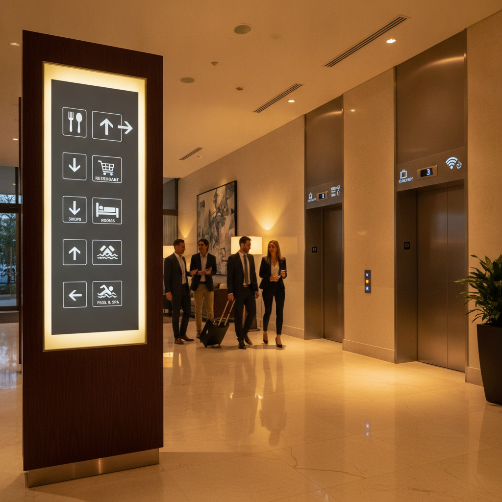
What are hotel room directional signs?
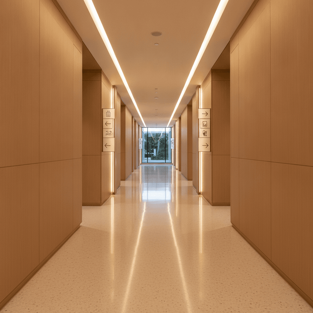
Hotel room directional signs are visual guides—usually arrows, room-number ranges, and pictograms—that steer guests from lobbies and elevators to the correct corridors and doors. Great systems pair corridor directionals with room-number plaques, amenity signs, and elevator/exit markers to eliminate hesitation and wrong turns.
At their core, hotel room directional signs turn a floor plan into an understandable journey. They remove guesswork at key decision points—elevator lobbies, corridor splits, and long hallways—so guests keep moving confidently.
- Core function: Identify the next turn and confirm guests are on the right path.
- Common components: Arrows, room ranges (e.g., “201–219”), elevator and stair icons, amenity pictograms.
- Supporting signs: Room number plaques, fire exits, elevators, restrooms, meeting rooms, and service areas.
- Design language: Consistent colors, symbols, and typography establish recognition in seconds.
In our experience fabricating directional signs for property teams across Ontario, the fastest wins come from clarifying the first 90 seconds after elevator arrival—where most wrong turns begin. Done well, hotel room directional signs reduce misroutes dramatically and cut check-in friction.
Why wayfinding matters in 2026
Clear wayfinding boosts guest satisfaction, reduces front desk interruptions, and supports accessibility. Hotels with intuitive signs see fewer lost guests during peak check-in windows and smoother event traffic flows, especially when corridors get crowded or lighting conditions vary.
2026 travel patterns show heavier weekend peaks and event-driven spikes around convention schedules. That means more first-time visitors navigating unfamiliar floors. Wayfinding becomes your always-on concierge—never taking breaks, never getting flustered.
- Faster navigation: Directional clarity trims minutes off long corridors and deters elevator backtracking.
- Lower staff load: Fewer “Where’s room 418?” questions free front desk time for higher-value service.
- Accessibility: Tactile room plaques, strong contrast, and predictable placement help all guests.
- Safety reinforcement: Clear exits and stair cues complement fire plans and after-hours routing.
- Brand consistency: A unified sign family extends the hotel’s visual identity beyond the lobby.
Event properties near the Timberlea Blvd corridor benefit most, as late-night arrivals and group blocks intensify wayfinding pressure. For venue-aligned operations, an updated system pays back every single check-in hour.
For broader accessibility context, you can review event venue accessibility guidelines for planning cues beyond hotels. While not a legal standard, it’s a helpful checklist for guest-friendly environments.
How hotel wayfinding works: from lobby to room
Effective hotel wayfinding breaks the journey into stages: arrival orientation, elevator decisions, corridor direction, and room confirmation. Each stage has a specific sign type and placement rule so guests never wonder where to go next—or whether they’re still on track.
Think in “navigation stages.” Design each stage with its own job, then link them. When we implement this structure, complaint volume drops and guests stop second-guessing hallway choices.
Stage 1: Orientation (Lobby and first decision)
- Goal: Make elevators, stairs, and key amenities obvious within the first glance.
- Signs: Lobby directory, elevator bank indicators, amenity pictograms.
- Action: Ensure arrows are visible from the main entrance sightline, not just near the elevators.
Stage 2: Decision (Elevators and floor landings)
- Goal: Eliminate ambiguity the second the doors open.
- Signs: Large corridor directionals with room ranges (e.g., 401–419 → left).
- Action: Place at elevator sightline height; keep arrows simple and bold.
Stage 3: Guidance (Corridors and splits)
- Goal: Maintain momentum along long corridors and at forks.
- Signs: Reassurance markers every 50–80 feet and at each intersection.
- Action: Repeat room ranges with arrows to avoid “Did I pass it?” moments.
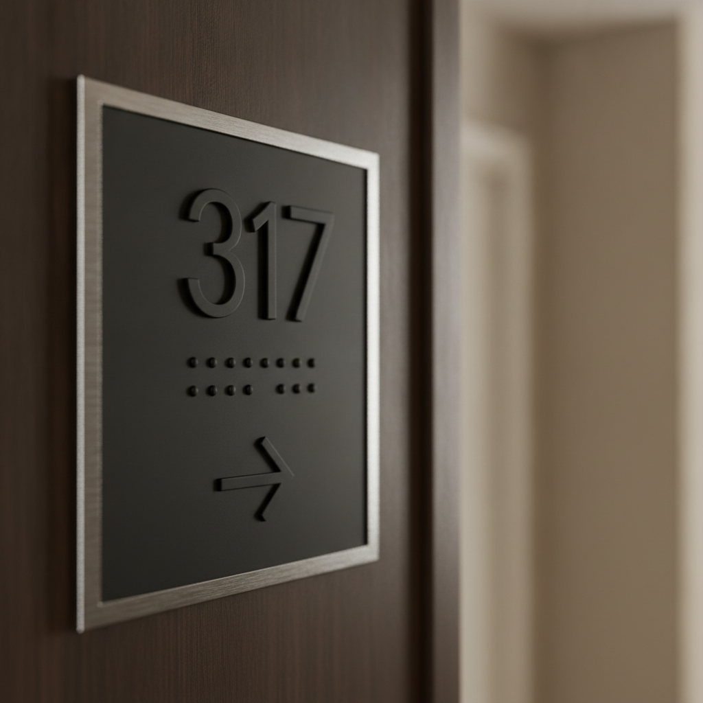
Stage 4: Confirmation (At the door)
- Goal: Verify guests found the right room.
- Signs: Room number plaques; tactile options help all users in low light.
- Action: Use consistent placement (e.g., latch side, 60 inches to centerline) so guests instinctively look in the same spot.
Process table: mapping the rollout
| Step | What to do | Owner | Timeframe |
|---|---|---|---|
| 1. Audit | Walk typical guest paths; record hesitations and wrong turns. | Ops + Front Desk | 1–2 days |
| 2. Plan | Define stages, room ranges, and decision points per floor. | GM + Designer | 2–4 days |
| 3. Design | Build a visual system: arrows, icons, colors, typography. | Designer + Printer | 3–7 days |
| 4. Fabricate | Produce prototypes; verify finish, mounting, and durability. | Printer | 3–10 days |
| 5. Install | Mount at consistent heights; verify sightlines from key angles. | Facilities | 1–3 days/floor |
| 6. Validate | Test with new guests; log questions at the desk for 2 weeks. | Front Desk | 2 weeks |
| 7. Iterate | Adjust arrow orientation, font weight, or placements as needed. | GM + Facilities | Ongoing |
We encourage teams in Mississauga to pilot a single floor first. A small, well-measured test reveals 80% of issues before you scale the sign family building-wide.
Types of hotel directional and room signs
A complete hotel sign family includes corridor directionals with room ranges, elevator and stair identifiers, amenity markers, and individual room number plaques. Add reassurance signs along long corridors and clear exit indicators to reduce doubt at every decision point.
Corridor directionals
- Use when: Guests exit elevators or approach a split.
- Design: Arrows + ranges (e.g., 301–319 →); high-contrast fields.
- Placement: In the elevator sightline and before corridor forks.
Room number plaques
- Use when: At the door for final confirmation.
- Design: Tactile numerals, readable strokes, consistent typography.
- Placement: Same side and height on every door to build muscle memory.
Amenity and service signs
- Use when: Guiding to ice, vending, laundry, fitness, pool.
- Design: Clear pictograms; avoid text-only solutions in long corridors.
- Placement: Near intersections; pair with arrows to prevent detours.
Elevator, stair, and exit indicators
- Use when: Reinforcing fire routes and day-to-day circulation.
- Design: Recognizable icons; consistent background colors.
- Placement: Visible from distance; avoid visual clutter at landings.
For safety planning that complements your everyday wayfinding, see this fire signage overview for context on exits and emergency visibility. Pairing everyday directionals with emergency readiness keeps your system coherent.
Best practices for design, placement, and accessibility
Prioritize legibility, consistency, and predictable placement. Use bold arrows, simple room ranges, strong contrast, and tactile room plaques. Repeat reassurance markers along long corridors, light signs evenly, and test lines of sight from elevator doors and corners before you drill.
Design clarity
- Arrows first: Large, simple arrows beat decorative art when guests are tired.
- Contrast: Dark text/icons on light backgrounds or vice versa; consistent palette.
- Typography: Sans-serif faces with open counters; avoid ultra-thin weights.
- Pictograms: Use widely recognized icons; don’t reinvent basics like elevator or restroom.
Placement consistency
- Height: Keep centerlines consistent per sign type for easy scanning.
- Sightlines: Validate visibility from the elevator threshold and corridor approach.
- Reassurance: Repeat room ranges after long segments and post-split.
Lighting and finishes
- Even lighting: Avoid hot spots and shadow bands that hide arrows.
- Non-glare finishes: Matte or satin surfaces stop reflections on polished floors.
- Durability: Choose scratch-resistant laminates or powder-coated metals for carts and luggage traffic.
Accessibility cues
- Tactile plaques: Raised numerals and Braille at room doors help many users.
- Predictability: Put plaques in the same location at each door so guests don’t hunt.
- Wayfinding width: Keep signs flush to walls; avoid protrusions in narrow corridors.
Local considerations for 5004 Timberlea Blvd Unit#18
- Expect surges on event nights; stage extra temporary directionals for meeting rooms near Stanford International College to ease guest flow.
- Winter evenings get dark early in Mississauga; review hallway lighting and increase sign contrast before the season.
- Coordinate with housekeeping routes so carts don’t block critical arrows during peak check-in.
Event-focused teams can also skim this conference setup guide for traffic-flow ideas during large meetings. Many of the same staging principles apply to hotel corridors before morning breakouts.
Tools, materials, and resources
Select durable substrates, clean icon sets, and consistent mounting hardware. Partner with a local fabricator for quick prototypes, color proofs, and same-day adjustments. Document your sign family so future renovations don’t break the system.
Materials that last
- Aluminum and steel: Powder-coated metals resist scuffs from luggage and cleaning.
- Acrylic and polycarbonate: Crisp edges and modern look; pair with standoffs.
- High-pressure laminate: Tough, matte finish for glare control.
- Non-glare laminate films: Protect prints and maintain color over time.
Design and fabrication workflow
- Concept to prototype: Produce one corridor set to test sightlines and finishes.
- Color management: Soft-touch brand palettes require calibrated proofing under actual hallway lighting.
- Mounting: Use templates for drill points to keep heights consistent across floors.
Need creative support? Our in-house team can build a unified visual language and icon set. See how we translate brands in our graphics portfolio and design portfolio. We apply the same rigor we bring to realtor directionals to hospitality layouts.
Communication aids for guests
- Pocket maps at check-in: A simple floor plan helps late-night arrivals.
- Elevator cabs: Mini floor directories reduce door-opening confusion.
- Digital supplements: QR codes can open a mobile floor plan; keep URLs short and legible.
For printed leave-behinds, align your makeover with refreshed collateral. If you maintain on-property marketing, our brochure printing and custom business cards keep front-desk materials on-brand. We also advise on flyer sizes that scan fast—a useful principle for lobby handouts.
Case studies and examples
Real properties fix wayfinding by clarifying elevator landings, repeating room ranges on long runs, and standardizing door plaque placement. Small changes—bigger arrows, higher contrast, and predictable plaque locations—often resolve the majority of guest misroutes within two weeks.
Example 1: Elevator landing confusion
A downtown hotel saw constant questions at the 8th-floor landing. We added large range signs visible from inside the elevator. Questions dropped within days; guests no longer paused at the doors.
Example 2: Long corridor, mid-run doubt
In a long L-shaped hall, guests slowed mid-run. Reassurance plaques every ~60 feet with ranges restored momentum and eliminated backtracking.
Example 3: Inconsistent door plaques
Plaques varied in height across floors. We standardized mounting and specified a matte finish. Guests stopped hunting with their eyes—navigation felt natural again.
Example 4: Amenity detours
Vending and ice were behind a partial wall. Pictogram + arrow signs at the intersection prevented two common wrong turns.
Example 5: Poor contrast on dark wood
Dark bronze letters on walnut disappeared at night. We shifted to a lighter backing panel; legibility improved immediately in evening light.
Example 6: Shared meeting floors
Group blocks near Red Brush Park weekends overloaded elevators. Temporary event placards paired with permanent directionals diffused traffic.
Example 7: Renovation mismatch
A wing remodel introduced new finishes but old signs. We rebuilt the family so icons, colors, and arrows matched—brand alignment lifted perceived quality.
Example 8: Multilingual guests
Pictograms replaced text-heavy signs near laundry and fitness. Guests understood at a glance regardless of language.
Example 9: Night-shift readability
Dim corridors hid plaque numerals. We specified non-glare coatings and nudged lighting; door confirmations became immediate.
Example 10: Fire stairs underused
Guests crowded elevators during morning rush. Clear stair icons plus arrows at corridor splits encouraged use, easing waits.
Example 11: Wayfinding for suites
Suite clusters confused numbering. We added mini range callouts before the cluster; guests aimed correctly without trial and error.
Example 12: Brand refresh
New logo, old arrows. We rebuilt arrows and icons in the refreshed style while maintaining legibility—brand and function advanced together.
Example 13: Seasonal surges
Holiday markets spiked traffic near Stanford International College. Extra temporary directionals near elevators kept lines moving.
Want help translating these ideas to your property? Our team fabricates directionals, room plaques, and amenity signs with fast local pickup. Explore bundled ordering via our streamlined packages—the same operational discipline we use for real estate projects adapts neatly to hotels.
Get a quick wayfinding assessment
If guests pause at elevator landings, stop mid-corridor, or ask for directions often, your wayfinding needs a tune-up. A 30-minute walkthrough identifies the two or three sign changes that eliminate most hesitation quickly.
- On-site or hybrid review focused on elevator landings and corridor forks
- Prototype one corridor set before full rollout
- Local Mississauga pickup for fast swaps during pilot
We routinely apply the same readable design logic we use in our business card printing and brochure runs—clean typography, strong contrast, and durable finishes.
Frequently Asked Questions
This FAQ covers planning, placement, and upkeep for hotel room directional signs. Use it to validate your layout, avoid common pitfalls, and plan maintenance so your system looks as good in year three as day one.
What’s the fastest way to reduce wrong turns from the elevator?
Post large, high-contrast corridor directionals with clear room ranges directly in the elevator sightline. Add a second reassurance sign a short distance down the hall. This two-step pattern eliminates most hesitation within days.
How often should we place reassurance signs along long corridors?
Plan a reassurance marker after each major split and periodically along straight runs so guests don’t wonder if they passed their room. Many hotels find that repeating ranges at regular intervals keeps foot traffic flowing.
Do we need tactile room number plaques for every door?
Tactile numerals and predictable plaque placement help all guests, not just a subset. They improve low-light readability and build muscle memory so visitors look in the same place on every door.
Should we update digital maps when we install new signs?
Yes. Keep elevator cab directories, lobby maps, and any QR-linked floor plans aligned with the new numbering, ranges, and arrows. When physical and digital guidance match, guests move confidently without extra help.
Conclusion and key takeaways
Hotel wayfinding works when arrows are bold, ranges are simple, and placement is predictable. Start at elevator landings, add reassurance markers along long runs, and standardize door plaques. Pilot one floor, measure results, then scale.
- Design for decisions: Treat landings and forks as critical moments.
- Repeat reassurance: Long corridors need confirmation signs.
- Standardize plaques: Same location and finish on every door.
- Test and tune: Pilot a floor, gather feedback, then adjust.
Operating near the Timberlea Blvd corridor in Mississauga? Book a discovery walkthrough and we’ll map a crisp sign family that guides guests on autopilot—no second-guessing, fewer interruptions, and a smoother first impression.
Related articles
Wayfinding clarity borrows from great print design: contrast, hierarchy, and consistency. For practical design cues, explore our approach to custom business cards, see print planning in our brochure guide, and skim layout lessons from our flyer sizing article. For bundled execution discipline, review our realtor packages, and browse visual inspiration in our graphics and design portfolios. The same principles make hotel room directional signs feel effortless.