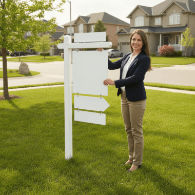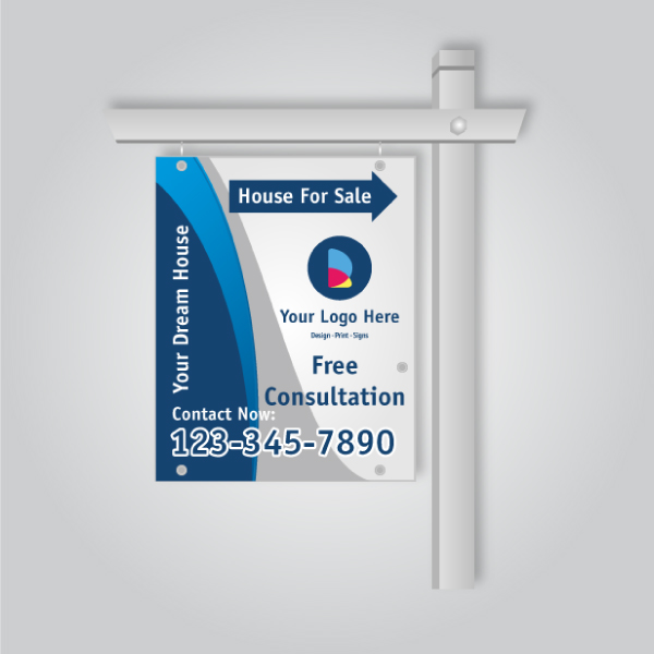
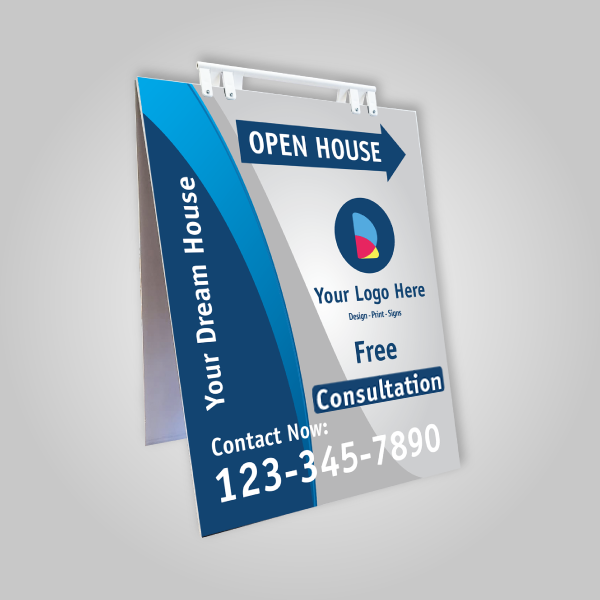
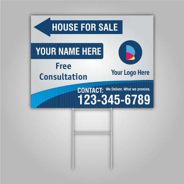
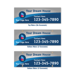


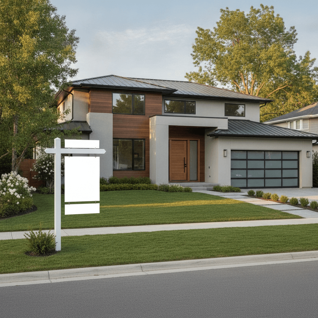
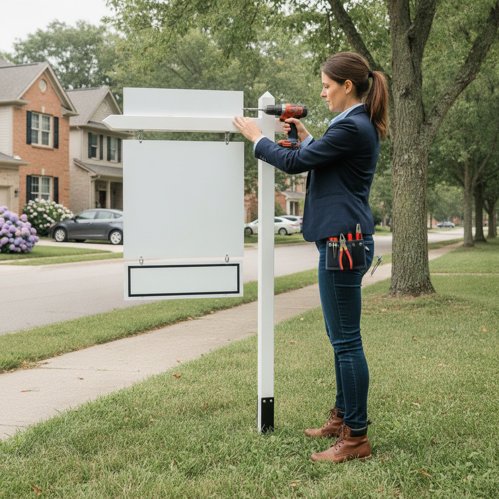
Real estate name riders are small, add-on panels that mount above or below a yard sign to display an agent’s name, team, or call-to-action. They boost brand recognition and direct leads to the right person. In Mississauga near 5004 Timberlea Blvd Unit#18, riders keep fast-moving listings clearly attributed and easier to contact.
By Ashwani — Top Realtor Sign & Print
Last updated: June 30, 2026
Overview and quick summary
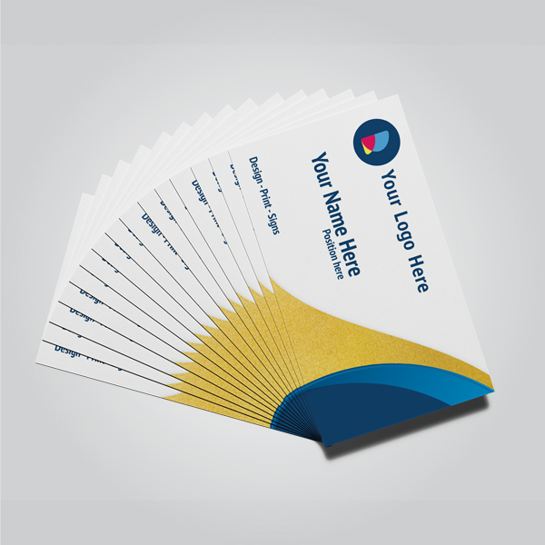
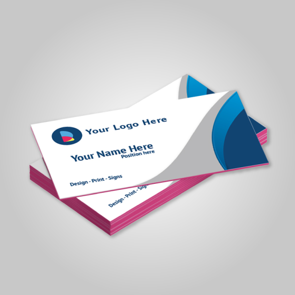
A name rider is a detachable sign panel that fastens to a For Sale or Open House sign to feature the agent’s name or a message. Standard sizes are 6×24 or 8×24 inches, built from weatherproof substrates, and mounted with grommets or clips. Good riders increase calls, reinforce branding, and simplify team coverage.
Here’s what you’ll take away from this complete guide for 2026:
- Clear definition, anatomy, and standard sizes that fit common frames and posts.
- Design rules that improve readability, including color contrast and letter height.
- Durable material choices for Ontario weather and on-site handling.
- Real-world workflows with Top Realtor Sign & Print in Mississauga.
- Local tips, common pitfalls, and a practical ordering checklist.
What are real estate name riders?
Real estate name riders are slim panels mounted above or below a yard sign to show the agent’s name, team, or a key message. They standardize attribution, adapt to changing listings, and extend sign utility without reprinting the main panel. The result: consistent branding and clearer contact paths for buyers.
Think of riders as modular identity strips for your yard sign system. You keep your brokerage-compliant main sign intact, then attach riders as your role or message changes. Most agents rotate riders like “Coming Soon,” “Sold,” or a direct phone line—keeping production costs stable while staying nimble week to week.
Core components you’ll work with
- Panel: Typically 6×24 or 8×24 inches; thickness varies by substrate.
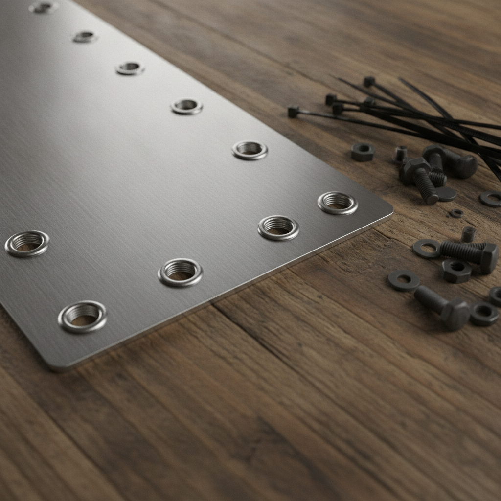
- Mounting: Pre-drilled holes with metal grommets, or clip/zip-tie attachment points.
- Finish: UV-stable inks and protective laminate for outdoor longevity.
- Branding: Agent name, team, or short CTA (“Text for Details”).
In our experience supporting Ontario agents, riders reduce reprints, shorten setup time, and keep teams aligned with brokerage standards while still spotlighting the lead agent.
Why name riders matter for listings
Name riders improve attribution, speed, and clarity. They tell passersby exactly who to contact, strengthen brand recall, and flex as listings evolve—without replacing full signs. The best riders pair readable typography with high contrast, producing faster inquiries and fewer missed calls in busy markets.
Here’s the thing: curbside decisions happen fast. A rider that a driver can read at 35 mph should use bold fonts, strong contrast, and minimal words. A practical rule-of-thumb is roughly 1 inch of letter height per 10 feet of viewing distance, keeping short names at 3–4 inches for typical suburban sightlines.
- Attribution at a glance: Your name is unmissable, even when team signs rotate.
- Operational agility: Swap riders in minutes as listings change; main panels stay put.
- Brand reinforcement: Repetition builds recognition across neighborhoods.
- Lead routing: A unique number or “Text code” helps track responses by location.
For high-turnover corridors, we’ve found agents benefit from bold name riders plus a directional arrow stack, improving discovery and follow-through on open house days.
How name riders work with your sign system
Riders attach to sign posts or frames with bolts, clips, or zip ties using pre-drilled, grommeted holes. Standard hole spacing matches common post and H-frame systems. With durable substrates and a UV laminate, a well-designed rider withstands sun, rain, and frequent on-site handling.
Most Ontario agents use either wood post systems with top eyes/hooks, metal H-frames, or sandwich boards for Open House setups. Your rider must align with hole spacing and clear the main panel’s hardware. A 6×24 panel keeps balance and avoids wind whip, while 8×24 offers extra presence for long names.
Mounting options that actually save you time
- Grommet + bolt kits: Reliable in wind; ideal for wood posts and eye bolts.
- Clip systems: Fast attachment on H-frames without tools.
- UV zip ties: Handy backups; always keep a few in your field kit.
We recommend pre-checking your post or frame brand once, then standardizing all riders to that layout. It avoids field retrofits and keeps teams moving between appointments.
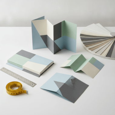
Types and materials of name riders
Popular rider materials include aluminum, coroplast, and composite panels. Aluminum provides long-term durability, coroplast is light and economical, and composites balance rigidity and resilience. Standard sizes (6×24, 8×24) fit common hardware. Choose UV inks and laminate for fade resistance across Ontario’s seasons.
Material affects durability, weight, and the crispness of typography. Here’s a practical comparison we share with agents who print with Top Realtor Sign & Print:
| Material | Rigidity | Weathering | Weight | Best use |
|---|---|---|---|---|
| Aluminum (0.040–0.063″) | High | Excellent with laminate | Medium | Daily installs, premium branding |
| Coroplast (4–6 mm) | Moderate | Good for short-to-mid term | Light | Open houses, quick swaps |
| Composite (e.g., dibond) | Very high | Excellent | Heavier | Harsh weather, long-term |
- Finish matters: A matte or satin laminate reduces glare for drive-by readability.
- Hole spacing: Verify spacing to match your post/frames before production.
- Edge safety: Smooth or rounded corners minimize snags in transport.
When your message must survive frequent installs, aluminum with a UV laminate is the dependable choice. For weekend directional blitzes, coroplast wins on speed and scale.
Design best practices for readability
Keep riders simple: bold sans-serif lettering, high contrast, and minimal words. Aim for 3–4 inch letter height for drive-by viewing, 30–40% whitespace, and a short CTA if needed. Matte finishes reduce glare and keep strokes crisp under bright daylight.
Great riders are readable at a glance. The following guidelines are battle-tested across suburban streets and busy arterials:
- Hierarchy: Put the agent’s first/last name first; any credentials secondary.
- Letter height: Plan roughly 1 inch per 10 feet of viewing distance.
- Contrast: Dark on light or light on dark; avoid mid-tone clashes.
- Stroke weight: Keep strokes at least 15% of letter height.
- Whitespace: Protect 30–40% negative space for legibility.
- CTA restraint: One action max: “Call,” “Text,” or URL—not all three.
Need help balancing brokerage colors with ADA-friendly contrast? Our in-house design team can mock up options and check legibility before you approve print.
For deeper branding tactics, see our primer on real estate branding that stands out for agents rotating through multiple neighborhoods.
Tools and resources agents actually use
Agents save time by standardizing on a single hole pattern, using an online design tool for proofs, and keeping a field kit with zip ties, clips, a small wrench, and alcohol wipes. Pre-laminated, UV-stable riders reduce fade and scuffs between frequent installs.
- Online design tool: Build print-ready riders without pro software; pair with your brokerage palette.
- Template library: Lock fonts, size, and margins to eliminate rework.
- Field kit: 8–12 UV zip ties, wrench, microfiber cloth, alcohol wipes, spare bolts.
- Labeling: Backside asset labels help teams track riders by agent.
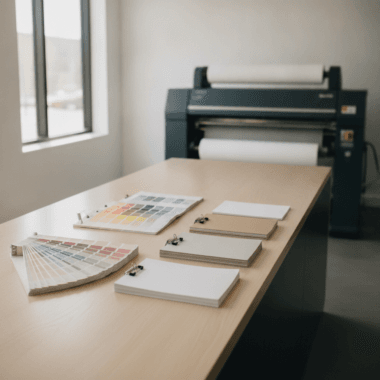
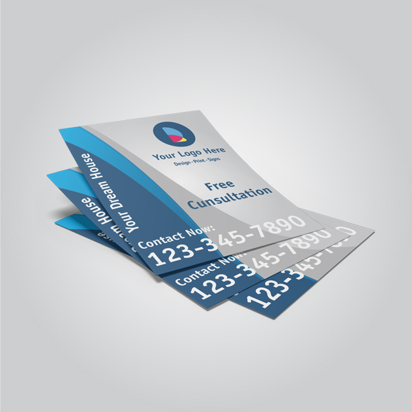
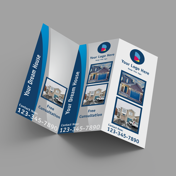
- Companion materials: Match riders with folded brochures and flyers sized for listings.
If you need inspiration for cohesive identity, browse our design portfolio and graphics gallery to visualize color, type, and finish combinations that read well outdoors.
How to order and implement with Top Realtor Sign & Print
Standardize your dimensions, upload or design your rider, proof once, and keep extras in your vehicle. With local Mississauga pickup, you can refresh riders the same day for urgent listings. Teams gain speed by reusing hardware and pre-labeling panels by agent.
- Confirm hardware: Measure your post or H-frame hole spacing once; choose 6×24 or 8×24 to match.
- Design or upload: Use our online editor or provide vector files; we’ll align bleeds and margins.
- Proofing: Check name spelling, contrast, hole placement, and laminate preference.
- Pickup or ship: Local pickup in Mississauga helps when timelines are tight.
- Deploy and label: Install with your preferred kit; label the backside for tracking.
| Step | Owner | Notes |
|---|---|---|
| Hardware check | Agent/Team Lead | Confirm hole spacing and post type once; reuse specification. |
| Design setup | Agent/Designer | Lock fonts and margins; choose matte laminate for glare control. |
| Proof approval | Agent | Final check on spelling, contrast, and placement. |
| Production | Top Realtor Sign & Print | UV inks, accurate hole drilling, quality control. |
| Install + label | Agent/Team | Attach securely; add backside asset label for inventory. |
Local considerations for 5004 Timberlea Blvd Unit#18
- During peak weekend traffic near Tomken Station East Platform A, prioritize bold, high-contrast riders for quick drive-by legibility.
- Winter glare and early sunsets in Mississauga favor matte laminates and reflective posts to keep riders readable in low light.
- If you prospect around Parkway Belt Dog Park corridors, carry spare UV zip ties; windy, open areas can stress clips.
Case studies and on-the-ground examples
Teams that standardize rider sizes, fonts, and hole spacing deploy faster and waste less. Solo agents using bold, contrasty name strips report clearer inquiries and fewer misrouted calls. In practice, small improvements in legibility compound into more showings across a listing’s first days.
Team rotation across multiple listings
- Scenario: A brokerage rotates three agents across five active signs.
- Action: Each agent keeps two labeled riders in their trunk; posts stay in place.
- Result: Less time in the field, fewer reprints, and consistent brand presence.
Solo agent with long surname
- Scenario: A Mississauga agent has a long last name that cramped on 6×24.
- Action: We moved to 8×24 with a condensed bold sans-serif and matte finish.
- Result: Cleaner stroke widths, pronounced contrast, and better curbside readability.
Open house directional blitz
- Scenario: Weekend open houses need rapid deployment across arterials.
- Action: Coroplast riders stacked with arrows on sandwich boards; UV zip ties for speed.
- Result: Fast coverage with clear attribution, then easy teardown for reuse.
Want done-for-you bundles that align riders with core collateral? Explore our Realtor package overview to coordinate signage, brochures, and event-day materials.
Common mistakes to avoid
Avoid low-contrast color pairs, script fonts at small sizes, and stuffing CTAs. Don’t mismatch hole spacing to your posts. Skip glossy finishes in bright corridors. Keep the message short—your name and one action beat clutter every time.
- Too much text: Riders reward brevity; extra words sink legibility.
- Glossy glare: Sunlight can wash out strokes; matte keeps letters crisp.
- Poor contrast: Mid-tone on mid-tone disappears at a distance.
- Mismatched hardware: Verify hole spacing once; standardize for speed.
- Font selection: Scripts and ultra-thins don’t survive drive-bys.
We routinely test proofs at reduced scale to simulate distance. If it’s hard to read as a thumbnail, it will be hard to read at 35 mph.
Advanced tips for pros
Use a consistent naming system, reflective accents for low light, and QR codes only where pedestrians can stop. Track calls per intersection by printing unique riders per corridor, then roll successful layouts across your territory.
- Night visibility: Subtle reflective borders can help in dusk hours.
- QR placement: Reserve for walkable spots; never as the only CTA.
- Message testing: “Call,” “Text,” or short URL—track which wins by location.
- Inventory discipline: Keep 2–3 spares per agent to avoid downtime.
- Finish matching: Coordinate with luxury business card finishes for brand cohesion.
For printed collateral that mirrors your rider aesthetic, pair with brochure and flyer layouts from our studio so every touchpoint feels unified.
Free proof check and layout advice
Send your rider artwork for a quick legibility check. We’ll review contrast, margins, and hole placement, then suggest improvements based on field-tested patterns. It’s an easy way to ensure fast installs and crisp curbside reads before you print.
Want a second set of eyes? Share your file or start in our online design editor. We’ll help you lock type, contrast, and spacing so your name commands attention. Cohesive sets are easy to build alongside brochures and listing flyers.
FAQ: real estate name riders
Most rider questions center on size, durability, attachment, and branding rules. Standard 6×24 panels fit most posts, aluminum lasts longest, and grommeted holes speed installs. Keep branding compliant with your brokerage, and use high-contrast layouts for quick drive-by reads.
What size should my name rider be?
Most agents use 6×24 inches for balance and compatibility with common posts. If your name is long or you need bigger letter heights, 8×24 offers more breathing room without overwhelming the main panel.
Which material holds up best outdoors?
Aluminum with a matte laminate resists bending, fading, and scuffs through frequent installs. Coroplast works well for short campaigns or backup sets. Composites deliver top rigidity when you expect heavy use or harsh weather.
How do I attach riders to my sign post?
Use the pre-drilled, grommeted holes with bolts, compatible clips, or durable UV zip ties. Standardize hole spacing once to match your post or H-frame system so installs are quick and repeatable.
Can I add a QR code to a rider?
Yes, but place QR codes where pedestrians can safely stop to scan—like near sidewalks. For drive-by viewers, prioritize large, high-contrast lettering and a simple call-to-action like a phone number or short URL.
How can I keep branding compliant?
Follow your brokerage’s identity rules for colors and logos, then use clear hierarchy: name first, credentials second. If you’re unsure, request a quick proof review from our in-house designers before production.
Additional context and references
Want to align your riders with stronger listing media? Explore complementary topics like real estate photography, branding, and social content. These resources help you present a unified identity from curbside signage to online promotion.
For brand and content planning inspiration, see this real estate media guide and this overview of real estate photography. For local market perspective, review a Toronto market snapshot to time your installs around listing activity.
Key takeaways
Standardize sizes and hardware, choose durable materials, and keep designs simple. Bold type, high contrast, and matte finishes improve drive-by readability. Label and track riders by agent to speed deployments. Pair signs with aligned brochures and flyers to reinforce your brand everywhere.
- Use 6×24 or 8×24 with hole spacing matched to your posts or H-frames.
- Aluminum + matte laminate delivers reliable outdoor performance.
- Keep typography bold with strong contrast and ample whitespace.
- Carry a field kit for five-minute installs and quick swaps.
- Unify curbside and print collateral for stronger recall.
Conclusion and next steps
Name riders turn your sign system into a flexible, branded platform. When you standardize sizes, hardware, and design rules, installs get faster and branding gets stronger. For quick, local support in Mississauga, our team can proof, print, and have riders ready for pickup on tight timelines.
- Review your post or frame specs once and lock a standard rider size.
- Prepare artwork or use our online editor to ensure legibility and contrast.
- Coordinate riders with brochures and flyers for a cohesive look.
- Plan pickup near 5004 Timberlea Blvd Unit#18 to keep timelines short.
Ready to move? Let’s align your riders with your core listing kit so your brand speaks clearly—curbside and online.