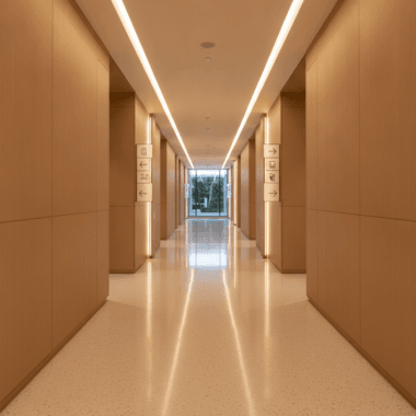


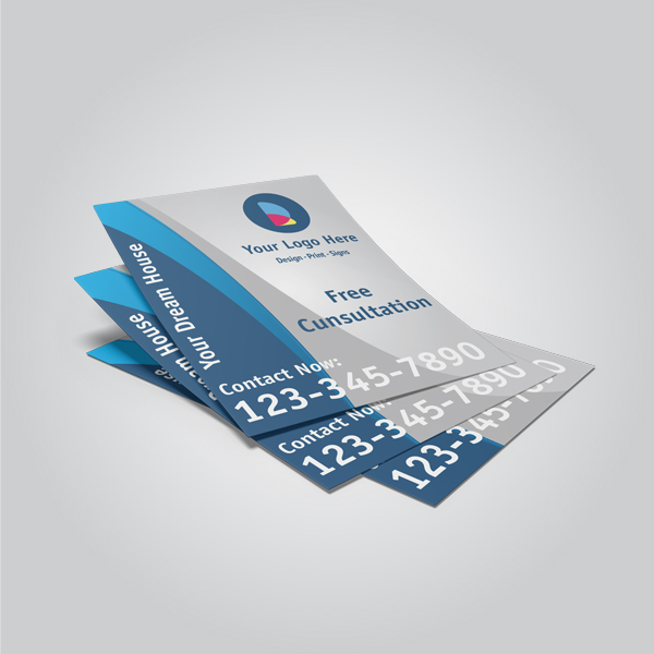


Custom business card printing is the end-to-end process of designing and producing personalized cards with the exact paper, size, and finishes your brand needs. Standard North American size is 3.5 × 2 inches. For pros working near 5004 Timberlea Blvd Unit#18 in Mississauga, local same-day pickup helps you make last‑minute meetings with confidence.
By Ashwani, Top Realtor Sign & Print · Last updated: 2026-07-01
Above the Fold: Hook + Table of Contents
This guide shows how to plan, design, and order custom business cards that get callbacks. You’ll learn the right specs, finishes like raised spot UV and foil, file-prep steps, and local pickup tips for Mississauga. Use it to move from idea to press with zero surprises.
When cards feel premium and read clearly, people keep them. Here’s the roadmap we use with real estate and local business clients across Ontario to turn cards into conversations that stick.
- What is custom business card printing?
- Why custom business cards still win in 2026
- How the printing process works
- Types of cards, stocks, and finishes
- Design best practices for Realtors and local brands
- Tools and resources
- Case studies and examples
- FAQ
- Conclusion
At a Glance
Great cards blend clear messaging, durable stock, and a tactile finish that reinforces brand quality. Set size to 3.5 × 2 inches, design in CMYK at 300 dpi with 0.125-inch bleeds, and choose a finish that matches your positioning. Plan pickup timing so you never miss an opportunity.
Quick wins for busy agents and owners:
- Use thick stock (16pt+ or laminated) so cards don’t bend in-pocket.
- Prioritize readability: 9–11 pt body type, high contrast, ample white space.
- Add one tactile cue like soft touch, raised spot UV, or foil to elevate.
- Prep right: CMYK, 300 dpi, vector logos, 0.125-inch bleeds, safe margins.
- Plan fulfillment with same-day or next‑day pickup when timing is tight.
What Is Custom Business Card Printing?
Custom business card printing is the tailored production of cards that match your brand’s specs—size, paper, color, and finishing—so every detail supports credibility. It covers design, proofing, press, and finishing, resulting in a durable, memorable leave‑behind for meetings and events.
In simple terms, you control every variable: dimensions, paper thickness, coating, and specialty treatments. That control ensures your card aligns with brokerage standards or brand guidelines without compromise.
Core components
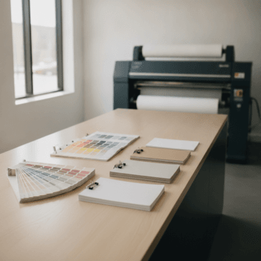
- Paper and thickness: From premium uncoated to silk/soft-touch laminates; typical thickness ranges from sturdy 14pt to ultra-premium multi-layer.
- Color model: CMYK for print; spot colors for specialty brand hues when needed.
- Dimensions: U.S./Canada standard is 3.5 × 2 inches; consider rounded corners or square formats for contrast.
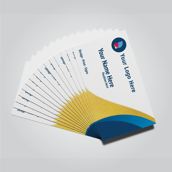
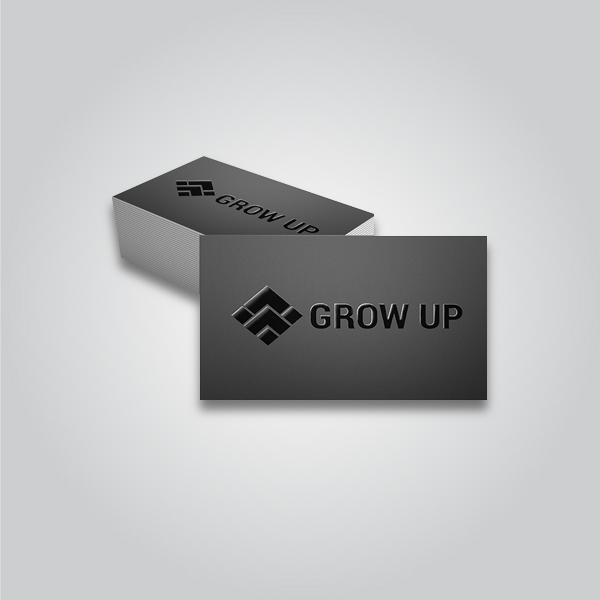
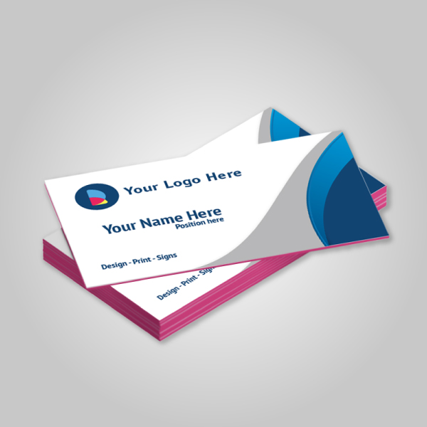
- Finishing: Raised spot UV, foil (gold/silver), painted edges, and die cuts to add tactile or visual impact.
- Fulfillment: Same-day printing Mississauga options help agents meet hard deadlines.
For Top Realtor Sign & Print’s real estate clients, custom specs also ensure compliance with brokerage branding—from RE/MAX reds to Royal LePage grays—so your handoff looks official and on-brand.
Why Custom Business Cards Still Win in 2026
Cards work because they’re fast, tangible proof of who you are. A sturdy card with crisp type and one premium finish signals reliability. In face-to-face moments—open houses, showings, local events—people prefer a physical reminder they can pocket and revisit later.
The reality is, you can’t always rely on a quick email exchange at a door or on a sidewalk. A premium card turns a 10‑second chat into a saved contact.
- Recall stays higher when people touch a textured surface; the tactile cue reinforces memory.
- Speed matters: In a 30‑minute open house, you might greet 20 groups. Cards let you move without bottlenecks.
- Consistency builds trust: Matching your signs, brochures, and postcard mailers compounds brand recognition.
We see this daily in Mississauga: agents who pair premium cards with polished brochure printing and tight listing signage make stronger first impressions and convert more showings into follow‑ups. Our real estate branding guide dives deeper into keeping your whole toolkit cohesive.
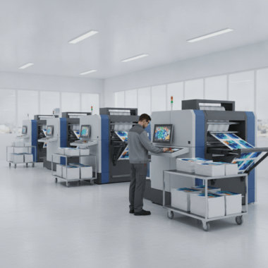
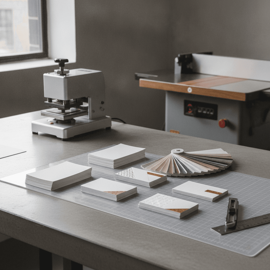
How Custom Business Card Printing Works
The process runs from discovery and design to proof, print, and finishing. Provide CMYK, 300 dpi artwork with bleeds. Approve a proof, then your cards move through press and finishing—lamination, spot UV, foil, trimming—before pickup. Clear specs and timely approvals speed everything up.
Here’s the step-by-step path we use with Ontario clients who need reliable turnaround without surprises.
- Discovery: Confirm quantity, size, stock, and finishes; note deadlines and pickup needs near 5004 Timberlea Blvd Unit#18.
- Design: Supply print-ready files or have our in-house team set them up. Vector logos (SVG/AI/PDF) prevent soft edges.
- Prepress: We check bleeds (0.125 in), safe margins (0.125–0.25 in), color space (CMYK), and overprint/knockout rules.
- Proof: Approve a digital proof to lock layout, finishes, and trim.
- Press & finish: Print, laminate if required, apply raised spot UV or foil, then die-cut/trim and quality-check.
- Pickup: Schedule same-day or next‑day pickup for urgent timelines.
| Prep Spec | Recommendation | Why it matters |
|---|---|---|
| Size | 3.5 × 2 in (U.S./Canada) | Fits standard wallets and card holders |
| Resolution | 300 dpi | Keeps type, QR codes, and logos crisp |
| Color | CMYK (no RGB) | Prevents dull or unexpected shifts on press |
| Bleed | 0.125 in on all sides | Allows clean full-bleed backgrounds post-trim |
| Safe margin | 0.125–0.25 in | Protects text from edge creep and trim variance |
Want to see finishing up close? Browse our graphics portfolio and design portfolio to compare textures and lamination in real projects.
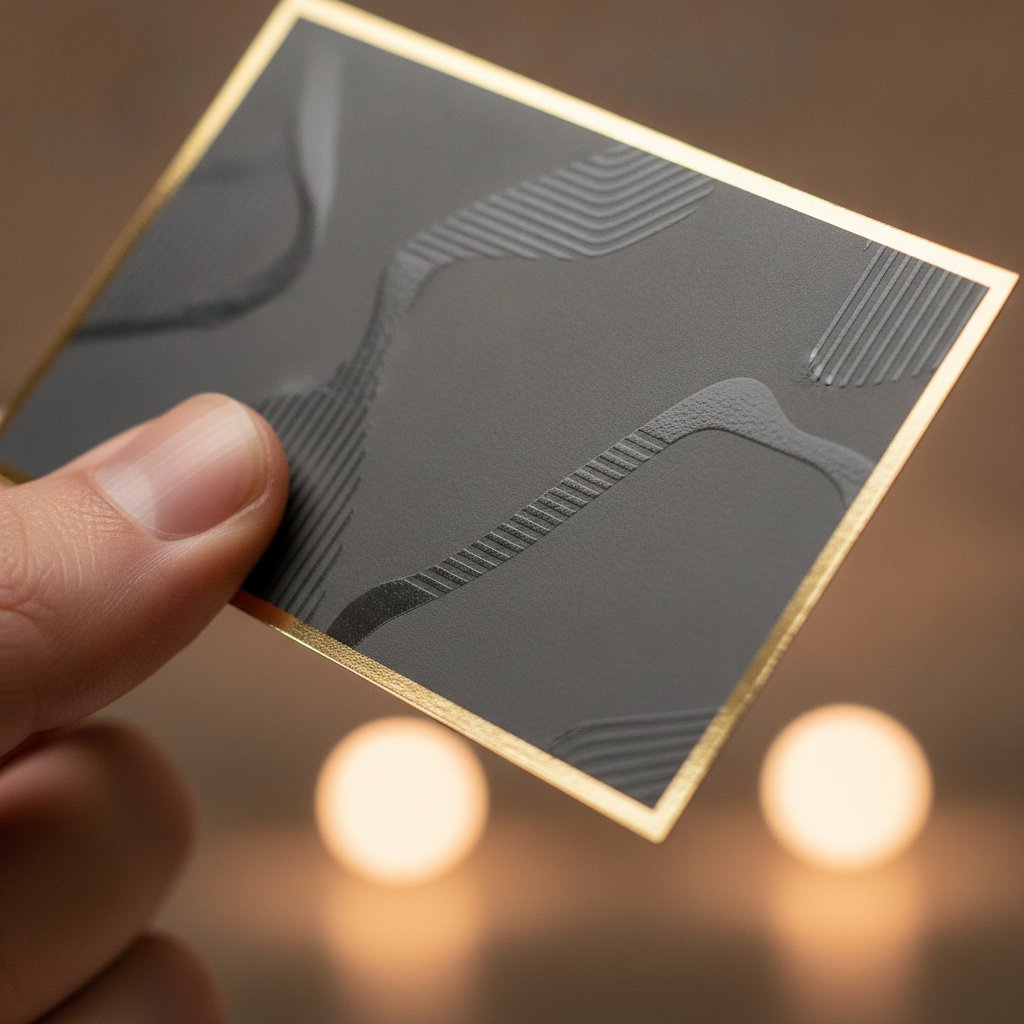
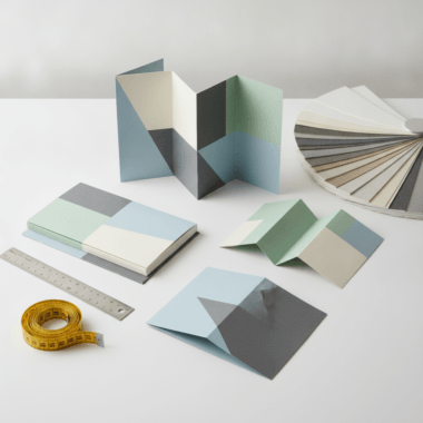
Types of Cards, Stocks, and Finishes
Choose stock first, then a single hero finish. Soft-touch lamination adds a velvety feel; raised spot UV delivers glossy texture on key elements; foil (gold or silver) creates shine; painted edges add a bold profile. Match finish to your brand personality and typical use.
In our experience serving Realtors and local businesses, one strong finish beats several competing effects. Here’s how to choose.
Paper stocks
- Matte uncoated: Natural feel, easy to write on for appointment notes.
- Silk/soft touch: Subtle sheen or velvety touch; resists scuffs in pockets.
- Gloss coated: High pop for photography or bold color fields.
- Heavyweight/multi-layer: Extra rigidity; impressive hand feel.
Signature finishes (Top Realtor Sign & Print)
- Raised spot UV: Gloss highlight on logos, names, or taglines your thumb can feel.
- Foil (gold/silver): Metallic shine for luxury positioning; great for initials or brand marks.
- Painted edges: Bold color stripe visible in a stack; pairs well with thick stock.
When to use which finish
| Finish | Best for | Why it works |
|---|---|---|
| Soft touch | Consultative brands and Realtors | Signals calm confidence and quality in hand |
| Raised spot UV | Modern, high-contrast designs | Adds tactile focal points without clutter |
| Gold/silver foil | Luxury positioning, initials, badges | Creates instant visual hierarchy and shine |
| Painted edges | Thick cards and bold palettes | Visible even when cards are stacked |
Not sure which path fits your brand? Skim our brochure overview for how we translate brand voice into print—then apply the same thinking to your card.
Design Best Practices for Realtors and Local Brands
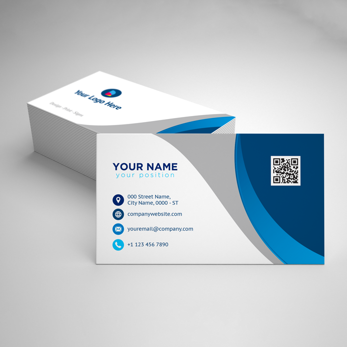
Keep what matters most: name, direct phone, email, and a scannable QR code linked to a clean landing page. Use 9–11 pt body type, high contrast, and tight hierarchy. Align brand colors and fonts with your signage, brochures, and postcards for instant recognition.
Layout and hierarchy
- One job per side: Front for identity, back for call-to-action or QR code.
- Avoid clutter: White space guides the eye and boosts legibility.
- Strong focal point: Logo, your name, or a hero badge—then supporting details.
Technical specs that save reprints
- Color: Build in CMYK. If a brand color is critical, ask about spot treatment or foil.
- Type: Convert to outlines or embed fonts to prevent substitution.
- QR codes: Generate vector codes and test at real size to confirm scan speed.
- Imagery: Place photos at 300 dpi at final size; avoid upscaling.
For brand alignment across your toolkit, match your card to listing signage and handouts. Many of our clients order cards alongside brochures and open house signage to lock in a consistent look from curb to handshake.
Tools and Resources
Work faster with templates, an online design tool, and a print checklist. Use internal style guides, export presets for CMYK/300 dpi, and a one-page proofing sheet. Inspiration and process overviews help you visualize finishes before you commit.
Speed comes from a smart toolkit. Here’s what we recommend for busy teams balancing showings and design time.
- Inspiration boards: Browse graphics projects to spot finish pairings you like.
- Proofing checklist: Size 3.5 × 2 in, CMYK, 300 dpi, 0.125 in bleed, 0.125–0.25 in safe margins, outlined text, linked images.
- Finish references: See third‑party business card portfolios for layout and texture ideas.
- Artwork prep: Process walk‑throughs like custom artwork printing pages can clarify file steps.
- Cross-media consistency: Extend your look to brochures and flyers so cards aren’t working alone.
- Design support: When time is tight, our in-house designers can adapt your listing graphics into press-ready cards.
- Portfolio deep dive: Review our design portfolio to compare typography and finish pairings.
If you’re planning seasonal outreach, coordinate cards with handouts. Our holiday card products and the holiday cards tag show how we align winter mailers and handbacks so everything feels cohesive.

Case Studies and Examples
Real-world wins come from pairing strong design with the right finish and timing. These Mississauga scenarios show how agents and owners used premium cards with same‑day pickup to capture attention, reinforce branding, and book more follow‑ups.
Open house momentum
- Scenario: Saturday open house with heavy foot traffic near Stanford International College.
- Approach: Soft-touch cards with raised spot UV on name and QR to the listing page.
- Outcome: Guests scanned the QR, saved contact, and several booked second showings on the spot.
Brokerage brand consistency
- Scenario: Team leaders standardize cards and brochures for six agents.
- Approach: Unified template, strict CMYK builds, foil on badge, consistent headshot treatment.
- Outcome: Materials matched from signs to handouts, improving recognition at curb and table.
Local business networking
- Scenario: New café launching near Red Brush Park needs a memorable leave‑behind.
- Approach: Thick matte stock with painted edges and a back‑of‑card loyalty QR.
- Outcome: Cards doubled as quick loyalty starters; staff carried them at all times.
Local considerations for 5004 Timberlea Blvd Unit#18
- Time pickups around campus traffic near Stanford International College to keep your day on track.
- Plan ahead for winter events; same‑day options are helpful when storms shuffle open-house timing.
- If you canvas near Red Brush Park on weekends, bring extra cards and a small sleeve to prevent scuffs.
Need cards fast? We specialize in custom business card printing with in‑house design and same‑day pickup options in Mississauga. Bring your file—or we’ll prep it—for a smooth, reliable turnaround.
Frequently Asked Questions
Most questions center on file specs, finishes, and pickup timing. Design in CMYK at 300 dpi with 0.125-inch bleeds, pick one hero finish, and coordinate same‑day or next‑day pickup when calendars shift. These quick answers cover what clients ask most.
What size should I set my business card file to?
Set the canvas to 3.5 × 2 inches and add a 0.125-inch bleed on all sides (final export 3.75 × 2.25 inches). Keep all important text at least 0.125–0.25 inches from the trim edge to protect readability.
Should I choose soft touch, raised spot UV, or foil?
Pick one hero finish that matches your brand. Soft touch feels refined and modern, raised spot UV adds tactile pop to names or logos, and foil (gold or silver) emphasizes luxury cues. One standout effect is cleaner—and more memorable—than stacking several.
What print settings ensure accurate colors?
Design in CMYK (not RGB), embed or outline fonts, and place linked images at 300 dpi at final size. If a brand hue is critical, flag it for spot treatment or foil so the accent renders consistently across runs and reorders.
Can you help if I don’t have print‑ready artwork?
Yes. Our in‑house designers can adapt your existing materials—like listing sheets, signage, or social graphics—into press‑ready cards with proper bleeds, margins, and color profiles. You’ll review a proof before we print.
Conclusion
Cards that feel substantial, read clearly, and include one premium finish get kept—and acted on. Lock your specs, prep files right, and plan pickup timelines so your cards are ready when opportunities appear. With a tight process, custom business card printing becomes a reliable growth lever.
Key takeaways
- Design in CMYK at 300 dpi with 0.125-inch bleeds and safe margins.
- Choose one hero finish—soft touch, raised spot UV, foil, or painted edges.
- Keep content focused and scannable; add a QR code to a clean landing page.
- Coordinate cards with brochures, signs, and mailers for compounding impact.
- Use same‑day printing Mississauga options to protect timelines around showings.
If you’re ready to move from draft to press, bring your file or brief. We’ll help you choose the right stock and finish, proof quickly, and line up pickup so you’re never empty‑handed at the next meeting.