


Common mistakes when ordering realtor signs include unclear specs, missing brokerage branding, low-resolution art, and skipping local bylaw checks. In Mississauga near the Timberlea Blvd area, the fastest way to avoid reprints is to follow a clear checklist, use print-ready files, and confirm hardware compatibility before pickup.
By Ashwani • Last updated: 2026-06-26
Summary and contents
This complete guide explains how to order real estate signs without errors. You’ll learn specs, materials, design rules, municipal considerations, riders, hardware, timelines, and pickup logistics—plus a step-by-step workflow and a pricing factors checklist (no prices). It’s written for Ontario agents who need reliable, same-day-ready solutions.
Here’s what you’ll find below—organized for scanning and quick action.
- What counts as a “mistake” when ordering signs
- Why avoiding errors protects listings and brand trust
- A step-by-step ordering workflow (with timelines)
- Materials, sizes, finishes, and hardware explained
- Design and compliance best practices
- Thirteen common pitfalls—and how to prevent each
- Tools and resources from Top Realtor Sign & Print
- Mini case studies from Mississauga agents
- Pricing and turnaround factors (no pricing)
- FAQs + a downloadable-style checklist you can mirror
What counts as a “mistake” when ordering realtor signs?
A sign-ordering mistake is any decision that delays installation, weakens brand compliance, or reduces on-street visibility. Typical errors include wrong size or material, missing riders, noncompliant logos, low DPI artwork, and skipping hardware checks. Each issue leads to reprints, fines, lost time, or a poor first impression.
At Top Realtor Sign & Print, we see similar patterns week after week. The good news? Most are preventable with a simple preflight.
- Spec confusion: ordering 18×24 when the post sleeve fits 24×32.
- Artwork problems: files at 72 DPI instead of 150–300 DPI for large-format.
- Brand misses: brokerage red rendered off in CMYK (e.g., RE/MAX, Royal LePage).
- Compliance lapses: missing required brokerage name size relative to agent name.
- Hardware oversights: grommet placement that doesn’t match the post arm holes.
When we onboard new agents in Mississauga, we walk through a standard preflight that covers materials, sizes, riders, artwork, and bylaw checks. This alone eliminates the bulk of reorders.
Why avoiding mistakes matters
Avoiding sign-ordering mistakes preserves timeline, money, and reputation. Listings move fast; a misprint can push an install by 24–72 hours. Tight branding earns trust at the curb, while noncompliance risks fines or takedowns. A clean, legible, high-contrast sign captures more drive-by attention.
Here’s the thing: yard signs are a 24/7 storefront for your listing. They must communicate clearly from 30–60 feet in motion.
- Time-to-market: Even a one-day delay can miss a weekend open house window.
- Brand equity: Inconsistent colors or typography erode credibility in seconds.
- Lead capture: A legible phone number at 2–3-inch letter height is easier to dial.
- Compliance: Brokerage standards and municipal bylaws protect you from removals.
- Durability: The right substrate and laminate withstand wind, rain, and freeze-thaw cycles.
We’ve found that teams who follow a repeatable ordering process reduce remake requests substantially and keep listings on schedule.
How the ordering process works (step-by-step)
The best workflow is plan → spec → design → proof → produce → pick up → install. Define materials and hardware first, submit print-ready art, approve a precise proof, then schedule pickup and installation. This sequence minimizes reprints and ensures your sign fits your post and local rules.
Use this sequence for every sign type—For Sale, Open House, Directional, Inserts, and custom Riders.
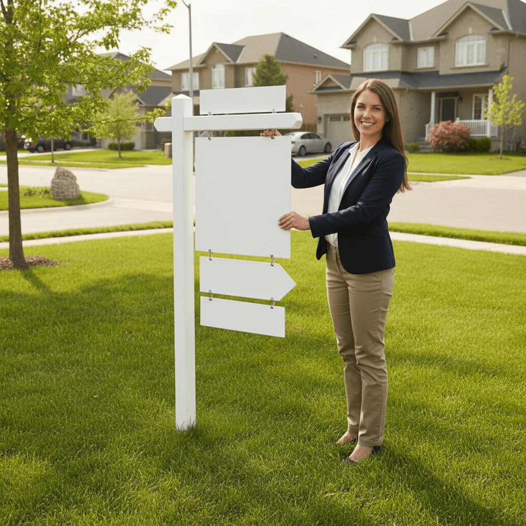
- Plan the need: For Sale panel (e.g., 24×32), directional arrows (18×24), rider needs (e.g., “SOLD”).
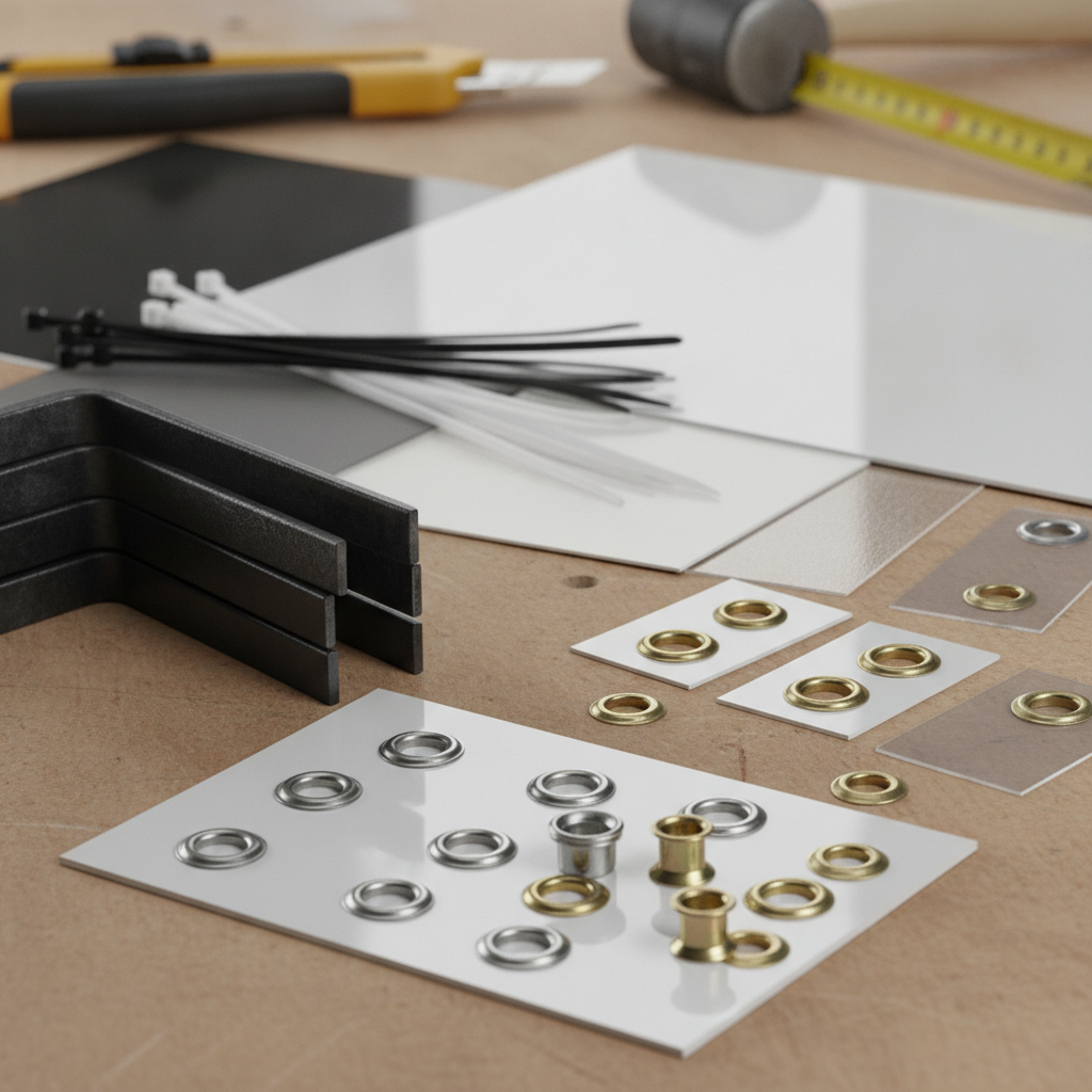
- Confirm hardware: 4×4 post arm hole spacing, H-stakes for corrugated (10×30 typical), or A-frame slots.
- Choose materials: 4mm/6mm corrugated plastic, 0.040″ aluminum, or aluminum composite (ACM) for longevity.
- Prep artwork: CMYK, 150–300 DPI at size, outlined fonts, 0.125″ bleed, 0.25″ safe margins.
- Proof carefully: Verify names, phone digits, URL/QR, license disclaimers, and grommet positions.
- Production: Typical digital runs are queued the same or next day, depending on preflight quality.
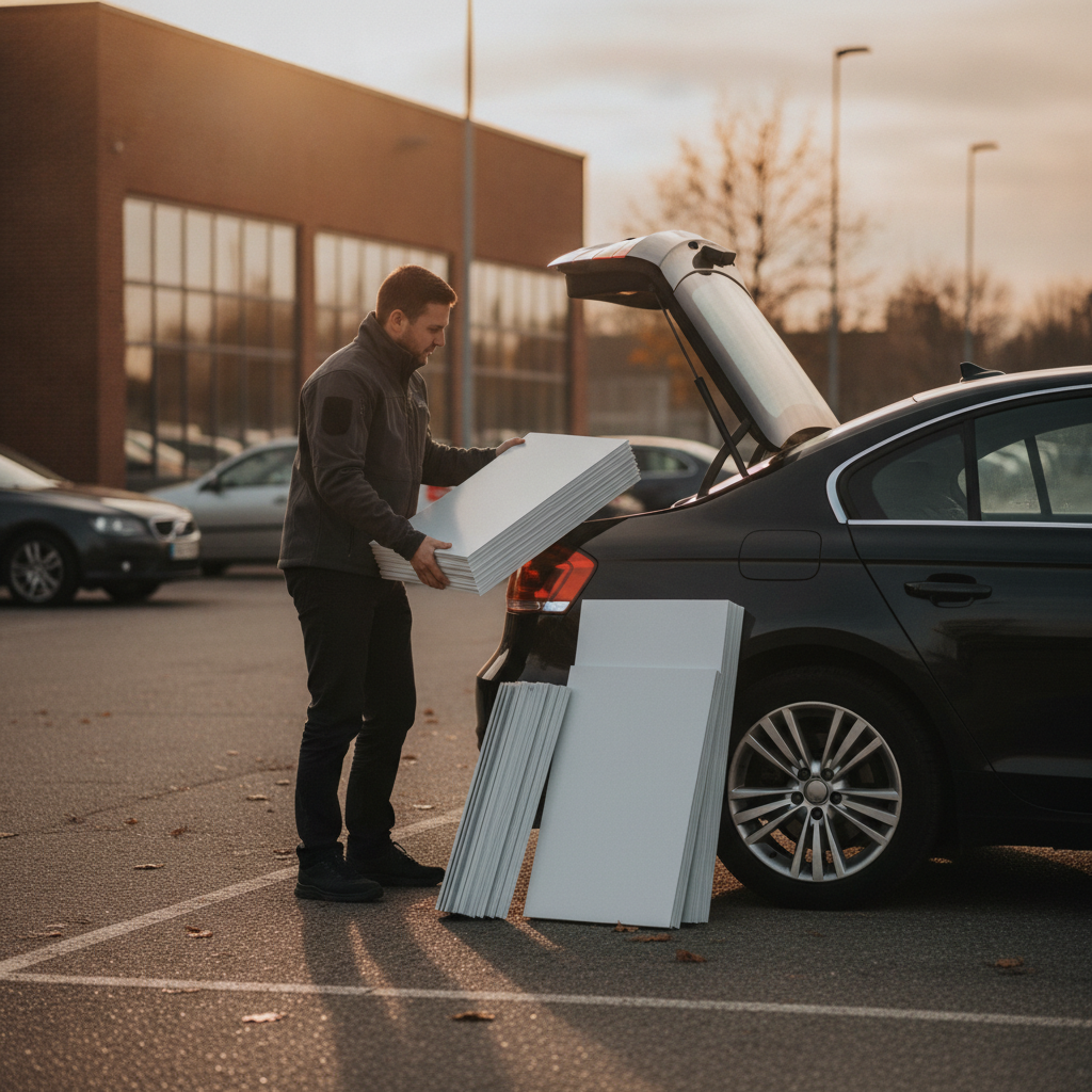
- Pickup & install: Check fasteners, add extra zip ties, and protect edges during transport.
| Stage | Key checks | Typical timing |
|---|---|---|
| Specs | Size, substrate, holes/grommets, rider slots | 15–30 minutes |
| Design | CMYK, DPI, bleed, brokerage elements | 1–4 hours |
| Proof | Text, color, finishing positions | 10–30 minutes |
| Production | Print, trim, laminate as needed | Same/next day |
| Pickup | Hardware fit check, extras | 15–20 minutes |
Tip: create a saved sign profile (sizes, materials, hole spacing) you can reuse for every order.
Types, materials, and approaches
Choose substrates and formats based on use length and weather. Corrugated plastic (4–6mm) suits short-term. Aluminum and ACM handle seasons. Standard sizes include 24×32 and 32×48 panels, 18×24 directionals, and 6×24 riders. Finish with UV laminate or reflective vinyl when visibility is critical.
Getting materials right prevents bowing, ghosting, and premature fading.
Common panels and inserts
- Primary panels: 24×32 or 32×48, single or double-sided; 0.040″ aluminum or ACM for rigidity.
- Directional arrows: 18×24 corrugated plastic with H-stakes; top/bottom flutes at 9mm pitch.
- Open House: 24×18 A-frame inserts; matte laminate reduces glare for sidewalk readability.
- Riders: 6×24 or 6×18 aluminum; pre-drilled holes match post rider clips.
Material selection tips
- Corrugated plastic (4–6mm): Light, economical, great for short runs and directional signs.
- Aluminum (0.040″–0.063″): Sleek, durable, resists rust; ideal for premium branding.
- ACM (3mm): Aluminum faces + polyethylene core; excellent dimensional stability year-round.
- Laminates: Matte for glare control; gloss for saturated color; add UV for outdoor longevity.
Riders and add-ons
- Purpose: Riders communicate timely details—SOLD, COMING SOON, 3 BED, BASEMENT APT, or URL/QR.
- Fit: Confirm rider clip type and hole spacing; keep copy to 2–4 words.
- Legibility: 2–3-inch letters on riders maintain readability from curb distance.
Want deeper context on riders? See our notes later where we reference the pillar concept of what a rider sign is typically used for in real estate marketing.
Design and compliance best practices
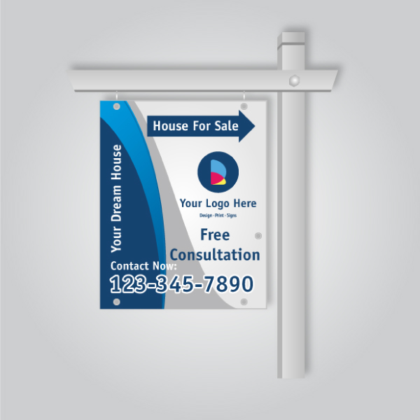
Design for distance with contrast, hierarchy, and brokerage compliance. Use 150–300 DPI art at size, bold type at 2–4-inch letter heights for core info, clean color contrast (e.g., black on white), and correct broker logo usage. Keep QR codes at least 1.25 inches wide for easy scans.
Here’s a practical way to structure every panel.
- Hierarchy: Top = brokerage; middle = headline (For Sale, Open House); bottom = agent + phone.
- Type sizes: Headline 4–5 in; phone 2–3 in; agent name 2–3 in; URL 1.25–1.5 in.
- Color: CMYK builds tuned for your brand; keep ΔE color shift minimal between reorders.
- Images: Avoid busy agent headshots on small panels; they reduce readability at 30–60 ft.
- QR codes: 1.25–1.5 in minimum; high contrast; leave 0.25 in quiet zone on all sides.
- Compliance: Follow brokerage identity guides and local sign bylaw rules for placement.
Before releasing to print, export flattened CMYK PDFs with fonts outlined and a 0.125-inch bleed. This alone eliminates the most common remake triggers.
13 common mistakes when ordering realtor signs (and fixes)
The most common mistakes ordering realtor signs include wrong sizes, low-resolution files, missing riders, mismatched hardware, poor contrast, and noncompliance. Fix them by locking standard specs, using print-ready PDFs, and checking bylaws and hardware before production to prevent delays and reprints.
- Wrong panel size: Standardize on 24×32 or your post’s exact sleeve. Action: save a specs sheet.
- Low-res artwork: Anything under 150 DPI at size risks blur. Action: export 150–300 DPI CMYK.
- Missing riders: Ordering panels without the add-on that sells the story. Action: pre-plan 2–3 riders.
- Incorrect holes/grommets: Holes off by even 0.5 in cause sag. Action: match your post template.
- Poor contrast: Fancy gradients fade at distance. Action: high-contrast pairs (black/white, navy/white).
- Too much copy: Over 7–10 words reduces curb readability. Action: edit ruthlessly.
- Wrong laminate: Gloss on sidewalk A-frames glares. Action: choose matte for pedestrian signs.
- Brand noncompliance: Off-model logos or colors. Action: use brokerage-approved assets.
- QR too small: Under 1.25 in won’t scan easily. Action: size up and test from 3–5 ft.
- Missing bleed/safe areas: Cropping issues on trim. Action: 0.125 in bleed; 0.25 in safe margins.
- Wrong substrate: Corrugated for multi-season installs warps. Action: choose aluminum or ACM.
- No preflight checklist: Skips serial number, URL typos. Action: use a 10-point check.
- Ignoring bylaws: Placement or timing violations. Action: confirm municipal rules before install.
Print the list above and keep it in your car. It pays off every busy Thursday before an open house weekend.
Tools and resources you can use
Leverage a repeatable toolkit: a saved spec sheet, brand assets, print-ready templates, an online design editor, and a preflight checklist. Pair that with local same-day pickup and reliable riders to keep listings on schedule—even when plans change mid-week.
Top Realtor Sign & Print is built for speed and consistency. Here are resources our Ontario clients use daily:
- Browse and order in the online shop to keep orders organized.
- Use our homepage shortcuts to popular realtor categories.
- Get brand-ready brochures from the brochure page for open houses.
- Choose bundled essentials in Realtor packages to simplify planning.
- Level up visuals with ideas in our graphics portfolio.
- Review message frameworks in our branding guide.
If you prefer not to design from scratch, we can prep brokerage-compliant templates for your next listings—so every reorder is literally a few clicks.
Mini case studies from Mississauga
Real agents avoid mistakes by locking specs, using same-day pickup, and standardizing riders. In each case below, a simple checklist prevented delays: confirmed hole spacing, verified CMYK files, and prepacked hardware. The result: on-time installs and consistent curb appeal across listings.
1) Weekend listing saved by standardized specs
A team preloaded a 24×32 ACM panel spec with 3mm thickness, top grommets at 16 inches center-to-center, and a matte laminate note. When a Friday listing popped up, they approved a proof and picked up the same day. Because sizes, holes, and finishes were standardized, installation took under 20 minutes.
2) Open house near the campus
An agent hosting a Saturday open house near Canadore College at Stanford Mississauga Campus needed 6 directional arrows and an A-frame insert. Using pre-approved artwork at 300 DPI and high-contrast type, they avoided reprints. Riders were staged in a tote, so “OPEN TODAY” swapped in as traffic built.
3) Directional placements by transit
For a townhouse cluster near Tomken Station East Platform A, an agent planned five 18×24 directionals with H-stakes and reflective arrows. They placed signs at 50–100 feet before each turn. A quick bylaw review and sunset pickup plan prevented removals and ensured clean streets post-event.
Pricing and turnaround factors (no pricing)
Total project time depends on artwork readiness, material choice, and finishing. Preflighted CMYK PDFs with set specs move fastest. Aluminum and ACM may add finishing time for drilling and laminate. Same-day pickup is often possible when proofs are approved early in the day.
Here’s how to keep momentum without talking dollars.
- Artwork readiness: Print-ready files (150–300 DPI, outlined fonts) shave hours off the queue.
- Material complexity: ACM with laminate and drilling takes longer than simple corrugated.
- Quantity and variety: Matching sets (panel + riders + arrows) minimize future trips.
- Proof speed: Fast proof approval can keep you in the same-day window.
- Pickup planning: Combine errands and bring extra zip ties, stakes, and gloves.
We emphasize value over price sheets: reliable specs and timely proofs consistently beat last-minute reprints.
Quick comparison of materials
Use corrugated plastic for short-term and aluminum/ACM for long-term installs. Choose matte laminate to cut glare on pedestrian signs and gloss for vivid panels at distance. Confirm hole spacing and rider clip types in advance to ensure a secure, level install on day one.
| Material | Typical thickness | Best for | Notes |
|---|---|---|---|
| Corrugated plastic | 4–6mm | Directional, short-term | Use H-stakes; align flutes to stake direction |
| Aluminum | 0.040″–0.063″ | Premium panels | Rigid, clean edge; add UV laminate |
| ACM (Alu-Composite) | 3mm | All-season installs | Stable in heat/cold; excellent print surface |
If you’re unsure, bring your post or clip to our counter; we’ll measure spacing in minutes.
How this applies to your marketing kit
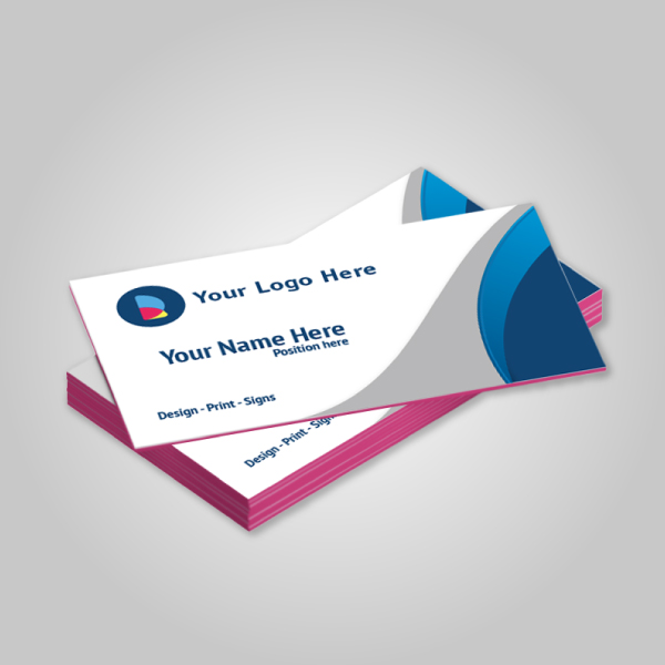
Your sign plan should connect to cards, flyers, and brochures. Keep colors and typography consistent across business cards, listing flyers, and yard signs. Use the same QR destination on riders and print collateral to streamline tracking and ensure every touchpoint reinforces your brand.
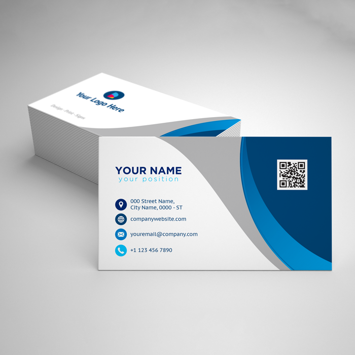
- Business cards: Consider soft touch, raised spot UV, or foil for premium handoffs.
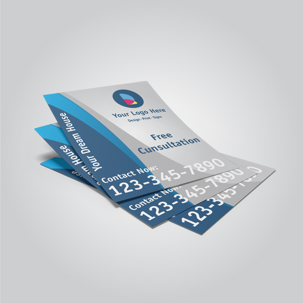
- Flyers and brochures: Match CMYK builds to your sign palette; tri-folds for features.
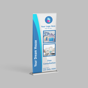
- Roll-up banners: Portable branding for broker opens and community events.
- Door hangers: Pair with open houses for targeted neighborhood outreach.
Keeping a single “brand file” with fonts, colors (CMYK, Pantone), and logos ensures every reprint looks the same—curb to kitchen table.
Local setup and operations
Ordering is faster when you plan around local pickup, traffic, and bylaws. Stage hardware in your trunk, review placement rules, and time pickups before rush periods. This local-first approach reduces install friction and keeps your weekend events running smoothly.
Local considerations for 5004 Timberlea Blvd Unit#18
- Plan open house pickups before afternoon traffic near the Parkway Belt area; it streamlines installs between listings.
- In spring and fall, wind gusts increase; favor aluminum/ACM panels and carry extra H-stakes for backup.
- If your listing is near Canadore College at Stanford Mississauga Campus, prepack extra directionals to guide transient weekend traffic.
We keep common hardware at the counter so last-minute changes don’t derail your schedule.
Frequently asked questions
These short answers resolve the most common hurdles: artwork specs, riders, hardware fit, and timing. Each response is designed for quick action so you can approve proofs faster and hit your open house windows without errors or reprints.
What file settings should I use for a yard sign?
Export a CMYK PDF at 150–300 DPI at final size with fonts outlined, 0.125-inch bleed, and at least 0.25-inch safe margins. Include grommet or hole positions on the proof so hardware lines up during installation.
How do I avoid common mistakes ordering realtor signs?
Lock your standard specs, prep print-ready art, confirm rider needs, and match holes to your post before production. Approve proofs quickly and schedule pickup with extra fasteners. A 10-point preflight prevents most reprints and delays.
Which materials last through Ontario weather?
For multi-season installs, choose aluminum or 3mm aluminum composite (ACM) with UV laminate. Use corrugated plastic (4–6mm) for short-term directionals and event signage where light weight and quick setup matter most.
What should a rider sign say?
Keep riders to 2–4 words that add timely context—SOLD, COMING SOON, OPEN HOUSE, or a URL/QR. Confirm hole spacing and clip type to ensure a clean, level fit above or below your main panel.
Conclusion and next steps
Standardize your specs, prep print-ready files, and confirm riders and hardware before you hit print. With a simple checklist, you’ll avoid reprints, stay compliant, and keep every Mississauga listing on schedule—even on tight, same-day timelines.
Key takeaways
- Lock a reusable spec: size, material, holes, riders, laminate.
- Design for distance: bold hierarchy, high contrast, readable type.
- Preflight every order: DPI, CMYK, bleed, contact details, QR.
- Plan locally: pickup timing, bylaws, hardware staging.
Action steps
- Save a one-page spec and attach it to every order.
- Store a preflight checklist in your car for Thursday prep.
- Stage spare riders, zip ties, and stakes in a trunk tote.
Need a fast, brokerage-compliant order near Timberlea Blvd? We’re ready to help—drop your files in our online shop and request local pickup today.