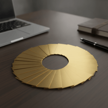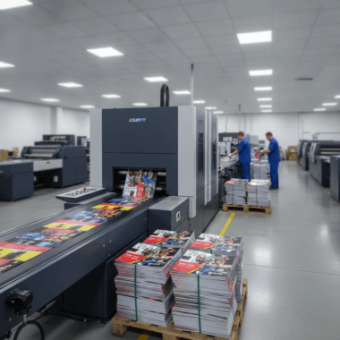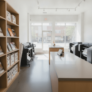
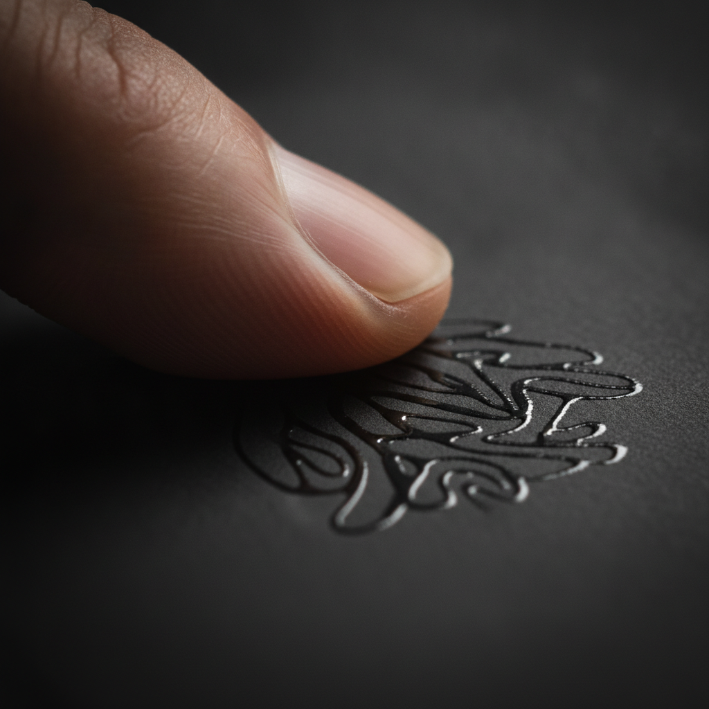
Raised spot UV cards for agents are premium business cards with a glossy, tactile coating applied to selected design elements. They add shine and texture that catch light and fingertips, elevating first impressions at listings and open houses. At 5004 Timberlea Blvd Unit#18 in Mississauga, Top Realtor Sign & Print helps agents deploy these finishes fast.
By Ashwani • Last updated: 2026-06-17
Quick Summary
Raised spot UV adds a glossy, raised varnish to targeted areas of a card, creating contrast against a matte base. For busy real estate agents, it highlights logos, names, and calls to action while staying brand-compliant. Use bold vector art, soft-touch laminates, and ample negative space for the cleanest, most tactile results.
- What it is: a selective, elevated gloss over a matte or satin card surface
- Why it matters: instant tactile and visual contrast that signals quality
- Who it’s for: agents who network often and need memorable cards
- What you’ll get here: design rules, production tips, scheduling guidance, and five pro tips
- Tools included: preflight checklist, finish comparison, and local pickup pointers
What Are Raised Spot UV Cards for Agents?
Raised spot UV cards for agents are business cards where a glossy, raised coating is placed only on chosen elements—like a logo or name—over a matte base. The result is crisp contrast, light-catching highlights, and a tangible “lift” that helps real estate professionals stand out at showings and open houses.
Think of raised spot UV as precision gloss. Instead of coating the entire card, we elevate specific elements so they pop. On a soft-touch base, the glossy varnish feels even more pronounced under your thumb—ideal when you want that subtle wow moment during a handshake.
- Selective emphasis: Apply to logos, agent names, brokerage marks, icons, or QR frames.
- Tactile signal: Raised gloss creates a micro-ridge you can feel without reading the card.
- Brand-friendly: Works with brokerage palettes and clear-space rules when set up correctly.
- Durable finish: Layering over laminated stocks helps resist scuffs in card holders.
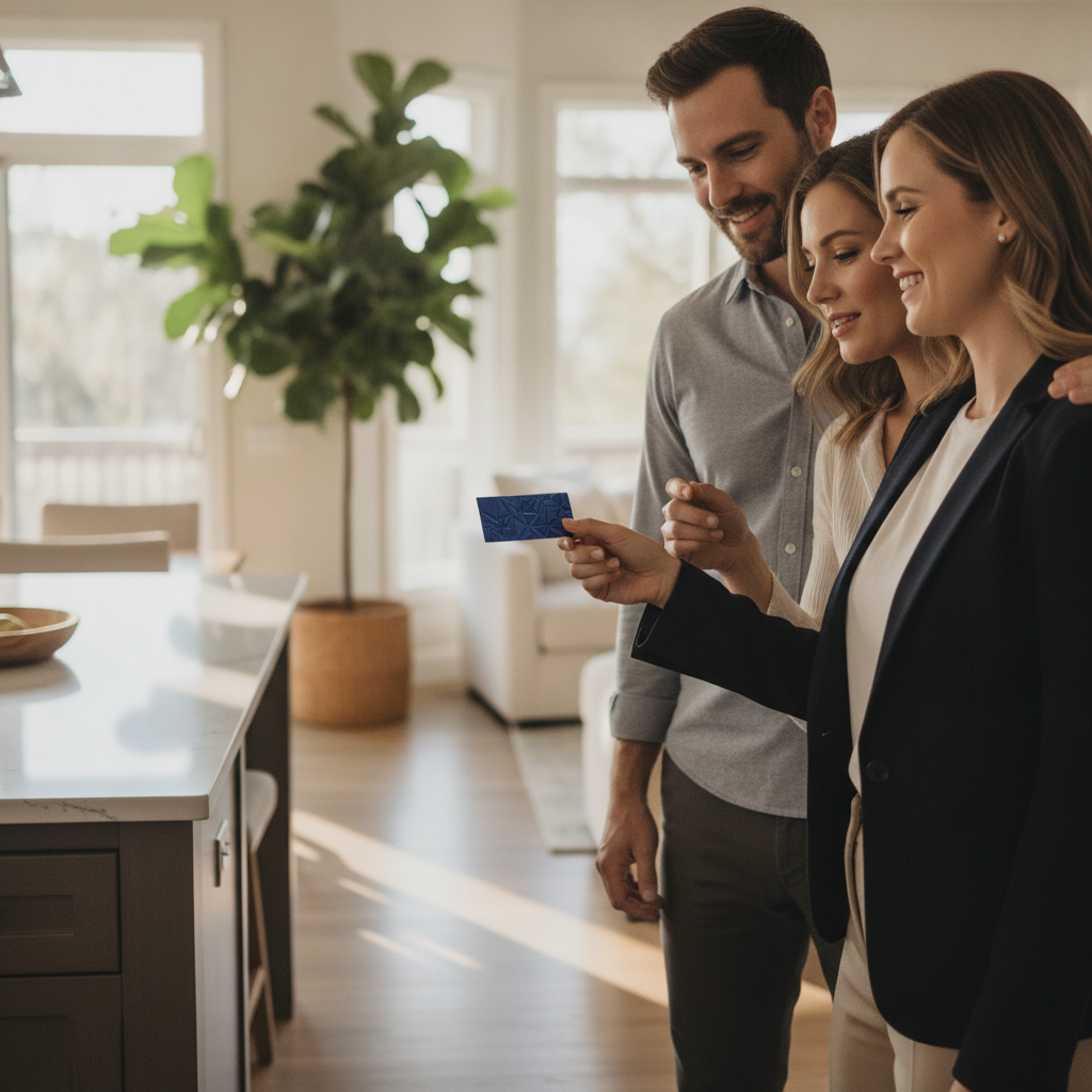
We serve Realtors across Ontario who rely on consistency across cards, For Sale signs, and brochures. The same attention to contrast that makes a yard sign legible at 30 feet applies to a card meant to convert a quick chat into a showing.
Explore our current options under the spot UV card selection and see how finishes align with your brand standards. For the base stock, many agents start with our soft-touch laminated business cards to maximize tactile contrast.
Why It Matters for Agents
Raised spot UV helps agents win recall in seconds. The shine draws the eye to your name and brokerage, while the texture cues quality. Cards that are easier to scan, feel premium, and survive pockets and keychains support more call-backs and smoother follow-ups after busy open houses.
Here’s the thing: you often have under 10 seconds between “Nice to meet you” and “I’ll follow up.” A tactile accent gives you an edge without adding clutter. It also pairs perfectly with soft-touch laminates that reduce glare, letting your essential details carry the spotlight.
- Fast recognition: Gloss on your name or title helps recipients find you again during a 2–3 second scan.
- Photo-friendly: UV over a headshot frame adds a clean rim that resists smudges.
- QR clarity: A glossy outline around a QR code guides phone cameras for faster locks.
- Pocket survival: Laminated stocks and UV accents shrug off friction better than uncoated cards.
We’ve found that agents who simplify hierarchy (name > mobile > QR) and reserve raised UV for one focal element see fewer reprints and tighter turnaround during peak listing season.
How Raised Spot UV Printing Works
Raised spot UV is a two-stage process: print the base design, then register a clear, high-build varnish onto selected vector shapes. Cured under UV light, the varnish forms a raised, glossy layer. Soft-touch lamination under the gloss amplifies tactile contrast and protects the base ink from abrasion.
In production, the secret is registration: ensuring the gloss layer sits exactly where the art dictates. Clean vector paths and minimum line weights prevent soft or jagged edges. Most shops set a safe minimum gap—often 0.5–1 mm—between UV and fine text to avoid flooding delicate type.
- Art prep: Provide a dedicated spot-color layer labeled “UV.” Vector shapes only.
- Thickness control: Coverage limits prevent pooling on large fills; consider patterning big areas.
- Dry/cure: UV curing locks the varnish in place, producing the raised feel you notice on contact.
- Combine finishes: Many agents pair soft touch + raised UV; some add foil or painted edges.
When should you use a heavy vs. lighter build? Heavier builds add drama on large logos; lighter builds suit fine lines or micro icons. A quick test print prevents over-glossing that can reduce legibility on small details.
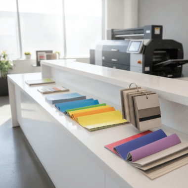
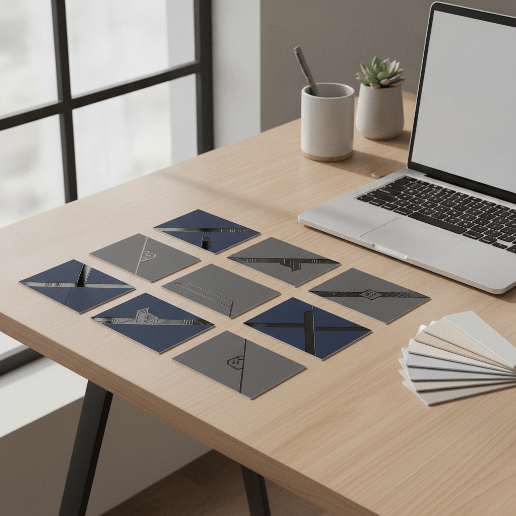
Types, Combos, and Comparisons
The best raised spot UV results come from thoughtful combos. Soft-touch + raised UV is the real estate classic; foil + UV adds shine-on-shine drama; painted edges finish the premium story. Compare by readability, durability, and brand fit—not just aesthetics.
| Finish | Look/Feel | Best for | Durability | Notes |
|---|---|---|---|---|
| Raised Spot UV | Targeted glossy lift over matte | Logos, names, accents | High with lamination | Use vector; mind minimum line weight |
| Flat Spot UV | Glossy but not raised | Large fills, patterns | High | Lower tactile impact than raised |
| Soft Touch Laminate | Velvety, low-glare base | Background surface | High | Boosts UV contrast and feel |
| Foil (Gold/Silver) | Metallic shine, flat | Luxury logos, trim | High | Pairs well with UV outlines |
| Painted Edges | Color pop on edges | Brand accents | High | Completes the premium feel |
Consider your use case. If you hand out dozens of cards at weekend open houses, prioritize legibility and smudge resistance. If your deals start with referral coffee chats, you can push bolder drama—foil rims, thicker stocks, and deeper UV builds.
For more base options and laminates, browse our lamination-ready card stocks. If you’re designing from scratch, the business cards category is the fastest way to align finish, quantity, and pickup.
Top 5 Raised Spot UV Card Tips for Busy Agents
Use vector-only UV layers, keep a 0.5–1 mm buffer from small text, anchor UV to one hero element, pair with soft touch, and proof on the actual stock. These five moves protect readability, speed production, and maximize that premium “lift” clients notice in the first second.
- Design the UV as shapes, not effects. Build a separate “UV” spot-color layer with vectors only. Avoid raster textures. This keeps edges crisp and helps your printer align layers perfectly.
- Give micro type breathing room. Keep a small gap between UV areas and 8–9 pt text. If you gloss right up to tiny letters, pooling can blur counters and reduce legibility.
- Pick one focal point. Use raised UV to highlight a single element—usually your name or logo. Scattered accents dilute impact and slow registration.
- Pair with soft touch. A velvety base magnifies tactile contrast and reduces glare everywhere else, so the UV can shine—literally and figuratively.
- Proof on the real stock. Ask for a production proof on the same laminate and thickness you’ll use. What looks perfect on uncoated test stock can behave differently on a laminated sheet.
Stick to these five and you’ll avoid most reprint headaches, especially during spring and fall listing peaks.
Design and Content Best Practices
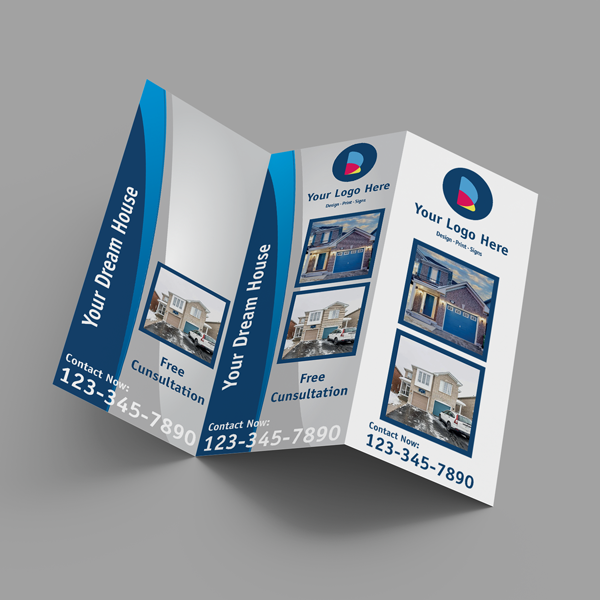
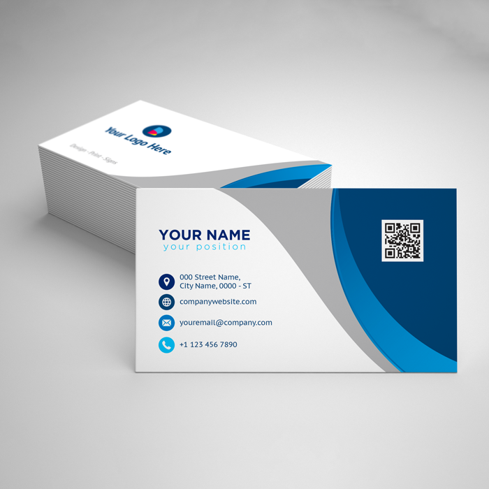
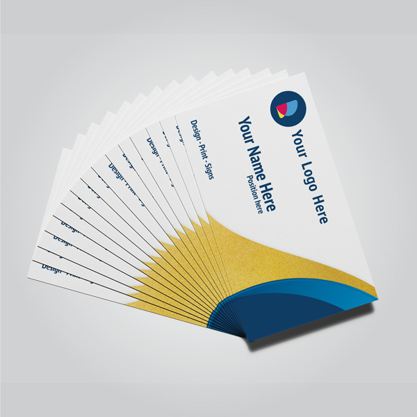
Prioritize scannability: clear hierarchy, strong contrast, and one unmistakable call to action. Use the standard 3.5 × 2 inch card size, bold type for your name, and a QR that lands on a listing or contact hub. Let raised spot UV emphasize, not replace, legibility.
Make hierarchy obvious
- Order of information: Name > title > brokerage > mobile > URL/QR. Don’t bury your best contact.
- Typeface choices: Use readable weights at real sizes; test at 10–12 pt on paper.
- Whitespace: 0.125–0.25 in safe margins keep edges clean after trimming.
Color, contrast, and psychology
Dark neutrals under UV amplify sheen; bright brand colors pop on edges or backs. For palette decisions, see this practical color psychology guide to align mood and message without guessing.
QR code strategy that converts
- Destination matters: Drive to a lead form or “Book a tour” page, not a generic homepage.
- Framing: Use a UV frame or corner ticks so cameras lock quickly.
- Tracking: UTM tags help you see which events or neighborhoods drive scans.
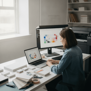
If you’re starting from a blank canvas, our business card design resources and online editor help you build a tidy, brand-compliant layout without specialized software.
Tools, File Setup, and Preflight
Use industry-standard design apps, export press-ready PDFs with outlined fonts, and include a labeled “UV” spot-color layer. Check bleed (0.125 in), safe margins (0.125–0.25 in), and minimum line weights. Send vector logos and embed any images at 300 dpi or higher.
- File structure: Front, Back, and a separate UV layer file or page; keep names clear.
- Color management: CMYK for print; avoid last-minute RGB conversions that shift brand colors.
- Bleed/safety: Include 0.125 in bleed; keep critical type at least 0.125–0.25 in from trim.
- Proofing: Request a PDF soft proof; for complex UV shapes, ask for a physical proof when timelines allow.
- Accessibility: Contrast ratios matter on small type; choose readable weights at real-life sizes.
Working fast? A tidy file with a distinct UV layer is the number-one way to keep production on schedule during listing crunches.
Local Pickup, Turnaround, and Logistics
For agents near 5004 Timberlea Blvd Unit#18 in the Regional Municipality of Peel, local pickup streamlines tight timelines. Coordinate artwork handoff, proof approvals, and pickup windows early. Same-day options exist for select items; premium finishes require a planned schedule to protect quality.
We see two timing realities for agents: last-minute events and planned campaigns. Standard cards can be fast-tracked; raised finishes benefit from predictable checkpoints. A short call to lock art, lamination, and UV coverage prevents bottlenecks later.
Local considerations for 5004 Timberlea Blvd Unit#18
- Leverage midweek pickups to avoid weekend rush near Stanford International College when open houses spike.
- Winter weather in Mississauga can slow travel; build an extra day into timelines around storms.
- If you’re arriving by transit, plan buffers around Tomken Station East Platform A to align with proof approval windows.
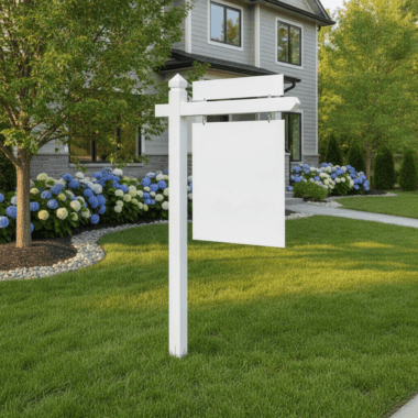
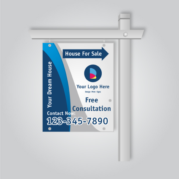
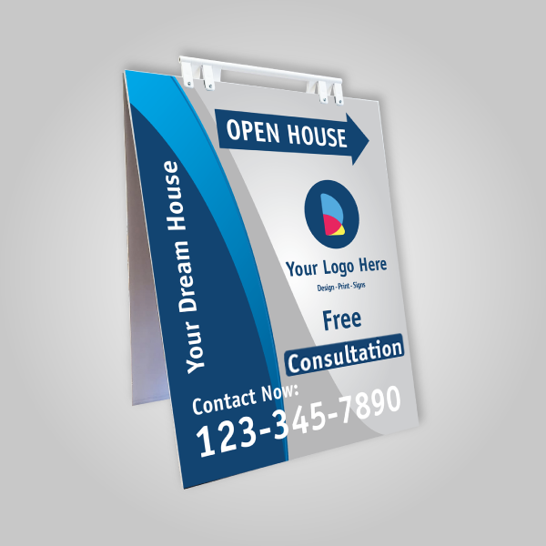
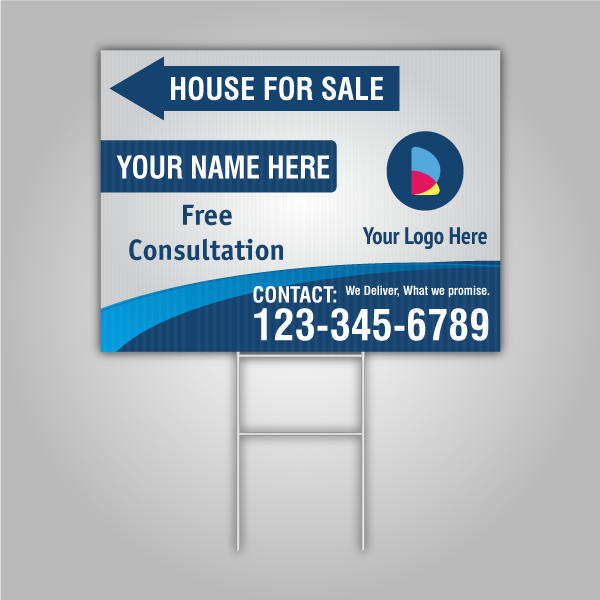
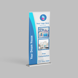
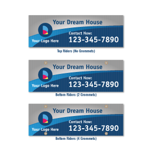
Need matching collateral for an open house kit? Consider adding 14pt postcards for neighborhood drops and pointer signage that complements your cards. Many agents also ask “what is a rider sign used for?”—think time-sensitive messages like “Open House Sun 2–4” that mirror your brand cues from the card.
Case Studies and Real-World Examples
Agents who pair soft touch with raised UV on one focal element report faster recognition and better post-event response. Clean hierarchies, QR frames, and durable laminates help cards survive repeated handling without smudging, keeping your brand sharp through the full sales cycle.
Open-house specialist: A Mississauga agent running three weekend showings simplified her layout and moved the UV to her first name only. Fewer accents sped up production and made her name pop in hallway lighting. Her 3.5 × 2 inch cards matched the typography on her directional signs for continuity.
Team rebrand: A GTA team added a UV rim to their shield logo and painted edges in brand yellow. The set photographed better for social posts and stayed crisp in pocket pulls. Strong contrast at 10–12 pt body text levels improved readability in low-light foyers.
Referral pro: A broker who meets clients over coffee kept the front minimal and placed UV on a monogram. The tactile mark became a conversation starter while the QR led to a pre-filled contact form. He kept a 0.125 in safe margin and used a 300 dpi headshot to prevent pixelation.
Want photography that complements premium finishes? Investing in clean headshots and brand images helps. See examples of realtor branding photography that pair well with soft-touch cards and raised accents.
Scheduling and Value Considerations
Premium finishes add steps—lamination, registration, and UV curing—so align your calendar accordingly. Batch orders ahead of listing season, keep editable templates on hand, and use proof checkpoints to lock details early. The long-term value is memorability, durability, and stronger follow-up rates.
- Batch wisely: Refresh runs for spring and fall campaigns rather than one-offs under pressure.
- Template library: Maintain master files for solo agents and team members to update quickly.
- Quality checks: Inspect a few cards from each box on pickup day to confirm consistency.
- Complementary collateral: Extend your finish to sign riders, brochures, and listing folders for a cohesive brand.
Trust signals matter in real estate marketing. Clear, consistent messaging across your card, yard signs, and web profiles supports client confidence; see why transparent messaging builds trust across channels.
Key Takeaways
Keep UV purposeful, readable, and production-ready: one focal element, vector-only layers, soft-touch pairing, and real-stock proofs. Plan ahead for premium steps and extend the finish across your print suite for brand consistency clients can feel and remember.
- Raised spot UV works best as a spotlight, not wallpaper.
- Soft touch under UV heightens both feel and legibility.
- Protect small text by giving UV some breathing room.
- Proof on the actual stock before you commit to a full run.
- Carry the premium story into folders, brochures, and sign riders.
Conclusion
Raised spot UV cards give agents a fast, tactile way to stand out. With disciplined design, clean files, and a realistic schedule, they deliver memorable handoffs that support stronger follow-up. Local pickup in Mississauga keeps timelines tight while protecting the premium quality that wins recall.
If you’re ready to elevate your cards, bring your vector logo and a draft layout. We’ll help finalize the UV layer, choose a soft-touch base, and create a proof you can trust—so your next open house puts your name in the spotlight. Start with our curated business cards collection and soft-touch laminated options.
Free file check: Send your press-ready PDF with a labeled UV layer—we’ll preflight it and confirm trim, bleed, and registration before you print. Prefer we design? Our team can adapt your brokerage template and set up the UV layer properly.
Frequently Asked Questions
Agents ask most about file setup, durability, design rules, and combining finishes. The answers below explain how to prep art, protect legibility, and decide when to add foil, painted edges, or soft-touch laminates alongside raised spot UV effects.
Can I put raised spot UV over small text?
Avoid coating very small type directly. Keep a small buffer so the gloss doesn’t pool into counters. Use UV on bolder elements—like your name or logo—and let small details stay matte for clarity.
What stock and size work best?
Standard U.S. cards are 3.5 × 2 inches. A laminated, velvety base (soft touch) enhances the tactile contrast of raised UV and improves durability in pockets, holders, and keychain environments.
Can I combine foil and raised UV?
Yes. Many agents combine a metallic foil logo with a raised UV outline or highlight. Keep the focal point clear and confirm minimum line weights for both processes to avoid registration conflicts.
How do I prep the UV layer?
Create a separate vector layer or page labeled “UV” using a spot color. Outline fonts, avoid raster textures, and export a press-ready PDF with bleed. This helps your printer align and cure the raised varnish precisely.