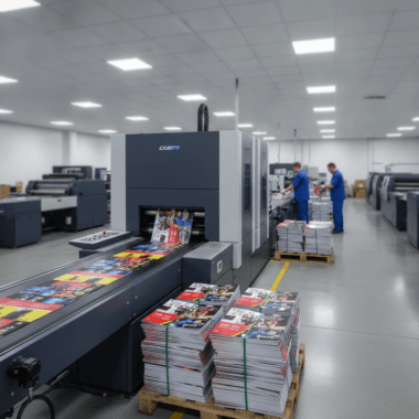


Common mistakes with directional signs include tiny type, low contrast, unclear arrows, and poor placement. At 5004 Timberlea Blvd Unit#18 in Mississauga, Top Realtor Sign & Print helps real estate teams correct these issues with bold, high-visibility wayfinding kits so open house guests arrive confidently without missed turns or extra phone calls.
By Ashwani — Top Realtor Sign & Print
Last updated: 2026-06-15
Summary
This complete guide explains directional signage for real estate and events, the most common mistakes, and the fixes that work. You’ll learn clear sizing rules, contrast and arrow standards, placement strategies, and a repeatable route-audit checklist—plus local tips for Mississauga and the Regional Municipality of Peel that keep traffic flowing.
- What directional signs are and why they matter for open houses and events
- 15 common mistakes with directional signs—and proven remedies
- Step-by-step workflow from mapping to teardown
- Sizing, contrast, and placement rules of thumb
- Mississauga-specific guidance near 5004 Timberlea Blvd Unit#18
- Tools, templates, and case examples you can apply today
What are directional signs?
Directional signs are wayfinding tools that guide people from point A to point B using large arrows, simple symbols, and minimal text. In real estate, they link busy streets and sidewalks to listings and open houses, reducing confusion, missed turns, and late arrivals while reinforcing consistent brand identity.
Directional signage focuses on one job: move people without hesitation. The fastest reads come from big arrows, high contrast, and two to four words that can be understood at a glance while driving.
- Primary components: bold arrow, short message, brand color panel, and high-contrast background.
- Common formats: A-frames, H-stake lawn signs, feather flags, window arrows, curbside boards, and riders.
- Real estate use: Open house routes, model home tours, new development events, and broker opens.
For fast ordering and consistent branding, explore our curated real estate signs collection and dedicated directional sign options.
Why directional signage matters
Clear directional signage increases open house traffic, lowers “Where are you?” calls, and strengthens brand recall. Strong wayfinding removes friction at every turn, delivering more visitors, better experiences, and higher-quality conversations for agents and event teams across neighborhoods and subdivisions.
Missed turns and unclear arrows create churn: slowdowns, U-turns, and frustration. That friction reduces attendance and shortens dwell time. Conversely, a crisp system of arrows and repeaters boosts participation and confidence. We’ve seen open houses add two to three extra qualified conversations per hour after cleaning up placement and contrast.
- Attendance impact: More visitors when every decision point is marked clearly.
- Operations: Fewer hotline calls and texts asking for directions during peak windows.
- Brand equity: Consistent colors and typography across a route build recognition.
Our teams in Mississauga assemble durable kits—A-frames, lawn arrows, riders, and inserts—so agents can deploy a full route in minutes and repeat it reliably every weekend.
Mississauga-specific wayfinding tips
Plan routes around neighborhood sightlines near 5004 Timberlea Blvd Unit#18 and account for winter banks and weekend congestion in the Regional Municipality of Peel. Use reflective vinyl for dusk, add repeaters after every turn, and stage backups for windy days so visibility stays high in all conditions.
Local traffic patterns and seasonal weather affect where your signs land and how well they perform. Think drivers first: position at natural braking points, not right at the corner; repeat the message one car-length after the turn; and avoid shrubbery, snow piles, and construction detours that block arrows.
- Keep A-frames just off the curb to reduce splash and snow cover.
- Use sandbags or internal ballasts on windy corridors.
- Place a follow-up arrow 30–60 feet after each intersection.
Local considerations for 5004 Timberlea Blvd Unit#18
- Time your route around arrivals from Tomken Station East Platform A to capture foot traffic safely on event days.
- Winter setups: plan extra height and reflective film to overcome plow banks and early sunsets.
- Campus crowds near Stanford International College change pedestrian flows—use larger arrows and repeaters.
For product formats that suit local streets, check our open house signs and fast-deploy marketing sign options.
15 common mistakes with directional signs (and quick fixes)
The most common mistakes with directional signs are illegible type, low contrast, vague arrows, cluttered messages, and poor placement height or angle. Fix them with bigger letters, bold high-contrast palettes, unmistakable arrows, two-to-four-word messages, and repeaters at every decision point along the route.
Directional errors waste attention. You often get one passing glance at 20–30 mph. Anything unreadable in that slice of time fails. Below are the most frequent issues we correct for real estate teams—and the fast remedies.
- Tiny letter height: Drivers can’t read 1-inch letters from far away. Aim for 1 inch of letter height per 10 feet of viewing distance.
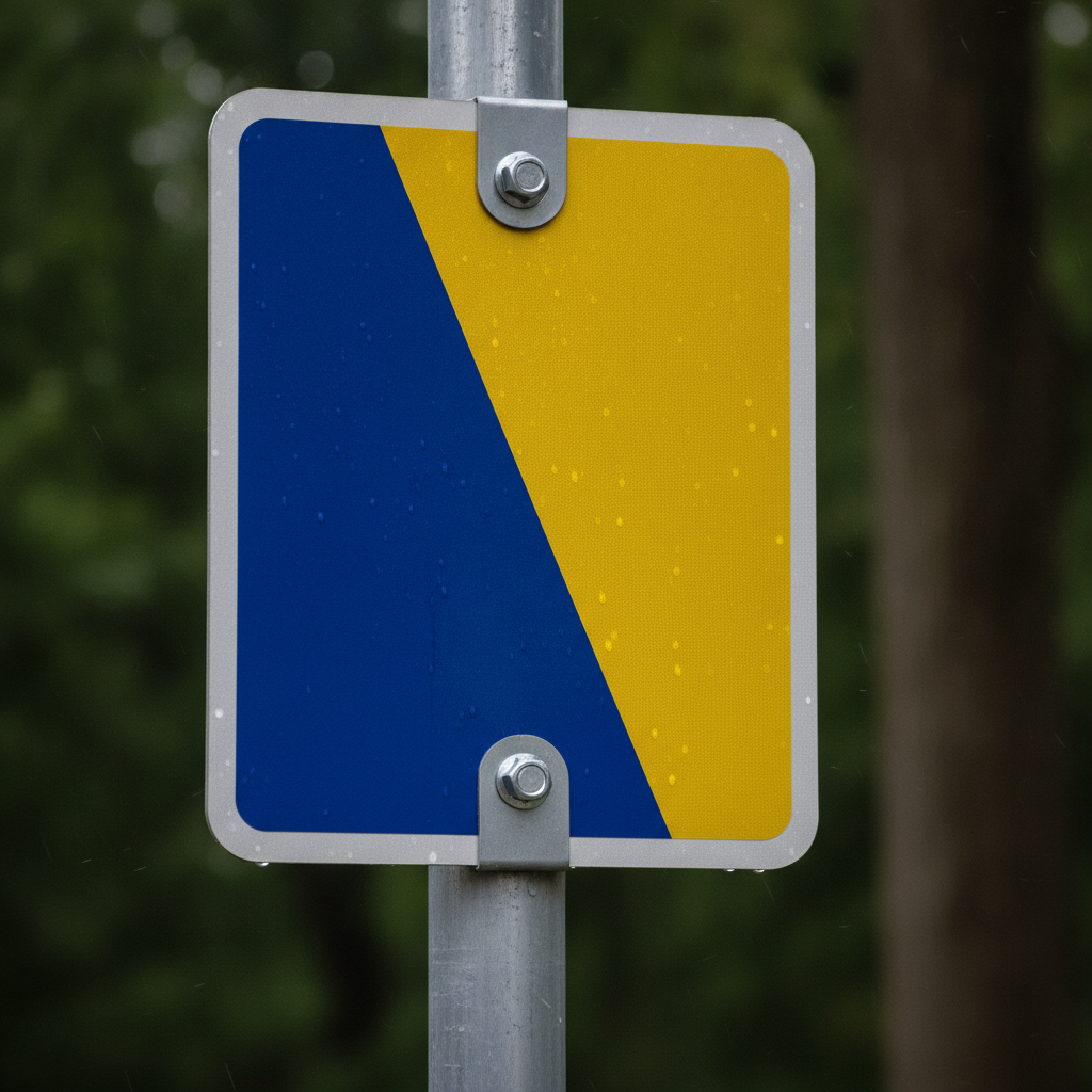
- Low color contrast: Pastel-on-pastel blends into the environment. Choose bold light-on-dark or dark-on-light combinations.
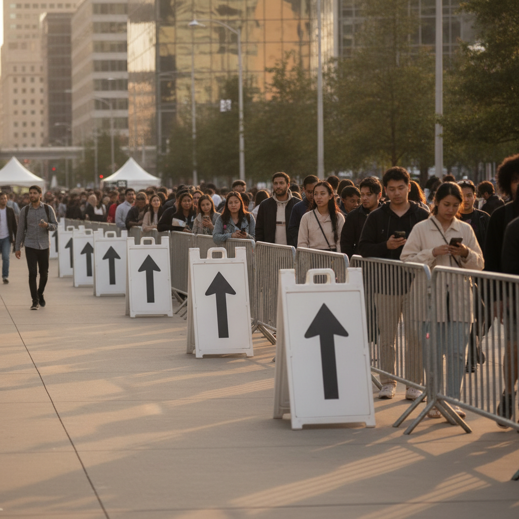
- Vague or conflicting arrows: Stylized icons that don’t scream left or right cause indecision. Use solid, heavy arrows.
- Too much text: More than 3–4 words becomes a paragraph at speed. Keep it tight.
- Inconsistent branding: Random colors and typefaces reduce trust. Standardize a kit.
- Missing repeaters: One sign before a turn isn’t enough. Confirm the path right after the corner.
- Bad placement angle: Flat to traffic equals low legibility. Toe signs 5–15° toward oncoming drivers.
- Ignoring lighting: Dusk and shade require reflective vinyl or flood the arrow size.
- Wrong materials: Coroplast sags in heat; bare steel rusts. Match substrate to campaign length.
- No drive test: If you can’t read it from the driver’s seat, guests can’t either.
- Ambiguous endpoints: “This way” without a final confirmation creates loops. End with a door-level arrow.
- QR codes in motion: They’re for static viewing; don’t expect scans from cars.
- No context riders: “Sat 2–4 PM” riders close the loop on timing.
- Ignoring bylaws/HOAs: Take-down times and setbacks matter—avoid removals and fines.
- No route data: Skipping photos and notes means you start from zero next time.
Mistake 1: Illegible typography
Illegible type is the top failure. Fancy fonts collapse at distance and speed. We recommend geometric sans or slab faces with open counters and heavy weights. Use upper-and-lowercase for natural word shapes, and reserve ALL CAPS for one or two short words max.
- Rule of thumb: About 1 inch of letter height per 10 feet of viewing distance.
- Spacing: Loosen tracking slightly for speed reading.
- Hierarchy: Arrow first, then the two-to-four-word message, then brand panel.
Need a fast template that stays legible? Start with our pre-built directional sign layouts and keep your brand consistent across deployments.
Mistake 2: Low contrast color choices
Low-contrast palettes vanish in glare, shade, and rain. Use high-contrast pairs (black/yellow, black/white, navy/white). Test against real backgrounds like grass, asphalt, brick, and snow. Contrast beats cleverness when drivers have half a second to decide.
- Pick a base: Dark background with light message or the reverse.
- Avoid: Red-on-black, light gray on white, or thin outlines as the only separator.
- For dusk: Reflective vinyl or a larger arrow to compensate.
Safety-forward signage thinking from other contexts reinforces this point; see broader visibility principles discussed in this fire signage guide on legibility and placement.
Mistake 3: Unclear or conflicting arrows
Decorative arrows hurt performance. Use a filled, heavy arrow with a wide stem and clear point. Don’t rotate artwork at the curb—design left/right variants so your arrow always points exactly where people should go.
- Consistency: The arrow style should stay the same for the whole route.
- Endpoint: Add a final, door-level arrow so there’s zero doubt at arrival.
- Testing: Stand at the sign line and ask, “Would a first-timer turn here?”
Mistake 4: Poor placement height and angle
Placement makes or breaks legibility. Toe signs slightly toward traffic and set them where drivers naturally brake or queue. Raise lawn signs above tall grass; keep A-frames away from puddles and plow berms. Space repeaters 30–60 feet after turns to confirm the move.
- Angle: 5–15° toward oncoming drivers improves readability.
- Height: Bottom edge above curb and landscaping for a clean sightline.
- Spacing: Repeat after each decision point—especially at multi-exit intersections.
Mistake 5: Cluttered messages
More than four words is too much at speed. Treat every extra word as friction. Build a house style of short, repeatable phrases, then attach riders for timing or unit details. Your job is to reduce thinking, not decorate panels.
- Do: “Open House →” or “Model Suite →”.
- Don’t: Add taglines, long URLs, or phone numbers on the route.
- Use riders: “Sat 2–4 PM,” “Unit 1810,” or “Use East Entrance.”
Mistake 6: Wrong materials for the conditions
Materials control lifespan and visibility. Short weekend? Coroplast is light and economical. Month-long campaign? Upgrade to PVC or aluminum and consider reflective films. Ballast is a must for A-frames on windy boulevards. Document what holds up on your typical route.
- Weather: Rain and freeze-thaw cycles weaken tape and soft stakes.
- Hardware: Use rust-resistant fasteners and quality H-stakes.
- Durability: Keep a “B kit” for backups during storms.
How to plan and place directional signs (step-by-step)
Plan routes by mapping every decision point, then design bold, high-contrast arrows with 2–4 words. Place signs before and after each turn, toe them toward traffic, and drive-test at 20–30 mph. Photograph the route so your team can replicate it quickly for future open houses.
This workflow turns chaos into a repeatable system. It captures local nuances—sightlines, weekend traffic, and seasonal weather—while giving new assistants a checklist that prevents misses.
- Map the approach: Mark every left/right turn from two main arterials.
- Choose formats: Mix A-frames for corners and H-stakes mid-block.
- Write the message: Two to four words plus a clear arrow.
- Select contrast: Black-on-yellow or white-on-navy for speed reading.
- Prep hardware: Sandbags, zip ties, spare H-stakes, and a mallet.
- Place at eye-line: Angle 5–15° toward oncoming drivers.
- Repeat after turns: Confirm the move 30–60 feet past each corner.
- Drive-test: Read from a car at 20–30 mph; adjust what fails.
- Document: Photograph each sign and note landmarks for next time.
- Teardown plan: Schedule pickups and verify all signs are accounted for.
Want a deeper walkthrough for event days? Our practical guide to display flow pairs perfectly with this process—see the companion article on open house setup.
Sizing, contrast, and distance rules of thumb
Use big type and bolder arrows than you think. A practical rule is roughly 1 inch of letter height per 10 feet of viewing distance, with high-contrast color pairs. At dusk or in rain, rely on reflective film and larger arrows to maintain quick, confident reads.
These guidelines aren’t abstract—they match how people process information at speed. Keep the math simple, then standardize your kit so assistants can set up with confidence.
| Viewing Distance | Recommended Letter Height | Arrow Panel Width | Best Contrast Pair |
|---|---|---|---|
| 50 ft | 5 in | 18–24 in | Black on yellow |
| 75 ft | 7–8 in | 24–30 in | White on navy |
| 100 ft | 10 in | 30–36 in | Black on white |
Context matters. On routes with slopes or grade changes, clearance and angles shift—insights from site planning disciplines echo this need to correct for terrain; see broader discussion of slope considerations in this slope correction overview.
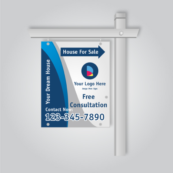
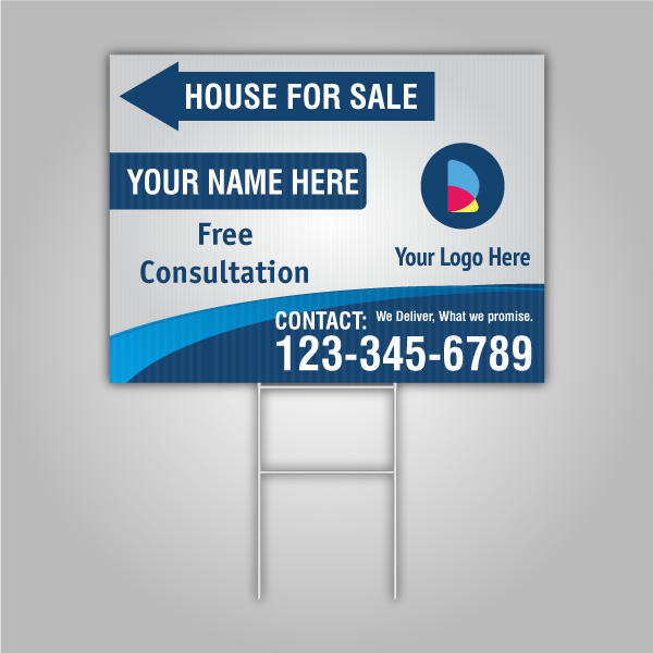
Types of directional signs for Realtors
Use A-frames for corners, H-stake lawn arrows mid-block, feather flags for long-range attention, and riders or inserts for timing and unit details. Coroplast suits weekend runs; PVC or aluminum handles multi-week campaigns, especially in windy or wet conditions.
Each format shines in a specific role. Building a mixed kit gives you coverage across turns, long sightlines, and pedestrian approaches.
- A-frames: Heavy, stable, great at corners and entries; accept reflective faces.
- H-stake lawn signs: Fast to deploy; perfect for confirmation arrows after turns.
- Feather flags: Add motion and vertical height where clutter competes for attention.
- Window arrows: Guide final feet from parking to door with zero ambiguity.
- Riders & inserts: Add timing, units, or “Use East Entrance.”
Explore ready-to-deploy options in our open house signs and specialized directional sign category.
Best practices that work in the field
Prioritize legibility: big arrows, high contrast, two-to-four-word messages, and consistent placement. Confirm every turn with a repeater, toe signs toward traffic, and document the route so you can redeploy it quickly for each open house or model tour without guesswork.
These habits cut through cluttered corridors and variable weather while giving assistants a reliable checklist.
- Standardize a kit: Keep a labeled bin with stakes, sandbags, zip ties, and spare faces.
- Design once, deploy often: Lock a brand template so any teammate can print and go.
- Measure placement: Use photos and notes so the next event matches the best version.
- Think like a stranger: Drive the route as if you’ve never been there.
- Final confirmation: Door-level arrow beats a last-minute phone call every time.
Even in adjacent fields like exhibit planning, route clarity is everything; floor plan thinking underscores how people choose paths and sightlines—see this floorplan overview for broader wayfinding context.
Tools and resources we recommend
Build a small field kit: digital maps, measuring wheel, mallet, zip ties, sandbags, reflective faces, and a phone for route photos. Pair quick in-house templates with an online design tool so new team members can produce legible, brand-aligned signs on short notice.
In our experience supporting agents across Ontario, the winning combo is a standardized design template plus a stocked trunk kit. That cuts setup time and keeps quality consistent week after week.
- Design: Online editor templates for arrows, riders, and timing inserts.
- Field gear: Stakes, mallet, gloves, zip ties, painter’s tape, and sandbags.
- Media: Reflective vinyl for dusk, weatherproof substrates for multi-week runs.
- Docs: A simple route sheet with photos and notes for re-use.
Start with our curated directional templates and extend your kit with ready-to-go marketing signs.
Case studies and quick wins
Minor adjustments—contrast, arrow clarity, and repeaters—often yield immediate results. We’ve watched open houses gain noticeable foot traffic the same weekend by swapping low-contrast boards for bold palettes and adding confirmation arrows 30–60 feet after turns.
Tomken corridor turnout: An agent running a Saturday open house near transit had decent exposure but frequent wrong turns. We replaced thin-outline arrows with solid, heavy icons and added two repeaters. That weekend drew a stronger, steadier flow with fewer help calls.
- Stanford International College area: Mixed car-and-pedestrian flows needed bigger arrows and door-level confirmation. A final window arrow eliminated hesitation at the entrance.
- Weekend townhouse tour: Dusk start times suffered in shade. Reflective vinyl faces restored snap-to decisions at corners.
- New-build preview: H-stakes mid-block reduced U-turns by clarifying long approaches between arterials.
Ready to standardize your route kit? Browse our open house sign lineup and specialized directional arrows for quick deployment.
Need help fast? We can prep your route today
Short on time? Send us your route map and event window. We’ll align brand templates, produce high-contrast arrows, and assemble a field-ready kit for pickup in Mississauga—so your team deploys confidently and on schedule.
If you have a listing this weekend, we can ready a consistent, legible pack: A-frames for corners, H-stake confirmations, and riders or inserts for timing. Tap our team to double-check contrast and arrow clarity before print.
See curated categories like real estate signs and flexible marketing formats for quick turnarounds.
Frequently Asked Questions
These short answers address the most common directional signage questions from real estate teams. Each response is practical and decisive so you can apply it to your next open house or event route immediately.
How many directional signs do I need for an open house route?
Cover every decision point with a pre-turn sign and a post-turn confirmation. For a typical neighborhood approach, that’s 6–10 pieces: 3–5 corners, mid-block confirmations, and a final door-level arrow. Document what works so you can repeat it next time without guesswork.
What’s the best message length for a drive-by read?
Use two to four words plus a heavy arrow. At 20–30 mph, longer lines become hard to process. Keep phone numbers and long URLs off the route and put timing or unit details on riders so the main message stays fast and clear.
How do I make signs readable at dusk or in rain?
Increase contrast and arrow size, and use reflective vinyl for faces exposed at dusk. Place signs where headlights strike them and avoid deep shade. Repeat confirmations after turns so drivers feel certain despite glare, mist, or wet asphalt.
Should I include QR codes on directional boards?
Skip QR codes on the driving route. People can’t safely scan from cars, and pedestrians are moving too. Keep wayfinding panels focused on arrows and short words. If needed, place a code at the entrance where guests can stop and scan.
What substrates hold up best for multi-week campaigns?
Use PVC or aluminum for longer campaigns and windy corridors. Coroplast is fine for weekend runs, but it can warp under heat or heavy rain. Pair durable substrates with rust-resistant hardware and sandbagged A-frames for reliability.
Key Takeaways
Bigger letters, bolder contrast, and unmistakable arrows fix most directional sign problems. Confirm every turn with a repeater, toe signs toward traffic, and document your route so you can redeploy it quickly with consistent, brand-aligned visuals that keep visitors moving.
- Design for speed: two to four words, heavy arrows, high contrast.
- Place for certainty: pre-turn plus post-turn confirmation every time.
- Build a kit: standardized templates, reflective options, and a stocked trunk.
- Document routes: photos and notes make next time faster and better.
Conclusion and next steps
Clean typography, strong contrast, and precise placement turn lost-guest problems into smooth arrivals. Standardize your kit, map every decision point, and capture photos. When timing is tight, our Mississauga team preps brand-aligned, high-visibility kits for quick pickup so your next open house runs on rails.
Ready to tighten your route? Start with our directional sign templates, add timing with riders, and confirm your door-level arrow. For more deployment ideas, scan our open house lineup and broader marketing sign formats.
Book a quick consult in Mississauga: Send your route map, event window, and brand files. We’ll validate contrast, arrow clarity, and placements—then assemble a repeatable kit for pickup at 5004 Timberlea Blvd Unit#18.