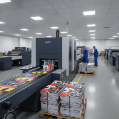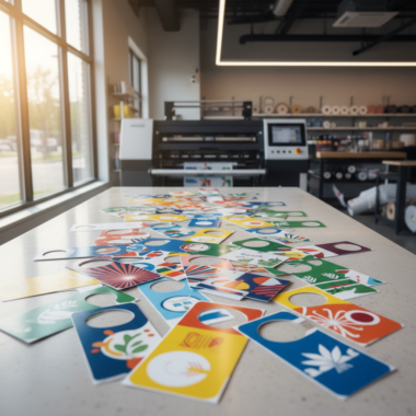
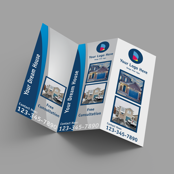


Table tent cards for promotions and events are small, folded tabletop signs that spotlight offers, schedules, QR codes, and calls to action. At 5004 Timberlea Blvd #18 in Mississauga, Top Realtor Sign & Print designs and prints durable, brand-aligned table tents with fast local pickup—helping campaigns stand out and convert on the spot.
By Ashwani • Top Realtor Sign & Print
Last updated: 2026-06-16
Overview and Table of Contents
Use table tent cards to turn idle moments into micro-conversions. Place them where people pause—registration desks, waiting areas, or café tables—to drive sign-ups, scans, and orders. This guide shows how to plan, design, print, and deploy table tents for real results, with Mississauga-local tips and ready-to-use checklists.
Here’s how this complete guide is organized and how you can use it today.
- What table tents are and when they work best
- Design, paper, and finish choices that boost responses
- Deployment playbooks for open houses, trade shows, and venues
- Local pickup and timing tips in Mississauga
- Tools, resources, and case-style examples you can adapt
Quick Summary
Table tent cards are folded mini-displays that promote one clear action—scan, book, RSVP, or order. Pick sturdy stock, high-contrast color, and a bold call to action. Pair tents with flyers, banners, and business cards to raise recall and response during events, then restock locally for continuity.
- Primary uses: menus, offers, schedules, lead capture, QR journeys
- Common sizes: 4×6 in., 5×7 in., 4×9 in. (tri-panel)
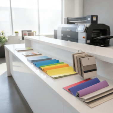
- Stocks: 14 pt–16 pt cover; finishes: matte, gloss, soft touch
- Ideal partners: business cards, postcards, roll-up banners
- Order flow: design → proof → print → local pickup at 5004 Timberlea Blvd #18

What Are Table Tent Cards?
Table tent cards are freestanding, folded prints that sit on flat surfaces and deliver one message at eye level. They guide on-the-spot decisions—scans, sign-ups, or small purchases—by compressing a headline, benefit, and CTA into a compact, self-supporting format.
In our experience supporting REALTORS and local businesses, table tents are the most versatile “micro-billboard” you can place at arm’s length. They thrive where dwell time averages 30–180 seconds: check-in tables, reception counters, café seating, registration lines, and model suites.
- Form factor: Folded, self-standing; typical footprints use 4×6 in. or 5×7 in. faces.
- Message strategy: One clear outcome (scan, RSVP, book, donate), one hero visual, one benefit.
- Durability options: 14 pt–16 pt cover stocks with matte or gloss; lamination or soft touch for longevity.
- Add-ons: QR codes, UTM-tagged URLs, offer codes, or tear-off tabs (when designed as hybrid pieces).
Because the footprint is small, clarity beats cleverness. A 6–10 word headline, 1–2 short bullets, and a high-contrast button-style CTA often outperform dense copy. You can brand tents to brokerage standards or campaign color palettes using our online design tool.
Why Table Tents Matter for Promotions and Events
Table tents convert passive moments into measurable actions. When placed where people pause, they raise recall and scan-throughs, reinforce brand consistency, and help staff keep conversations brief but effective—all without crowding floor space or blocking sightlines.
Here’s the thing: events compress attention into short windows. A concise, well-placed tent nabs 1–3 seconds of eye contact, then prompts an immediate micro-action. That’s why they pair so well with busy open houses, trade show aisles, and registration desks.
- Action density: One tent can highlight a limited-time offer, a schedule, and a QR link—yet still fit on a small counter.
- Reinforcement effect: Pairing a tent with a roll-up banner increases readability range (banner) and action immediacy (tent).
- Staff efficiency: Tents answer FAQs visually so staff can focus on high-intent questions.
- Brand control: Pre-approved templates keep brokerages and businesses on-brand across locations.
Take a REALTOR open house: a tent on the kitchen island with a “Scan for Feature Sheet” QR can capture 20–40% of visitors who won’t take a flyer. Meanwhile, a second tent at the entry can route guests to a guest book or digital lead form.
How Table Tents Work: From Idea to Printed Piece
Plan a single outcome, write a tight message, design for high contrast, then print on sturdy stock. After proofing, deploy table tents at natural pause points. Track scans and URLs to see which placements and offers perform best.
- Define the one action: RSVP? Scan a menu? Book a showing? One tent, one goal.
- Write for skimmers: 6–10 word headline, 1–2 bullets, and a CTA. Keep body text under ~35 words.
- Design for legibility: 18–24 pt headline, 12–14 pt body; 4.5:1 color contrast or better.
- Select stock and finish: 14 pt–16 pt cover with matte, gloss, or soft touch for the right feel.
- Proof and print: Use our online design tool to generate print-ready files and request a preflight check.
- Deploy and measure: Use unique QR codes/URLs per location so you can compare results.
Designing to these constraints forces focus. You’ll notice that cutting one extra sentence often raises scan rates. We see this switch daily in Mississauga: tighter message, better lift.
Types, Sizes, and Materials That Perform
Choose a size that fits your surface and sightline: 4×6 in. for tight spaces, 5×7 in. for more impact, and 4×9 in. when you need three short panels. Use 14–16 pt stocks with matte, gloss, or soft touch to balance durability and feel.
Match the form factor to the job. In cafes or narrow counters, a compact 4×6 in. face reduces tipping. For registration desks or reception areas, a 5×7 in. face presents a bolder headline while staying compact. When you have multiple talking points—like agenda, map, and QR—the 4×9 in. tri-panel format keeps each item clean.
| Use Case | Recommended Size | Best Stock | Finish | Notes |
|---|---|---|---|---|
| Open house sign-in | 5×7 in. | 16 pt cover | Matte or soft touch | Soft touch dampens glare near windows |
| Trade show offer | 4×6 in. | 14 pt cover | Gloss | Gloss boosts color pop under LEDs |
| Conference schedule | 4×9 in. tri-panel | 16 pt cover | Matte | Three short sections: agenda, map, QR |
| Café tabletop promo | 4×6 in. | 14 pt cover | Matte | Smaller footprint reduces tipping risk |
- Tip: If your venue uses bright overheads, a matte or soft touch keeps glare low and eye travel high.
- Tip: If the surface is busy (e.g., brochures), choose a larger headline size and solid-color background for contrast.
- Tip: For outdoor patios, keep copy bolder and shorter; wind and distance reduce read time.
Design Best Practices That Drive Scans and Sign-Ups
Design table tents like landing pages: one promise, one proof, one button. Use a bold headline, a short benefit, and a high-contrast CTA. Keep images uncluttered, and place QR codes at least 0.8–1.2 inches wide for reliable scans at arm’s length.
- Visual hierarchy: Headline (largest), benefit (smaller), CTA (button-style), support visual (simple, not busy).
- Contrast: Aim for at least 4.5:1 between text and background for quick legibility.
- QR usability: Keep codes sharp, with clear quiet zones; test scans at 6–18 inches.
- Branding: Use brokerage or company palettes and typography for instant recognition.
- Finish cues: Soft touch reads as premium; gloss pops color; matte reduces glare in bright rooms.
Many teams try to say too much. Resist. A 10-word headline plus two bullets usually beats a paragraph for converting busy foot traffic. If you need to include supporting info, point the QR to a short landing page instead.
Local Pickup and Logistics in Mississauga
Pick up table tent cards at 5004 Timberlea Blvd #18 in Mississauga for quick turnarounds across the Regional Municipality of Peel. Order online, confirm proofs, and stage your pickup to match event load-in windows. Local pickup compresses timelines and avoids shipping delays.
Coordinating your tent rollout with other materials lowers stress. Many clients pair tents with same‑day business cards or postcards so handouts match the on-table message. You can also browse table tent cards and submit artwork through our online design tool to shave hours off prep.
Local considerations for 5004 Timberlea Blvd Unit#18
- Transit timing: If your team uses Tomken Station East Platform A, schedule pickups to avoid peak transfer times so staging and loading stay smooth.
- Academic calendars: Nearby Canadore College at Stanford Mississauga Campus events can spike local traffic; plan event materials a day earlier during orientations or graduations.
- Weather windows: For outdoor promos, keep gloss to a minimum on bright days and secure tents to prevent tipping in breezy conditions.

Deployment Playbooks: 12 Proven Placements
Place table tents where attention naturally pauses and hands are free. Prioritize check-in points, counters, café tables, registration areas, and demo stations. Use one CTA per placement and unique QR codes to compare scan-through by location.
- Open house kitchen island: “Scan for feature sheet” + brokerage branding.
- Model suite coffee table: “Book a showing” QR leading to a calendar.
- Trade show reception desk: “Enter to win” with short form.
- Product demo pod: “See full specs” + quick-start video.
- Registration table: “Text updates” opt-in with keyword.
- Conference break tables: “Join the session chat” via QR.
- Venue bar or café: “Limited-time combo” with photo.
- Charity gala tables: “Donate now” with short URL.
- Hotel front desk: “Late checkout info” + policy link.
- Fitness studio lobby: “Trial class sign-up” + waiver link.
- University booth day: “Apply now” with steps 1–3.
- Waiting room counter: “Review us” with UTM code.
Use this sanity check: Would a distracted guest still get your message in two seconds? If not, simplify.
Pairing Table Tents with Other Materials
Pair table tents with business cards, postcards, flyers, and banners to cover both reach and response. Tents trigger immediate actions; handouts extend memory after people leave. Align headlines and visuals so the campaign feels like one message across formats.
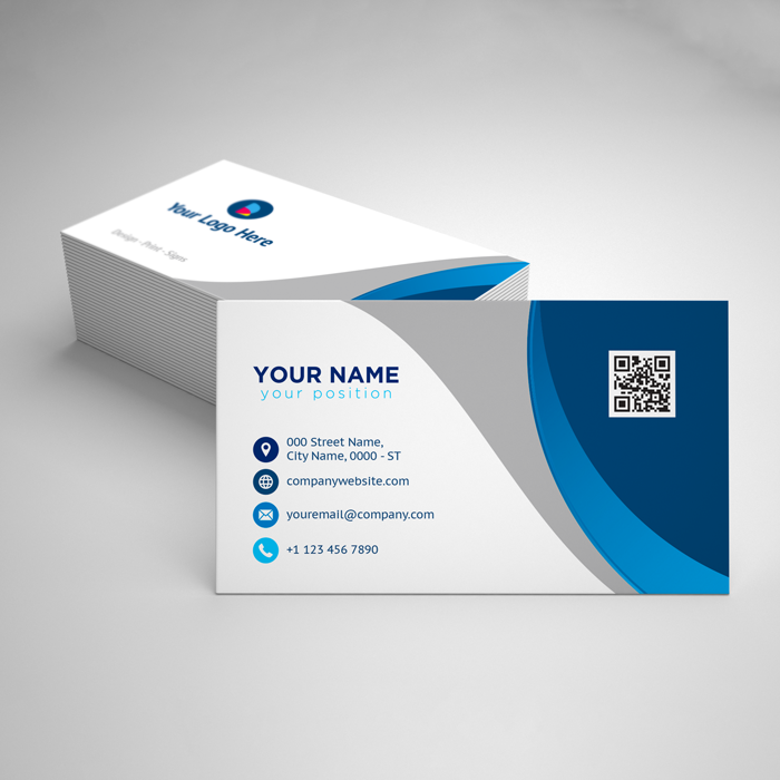
- Business cards: Hand over a card that repeats the tent’s headline; it boosts recall during follow-up. Browse business card options.
- Postcards: Use 14 pt postcards for take-home offers that mirror on-table CTAs. See postcards.
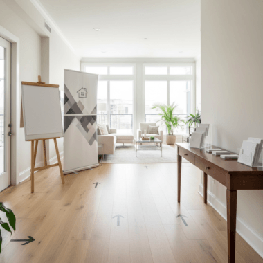
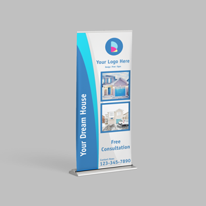
- Roll-up banners: Extend visibility 6–20 feet so people spot the tent area from a distance.
- Flyers and brochures: Place stacks beside tents to catch high-intent readers.
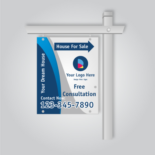
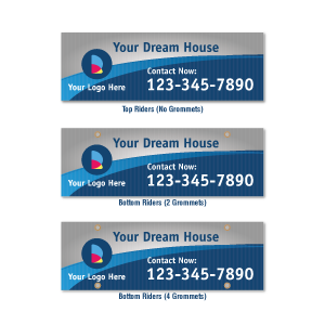
- Rider signs (concept link): If you’re a REALTOR, think of tents as indoor cousins to riders—short, directional, and action-focused.
If you already use rider signs to highlight “Pool” or “Sold Over Ask,” you know brevity works. Table tents apply that same logic indoors—fast path to action with minimal space.
Tools and Resources
Use a browser-based design tool, preflight checks, and QR/UTM tagging to speed production and measurement. Templates keep branding consistent, and local pickup compresses timelines when schedules shift.
- Design faster online: Build print-ready artwork with our online design tool.
- Start with the right product: Explore table tent cards in the catalog.
- Tag every channel: Generate unique QR codes and UTM links for each placement.
- Keep campaigns organized: Group all print collateral with the Printed Promotions tag.
- Reorder quickly: Save project files so you can refresh offers without rebuilding layouts.
For events with complex booth flows, layout choices matter. For broader traffic flow tips, see these helpful insights on trade show booth layout and exhibit planning. They pair well with the placement strategies in this guide.
Mini Case Examples (Adapt These Today)
Copy what already works. Use one headline, one benefit, one CTA, and a scannable QR. Place the tent at the natural pause point, then mirror the same message on a handout for memory once people leave.
- GTA REALTOR open house: Kitchen island tent: “Scan for feature sheet.” Front hall tent: “Sign in for updates.” Handouts: postcards featuring the same property photo.
- Local café limited-time combo: Café table tent: “Try the summer iced pack.” Counter tent: “Skip the line—order ahead.” Banner behind counter repeats headline.
- Trade show SAAS demo: Reception tent: “Enter to win after the demo.” Pod tent: “See pricing tiers.” Leave-behind: business cards repeating “Win a free month.”
We’ve found that mirroring the exact headline across tents, banners, and cards increases recognition in under five seconds. Simplicity wins.
Upload your artwork with our online design tool, request a quick preflight, and pick up at 5004 Timberlea Blvd #18. We’ll help ensure legibility, contrast, and QR performance before you print.
Troubleshooting and Mistakes to Avoid
Keep copy brief, contrast high, and QR codes large enough. Avoid crowding logos and headlines, testing only in bright light, or placing tents where hands are busy. If in doubt, simplify the message and test scans at arm’s length.
- Too much text: If your body copy exceeds ~35 words, trim. Skimmers bail fast.
- Low contrast: Brand colors still need readability; adjust hues or add a solid background.
- Tiny QR codes: Under ~0.8 in. wide reduces scan reliability on older phones.
- Poor placement: Don’t block sightlines; keep tents near lanes where people pause naturally.
- Finish mismatch: Gloss near windows can glare; soft touch or matte solves it.
When a layout isn’t performing, swap one variable at a time—size, headline, or art—so you can see what moved the needle.
Event Timing and Operations
Back-time your artwork and pickup to match load-in windows. Stage tents in labeled boxes by placement, and keep 10–20% spares. Use unique QR/UTM pairs so you can compare scan-throughs by zone after the event.
- Back-timing: Lock content early so proofs stay quick; leave space for minor offer edits.
- Label by zone: “Reception A,” “Demo 2,” “Bar 1” makes onsite setup faster.
- Check lighting: Walk the venue with a sample—glare changes minute-by-minute.
- Spare stock: Keep extras in case of spills, wind, or layout changes.
- Post-event review: Compare QR scans across placements; double down on winners next time.
For broader venue planning ideas in Mississauga, skim this practical overview of banquet hall setups as a companion to your site walk.
Where to Start (Ordering Made Simple)
Pick a table tent template, drop in your headline and QR, request a proof, then pick up locally. Start with one placement and one message. Once it works, scale the same design across your counters, booths, and tables.
- Browse the table tent cards category.
- Open a template in the online design tool.
- Write a 6–10 word headline and add a bold CTA.
- Insert a high-contrast photo and your logo.
- Add a QR linked to a short, mobile-first page.
- Request a proof and plan pickup at 5004 Timberlea Blvd #18.
Need matching handouts? Check postcards or browse the printed postcards tag to keep campaigns cohesive.
FAQ: Table Tent Cards for Promotions and Events
These are the most common table tent questions from local teams. Each answer is short, direct, and focused on outcomes so you can act with confidence.
What size table tent should I choose?
Use 4×6 in. for tight counters and café tables, 5×7 in. for bold headlines at reception desks, and 4×9 in. tri-panel when you need three short sections like agenda, map, and QR. Match size to the viewing distance and clutter around it.
How big should my QR code be on a table tent?
Keep QR codes at least 0.8–1.2 inches wide with a clear quiet zone so phones scan reliably at arm’s length (6–18 inches). Test under your actual lighting to confirm contrast and focus are adequate at the intended distance.
What finish is best—matte, gloss, or soft touch?
Choose matte or soft touch in bright rooms to control glare and improve readability. Use gloss to make colors pop under LED lighting. If you want a premium feel for hospitality or luxury listings, soft touch delivers a subtle, tactile effect.
Where should I place table tents for the best results?
Place them where people pause and have free hands: check-in desks, reception counters, café tables, demo pods, and waiting areas. Use one clear headline and CTA per tent, and give each location a unique QR/UTM so you can compare scan-throughs afterward.
Key Takeaways and Next Steps
Focus each table tent on one clear action, design for instant legibility, and deploy at natural pause points. Pair tents with handouts and banners, tag every placement, and restock locally for momentum between events.
- One tent, one message, one CTA.
- High-contrast color and generous font sizes.
- QR codes at 0.8–1.2 in. wide; test at 6–18 in.
- Mirror headlines on tents, cards, and banners.
- Order online, proof fast, and pick up locally.
Ready to move? Start your design in our online tool, explore table tent options, and plan pickup at 5004 Timberlea Blvd #18.
Related Articles and Helpful Guides
Dive deeper into print that supports events: align table tents with business cards and postcards, and build artwork faster with browser-based design. These resources help you scale one message across formats without slowing down.
Keep building your kit with high-impact business cards and take-home postcards. If you like to self-serve, our Mississauga online design tool speeds layout without special software.