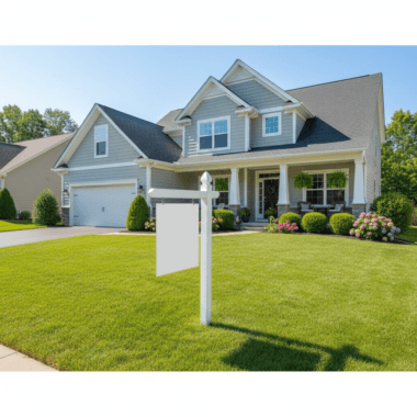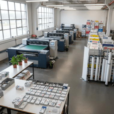


Real estate branding on a budget is the disciplined use of a few high-impact assets—yard signs, business cards, open house materials, and simple templates—to create a consistent look buyers recognize. At our Mississauga shop at 5004 Timberlea Blvd Unit#18, we help agents build cohesive, pro-grade kits fast so every listing touchpoint works harder.
By Ashwani at Top Realtor Sign & Print · Last updated: 2026-05-04
At a Glance: Budget Real Estate Branding That Works in 2026
Build a lean, repeatable branding kit: business cards, For Sale and Directional signs, an A-frame or roll-up banner, door hangers/postcards, and a few editable templates. Keep colors, fonts, and logo consistent. Reuse hardware with interchangeable inserts and riders. This system lowers spend, speeds setup, and increases listing visibility.
Here’s what you’ll get in this complete guide, with practical steps you can use today:
- Clear definition of budget-friendly real estate branding
- Why consistency beats complexity (and how to achieve it)
- A step-by-step process you can follow this week
- Print-and-signage assets that deliver outsized impact
- DIY tools, resources, and quick-win checklists
- Local tips for Mississauga and the Regional Municipality of Peel
Jump to a section:
- What is it?
- Why it matters
- How it works
- Types of low-cost brand assets
- Best practices
- Tools and resources
- Mini case studies
- FAQ
- Conclusion and next steps
- Related guides
What Is Real Estate Branding on a Budget?
Real estate branding on a budget means choosing a small set of core assets and repeating them consistently across listings. Focus on legible signs, professional business cards, and a few reusable templates. The goal is recall: buyers should recognize your brand within three seconds, from 30–50 feet away.
Branding is recognition plus trust. You don’t need dozens of assets; you need a handful that show up everywhere. In our experience, five to seven consistent touchpoints (card, yard sign, riders, A-frame, postcards, open house materials) outperform scattered efforts with more items but less cohesion.
Core elements you actually need
- Logo lockup in full color and a single-color version
- Color palette with two primaries and one accent
- Type pairing (headline + body) that prints clearly
- Photography style (light/bright or bold/contrasty)
- Templates for postcards, door hangers, and social covers
If your brokerage has strict guidelines, align first. Our team often adapts RE/MAX, Royal LePage, Century 21, and other brand standards into print-ready templates so agents can hit the ground running without rework.
Why Budget Branding Matters for Agents and Teams
Budget branding compounds impressions across signs, cards, and open house materials. In dense neighborhoods near 5004 Timberlea Blvd Unit#18 across the Regional Municipality of Peel, repetition is your edge. A tight kit shortens setup time, keeps compliance simple, and increases local recall.
Consistency beats complexity. When your For Sale sign, directionals, and postcards share the same visual system, buyers connect the dots faster. That means more sign calls, more open house traffic, and stronger listing presentations. The sweet spot is repetition: same colors, same hierarchy, same contact info.
- Speed matters: You can deploy a cohesive listing kit in under an hour when the assets match and hardware is reusable.
- Compliance stays manageable: One master template prevents missing brokerage/legal lines on rushed prints.
- Local relevance: Neighborhood-ready directionals placed 100–150 feet from key turns guide traffic without confusion.
We’ve seen agents increase open house visits week-over-week simply by adding two extra directionals and a sidewalk A-frame. Small changes, repeated, add up.
How Budget Branding Works: A Step-by-Step Plan
Use a repeatable five-step loop: lock your visual system, assemble a core kit, template your messaging, prep hardware for quick swaps, and schedule checkpoints. This approach stabilizes quality, reduces waste, and turns every listing into an on-brand micro-campaign.
- Lock your visual system: Approve colors (CMYK and HEX), font pairing, and logo variations. Save to a shared folder.
- Assemble your core kit: Business cards, For Sale sign, 3–6 directionals, A-frame or roll-up banner, riders, postcards/door hangers.
- Template your messaging: Create editable files with headline, address, features, and contact blocks in fixed positions.
- Prep reusable hardware: Use insert frames and universal posts so you only swap printed inserts/riders.
- Schedule checkpoints: 15-minute reviews before installs and after open houses to fix gaps for the next weekend.
Need a starting point? Our team built a practical overview of custom printing for Ontario agents that you can adapt to your brand standards in minutes.
Local considerations for 5004 Timberlea Blvd Unit#18
- Leverage foot traffic from Stanford International College by placing compliant directionals during weekend showings.
- Plan for winter setups: keep extra zip ties and gloves in your kit; cold snaps can stiffen coroplast and slow installs.
- Aim installs around evening commute windows; signage near arterial roads tends to earn more glances after 5 p.m.
Soft CTA: Want a 10-minute kit audit? Bring your current card, a yard sign photo, and a postcard to our shop. We’ll suggest two quick wins you can deploy this week.
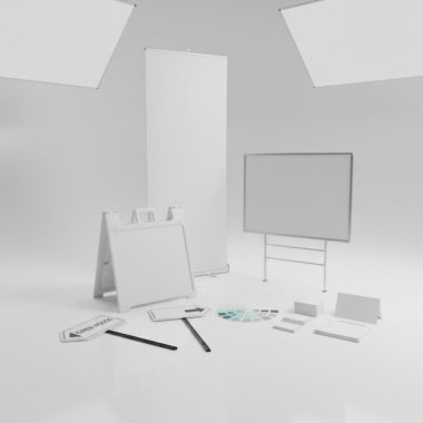
Types of Low-Cost Brand Assets (Print + Signage)
Prioritize assets that win attention at key moments: cards for handoffs, yard signs for curb appeal, directionals for wayfinding, banners/A-frames for open houses, and postcards/door hangers for local reach. Reuse hardware where possible, and keep all layouts on the same visual grid.
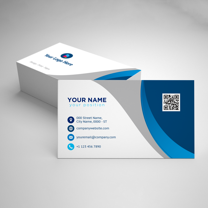
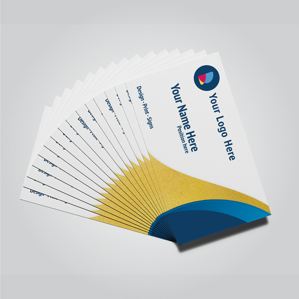
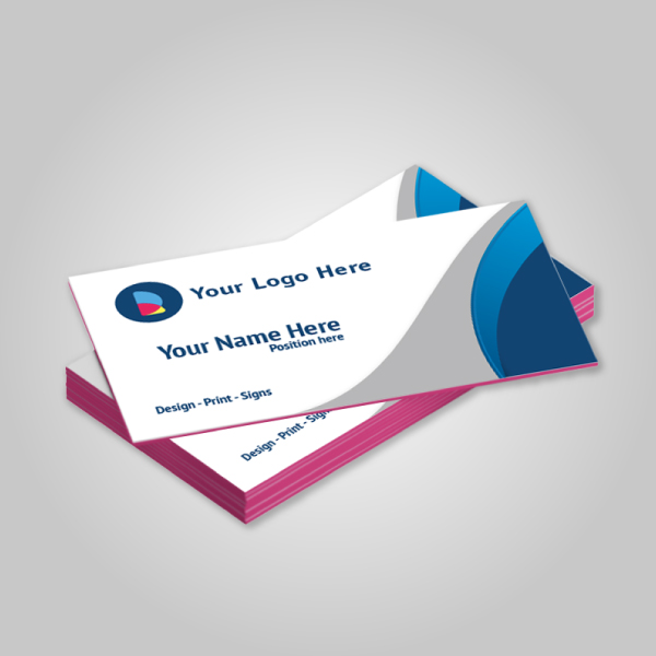
Business cards that actually convert
Your card is a mini billboard. Go for clean hierarchy and tactile finishes agents remember. Our guide to ordering luxury business cards explains when to consider soft touch, raised spot UV, foil, or painted edges for memorability.
- Hierarchy: Name + phone in top priority; website and QR in secondary tier.
- Legibility: Avoid thin scripts under 9 pt; keep contrast high.
- Tactility: Raised spot UV or foil adds a “feel” cue buyers recall days later.
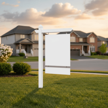
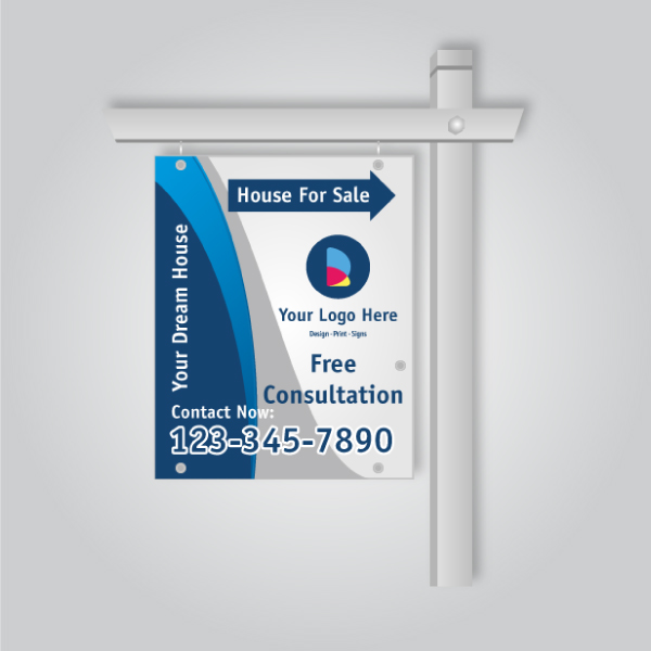
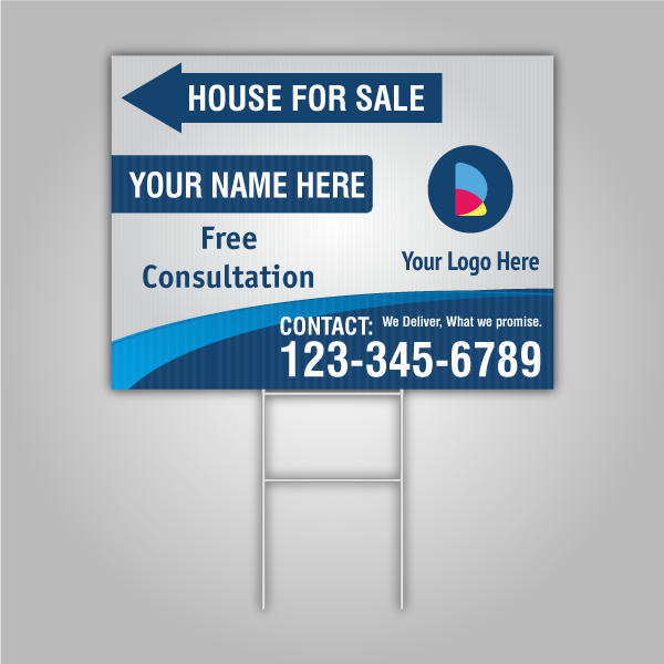
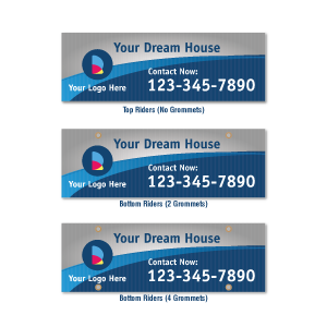
For Sale signs, riders, and yard hardware
Signs should read in three seconds at 35–50 feet. Keep the hero area clean—photo, headline, and a bold contact block. Our article on Ontario sign design and placement tips shows real layouts that work on busy streets.
- Main board: Brand, listing headline, and a direct call block.
- Riders: Swap “Open Sat/Sun,” “Just Listed,” or “Sold Over Asking” as needed.
- Hardware: Use insert frames to refresh listings without re-buying posts.
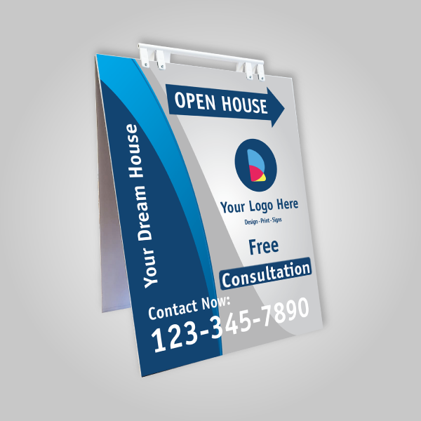
Directional signs and A-frames
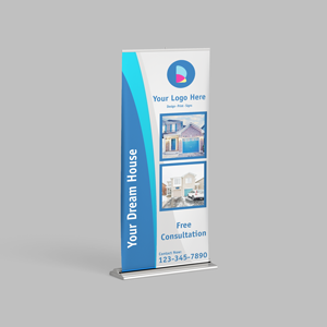
Directionals do the heavy lifting for traffic. Place them 100–150 feet before turns with clear arrows. For sidewalks, a bold A-frame at the entry boosts trust and capture. If you prefer vertical presence, a roll-up banner adds height without tools.
- Coverage: 3–6 directionals per listing route is a good baseline in grid neighborhoods.
- Contrast: High-contrast arrows and few words win glance time.
- Durability: Coroplast and metal stakes withstand weekend weather swings.
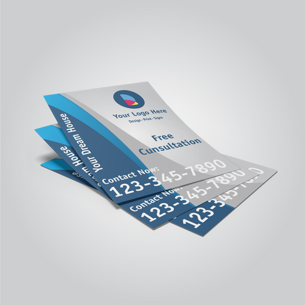
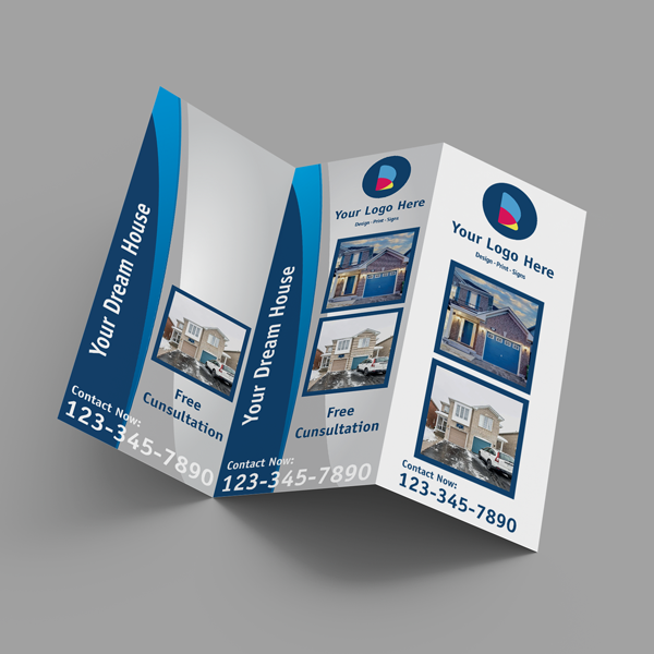
Brochures, postcards, and door hangers
Leave-behinds extend the conversation. Use one modular template for all three formats and swap listing data. That keeps printing fast and on-brand. For more sign-and-print fundamentals, see our beginner’s guide to yard sign printing.
- Brochures: Tri-fold or Z-fold with a photo-led cover and bullets.
- Postcards: 14pt stock handles mail sorting and stays crisp.
- Door hangers: Target radiuses around new listings and recent sales.
Stickers, notepads, and folders
These “quiet” assets accumulate recall. A notepad on a kitchen counter or a sticker on a moving bin gets dozens of views in a week. Presentation folders tie your listing packet together and elevate your value story without extra design time.
| Asset | Best Use | Typical Reach | Reusability |
|---|---|---|---|
| Business Cards | Networking, showings, referrals | 1–5 people per interaction; high-depth | One-time print; staple asset |
| For Sale Sign | Curb appeal and authority | Dozens of daily glances on busy streets | Reuse hardware, swap inserts/riders |
| Directional/A-frame | Wayfinding for open houses | Multiple routes; peak on weekends | Highly reusable |
| Postcards/Door Hangers | Neighborhood awareness | Hundreds per drop; low-depth | Designed once; repeat prints |
| Roll-up Banner | Open house presence, broker tours | Focused; room-level attention | Reuse for months |
When you align these assets to a single visual grid, you train the market to recognize you faster—often within three seconds of a drive-by or handoff.
Best Practices for High-Impact, Low-Spend Branding
Keep it simple, bold, and repeatable. Use one grid across assets, large contact info, and high-contrast colors. Reuse hardware with inserts and riders. Document rules in a one-page brand sheet and apply them the same way every weekend.
Design rules that scale
- One grid, many formats: Align headline, image, and contact blocks at consistent positions across cards, signs, and mailers.
- Contrast first: Dark text on light background or vice versa; avoid mid-tones that fade outdoors.
- Legal and brokerage lines: Bake them into master templates to prevent last-minute errors.
Operational habits that save time
- Pack once, deploy fast: Keep a trunk kit: zip ties, stakes, gloves, wipes, spare riders, and a microfiber cloth.
- Photograph your installs: A quick snapshot helps you iterate spacing, angle, and copy for the next listing.
- Use checklists: The same install sequence every weekend reduces misses to near zero.
For asset sizing and compliance basics, see our reference on real estate sign sizes in Ontario. It pairs well with our real estate signs collection when you’re ready to standardize.
Tools and Resources to DIY Like a Pro
Lean on a browser-based design editor, brand templates, and a trusted local print partner for same-day pickups. Add simple photo standards and a social distribution plan. Together, these tools compress turnaround from days to hours without sacrificing quality.
- Online design editor: Our in-browser tool helps non-designers finalize print-safe layouts without software.
- Template library: Set up postcard, door hanger, and brochure templates once; just swap property data per listing.
- Photography checklist: A photo-led card or postcard boosts saves and shares. A practical primer from HouseUp on listing photography is a helpful refresher.
- Social distribution: Repurpose your print creative for social. See this guide to real estate platforms for channel strengths.
When premium finishes add memorability, use them intentionally. Our walk-through on business card design tips explains when raised spot UV, foil, or painted edges provide the most lift per handoff.
For broader marketing planning, many agents like this concise marketing strategy overview as a starting framework before tailoring tactics to their neighborhoods.
Mini Case Studies: Mississauga Agents Winning on a Budget
Small, consistent upgrades compound. Agents who standardize a yard sign system, add two more directionals, and refresh their business card finish often see stronger open house traffic and better listing consults within a few weekends.
Scenario 1: The open house turnaround
A Mississauga agent swapped a mixed bag of signs for a unified kit: main board, three riders, five directionals, and an A-frame. With identical colors and hierarchy, weekend traffic grew noticeably, and the same kit redeployed for the next listing in minutes.
Scenario 2: The tactile card effect
A team lead refreshed cards with a clean grid and raised spot UV on the logo. At showings, buyers kept the card longer and referenced it when booking private tours. One small tactile cue increased recall at the decision moment.
Scenario 3: The modular mailer
An agent templated a postcard/door hanger pair using one layout. Swapping photos, address, and QR took minutes per listing. The consistent look tied mailers to yard signs, and neighbors recognized the brand before the first open house.
FAQ: Real Estate Branding on a Budget
Focus on a tight asset kit, repeat your visual system everywhere, and reuse hardware. The FAQs below answer the most common agent questions about what to buy first, how many signs to deploy, and how to keep everything compliant and cohesive.
What should I buy first if I’m starting from scratch?
Start with business cards, a For Sale sign with riders, 3–6 directional signs, and either an A-frame or a roll-up banner. Then create one postcard/door hanger template. This gives you coverage across handoffs, curb appeal, wayfinding, and neighborhood awareness.
How many directionals do I need for a typical open house?
A baseline of three to six works for grid neighborhoods. Place signs 100–150 feet before key turns and add an A-frame at the entrance. In low-visibility areas, add two more near traffic lights or roundabouts.
How do I keep everything on-brand without a designer?
Use a simple brand sheet—logo, colors, fonts—and lock a one-page grid that positions headline, image, and contact info. Then reuse that grid across cards, signs, and mailers. A browser-based editor helps you update content without changing the layout.
When should I consider premium finishes like foil or raised UV?
Use premium finishes on your primary handoff card when you’re meeting sellers or higher-end buyers. Tactile cues improve recall. Keep the layout minimal so the finish does the talking, and reserve it for the card that travels with you most.
Conclusion and Next Steps
A small, consistent kit beats a large, scattered one. Standardize your grid, print the essentials, and reuse hardware. Review results weekly and refine. This keeps quality high, spend tight, and your market recognition climbing.
- Key takeaways
- Choose a five-to-seven-asset kit and stick to it.
- Make everything legible at a glance from 30–50 feet.
- Reuse frames and riders to stretch your budget.
- Template once; swap listing data quickly.
- Action steps
- Lock your brand sheet and grid today.
- Book a 10-minute kit audit at our Mississauga shop.
- Standardize your sign sizes and placement rules.
Ready to streamline your kit? Explore our curated realtor packages or drop by 5004 Timberlea Blvd #18 for a quick consult.
Related Guides in Our Realtor Series
Strengthen your kit piece by piece. Use these deep dives to finalize sizes, finishes, and placement tactics that make every weekend run smoother and more effective.
Dial in sign readability and municipality-friendly sizes with our Ontario sign sizes guide. For field setup workflow, review the yard sign printing beginner’s guide. When it’s time to elevate handoffs, see our luxury business cards walkthrough and our Ontario agents’ custom printing playbook.