


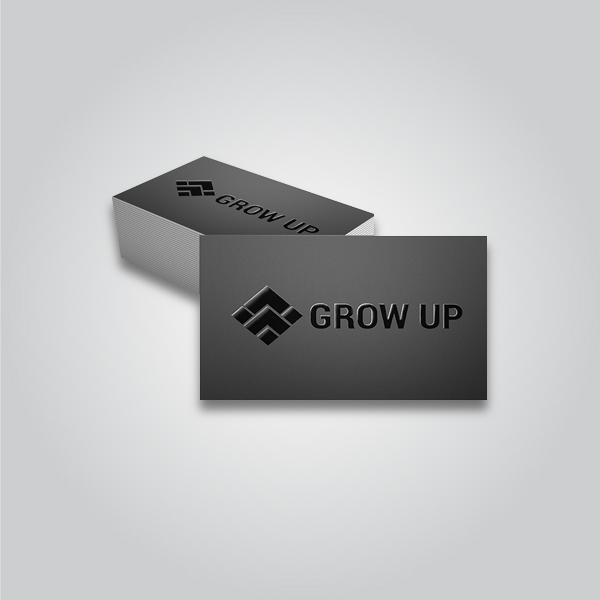
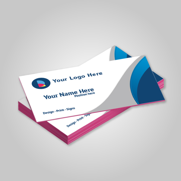


Business card proofing is the quality-control step that confirms names, titles, contact info, layout, color, and finishes are correct before printing. At our Mississauga shop at 5004 Timberlea Blvd #18, we guide you through each check so you approve with confidence. This guide has the business card proofing process explained in plain language.
By Ashwani, Top Realtor Sign & Print • Last updated: 2026-05-31
Quick Summary
Business card proofing verifies text accuracy, layout alignment, bleed and safe zones, 300 PPI images, CMYK color, and finishing layers before press. Approve a clean PDF proof, review hard-copy color when needed, and sign off once every element matches your brand and the intended paper and finish.
Here’s the fast overview you can skim now and use later on your next order.
- What you’ll learn: What proofing is, why it matters, step-by-step checks, file setup, finish-specific tips, and tools.
- Who it’s for: Realtors, brokerages, and local businesses that need accurate cards—often within 1–2 days.
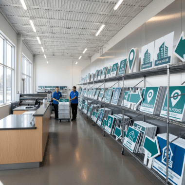
- Where we help: Our Mississauga shop at 5004 Timberlea Blvd #18 (Regional Municipality of Peel) with same-day pickup on select items.
- Key specs to remember: 3.5 × 2 inches final size (North America), 0.125 inch bleed on all sides, 0.125–0.25 inch safe zone, images at 300 PPI, CMYK color, outlined fonts, and vector logos.
- Proof types: On-screen PDF (soft proof), printed color sample (hard proof), finish mockups for raised spot UV and foil, and optional press checks for complex runs.
- Final sign-off: Approve only when all text, color, trim, and finish placement match the proof exactly.
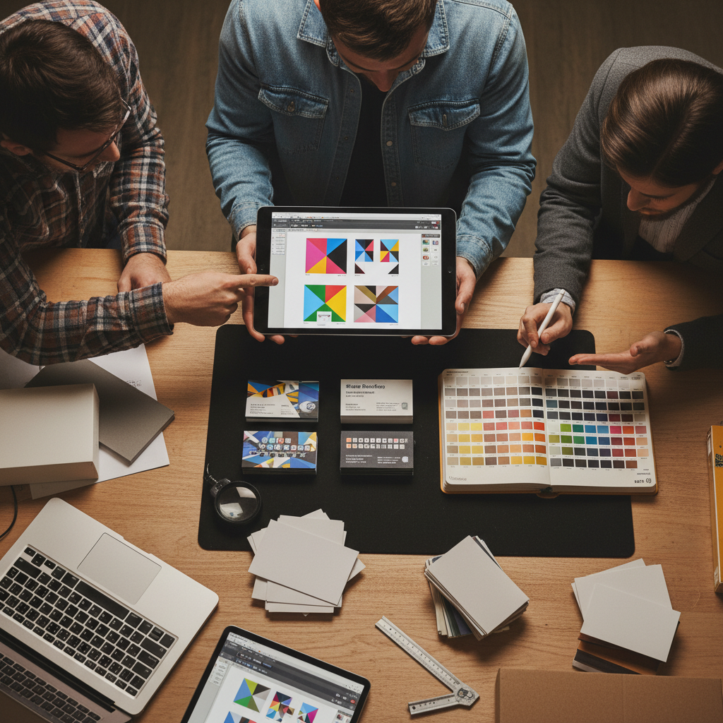
What Is the Business Card Proofing Process?
The business card proofing process is a structured review of content, layout, color, image resolution, and finishing layers before printing. It ensures names, titles, numbers, and branding are correct; graphics meet 300 PPI; color is set to CMYK; and bleed and safe zones align with the final trim.
In practice, proofing is your chance to catch mistakes while they’re easy to fix. You’ll review a PDF that reflects exact trim, bleed (usually 0.125 inch), and finish positions. For specialty effects—like raised spot UV or foil—you may also see finish-separation layers and a printed sample to confirm texture.
Why Proofing Matters for Realtors and Local Businesses
Proofing prevents reprints and protects your brand. A 10-minute review catches typos, misaligned logos, and color shifts that are costly to fix later. For Realtors and small businesses, consistent cards reinforce trust at every handoff, open house, and networking event.
Here’s why it’s worth doing right—every time.
- Brand consistency at scale: Matching color across cards, signs, and flyers keeps your brokerage’s visual system intact. CMYK builds with 10–15% total ink changes can shift brand color; checking the PDF prevents drifts.
- Accuracy across channels: One digit off in a phone number drops responses to zero. Proofing verifies all contact points—phone, email, URL, QR—are correct.
- Finish placement matters: Raised spot UV and foil require exact vector masks. A 1–2 mm misalignment is visible; a careful proof avoids it.
- Paper + press realities: Trim variance of about 1/32–1/16 inch is common on stacks. Safe zones keep content clear even with normal mechanical tolerance.
- Speed with confidence: Same-day or next-day timelines still benefit from a 1–2 cycle proof loop—often under 30 minutes end to end when files are set up correctly.
We see this daily: tight timelines, multiple cardholders, and complex brokerage branding. A clear proofing step streamlines approvals—so cards hand off cleanly at the next showing or event.
How the Proofing Process Works (Step-by-Step)
Proofing follows a repeatable flow: preflight your file, export a print-ready PDF, review trim/bleed/safe zones, verify text and logos, check CMYK color and 300 PPI images, confirm finish masks, request a hard proof if needed, and sign off. Each step prevents a specific production error.
Use this checklist on every project. It’s fast and thorough.
- Confirm final size: 3.5 × 2 inches (North America). Oversized cards need matching sleeves and holders.
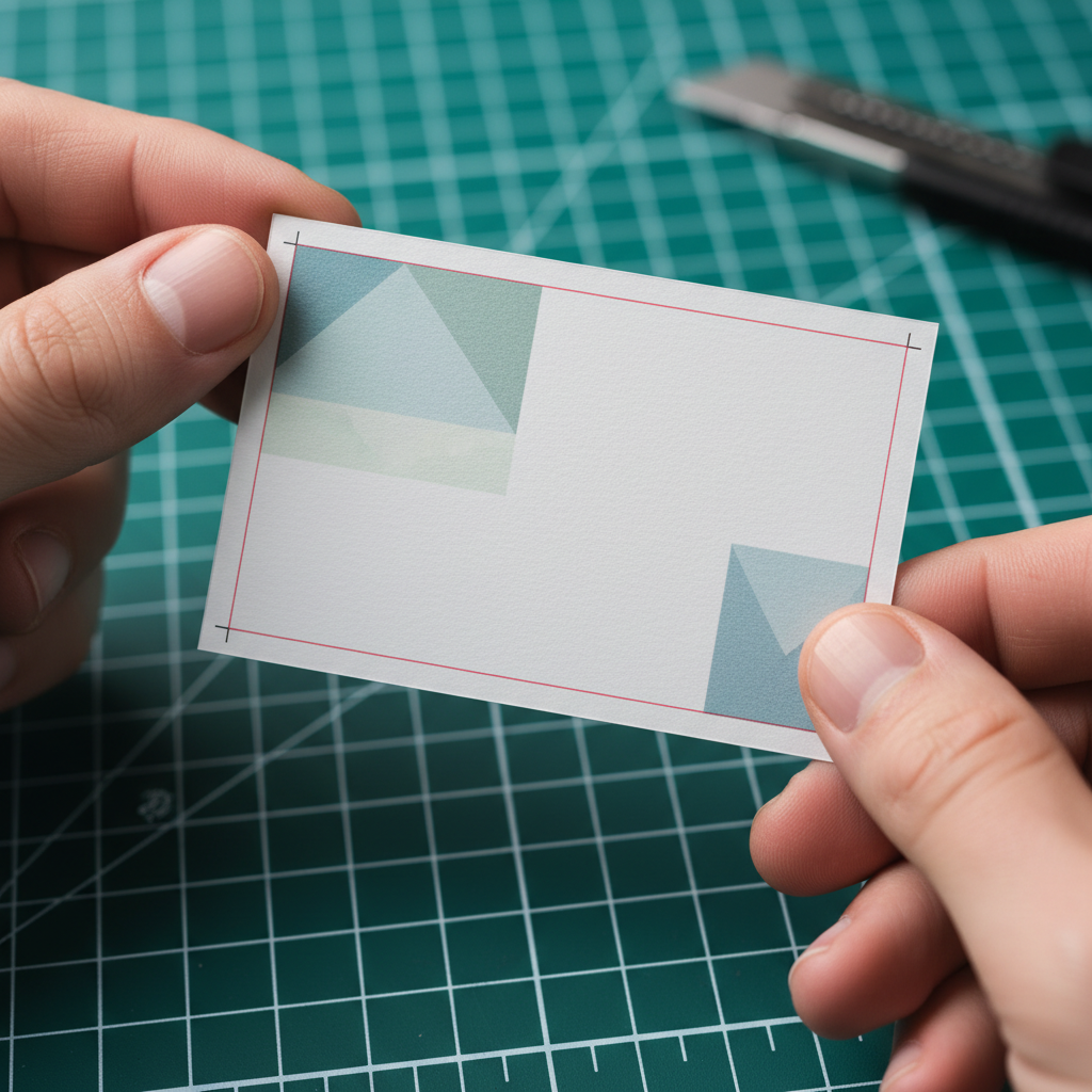
- Set bleed: Add 0.125 inch on all sides. Backgrounds and photos should extend fully to the bleed edge.
- Mark safe zone: Keep important text/logos at least 0.125–0.25 inch from trim to protect against mechanical variance.
- Convert color to CMYK: Avoid RGB. Spot colors may be simulated; ask us if you need Pantone guidance.
- Check resolution: Photos and rasters at 300 PPI at print size; logos should be clean vectors (SVG/AI/EPS/PDF).
- Outline fonts: Convert text to curves; embed fonts only if your workflow requires edits later.
- Verify contact info: Name, title, license number (where applicable), phone, email, URL, QR code target, and brokerage disclaimers.
- Export a print-ready PDF: Use high-quality presets; include bleed and trim marks; flatten transparency where needed.
- Review the PDF proof: Zoom to 200–400% to spot alignment issues and thin strokes under 0.25 pt.
- Confirm finish layers: For raised spot UV or foil, supply a 100% black vector mask on a separate layer/page.
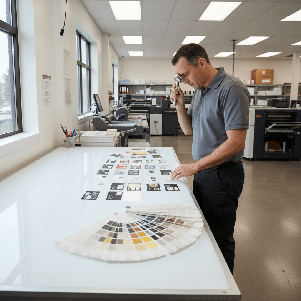
- Request a hard proof when color-critical: Substrates and laminations shift perception; a sample avoids surprises.
- Approve in writing: Final sign-off locks your spec and enables production at speed.
Prefer a structured view? Here’s a concise process table you can reference during approvals.
| Step | Purpose | What to Check |
|---|---|---|
| Size & Bleed | Clean trimming | 3.5 × 2 in; 0.125 in bleed |
| Safe Zone | Protect content | 0.125–0.25 in margin |
| Color Mode | Accurate printing | CMYK, no RGB |
| Images | Sharp results | 300 PPI at size |
| Typography | Legibility | ≥ 7–8 pt text; outlined |
| Finishes | Correct effects | Spot UV/foil masks |
| Hard Proof | Color confidence | Substrate + lamination |
| Approval | Release to print | Written sign-off |
When your file arrives clean—correct size, bleed, and masks—proofing often finishes in a single pass. For complex finishes, plan one extra loop to confirm placement at 100% scale.
Types of Proofs and When to Use Them
Use a soft proof (PDF) for layout and text, a hard proof for color on the actual stock, and a finish mockup for raised spot UV or foil alignment. Reserve a press check for mission-critical color where small tolerances matter.
Not every job needs every proof. Here’s how to decide.
Soft proof (on-screen PDF)
- Best for: Text verification, layout, bleed/safe zone, and logo placement.
- What to look for: Trim alignment, margins ≥ 0.125 inch, and vector logos scaling without pixelation at 400% zoom.
- When to rely on it: Standard CMYK builds on known stocks where color is not mission-critical.
Hard proof (printed sample)
- Best for: Color-critical branding, photos, gradients, and substrate/lamination interactions.
- What to look for: Skin tones, neutrals, and solid fills; view under neutral light (5000–6500K) for accuracy.
- When to request: New brand launches, foil or Spot UV next to type, or whenever subtle hue shifts would be noticeable.
Finish mockups (raised spot UV, foil)
- Best for: Confirming the exact area of effects on logos, names, or patterns.
- What to look for: Vector mask precision; avoid effects touching fine serifs under ~0.5 pt equivalent.
- When to request: First-time specialty finishes or tight placements within 1–2 mm of live text.
Optional: press check
- Best for: Large runs or color-sensitive work where ΔE or small tolerances matter to your brand.
- What to look for: Solid areas, gradients, and registration; approve pull sheets before full production.
Digital workflows move fast, but paper, lamination, and specialty effects always change how color reads. If you’re launching a new brand or adding luxury finishes, invest one extra cycle for a printed check.
Best Practices for Flawless Business Card Approvals
Lock in size, bleed, and safe zones; keep type ≥ 7–8 pt; convert to CMYK; ensure 300 PPI images; and supply vector masks for finishes. Use one owner for final sign-off and keep versioned PDFs to avoid outdated files slipping through.
These habits keep approvals smooth—even on tight timelines.
- Use a single source PDF: Rename files with dates (YYYY-MM-DD) and version numbers (v1, v2) to prevent confusion.
- Keep a 12-point checklist: Size, bleed, safe zone, CMYK, PPI, fonts, logo vector, contact info, QR target, finish masks, lamination, and approval initials.
- Mind the minimums: Text at 7–8 pt or larger; hairlines ≥ 0.25 pt; white text on dark backgrounds gets extra scrutiny.
- Outline or embed fonts: Outlined fonts remove dependency; embedding is fine if you’ll edit later—just confirm no reflow.
- Work in CMYK from the start: Conversions at the end risk hue shifts ≥ 5–10% in solids; start with CMYK swatches.
- Check QR codes at 100% scale: Print a quick proof on office paper; scan from 6–12 inches to confirm real-world function.
- Vector logos only: SVG, AI, EPS, or vector PDF prevent pixelation; rasters should be 300 PPI minimum at final size.
- Bleed and borders: Keep borders thick (≥ 0.125 inch) or avoid them; thin borders amplify trim tolerance visually.
- Finish alignment: For raised spot UV business cards, supply a 100% K mask; the same for raised gold or silver foil.
- Lamination effects: soft touch or matte lamination slightly mutes color; hard proofs help you judge the final look.
- Assign a single approver: One decision-maker cuts approval time by 30–50% in real projects.
- Archive sign-offs: Save the final approved PDF and email confirmation; future reorders become instant.
When proofs reflect print realities—bleed, trim, stock, and finish—the press results match your screen expectations.
Tools and Resources That Speed Approvals
Use print-ready templates, a browser-based design tool, and a standardized checklist to cut proof cycles. Keep brand assets in a shared folder, and store final PDFs with versioning so reorders happen without rework.
Here’s a practical toolkit that our clients use daily.
Templates and specs
- Card templates: Start with 3.5 × 2 inches, 0.125 inch bleed, and safe zones defined; export as PDF/X where possible.
- Checklists: A repeatable 12-point list saves time on every run; adapt it to your brokerage’s brand standards.
Design and version control
- Online editor: Our clients love browser-based editing to update titles, photos, and QR codes without desktop software.
- Versioned folders: Keep /Drafts, /Proofed, and /Approved folders with date-stamped files to avoid mix-ups.
Helpful references
For teams exploring digital alternatives and checklist discipline, these reads can inform your workflow. Use them for background thinking while you keep your print proofs focused and precise.
- Explore digital business card ideas for hybrid networking strategies.
- Consider e‑business card app development if your team needs shareable profiles alongside print.
- Skim this entrepreneur launch checklist to see how structured checklists reduce misses.
Case Studies and Real Examples from Mississauga
Fast, accurate proofs reduce rework and keep listings moving. In our experience, aligning on a 12-point checklist and one approver shortens approval time significantly, while hard proofs for new finishes avoid color and texture surprises.
We work with agents and small businesses across the GTA; here are typical scenarios.
1) New agent onboarding across multiple materials
- Need: Business cards to match brokerage-compliant templates, plus open house signage and flyers.
- Approach: We used a branded card template, locked CMYK swatches, and a hard proof to confirm skin tones.
- Outcome: Same-week delivery from proof to pickup; consistent color across cards, For Sale signs, and flyers.
2) Luxury upgrade with specialty finishes
- Need: Premium cards featuring luxury business card finishes.
- Approach: We prepared vector masks for raised spot UV and raised foil, then supplied a finish mockup and a hard proof.
- Outcome: Final sign-off placed effects precisely on logomarks and names with no encroachment on fine serifs.
3) Time-sensitive relaunch before a weekend open house
- Need: Updated branding and contact info with same-day business cards.
- Approach: We received a clean, print-ready PDF (300 PPI images, 0.125 inch bleed), issued a soft proof, and secured sign-off in one cycle.
- Outcome: Cards picked up on schedule; messaging matched Open House and Directional signs at the property.
Local considerations for 5004 Timberlea Blvd #18
- Plan approvals around pickup windows—traffic near Tomken Station East Platform A can add 10–15 minutes at rush times. Approve before lunch for smoother afternoon pickups.
- Seasonal note: Winter lighting (early dusk) changes how matte vs gloss reads; request a hard proof if evaluating finishes after 4:30 pm.
- If you’re coordinating with events at Canadore College at Stanford Mississauga Campus, align proofs 24 hours earlier so your team can kit cards with signage.
Frequently Asked Questions
Great proofs prevent reprints. Review size, bleed, safe zones, CMYK color, 300 PPI images, and finish layers. Approve a clean PDF, request a hard proof when color or finishes are new, and sign off only when everything matches your brand.
What file format should I send for proofing?
Send a print-ready PDF with bleed and trim marks included. Keep images at 300 PPI at print size, convert color to CMYK, and outline fonts. Vector logos (AI/EPS/SVG or vector PDF) help ensure sharp results at any scale.
Do I need a hard proof for every job?
Not always. A soft PDF proof covers layout and text. Request a hard proof when color is critical, when using new paper or lamination, or when adding specialty finishes like raised spot UV or foil that benefit from a tactile check.
What are typical bleed and safe zone settings?
Use a 0.125 inch bleed on all sides and keep key content at least 0.125–0.25 inch from the trim line. This protects text and logos against normal trimming tolerances so nothing looks off-center or clipped.
How small can my text be and stay readable?
We recommend a minimum of 7–8 pt for most typefaces. Very thin or light fonts need more size or extra contrast. When in doubt, print a quick office proof at 100% and check readability at arm’s length.
How does lamination affect color?
Soft touch and matte laminations slightly mute color and lower contrast, while gloss adds pop and perceived saturation. If your brand relies on precise hues or subtle gradients, ask for a hard proof on the exact stock and finish.
Key Takeaways and Next Steps
Lock your specs, verify details on a PDF, and request printed checks when color or finishes matter. One owner approves; version your files. With this workflow, you’ll move from proof to pickup quickly—without surprises on press or at the trimmer.
- Use 3.5 × 2 inches, 0.125 inch bleed, 0.125–0.25 inch safe zone, CMYK, and 300 PPI images.
- Provide vector logos and separate masks for raised spot UV or foil.
- Adopt a 12-point checklist and keep a single approver.
- Request hard proofs when launching brands or testing new finishes.
Need a second set of eyes? We proof business cards for Realtors and local businesses every day—often with same-day pickup options. Start with our business card templates and we’ll guide you through sign-off.
Working on other materials too? Keep consistency across your collateral and signage. See our guidance on finishes in the luxury finishes guide and align your cards with your listing kits and event graphics.