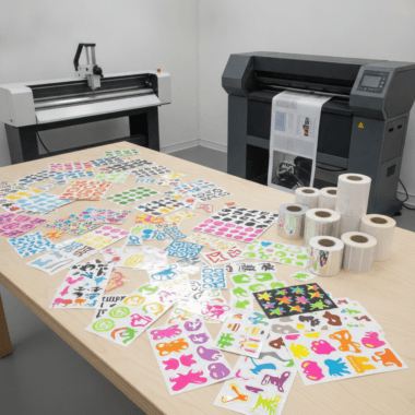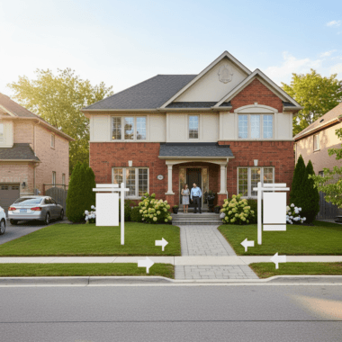

What to put on realtor business cards is the set of contact, branding, and trust elements that help prospects remember and reach you fast. Include your name, title, brokerage, license region, phone, email, website/QR, headshot, and service area. At 5004 Timberlea Blvd Unit#18, we print and finish cards the same day when timing matters.
By Top Realtor Sign & Print • Last updated: 2026-05-25

Summary
A high-performing real estate business card pairs clear contact info with brokerage-compliant branding, a scannable QR to your listings, and a professional headshot. Choose sturdy stocks and premium finishes to signal quality. Keep layout simple, legible, and on-brand to convert handshakes into listing appointments.
- Essentials: name, title, brokerage, direct phone, email, website/QR, headshot, service area
- Design specs: 3.5 × 2 in, CMYK, 300 DPI, 0.125 in bleed, 0.125 in safe zone
- Conversion cues: clear CTA, QR to active listings or Calendly-style booking
- Premium signals: soft-touch, raised spot UV, gold/silver foil, painted edges
- Local speed: same-day pickup available from our Mississauga location
What is a Realtor business card?
A Realtor business card is a compact, branded contact tool that communicates who you are, what market you serve, and how to reach you instantly. It blends brokerage-aligned visuals with scannable details (QR/URL) and trust signals (headshot, design quality) to turn introductions into callbacks.
A great card isn’t a mini brochure—it’s a credibility cue and a bridge to your digital presence. When you hand it over at an open house or community event, it should make calling or scanning feel effortless.
Core purpose
- Identification: Your name, title, and brokerage affirm authority.
- Navigation: A URL or QR guides prospects to listings and reviews.
- Memory trigger: A consistent headshot and color scheme aid recall.
Real-world example
Agents who pair a short call-to-action (e.g., “Tour new listings today”) with a QR linking to their active inventory make it easy to act on interest the moment it sparks.
To keep artwork consistent across your brand kit, see our design tips for Ontario real estate cards and align with your brokerage’s palette and logo rules.
Why Realtor cards still matter in 2026
Realtor cards still convert because they’re tangible, portable, and fast to share in offline moments—open houses, door knocking, and community events. A polished card signals professionalism, routes prospects to online listings, and reinforces brand memory when a conversation ends.
Paper is physical proof of presence. In our experience with agents across the GTA, the card’s finish and legibility often shape first impressions as much as the handshake. Keep fonts readable (minimum 8–9 pt for body text) and contrast high for easy scanning.
- Offline to online: A QR code linking to your listings or contact form reduces friction.
- Credibility: Quality stocks and finishes communicate reliability without saying a word.
- Follow-up velocity: Short CTAs (“Text me to see it today”) prompt immediate contact.
Want finishes that stand out without clutter? Explore our luxury card finishes guide for soft-touch, foil, and raised UV examples tailored to real estate branding.
Exactly what to put on Realtor business cards
Put only what helps prospects contact and trust you: name, title, brokerage, phone, email, website/QR, headshot, service area, and a concise call-to-action. Avoid clutter. Use one clear hierarchy so eyes land on your name and number first.
Must-haves (front)
- Your name and title: Use the professional title you advertise elsewhere for consistency.
- Brokerage and logo: Match approved colors and spacing; maintain minimum logo size for legibility.
- Direct phone: A number you actually answer; label it “call or text.”
- Email: Use a domain-based address when possible for credibility.
- Website or QR code: Drive to a mobile-friendly page with current listings or a lead form.
Should-haves (back)
- Headshot: Consistent with social profiles; neutral background; friendly, approachable framing.
- Service area: Neighborhoods or cities you specialize in; don’t list too many.
- Short CTA: One action line, such as “Book a private showing.”
- QR destination: Your listings hub, seller guide, or calendar for consultations.
Nice-to-haves (use sparingly)
- Social icons: Only if your profiles are active and professional.
- Languages: If you market in multiple languages, list them succinctly.
- Awards/certifications: Keep to one line—focus on what prospects value.
Need help prioritizing? Our ordering guide for luxury cards shows working layouts that keep the focus on your contact details and CTA.
Local pickup and geo context for Mississauga agents
For fast turnarounds near 5004 Timberlea Blvd Unit#18 in the Regional Municipality of Peel, design clean, brokerage-compliant cards and plan for same-day pickup. Keep a QR to your active listings so open house visitors can scan and save your info before they leave.
Speed matters when a hot listing hits the market. We routinely print and finish cards on accelerated timelines so you can stock your open house kits alongside directional signage and rider inserts without delay.
Local considerations for 5004 Timberlea Blvd Unit#18
- Plan pickup around traffic near Tomken Station East Platform A; build 15–20 minutes into your route for smoother scheduling.
- Spring and fall bring open house spikes; order an extra 100–250 cards so weekend events don’t run short.
- Hosting near Canadore College at Stanford Mississauga Campus? Emphasize transit access and walkability on your QR landing page.
Design specs that prevent reprints
Set files to 3.5 × 2 inches, CMYK, 300 DPI with 0.125-inch bleed and at least a 0.125-inch safe zone. Keep text above 8–9 pt, export as print-ready PDF, and ensure your QR tests from arm’s length under indoor lighting.
Production checklist
- Size: 3.5 × 2 in (North American standard) with 0.125 in bleed on all sides.
- Color mode: CMYK; avoid rich black for small text to prevent fuzziness.
- Resolution: 300 DPI minimum for photos and logos.
- Safe zone: Keep critical text at least 0.125 in from trimmed edges.
- QR sizing: At least 0.8–1.0 in square for dependable scans.
- Proofing: Print a one-off on your office printer to validate type size and contrast.
Finishing choices that communicate quality
- Soft-touch lamination: A smooth, matte feel that resists fingerprints.
- Raised spot UV: Glossy texture to highlight your name or logo.
- Gold/silver foil: Metallic accents for luxury positioning.
- Painted edges: A colored edge that ties into brokerage branding.
See how each option looks on real real estate cards in our painted edge overview and our finishes explainer. These tactile upgrades work especially well for listing presentations and investor meetings.
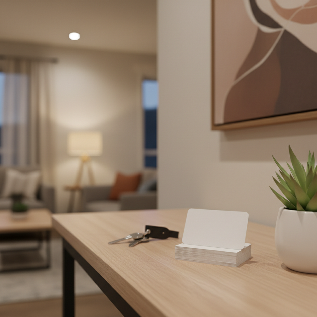
Layout that converts without clutter
Use a single, clear information hierarchy: name, role, brokerage, then the best contact method. Reserve the back for your headshot, CTA, and QR. High contrast, generous spacing, and one brand color accent beat dense blocks of tiny text.
Simple wireframe
- Top-left: Name (largest), title (smaller).
- Top-right: Brokerage logo sized for clarity.
- Center: Direct phone and email, generously spaced.
- Bottom: Website or QR with a one-line CTA.
Common mistakes to avoid
- Too many phone numbers or emails—choose the one you’ll monitor.
- Low-contrast type on textured backgrounds—hurts legibility.
- QR code pointing to a slow or outdated page—kills momentum.
Need a template to start fast? Our luxury card ordering guide includes starter layouts aligned with brokerage brand rules.
Must‑have vs. nice‑to‑have card elements
Prioritize essentials that drive contact—name, title, brokerage, phone, email, URL/QR—then add selective enhancers like a headshot and a short CTA. Avoid clutter by assigning each side a role: contact on the front, context on the back.
| Element | Must‑Have | Nice‑to‑Have | Notes |
|---|---|---|---|
| Name + Title | Yes | — | Make your name the largest text on the card. |
| Brokerage + Logo | Yes | — | Follow spacing and color rules in your brand kit. |
| Direct Phone | Yes | — | Label “call or text” if you accept texts. |
| Yes | — | Prefer a domain-based address to webmail. | |
| Website or QR | Yes | — | Point to listings or a lead form; test scans. |
| Headshot | — | Yes | Keep lighting consistent with your online profiles. |
| Service Area | — | Yes | List 2–4 areas; too many weakens focus. |
| CTA | — | Yes | One clear action like “Tour this weekend.” |
Premium finishes and when to use them
Use premium finishes to match positioning: raised spot UV for modern shine, foil for luxury, soft-touch for understated elegance, and painted edges for bold accents. Choose one hero finish so the design stays clean and legible.
- Raised spot UV: Highlight your name or logo; works well on dark, matte bases.
- Gold or silver foil: Luxury signal for higher-end listings or investor segments.
- Soft-touch: Tactile, low-glare feel that keeps fingerprints at bay.
- Painted edges: Eye-catching color that ties to brokerage branding.
Compare options and pairings in our 2026 finishes guide, or bundle cards with signs via our Realtor packages to keep brand consistency across print and signage.
How to build your card: from concept to pickup
Gather your essentials, choose a layout, apply finishes, and export a print-ready PDF. Test your QR, check margins, and plan your pickup window. Keep one decision per step to move from concept to handoff in under a day.
- Collect content: Name, title, brokerage files, phone, email, URL, headshot.
- Decide the hierarchy: What should prospects see first, second, third?
- Pick a finish: One tactile enhancement that matches your brand.
- Prep files: CMYK, 300 DPI, 0.125 in bleed; safe zone set.
- Proof + test: Print a home proof and scan the QR from arm’s length.
- Schedule pickup: Align with your open house timeline.
Prefer a guided path? Our in-browser online design tool workflow walks you from template to handoff, or our designers can adapt your brokerage kit for print precision.
Where your QR should point (and where it shouldn’t)
Point your QR to a fast, mobile-first page with current listings or a one-click contact form. Avoid generic homepages or slow links. Add a simple UTM code so you can see card-driven visits in analytics later.
- Best destinations: Active listings, seller guide, or a booking page.
- Avoid: Desktop-only pages, heavy sliders, or PDFs that load slowly.
- Testing: Scan under indoor and outdoor lighting; check email/phone clicks.
For a broader context on modern buyer flows and mobile behavior in real estate, see this mobile features checklist that many agents use to evaluate their digital touchpoints.
Case studies and real examples
Winning cards minimize decisions for the reader: one contact method, one CTA, and one path to listings. In fast markets, agents who streamline this path get responses sooner and avoid the “I’ll look you up later” drop-off.
Open house speed kit
A Mississauga agent needed cards for a weekend blitz. We printed soft-touch cards with raised UV on the name, added a QR to the listings hub, and synced pickup with directional sign printing. The uniform look across cards and Open House signs reinforced brand recall at every turn.
Investor networking
For a condo pre-sale event, an agent chose black stock with gold foil and painted edges to match a premium portfolio. The card doubled as a conversation starter while the QR fed visitors to a gated resources page with floor plans and appointment booking.
Team rebrand roll‑out
A small team standardized type, colors, and finishes across business cards, For Sale signs, and presentation folders. New cards launched first, followed by a staged signage refresh. The consistent system made every touchpoint feel deliberate and professional.
If you’re rebranding, consider packaging cards with signage via our Realtor packages overview so timelines and finishes stay coordinated.
Compliance, branding, and consistency
Keep cards consistent with your brokerage’s brand standards and local advertising rules. Use approved logos, required disclosures, and readable type. Consistency between your card, signs, and digital profiles reduces confusion and builds trust.
- Logo usage: Respect minimum sizes and clear space.
- Disclosures: Include any regulator-required identifiers from your region.
- Consistency: Match fonts and colors used on your signs and website.
For a bird’s-eye view on what today’s listings pages cover, agents sometimes review a general listings guide to align their card-to-digital journey. And when you message your value on cards, keep promises specific and verifiable; practical communication supports consumer trust principles similar to those discussed in this industry explainer.
Plan your next batch in minutes
Ready to refresh your cards? Send your files or start from a template, pick a finish, and schedule same-day pickup. We’ll proof fast and keep your brand consistent across cards, signs, and brochures.
Need help choosing between soft-touch, foil, or raised UV? Our team at 5004 Timberlea Blvd #18 can show real samples and align your choice with your farm area and listing strategy. If you’re expanding outreach, we can coordinate matching For Sale and Open House signage as well.
Tools, templates, and support
Use templates to reduce guesswork, then customize finishes for brand personality. If you’re short on time, a designer can adapt your brokerage kit into a print-accurate, QR-optimized layout and prep files for same-day production.
- Templates: Start from a proven layout and replace your details.
- Online editor: Customize designs in-browser without specialized software.
- Designer assist: Tight timelines? We’ll finalize files and color-manage photos.
To see what’s possible with tactile upgrades, browse our luxury finishes walkthrough. When you’re ready, align your business cards with your Open House kit and For Sale signage for a cohesive in-person experience.
FAQ: Realtor business cards
These quick answers cover the most common questions agents ask about content, design, and production timelines for real estate business cards in 2026.
What size are Realtor business cards?
In North America, the standard finished size is 3.5 × 2 inches. Set your document to CMYK at 300 DPI with a 0.125-inch bleed and keep text at least 0.125 inches from the trim for clean, accurate results.
Should I include a headshot on my card?
Yes if it supports recognition and trust. Use a professional, consistent photo that matches your online profiles. If space is tight, place the headshot on the back with your QR code and a short call-to-action.
Where should my QR code link?
Link to a fast, mobile-first page with current listings or a one-click contact form. Avoid generic homepages. Test the QR from arm’s length under indoor lighting to confirm reliable scanning.
What finish is best for real estate cards?
Match finish to positioning. Soft-touch feels refined and reduces glare, raised spot UV highlights names or logos, foil adds luxury, and painted edges create a bold accent. Choose one hero finish to keep designs clean.
Conclusion and next steps
Keep your card focused: one path to contact, one path to listings, and one premium signal that says “professional.” Prep files to spec, test your QR, and plan pickup around your open house calendar.
Key takeaways
- Show the essentials first: name, title, brokerage, phone, email, URL/QR.
- Use a simple hierarchy and high-contrast type for readability.
- Pick one finish—raised UV, foil, soft-touch, or painted edges—for impact.
- Point QR to a fast, mobile-first page with current listings or a booking form.
- Coordinate cards with signs for a consistent offline experience.
When you’re ready, stop by 5004 Timberlea Blvd #18 for samples, or start your design online and schedule pickup. We’ll help you align cards with your For Sale and Open House kits so every touchpoint feels intentional.