


Common mistakes with brochure printing are preventable setup and finishing errors that lead to dull color, fuzzy images, cracked folds, or misaligned panels. At Top Realtor Sign & Print, 5004 Timberlea Blvd Unit#18 in Mississauga, we eliminate these with expert preflight, clear templates, and on-the-spot guidance so your brochures print sharp, fold cleanly, and look on-brand.
By Ashwani — Top Realtor Sign & Print • Last updated: 2026-06-12
Quick Summary
To avoid wasted brochure prints, lock in four basics: CMYK color, 300 ppi images, 0.125 inch bleeds, and correct panel math for your fold. Export a press-ready PDF, request a proof when color matters, and plan finishing (scoring, folding, coating) early. This workflow prevents reprints and delays.
This complete guide focuses on practical fixes you can apply today. You’ll see where errors originate, how a pro shop prevents them, and how to proof with confidence.
- File setup essentials: bleed, safe margins, CMYK, fonts
- Fold types and panel math that actually align
- Proofing, finishing, and coating decisions
- Templates, checklists, and local pickup timing
- Mississauga-specific tips tied to our pickup location
What Is a Brochure Printing Mistake?
A brochure printing mistake is any preventable file, press, or finishing error that hurts readability or brand quality. Typical culprits include missing 0.125 inch bleeds, RGB color, low-resolution images, thin borders near trims, and incorrect panel widths that cause folds to creep or crack.
In practice, most problems trace back to setup. If bleeds, resolution, and color space are correct, you avoid the vast majority of issues long before paper meets press.
Typical mistakes we catch in preflight
- No bleed or too little bleed (needs 0.125 inch on all sides)
- RGB instead of CMYK (RGB prints dull; convert to CMYK)
- Low-resolution images (under 300 ppi at final size)
- Fonts not embedded (substitution shifts copy)
- Hairline borders (look lopsided after trim tolerances)
- Wrong panel widths for tri-fold, roll fold, or gate fold
Here’s the thing: the press is consistent. The variables are file setup and finishing. Get those right, and your brochures will look as good as your screen mockups.
Why Brochure Printing Quality Matters in Real Estate
Quality brochures reinforce trust at listings, showings, and events. Sharp photos, consistent brand colors, and clean folds make properties memorable and agents credible. Errors cost time, create reprints, and can derail open house weekends—when timing and presentation matter most.
For Realtors and local businesses, brochures are often your leave-behind story. They’re shared in lobbies, broker tours, and community events. If color looks off or folds crack down the main image, attention goes to quality flaws—not your message.
- Brand consistency: Lock brokerage colors, fonts, and spacing.
- Listing impact: High-contrast, color-accurate photos convert attention into showings.
- Event timing: Missed deadlines mean missed weekends. Reliable, press-ready files help you hit windows.
- Hand-off clarity: Floor plans, QR codes, and contact info must be crisp and scannable.
We align brochure work with your other collateral too—like flyers for handouts and presentation folders for listing packages—so everything matches at first glance.
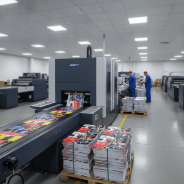
How the Print Workflow Prevents Errors (File to Finish)
A disciplined workflow—preflight, proof, print, finish—catches mistakes before they’re expensive. We verify CMYK color, 300 ppi images, 0.125 inch bleeds, embedded fonts, and correct panel math. Then we print, trim, score, and fold so panels align and creases don’t crack.
Think of this as a relay: each stage protects the next. If preflight passes, proofing is faster. If proofing is clean, finishing is predictable.
Process at a glance
| Stage | What we check | Common mistake avoided |
|---|---|---|
| Preflight | Bleed (0.125 in), CMYK, 300 ppi, fonts embedded | White slivers, dull color, fuzzy photos, font shifts |
| Proof | Color density, panel order, margins, copy accuracy | Wrong fold order, clipped text, typos |
| Registration, consistency, coating compatibility | Color drift, set-off, smudging | |
| Finish | Score, fold alignment, trim accuracy | Cracking at creases, misaligned panels |
- Plan finishing early: If heavy ink crosses a fold, request scoring to reduce cracking.
- Use press-ready PDFs: PDF/X exports keep color profiles and fonts stable.
- Proof decisively: One clean, consolidated round beats five partial edits.
When timing is tight, we coordinate proofs with same-day pickup so production keeps moving without sacrificing quality.
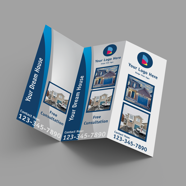
Brochure Folds, Sizes, and Panel Math
Different folds require different panel widths to avoid “creep.” On an 8.5 × 11 inch tri-fold, inside panels are often offset by ~0.01–0.02 inch. Heavy ink at creases needs scoring to avoid cracking. Planning panel math up front keeps folds flush and visuals aligned.
Folds aren’t just aesthetics; they’re geometry. The paper thickness, grain, and coating all influence how panels stack and how a fold behaves over time.
Popular formats we produce daily
- Half-fold (bi-fold): Two large panels; great for big photos and floor plans.
- Tri-fold: Six panels; classic for property highlights and a mail panel.
- Z-fold: Accordion style; ideal for step-by-step tours or maps.
- Gate fold: Dramatic reveal; use scoring and margin buffers.
- Roll fold: Nested panels; inner panels slightly narrower to prevent buckle.
Panel math tips that save reprints
- Keep safe margins at 0.125–0.25 inch inside trims and folds.
- If a line or photo crosses a fold, add a score and consider a coating that resists cracking.
- Avoid thin borders that rely on perfect trim; they magnify normal tolerances.
- For mail panels, confirm postal placement rules before finalizing artwork.
Need help choosing a format? Our brochure team can recommend folds, weights, and coatings based on your images and how you’ll distribute them with other marketing materials.
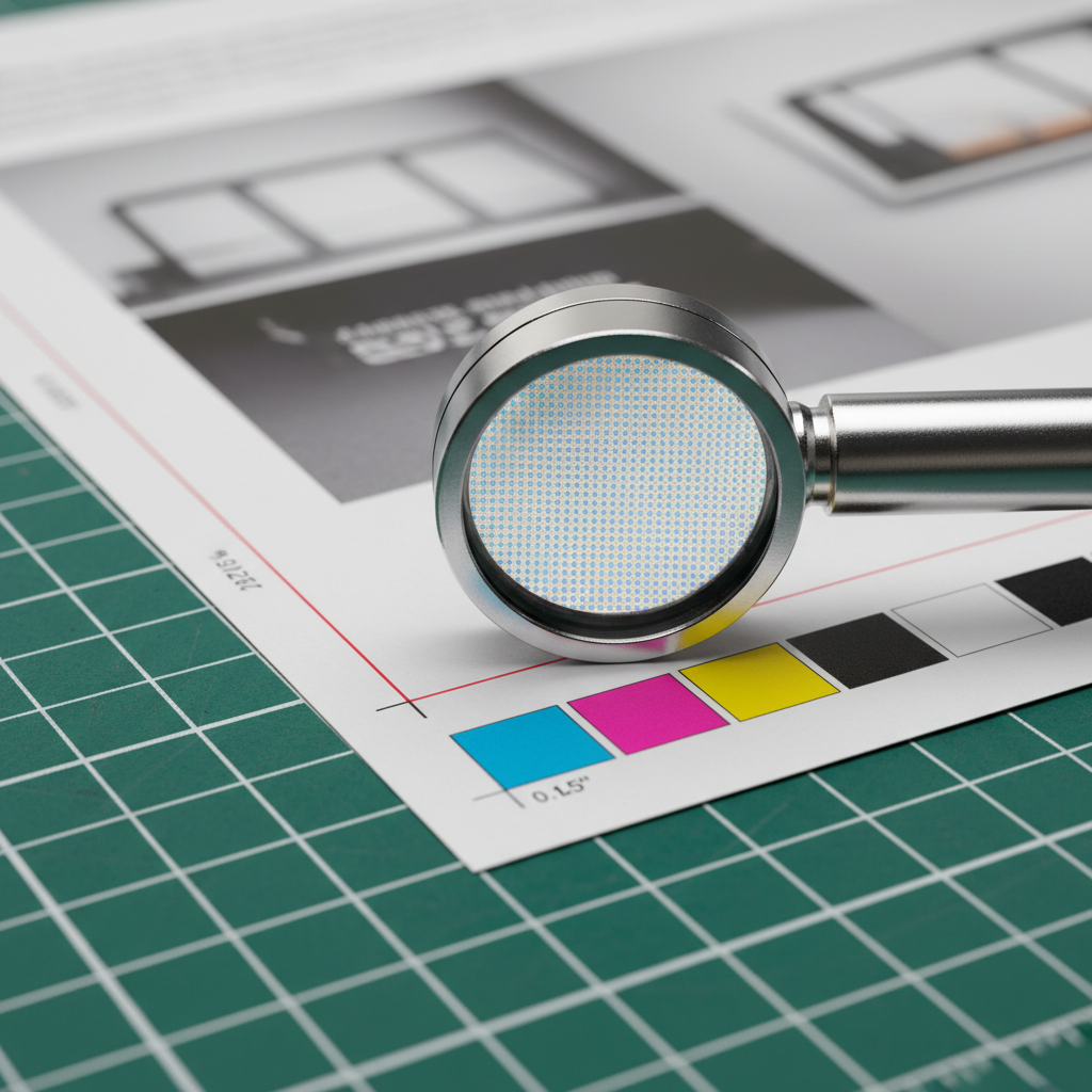
Design and File Setup: Best Practices
Set your brochures up for success: design in CMYK, use 300 ppi images, add 0.125 inch bleed, and keep text inside 0.125–0.25 inch safe margins. Embed or outline fonts and export a press-ready PDF. Avoid hairline borders and verify panel order before you send.
We’ve found that a consistent checklist cuts errors dramatically—especially across busy brokerages with multiple contributors.
Baseline file checklist
- Color: CMYK throughout; spot colors converted intentionally.
- Resolution: 300 ppi at final size; never upscale small images.
- Bleed: 0.125 inch on all sides for full-bleed designs.
- Safe area: Keep critical content 0.125–0.25 inch from trims and folds.
- Fonts: Embed or outline; avoid last-minute substitutions.
- Logos: Supply vector (SVG, AI, EPS) for crisp edges at any size.
- Export: PDF/X profile, no downsampling below 300 ppi.
Layout and readability pointers
- Use one clear hierarchy: headline, subhead, short body copy.
- Favor 10–12 pt body size for at-a-glance reading at showings.
- Limit typefaces to 2–3; align with brokerage brand guides.
- Test QR codes at actual size; keep quiet zones clean.
- Balance ink coverage near folds to reduce cracking risk.
Pair brochures with leave-behinds like postcards or neighborhood door hangers to reinforce your campaign message across channels.
Proofing, Finishing, and Quality Control
Proof your brochure like a pro: check panel order, trims, and color density on a calibrated proof. Plan finishing—score before folding, choose coatings that fit the design, and inspect final stacks for uniform alignment. A deliberate review prevents last-mile surprises.
Proofs are your final chance to validate assumptions before hundreds or thousands of pieces are produced. Treat them like gold.
Smart proofing steps
- Panel walk-through: Fold a printed proof and read it in order.
- Margin test: Confirm nothing clips at trims or creases.
- Color review: Compare to known brand swatches under neutral light.
- Functional test: Scan QR codes, confirm URLs and phone numbers.
Finishing choices that affect durability
- Scoring: Essential when heavy ink crosses a fold.
- Coatings: Gloss adds pop; matte reduces glare; soft touch adds tactile polish.
- Folding alignment: Check stack drift; minor shingling can indicate panel width tweaks are needed.
For color-critical photography, you can also review style inspiration from local branding resources like this professional real estate photography guide to plan images that reproduce cleanly in CMYK.

Tools, Templates, and Resources
Use templates sized for your fold, a preflight checklist, and an export preset for press-ready PDFs. Our team supports in-house design or a browser-based editor, so you can finalize fast and pick up locally without needing pro software.
In our experience, the right tools turn “rush” projects into routine ones. Standardize, and your error rate drops.
Practical resources you can use today
- Templates: Keep half-fold, tri-fold, z-fold, and gate fold templates handy.
- Checklists: File setup, proofing, and pickup handoff lists for every job.
- Export presets: PDF/X with CMYK profile and no downsampling below 300 ppi.
- Calibration: View proofs under neutral 5000K lighting to judge color consistently.
If you organize content with checklists, you’ll appreciate how repeatable your process becomes; see a parallel example in this bid preparation checklist that demonstrates the value of structured steps.
Local considerations for 5004 Timberlea Blvd Unit#18
- Plan pickups around area traffic; the Tomken Station East Platform A area can be busy during commute times—buffer your schedule when approving proofs and pickups.
- Spring and fall event seasons book fast. Lock your fold and paper early to keep same-day options realistic during peak weekends.
- Outdoor brochure handoffs at nearby Red Brush Park? Choose coatings that resist smudges and fingerprints.
Want a broader campaign? Pair brochures with same-day flyers and coordinated marketing materials.
Case Insights: Mississauga Agents and Local Businesses
Serving 5004 Timberlea Blvd Unit#18 in the Regional Municipality of Peel, we fix real-world brochure issues daily—from RGB artwork that prints dull to tri-fold panels that creep. With quick proofs and in-house design help, we tune files so prints look vibrant and folds land flush.
Here are a few anonymized examples that mirror common scenarios.
RGB to CMYK rescue
- Situation: A listing brochure arrived in RGB; proofs looked muted.
- Fix: Converted to CMYK, adjusted saturation curves, and soft-proofed.
- Result: Richer property photos and brand reds that matched signage.
Panel creep on tri-fold
- Situation: The mail panel overlapped a headline after folding.
- Fix: Narrowed inner panel by ~0.02 inch; added a score across heavy ink.
- Result: Flush folds; no headline clipping.
Cracked crease across hero image
- Situation: Dense ink crossed a fold on matte stock.
- Fix: Introduced scoring and a different coating to reduce cracking.
- Result: Smooth fold with image integrity preserved.
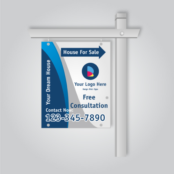
Planning a neighborhood blitz? Pair your brochures with open house collateral and remember that “what is a rider sign used for” often comes up in yard-sign strategy—riders can carry QR codes that link back to the brochure’s digital version.
For timing around major property pushes, you can also skim local timelines like this Mississauga home-buying checklist to anticipate peaks when you’ll want brochures on hand.
Frequently Asked Questions
Brochure success comes down to setup, proofing, and finishing. Use CMYK, 300 ppi images, 0.125 inch bleeds, and safe margins. Export a press-ready PDF, request a proof for color-critical work, and score folds that cross heavy ink. The result: consistent, professional brochures.
What resolution should brochure photos be?
Use 300 ppi at final print size. If you scale images larger, effective resolution drops and details look soft. Avoid upscaling small web images. For logos or line art, provide vector files so edges remain crisp at any size.
How much bleed and safe margin do I need?
Add 0.125 inch bleed on all sides for full-bleed designs. Keep text and key elements 0.125–0.25 inch inside the trim and folds. This buffer accounts for normal trim tolerances and keeps thin borders from looking uneven.
Should I design in RGB or CMYK?
Design and export in CMYK for print. RGB files can print dull or shift unexpectedly. If your assets start in RGB, convert to CMYK and review a printed proof to validate color, especially for brand-critical hues and skin tones.
Which brochure fold works best for real estate?
Tri-folds are versatile and mail-friendly. Half-folds showcase large photos or floor plans. Gate folds create drama for luxury listings. Match the fold to your content volume and how the brochure will be handed out or mailed.
When should I request a printed proof?
Request a printed proof for color-critical projects, complex folds, or new paper/coating combinations. It’s the fastest way to confirm panel order, margins, and color density before committing to full production—especially on tight event timelines.
Key Takeaways
Most brochure issues are preventable with a disciplined setup and proofing routine. Use CMYK, 300 ppi, 0.125 inch bleeds, and fold-aware layouts. Plan finishing early, proof once decisively, and coordinate pickup windows. This is how you avoid reprints and rushed fixes.
- Four setup pillars: CMYK, 300 ppi, bleed, safe margins
- Panel math and scoring prevent fold creep and cracking
- Press-ready PDFs and decisive proofs save time
- Coordinate pickups with local traffic and event peaks
Conclusion and Next Steps
Avoiding brochure mistakes is about systems. Standardize templates and checklists, export press-ready PDFs, and proof with intention. When timelines compress, work with a local shop that can preflight and finish quickly without sacrificing quality.
If you’re gearing up for listings or events, we can help you finalize files or design from scratch. Explore our brochure options, coordinate with flyers, and plan a pickup that fits your schedule.
Mid-article CTA: Need a second set of eyes on your file? Ask our team for a preflight check and proof. We’ll flag risks before you print, and align brochure work with your marketing materials so everything matches on the table.