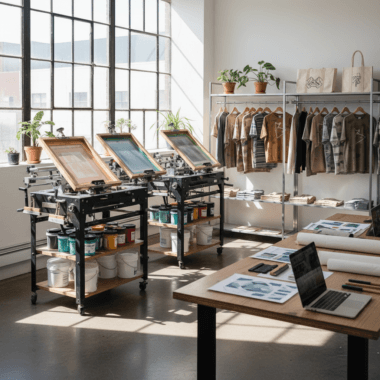


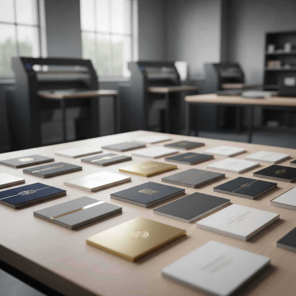
Luxury business card finishes explained: these are premium surface treatments—like soft touch lamination, raised spot UV, hot foil, and painted edges—that add tactile feel, shine, and color accents to thick card stocks. At 5004 Timberlea Blvd Unit#18 in Mississauga, we produce these upgrades in-house so Realtors can pick up the same day on select options.
By Ashwani • Last updated: 2026-05-11
Above-the-Fold Overview
Luxury card finishes elevate first impressions through texture, shine, and edge detail. This guide shows how soft touch, raised spot UV, foil, and painted edges work, when to use each, and how to order locally for fast pickup in Mississauga—so your card matches the caliber of your brand.
Here’s the thing: your business card is often the only physical brand asset a client keeps. The finish you choose signals quality in seconds. We built this guide for Ontario Realtors and local businesses who need a practical, no-fluff playbook that turns design choices into real-world impact.
- What each premium finish is—and what it looks and feels like
- When to pick soft touch vs. foil vs. raised spot UV vs. painted edges
- Ordering tips for quick-turn pickup in Mississauga
- Pro specs on stock thickness, lamination, and durability
- Real estate use cases: listing appointments, open houses, and luxury showings
Quick Summary
Choose soft touch for a velvety feel, raised spot UV for tactile gloss on highlights, foil for metallic shine, and painted edges for bold color accents. Pair finishes with 16–18pt cards and clean layouts. Local pickup near the Regional Municipality of Peel keeps timelines tight for time-sensitive listings.
Short on time? Use this at-a-glance plan and you’ll be 90% of the way there.
- Soft touch: Matte, velvety coating that resists fingerprints and feels premium.
- Raised spot UV: Clear gloss only where you want emphasis—logos, names, icons.
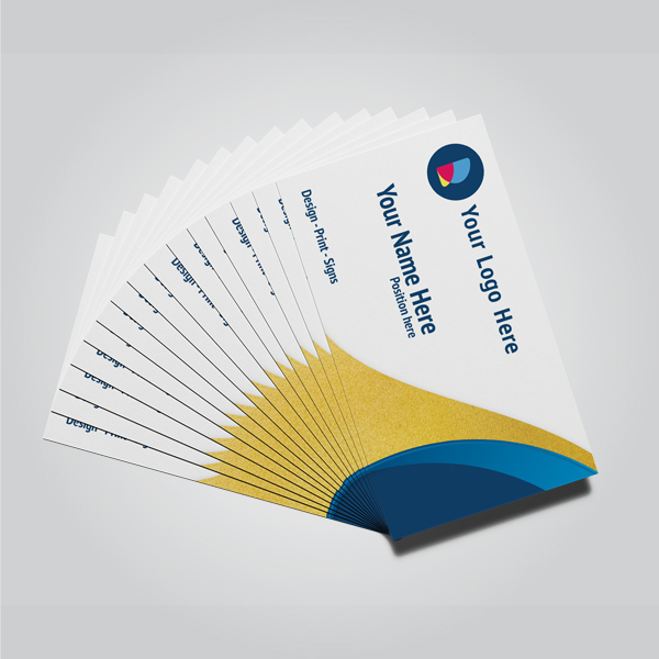
- Foil (gold/silver): Bright metallic accents for luxury brands and high-end listings.
- Painted edges: Bold color on card sides; stands out in a stack.
- Stock: 16–18pt is a strong everyday choice for rigidity and longevity.
Local considerations for 5004 Timberlea Blvd Unit#18
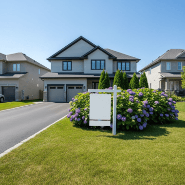
- For weekend open houses near Stanford International College, plan pickup a day early so you’re not rushing before showings.
- Winter slush can scuff cards during travel; soft touch lamination helps resist marks in transit.
- For large team drops at offices around the Regional Municipality of Peel, request banded stacks by route to speed distribution.
What Are Luxury Business Card Finishes?
Luxury business card finishes are premium treatments that change how a card feels, reflects light, and endures handling. Common options include soft touch lamination, raised spot UV, metallic foil stamping, and painted edges—each adding sensory cues of quality that standard matte or gloss alone can’t convey.
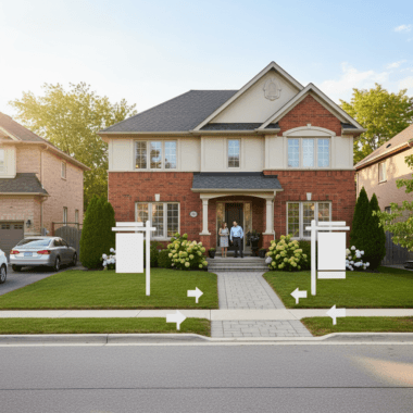
When people say “premium cards,” they usually mean two things: thicker stock and upgraded finishing. Finishes reshape perception immediately—before anyone reads your title. For real estate professionals, that split-second advantage matters at open houses, listing presentations, and networking events where stacks of cards all compete for attention.
- Soft touch lamination: Creates a velvet-matte surface and dampens glare, elevating perceived value.
- Raised spot UV: Applies glossy, tactile clear coating to selected design elements.
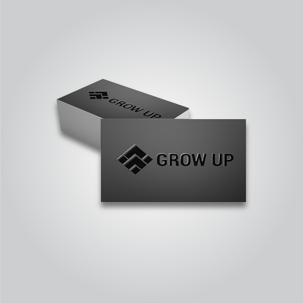
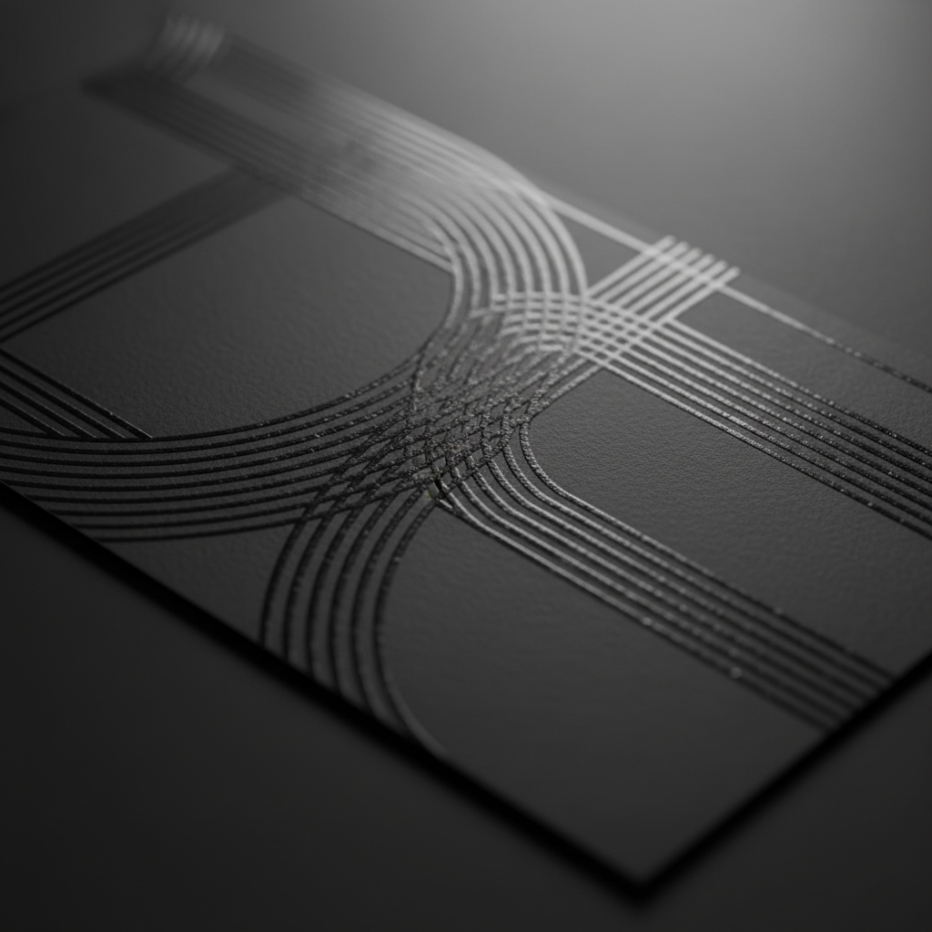
- Hot foil (gold/silver): Stamps reflective metallic foil for high-contrast shine.
- Painted edges: Colors the sides of the card for an unexpected pop in a stack.
In our experience with Ontario Realtors, even subtle finishing—like a soft touch base plus one high-impact accent—can lift recall at networking events. The best results come from pairing finishes with purpose, not piling them on.
Why Finishes Matter in Real Estate
Finishes matter because they communicate trust, care, and market position fast. Texture and shine influence how prospects remember you, how long they keep your card, and whether they associate you with premium listings—especially in competitive real estate markets.
Real estate is tactile. Clients tour properties, touch materials, and compare quality by feel. Your card participates in that same judgment. A velvety soft touch surface or raised gloss logo delivers a micro “wow” that generic cards can’t. We’ve seen agents report higher call-back rates after sharing upgraded cards during open houses and broker tours.
- Signal fit for luxury listings: Metallic foil or crisp raised UV conveys polish suited to high-end homes.
- Boost memorability: Tactile differences increase how long recipients hold and examine cards.
- Reinforce brokerage standards: Premium finishes honor strict brand guidelines with clean reproduction.
- Protect against wear: Laminations reduce scuffs as cards move between wallets and countertop displays.
Here’s why this matters day to day: open house tables often collect dozens of cards. The one with painted edges or a foil crest stands out visually from six feet away. That tiny edge may be the difference between a quick glance and a real conversation.
How These Finishes Are Made (Plain-English)
Soft touch and matte/gloss are laminations applied after printing. Raised spot UV is a clear, high-build coating jetted only on chosen areas. Hot foil uses heat and pressure to transfer metallic film to paper. Painted edges add color to trimmed card sides after cutting.
Understanding the process helps you design smarter and avoid production hiccups.
Soft touch and laminations
- Printed cards are laminated with a thin film for protection and feel.
- Soft touch gives a velvety matte, while gloss maximizes shine and contrast.
- Lamination reduces fingerprinting and adds rigidity without changing your colors.
Raised spot UV
- Clear, glossy varnish is digitally applied only to selected areas (e.g., logos).
- It cures to a tactile height you can feel; line widths and spacing matter for clean edges.
- Under soft touch, the contrast between matte base and glossy highlights is striking.
Hot foil stamping
- A heated die transfers metallic film (gold/silver) to the card with pressure.
- Solid shapes and larger type foil best; ultra-fine detail can break up on textured papers.
- Foil looks extra crisp over smooth, laminated bases.
Painted edges
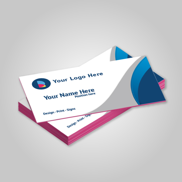
- After trimming, color is applied to the card edges for a bold accent.
- Works best with thicker stocks where the edge color is more visible.
- Pairs well with minimalist front/back designs to keep focus on the color pop.
If you love precise specs and production notes, our business cards category lists supported finishes, typical stocks, and recommended design practices for smooth runs.
Types of Luxury Finishes Explained
The main luxury finishes we offer are soft touch, raised spot UV, gold/silver foil, and painted edges. Each has a distinct visual and tactile effect. Combine one base (usually soft touch) with a single accent (UV or foil) for modern, high-contrast cards that photograph well and feel premium.
Below are the core options Ontario agents order most—and why.
Soft touch lamination
- Effect: Velvet-matte feel, low glare, refined look in photos.
- Best for: Luxury branding, dark palettes, portrait headshots, muted color schemes.
- Design tip: Increase contrast slightly; matte surfaces soften low-contrast designs.
- Order it: Soft touch, matte & glossy options.
Raised spot UV
- Effect: Glossy, tactile highlights only where you choose.
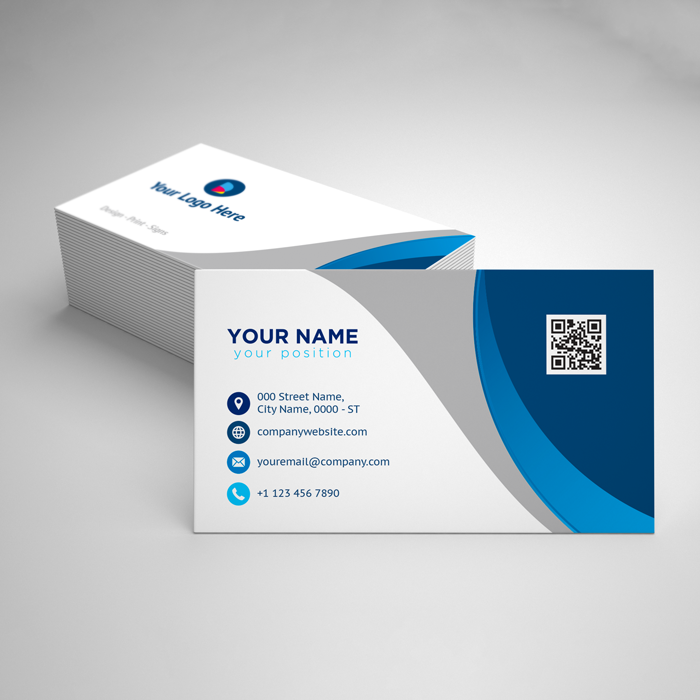
- Best for: Logos, names, iconography, pattern overlays, QR codes with breathing room.
- Design tip: Keep lines ≥0.5 pt and avoid stacking tiny details too close.
- Order it: Raised spot UV cards.
Gold and silver foil
- Effect: Reflective metallic shine with luxe depth.
- Best for: Premium listings, brokerage crests, monograms, luxury market positioning.
- Design tip: Favor bold shapes; avoid ultra-fine scripts below small sizes.
- Order it: Foil-enhanced cards.
Painted edges
- Effect: Bold color stripe visible in a stack.
- Best for: Brand-color emphasis, minimal layouts, event networking.
- Design tip: Let the edge do the shouting—keep faces clean.
- Order it: Painted edge cards.
Design Rules That Prevent Issues
Keep type above 6–7 pt on soft touch, give raised spot UV at least 0.5 pt line weight, and reserve foil for bold shapes. Add 1/8 inch bleed, and stay 1/8 inch from edges for live elements. These basics avoid cracking, fill-in, and trimming headaches.
We want your file to print clean on the first pass. These guidelines stop the usual pitfalls we see in prepress.
- Bleed and safe zones: 0.125 in bleed; keep logos/text 0.125 in from edges.
- Raised spot UV: 0.5 pt minimum lines; expand tiny paths so they don’t drop out.
- Foil stamping: Prefer solid shapes; thin hairlines can break under pressure.
- Soft touch base: Boost contrast and sharpness a touch to counter matte diffusion.
- Edge paint: Choose high-contrast hues (brand red, yellow, or black) to maximize visibility.
Good news: if you’re not using pro software, our business card templates and browser-based editor make bleeds and finish layers simple. We can also review files before production.
Finish Comparisons and Smart Pairings
For modern, durable cards: use soft touch as your base and add one accent—either raised spot UV for subtle texture or foil for bold shine. Painted edges pair best with minimalist layouts and thicker stocks. Avoid stacking multiple flashy accents on dense designs.
Use this quick reference when you’re deciding between finishes.
| Finish | Look & Feel | Best Use | Design Watchouts | Pairs Well With |
|---|---|---|---|---|
| Soft touch | Velvet-matte, low glare | Luxury branding, dark palettes | Low-contrast art can soften too much | Raised spot UV |
| Raised spot UV | Tactile gloss highlights | Logos, names, patterns | Lines below 0.5 pt may fill in | Soft touch base |
| Gold/Silver foil | Reflective metallic shine | Premium marks, monograms | Hairlines can crack or flake | Soft touch base |
| Painted edges | Bold side color | Minimal layouts, brand pop | Less visible on thin stocks | Thick 16–18pt |
Want help matching finishes to your brand book? See our ordering guide for Realtor-specific examples and file prep.
Best Practices for Realtors and Local Pros
Pick one accent finish, keep layouts clean, and use thicker stock. Align to brokerage colors, add a scannable QR code with breathing room, and test-print a small batch before a major event. Local pickup in Mississauga helps you iterate quickly before big listing weekends.
Over the last few seasons, we’ve noticed what consistently works for real estate teams across Ontario.
- One finish, one focus: Let either the foil or the raised UV lead.
- Readable contact area: Keep essential info on a matte base without heavy overlays.
- Edge color for memorability: A painted brand-color stripe separates your stack from generic cards.
- QR code spacing: Minimum 0.25 in empty space around it improves scans at showings.
- Consistency: Match signage (For Sale, Open House, riders) for cohesive presence.
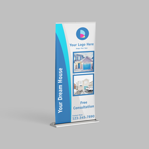
Need cohesion across signs and print? Our Realtor packages bundle business cards with core signage so your finish choices carry from pocket to property.
Tools and Resources (Design, Inspiration, Workflow)
Use our browser-based editor for bleeds and finish layers, keep brand assets handy, and save a reusable template for fast reorders. Inspiration boards, color swatches, and local pickup windows help teams move from idea to cards in days—not weeks.
Mini Case Studies and Real Examples
Small changes to finish selection create outsized impact. Soft touch plus raised UV on the logo increases tactile interest; painted edges make stacks pop; foil on a crest signals luxury listings. Local pickup lets teams test variations before a busy open house weekend.
Example 1: Listing appointment leave-behind
- Agent needed a luxe but understated card for executive relocations.
- We used soft touch base, raised UV on initials, and 18pt stock for heft.
- Reports from the field: prospects lingered on the logo texture during meetings.
Example 2: Open house networking
- Team wanted visibility in a bowl of cards at the entry table.
- We added black painted edges on white minimalist cards.
- Outcome: the edge stripe drew eyes across the room and sparked conversations.
Example 3: Luxury waterfront focus
- Agent specialized in high-end listings and needed to signal that fast.
- We applied silver foil to the brokerage crest over a soft touch base.
- Impact: immediate “premium” read that aligned with marketing photos and signage.

How to Choose Your Finish (Step-by-Step)
Start with brand tone, pick a base (soft touch for matte or gloss for shine), choose one accent (raised UV or foil), and finalize stock thickness. Order a small run, test in the field, then scale. Local pickup accelerates iteration between open houses and listing meetings.
- Define the vibe: Modern matte or classic shine? Choose soft touch for matte luxury; gloss for punchy color.
- Pick one accent: Raised spot UV for texture, or foil for shine. Avoid doubling accents on dense art.
- Confirm stock: 16–18pt is sturdy; heavier stocks amplify edge paint.
- Prep files: Add bleeds, separate finish layers, and keep safe margins.
- Field test: Share a dozen at a networking event and observe reactions.
- Fine-tune: Adjust contrast or accent size based on feedback.
Prefer a done-for-you path? Our luxury card ordering guide walks you through templates, proofs, and finish combinations that match common Realtor brand systems.
Durability and Care
Laminations protect against scuffs and moisture. Soft touch resists fingerprints; gloss resists abrasion. Store cards in hard cases, avoid overstuffed wallets that bend corners, and keep a fresh stack in your open house kit to present pristine cards every time.
Your card endures car rides, jacket pockets, and countertop displays. A few habits extend life and preserve that premium look.
- Use lamination: Soft touch or gloss reduces scuffing from keys and bags.
- Protect corners: Card cases stop bent edges in day-to-day carry.
- Refresh often: Replace display stacks weekly during peak season to avoid dull edges.
For field kits, we recommend storing banded stacks by neighborhood and property type. It speeds handoffs and keeps the best-looking cards at the ready for luxury showings.
Common Mistakes to Avoid
Don’t combine too many accents, crowd small text under glossy coatings, or ignore bleed and safe zones. Keep QR codes scannable with clear margins, and avoid ultra-thin foil scripts. Minimal, spacious layouts consistently print better and look more expensive.
- Too many finishes: One accent is punchy; two can feel chaotic on small canvases.
- Tiny text under UV: Gloss can reduce readability if it crosses thin copy.
- No bleed: Trimming variances can expose white slivers without proper setup.
- Busy backs: Painted edges or foil need breathing room to shine.
If you’re unsure, send us your artwork. We’ll flag risks before production and suggest small tweaks that make a big visual difference.
Workflow for Fast Local Pickup in Mississauga
Upload artwork, pick finishes, request a proof, and choose local pickup at 5004 Timberlea Blvd #18. We’ll confirm specs and timing. This streamlined flow gets premium cards into your hands quickly—ideal before a busy weekend of open houses across the Regional Municipality of Peel.
Time is tight before listings go live. A simple, reliable process keeps stress off your plate.
- Choose your product: Start in the business cards section and select finishes.
- Design or upload: Use the browser editor or attach print-ready files.
- Proof: Approve layout, finish overlays, and edge paint color if selected.
- Pickup: Select local pickup; we’ll message you when your order is ready.
- Iterate: Test, gather feedback, and reorder in minutes using saved templates.
FAQs: Luxury Business Card Finishes Explained
Most buyers ask how finishes feel, which options pair best, and whether premium cards hold up in real-world use. The short answers: soft touch feels velvety, raised UV adds texture, foil shines, and painted edges pop. Combine one accent with a matte base for a clean, modern result.
Which finish should I choose for luxury listings?
Use soft touch as a matte base for a refined feel, then add either raised spot UV to highlight your logo or silver/gold foil for a bold luxury signal. Keep layouts clean and avoid piling on multiple accents. This combo photographs well for social posts and listing presentations.
Will raised spot UV affect readability?
Raised spot UV is best on logos, icons, or headings—not tiny body text. Keep small contact details on a matte surface for clarity. Give the coating at least 0.5 pt line width and spacing so it cures cleanly without filling in fine details.
Do painted edges work on thinner cards?
Painted edges show best on thicker stocks where the edge area is more visible. If you prefer a thinner card, consider a bold front/back design instead, or upgrade to a heavier stock to maximize the edge color impact in a stack.
Can I design these finishes without pro software?
Yes. Use our browser-based editor and templates. They include proper bleeds and separate layers for finishes. If you have artwork ready, we’ll review files to ensure raised UV and foil areas output cleanly before production.
How do I keep cards looking new in my bag or car?
Store cards in a rigid case, use lamination (soft touch or gloss) for protection, and refresh your stack often. Avoid overstuffed wallets that bend corners. Keep a clean bundle in your open house kit so every handoff looks intentional.
Get Expert Help Choosing Your Finish
Unsure which finish fits your brand? Share your logo and color palette. We’ll recommend a soft touch base and one accent (raised UV or foil) that photographs well and feels right at handoff—ready for pickup at 5004 Timberlea Blvd #18 in Mississauga.
Want design support, file checks, or a second opinion on pairings? We’re here to help. Explore options like foil-enhanced cards, raised spot UV, and painted edges—then choose local pickup.
Inspiration and Style Alignment
Match your card’s finish to the properties you sell and the experiences you stage. Study environments, textures, and lighting you want to evoke. Align shine (foil), texture (raised UV), and mood (soft touch) with your listing photos and signage for a cohesive brand story.
If you curate moody interiors, a soft touch base with a subtle raised pattern might fit. If your brand leans classic and bright, foil crest + clean serif type wins. For lifestyle-driven teams, consider edge paint in your primary brand color to echo your yard signs and riders.
You can also browse lifestyle references—like luxe venue imagery or decor finish comparisons—to get a feel for how matte vs. gloss reads in the wild. A quick scan of finish craftsmanship examples or venue galleries can sharpen your eye for contrast and reflection.
Key Takeaways
Use soft touch as a premium base, add one accent (raised UV or foil), and consider painted edges for stack visibility. Keep designs clean, respect bleed and safe zones, and test in the field. Local pickup in Mississauga helps you iterate fast before big listing weekends.
- One accent finish beats three competing effects.
- Thicker stocks show edge paint best and feel more premium.
- Raised UV belongs on bold shapes, not tiny text.
- Soft touch reduces fingerprints and photographs beautifully.
- Save a reusable template to reorder in minutes.
Ready to see options in person? Stop by 5004 Timberlea Blvd #18 for samples, or start an order in our business cards section. We’ll guide you from logo to luxury finish.