


Presentation folders for brokerage branding are custom 9×12 folders that package listings, disclosures, and marketing pieces under one, unified brand. At our 5004 Timberlea Blvd Unit#18 shop, we produce folders that match your brokerage colors and standards, with business card slits and sturdy pockets—ready for same-day pickup on key items that support your folders.
By Ashwani — Top Realtor Sign & Print
Last updated: 2026-05-13
Quick Summary and Table of Contents
This guide shows brokerages how to spec, design, order, and deploy presentation folders for brokerage branding. You’ll see finishes that last, insert stacks that sell, and a repeatable process that keeps multiple offices on-brand while saving time.
- Overview — purpose, size, and durability
- What is a brokerage folder? — definition and parts
- Why it matters — trust, recall, and speed
- Where it fits — use cases and insert mapping
- Types & finishes — stock, coatings, and accents
- Design rules — brand compliance checklist
- Production specs — file prep and pocket capacity
- Bundle smart — flyers, cards, signs
- Local pickup — Mississauga operations
- Tools & resources — templates and workflows
- Step-by-step — concept to handoff
- Comparison — match style to audience
- Case studies — real-world rollouts
- Budget & scope — planning without prices
- FAQ — sizes, coatings, brand control
- Key takeaways — quick recap
- Conclusion — next steps to get started
Overview: Brokerage presentation folders at a glance
Brokerage presentation folders organize property packets, protect documents, and reinforce brand trust at every handoff. Choose durable 9×12 folders with left/right pockets, business card slits, and coatings that resist scuffs. Align colors, typography, and logo placement to your brokerage style guide for a polished, consistent client experience.
Great folders do three jobs at once: they carry everything buyers or sellers need, they look premium, and they keep your brand consistent. That consistency keeps each agent aligned while speeding up daily work like listing presentations and offer packets. Well-specified presentation folders for brokerage branding also scale across offices with minimal retraining.
At a Glance
- Purpose: Package listings, disclosures, comps, and marketing leave-behinds in one branded piece.
- Standard size: 9×12 inches with two pockets; fits letter-size documents cleanly.
- Durability: 14–16pt cover stocks with gloss, matte, or soft touch lamination minimize wear.
- Brand alignment: Color-matched inks and precise logo placement standardize broker visuals.
- Capacity: Pockets typically hold 30–50 sheets of 20lb paper without bulging.
- Speed: Local production in Mississauga with quick pickup coordinates with time-sensitive listings.
What are presentation folders for brokerage branding?
Presentation folders for brokerage branding are custom-printed folders that standardize how a real estate brokerage packages and presents documents. They match brand colors, fonts, and logos, and include pockets plus business card slits to carry listing sheets, contracts, and marketing collateral professionally.
In real estate, the folder is the “first impression you leave behind.” It travels from listing appointment to office, then to the kitchen table where decisions happen. When the folder, business card, and print pieces echo the same brand rules, your brokerage looks organized and trustworthy. For teams we support, presentation folders for brokerage branding unify dozens of small visual choices into a single, reliable system.
- Core components: 9×12 folder body, twin pockets (often 4-inch), card slits, spine score, and durable coating.
- Inside capacity: Typical pockets hold about 30–50 sheets of 20lb paper without bulging.
- Brand elements: Approved colors, logo clear space, and consistent typography for every office and agent.
- Where we help: We print, finish, and coordinate matching presentation folders plus all the inserts.
Why presentation folders matter for brokerages
Presentation folders matter because they create an instant trust signal and reduce friction in sales conversations. A uniform, well-built folder helps agents stay organized, improves recall at home, and strengthens brand recognition across offices and teams.
Here’s the thing—buyers and sellers compare you to the last agent they met. A sturdy, beautiful folder with well-ordered inserts says, “We’re organized.” That message supports your value story before the meeting even starts. Across busy seasons, repeating the same presentation folders for brokerage branding cuts prep time and keeps conversations focused on value, not loose paperwork.
- Brand equity: Repetition of color, logo, and layout primes recognition and trust.
- Clarity: Pockets separate disclosures from marketing so clients can find what they need fast.
- Durability: Soft touch or matte lamination resists fingerprints; gloss pops photography.
- Scalability: One spec works for every agent, cutting rework and variant creep.
- Retention: Folders stick around in households—keeping your brand on the counter while decisions are made.
In our experience with Ontario brokerages, standardizing a single folder spec speeds new-agent onboarding and lowers design churn. Teams spend less time reinventing collateral and more time prospecting. The result: smoother meetings and consistent brand delivery across 10, 50, or even 100+ agents.
How presentation folders fit your sales process
Map folders to the moments that matter: listing consultations, open houses, offer packets, and new-client onboarding. Build a consistent insert set so every agent delivers the same story, in the same order, every time.
Folders aren’t a one-off print; they’re a workflow tool. When the structure repeats, agents remember what to include and clients know what to expect. Most brokerages succeed with 5–7 inserts plus a single-page “About Our Process” that orients the reader in under 30 seconds.
Recommended folder use cases
- Listing consultation: CMA summary, marketing plan, testimonial one-pager, agent card in front pocket.
- Open house kit: Feature sheet, neighborhood map, financing tips, disclosure in separate pocket.
- Buyer onboarding: Process timeline, agency forms, inspection checklist, mortgage contact sheet.
- Offer packet: Signed forms on left, contingencies and comps on right; card up front for quick contact.
We bundle matching inserts—feature flyers, folders, and business cards—so every touchpoint aligns without extra design cycles. For event days, keep a pre-packed box of 25 folders, 100 flyers, and 50 postcards ready to deploy.
Types of presentation folders and premium finishes
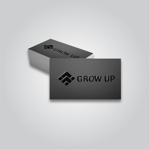
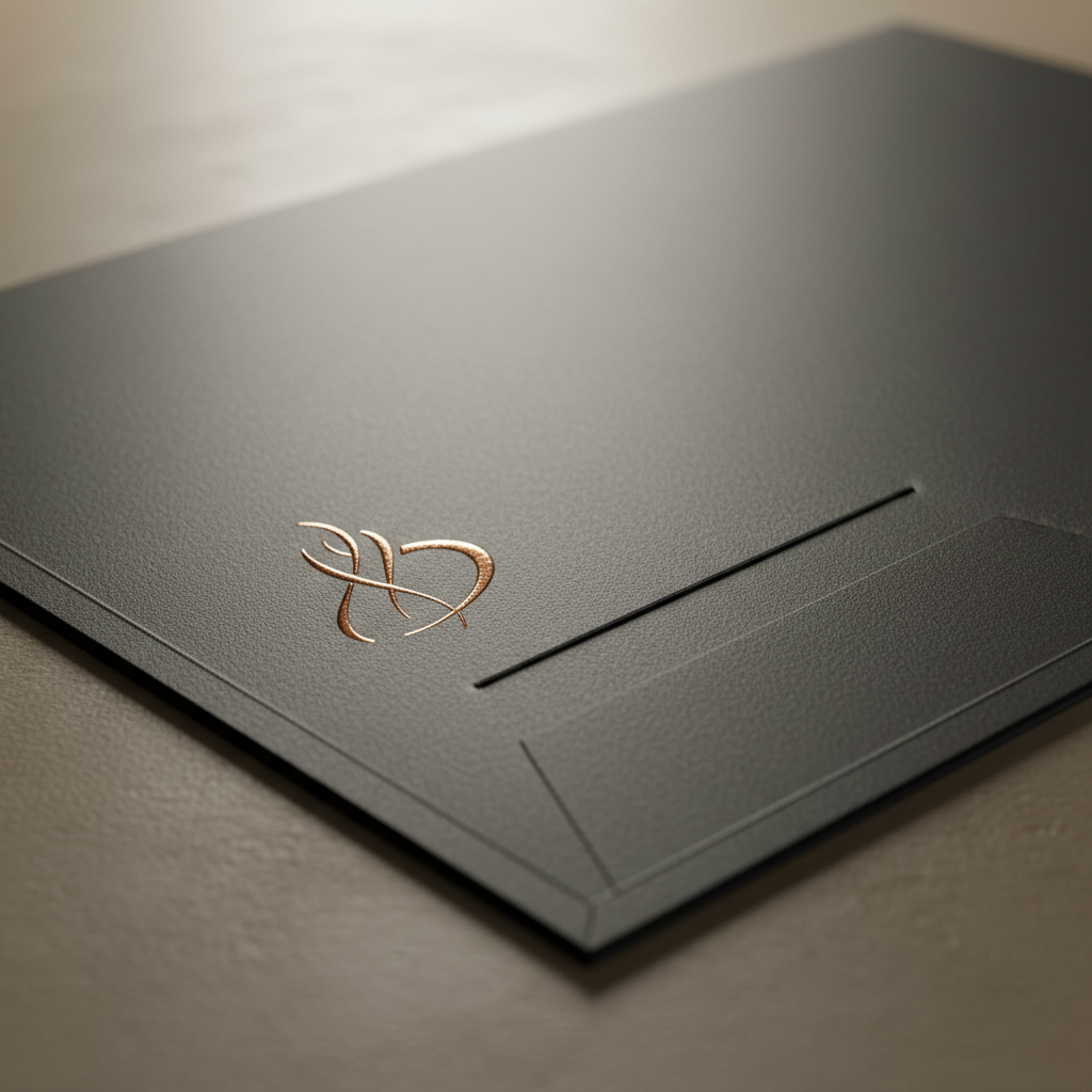
Choose a 9×12, two-pocket folder as your standard, then add a finish that fits your brand: gloss for vivid photos, matte for muted elegance, or soft touch for a velvet feel. Premium accents like raised spot UV or foil elevate luxury positioning.
Material choices affect both feel and longevity. A brokerage targeting luxury listings benefits from tactile finishes that make photography and branding pop—without sacrificing durability in the field. For high-traffic use, matte and soft touch show fewer fingerprints than high-gloss while still delivering deep color at 300 DPI.
- Stocks: 14pt–16pt cover stocks hold shape; heavier stocks resist corner wear.
- Coatings:
- Gloss: Bright, high-contrast; best for image-driven covers.
- Matte: Glare-free, modern; hides minor scuffs better than gloss.
- Soft touch: Velvet-like; pairs well with foil or raised UV for contrast.
- Accents:
- Raised spot UV: Tactile gloss on logos or headlines to guide the eye.
- Gold/Silver foil: Metallic pop for premium brands; complements minimal covers.
- Deboss/emboss: Pressed effects for subtle texture (cover area planning required).
- Pockets & slits: Specify left and right pockets with business card slits (horizontal or vertical).
We coordinate finishes to match your broader set: raised spot UV on the folder, the same gloss effect on luxury business cards, and a soft touch laminate across both to tie the experience together. That’s how presentation folders for brokerage branding create a consistent, premium hand-feel from curb signage to closing table.
Design best practices for broker-compliant folders
Lock the essentials first: color values, logo size and clear space, and headline font. Keep copy minimal on the cover, place disclaimers inside, and leave bleed-safe zones untouched. Minimalism plus precision prints cleaner and repurposes better across offices.
Consistency beats complexity. When teams keep to a tight system, it’s easier to produce compliant versions for individual agents without reinventing the design. Aim for one display font and one body font; set minimum logo sizes; define image treatments; and document them in a one-page style card that rides with your template files.
Brand system checklist
- Color accuracy: Establish CMYK values for brand colors and specify an approved Pantone if needed.
- Logo control: Set minimum size and clear space rules to avoid crowding.
- Type pairing: One display font for headings, one body font—no mix-and-match.
- Image standards: Photography resolution at 300 DPI for the cover to keep edges crisp.
- Compliance area: Place broker disclosures or legal lines on the back or inside pocket.
For event handouts and trade shows, a simple, legible front with high-contrast elements helps readability in busy lighting. You can reference practical layout ideas from this overview of trade show booth tips and apply the same “few strong focal points” rule to your cover composition.
Production specs that save time and prevent reprints
Standardize on 9×12 with two 4-inch pockets, 0.25-inch gusset score, and business card slits. Use 14–16pt cover with matte or soft touch for durability. Provide print-ready PDFs with 0.125-inch bleed and outlined fonts to avoid delays.
Clear specs remove guesswork and keep reprints to a minimum. They also make it straightforward to scale orders across offices and timelines. When every office uses the same template and die line, onboarding a new coordinator takes minutes, not days.
- File setup: 0.125-inch bleed, 0.25-inch safe margin, CMYK color space, 300 DPI images.
- Folding & pockets: Two pockets with glue area; reinforce pocket glue lines for heavy inserts.
- Coatings: Choose soft touch if handling is frequent; it hides fingerprints.
- Proofing: Approve a hard proof for color-critical brands before full production.
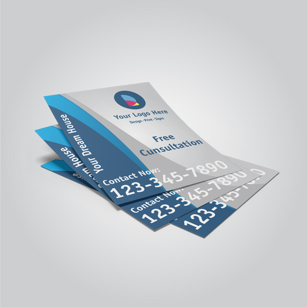
- Insert planning: Pair folders with feature flyers, brochures, and postcards sized for clean stacking.
Complementary collateral to bundle with folders
Bundle presentation folders with matching inserts—feature flyers, trifold brochures, postcards, and agent business cards. Add open house and yard signage to extend the same brand from folder to curb. One spec, many touchpoints, zero confusion.
A single visual system multiplies your brand impact. When the folder, flyers, and signs all match, you look larger, more organized, and more memorable. For many brokerages, combining 250–500 flyers with a 100-folder run keeps outreach steady for a month of open houses.
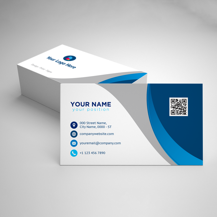
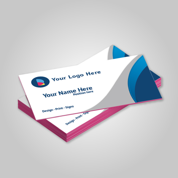
- Business cards: Pair soft touch folders with luxury business cards (foil or raised spot UV).
- Flyers & brochures: Align hero image style across feature sheets and tri-fold brochures.
- Postcards: Keep the same grid and header bar on postcards to maintain recognition.
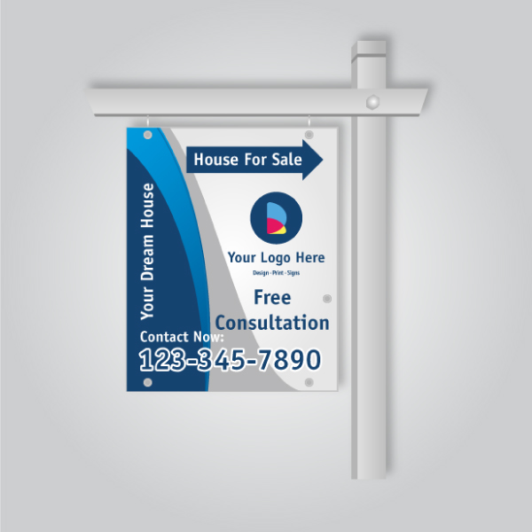
- Signage: Match folder colors to For Sale, Open House, and directional signs for curb-to-table consistency.
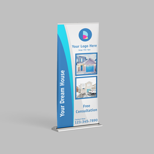
- Event assets: Extend the look to roll-up banners for recruiting or community events.
- Presentation folders: Centralize reorders via our presentation folder product page.
Local ordering and pickup in Mississauga
Order online and pick up your brokerage presentation folders near 5004 Timberlea Blvd Unit#18 in the Regional Municipality of Peel. We coordinate folder runs with matching inserts so your packets are ready for same-week appointments.
Local matters when timelines are short. Our Mississauga shop supports quick turnarounds and coordinated bundles that ship together or stage for pickup. Presentation folders for brokerage branding are most effective when your teams can restock in hours, not weeks.
Local considerations for 5004 Timberlea Blvd Unit#18
- Schedule pickups to avoid peak traffic near Tomken Station East Platform A on busy weekdays.
- Plan ahead for spring listing surges; book folder runs alongside Open House and yard sign orders.
- Use our in-house design when onboarding new agents to lock brand files before field use.
Tools and resources brokerages actually use
Use a browser-based online design tool for fast edits, and in-house designers for brand-critical work. Centralize templates, name files clearly, and standardize specs so any office coordinator can reorder without confusion.
We provide both routes: a self-serve editor for simple updates and full-service design when you need precision or net-new branding. Keep a shared repository with version numbers (v1.0, v1.1) and lock the die line so no one shifts the logo into the pocket glue area.
- Online design tool: Make small copy swaps or agent info changes without new files.
- In-house design: Set master templates, define color and type rules, and finalize print-ready PDFs.
- Template library: Store folder, flyer, and postcard templates with clear version naming.
- Reorder cadence: Align reorders with recruiting cycles and seasonal listing peaks.
- Package alignment: Bundle with Realtor packages to cover all basics quickly.
For marketing planning inspiration, you may review general real estate marketing overviews like this practical marketing strategy summary and adapt the ideas into your own brokerage folder inserts and sales scripts.
Step-by-step: from concept to handoff
Define your brand system, pick a standard folder spec, finalize inserts, and approve a proof. Then produce, assemble, and distribute to offices. Train agents on what goes where. Reorder on a set cadence so you never run out before key events.
- Gather brand assets: Logos (vector), color values, fonts, and any broker-mandated statements.
- Choose a base spec: 9×12, two pockets, card slits; select coating and any premium accents.
- Design cover/back: Minimal, high-contrast cover with strong imagery or clean color field.
- Map inserts: Feature flyer, brochure, postcard, service one-pager, testimonials, and disclosures.
- Prep files: Bleeds, safe areas, outlined fonts, CMYK, 300 DPI images.
- Proof: Review a printed proof for color and finish accuracy.
- Produce: Print, coat, and die-cut; add raised spot UV or foil as specified.
- Assemble: Insert materials by stack order; place agent card in slits.
- Distribute: Deliver to offices or stage for pickup in Mississauga.
- Train & restock: Quick huddle on insert order; set reminders for reorders.
Comparison: folder styles vs. use cases
Match folder style to your audience. Standard two-pocket fits most packets; soft touch with foil suits luxury; gloss with large imagery works for high-volume farming. Choose finish first by audience, then by durability needs.
| Folder Style | Best For | Pros | Considerations |
|---|---|---|---|
| 9×12 Two-Pocket (Matte) | Everyday brokerage packets | Glare-free, hides scuffs, modern look | Less vivid for photo-heavy covers |
| 9×12 Soft Touch + Foil | Luxury listings, recruiting | Premium hand-feel, strong contrast with foil | Fingerprints less visible but needs careful handling |
| 9×12 Gloss | Image-driven farming pieces | Vivid photos, high contrast | Shows glare in bright lighting |
| Gusseted Pocket | Large document sets | Increased capacity, sturdy spine | Slightly higher material use |
Case studies and real-world examples
Standardizing one folder spec per brokerage speeds onboarding, shortens reprint cycles, and creates a uniform look in the field. Pairing folders with matching inserts and signage multiplies brand recall from curb to kitchen table.
- Team rollout: A GTA brokerage unified multiple office designs into one soft touch folder with foil logo. Agents reported faster prep and a clearer story in listings.
- Open house flow: Mississauga agents used a standard insert stack—feature sheet, mortgage tips, and neighborhood overview—to streamline conversations and follow-ups.
- Recruiting events: Coordinated roll-up banners, presentation folders, and luxury cards presented a polished, big-brand feel at career nights.

For additional context on preparing materials clients can navigate quickly, see this general guide to what clients ask real estate pros and ensure your insert set answers those common questions up front.
Budget and scope considerations (no pricing)
Scope folders by audience and usage. Pick one spec that works 80% of the time, then add a premium variant for recruiting or luxury. Consolidate orders with inserts to save time, and store extras across offices to prevent last-minute shortages.
Rather than chasing custom variants per agent, select one master design with optional accents. This simplifies reorders, reduces design cycles, and ensures every agent presents the same message. In practice, most teams succeed with one everyday matte folder plus one soft touch + foil variant.
- Volume planning: Forecast by office size, listing cadence, and events.
- Finish strategy: Everyday matte; premium soft touch + foil for VIP use.
- Insert inventory: Print evergreen pieces in larger batches; swap property-specific sheets as needed.
- Storage: Keep dedicated bins per office; label by quarter to maintain freshness.
If you’re assembling marketing kits for a broader go-to-market push, this overview of AI-aided planning can spark ideas for which inserts to include (testimonials, neighborhood stats, timelines) and how to tailor them for different audiences.
Frequently Asked Questions
Brokerages ask about sizes, finishes, timelines, and how to keep agents on-brand. Standardizing one 9×12 spec, using durable coatings, and centralizing reorders solves most pain points while keeping speed and quality high.
What size folder should our brokerage use?
Use a 9×12 two-pocket folder. It cleanly fits letter-size documents, accommodates 30–50 sheets comfortably, and supports standard business card slits. This spec covers most listing, buyer, and recruiting scenarios without custom die costs.
Which coating is best for frequent handling?
Choose matte or soft touch. Both resist fingerprints better than high-gloss and feel premium in hand. If your covers feature photography, matte or soft touch still prints vivid color when files are prepared properly in CMYK at 300 DPI.
How do we keep multiple offices on-brand?
Lock a master template with fixed logo, color values, and headline font. Share print-ready PDFs and a simple insert checklist. Centralize reorders with a single vendor so specs, coatings, and finishes remain identical across offices and agents.
Can we coordinate folders with signs and banners?
Yes. Use the same color system and type across folders, feature sheets, For Sale and Open House signs, directional signs, and roll-up banners. A single visual language strengthens recognition from curb to conference room.
Key takeaways and next steps
Standardize one 9×12 folder spec, align finishes to your audience, and bundle matching inserts and signage. Centralize templates and reorders to keep quality high and timelines short. Train agents on what goes where, then reorder on a predictable cadence.
- Pick one master spec: 9×12, two pockets, business card slits, durable coating.
- Align finishes: Matte for daily use; soft touch + foil for luxury and recruiting.
- Bundle smart: Folders + flyers + cards + signs = consistent brand everywhere.
- Centralize reorders: Use our presentation folder page and keep inserts stocked.
- Local advantage: Order online, pick up near Timberlea Blvd, and move faster.
Ready to align your brand? Start with our presentation folder options or talk through Realtor packages to bundle essentials.
Conclusion: align, simplify, and scale
Choose one standard folder, pair it with a tight set of inserts, and lock brand rules in a shared template. With local pickup in Mississauga, your team can deploy presentation folders for brokerage branding quickly—and keep every office on the same polished page.
Here’s why this works: a single spec eliminates guesswork, consistent finishes elevate perceived value, and a predictable reorder rhythm protects you from last-minute scrambles. If you want help mapping the spec, bring your logo files and current inserts—we’ll streamline the stack and get your next run on press.