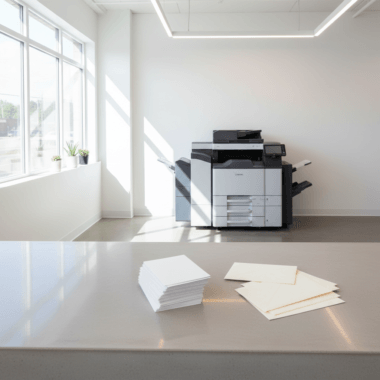


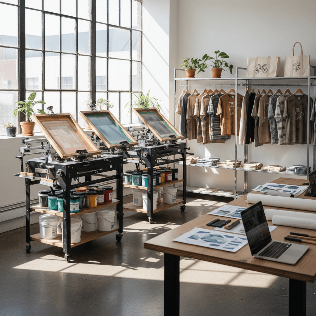
Screen printing for small business branding is the process of pressing ink through a mesh stencil to create bold, durable logos on apparel, bags, and flat goods. From our Mississauga shop at 5004 Timberlea Blvd Unit#18, Top Realtor Sign & Print offers in-house screen printing to help local teams deploy consistent, eye-catching brand gear fast.
By Ashwani · Top Realtor Sign & Print
Last updated: 2026-05-16
Above the fold: hook and table of contents
This complete guide explains how small businesses can use screen printing to build recognizable, repeatable branding across tees, totes, and uniforms. You’ll see how the method works, when it outperforms alternatives, and how to coordinate apparel with signage, cards, and banners for a unified customer experience.
Use this guide to move from idea to a finished, durable kit you can actually wear, gift, and restock:
- What screen printing is and why it matters for small brands
- How the process works from file handoff to finished goods
- Methods, inks, mesh counts, and curing basics (with ranges)
- Branding best practices, templates, and file prep tips
- Local partner checklist for Mississauga and the Regional Municipality of Peel
- Mini cases, comparison table, and ROI factors (no pricing)
Jump to a section:
- Quick summary
- What it is
- Why it matters
- How it works
- Methods and inks
- Branding best practices
- Tools, templates, and file prep
- Choosing a local partner
- Case examples
- Screen printing vs alternatives
- Investment & ROI (no pricing)
- FAQ
- Conclusion
Quick summary
Screen printing excels for bold, durable brand marks on textiles and flat goods. It shines on medium-to-large quantities, solid spot colors, and opaque prints on dark fabrics. Pair it with consistent brand files and Pantone references to repeat color accurately across shirts, totes, and staff uniforms.
In our experience, the sweet spot for small teams is 25–300 pieces per design, where setup time spreads across units and color consistency matters. Typical mesh counts range from 110–160 for solid coverage and 200–305 for finer detail. Plastisol inks often cure around 320°F, which locks in longevity.
- Best for: uniforms, promo tees, tote bags, pop-up and event merch
- Strengths: durability, opacity, Pantone matching, repeatability at scale
- Consider when: you need the same color and logo across many items
- Combine with: high-visibility signage and premium business cards for a complete brand kit
What is screen printing for small business branding?
Screen printing for small business branding uses a mesh stencil and squeegee-driven ink to apply crisp, durable designs to apparel and merchandise. It’s favored for pantone-level color control, opacity on dark fabrics, and cost-efficiency at scale, producing consistent visuals across team wear, giveaways, and resale merch.
Here’s the thing: you want your brand to look the same—on a hoodie, tote, or apron. Unlike many digital methods, screen printing lays a thicker ink film, so colors stay vibrant after wash cycles. With a proper cure, we routinely see prints hold up across 25–50 washes with minimal fading or cracking.
Most small businesses we support choose cotton or poly/cotton blends because they print predictably and feel comfortable for staff and customers. For dark garments, a white underbase is often used to keep colors bright; that extra layer can improve perceived vibrancy by a clear margin on navy, charcoal, or black textiles.
Why screen printing matters for branding
Consistent, durable marks drive recognition and trust. Screen printing delivers opaque, repeatable colors that hold up through washing and daily use, turning apparel and bags into roaming billboards. That repeat exposure compounds brand recall for teams, events, and retail environments.
Repetition matters. If your staff shirts, giveaway totes, and event banners share the same exact red, you multiply impressions without redesigning every time. We often standardize two to four core brand colors; with Pantone-matched inks, we align them across apparel, printed handouts, and banners to reduce variance.
- Color consistency: Dedicated spot inks and Pantone references minimize drift between runs.
- Longevity: Properly cured prints resist cracking and fading; a 60–90 second cure window at target temperature is common for many plastisols.
- Versatility: Cotton, cotton/poly blends, and canvas totes are reliable substrates; many shops also handle performance fabrics with the right ink.
- Scalability: Separate screens per color enable efficient runs of 50, 250, or 1,000 units with the same art, maintaining registration to within fractions of a millimeter.
Want a practical example? A pop-up coffee cart that rotates locations weekly can equip two baristas and one promoter with branded tees and aprons. Add 100 totes for early customers, and your logo walks out the door daily—consistently printed and cured to survive the next laundry day.
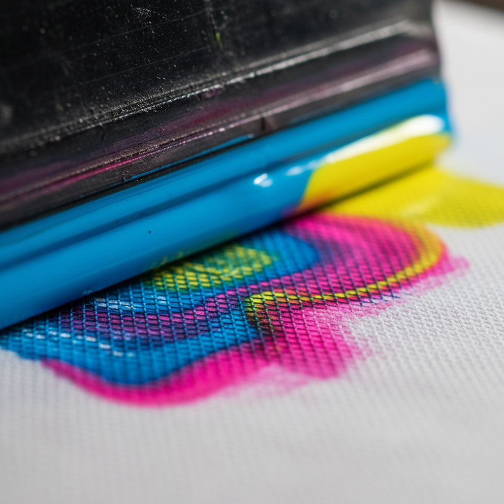
How screen printing works (step-by-step)
The process converts your vector artwork into a light-exposed stencil, then presses ink through mesh onto the item. Each color uses a separate screen, tight registration aligns layers, and heat curing locks the ink so your brand survives repeated wear and washes.
- Artwork prep: Supply vector files (AI, EPS, SVG, PDF) with outlined fonts and Pantone callouts. Keep strokes above 0.25–0.35 pt for reliability.
- Separations: We output one film per color, ensuring halftone angles and dot gain suit the fabric and mesh. For fine detail, 45–55 LPI halftones are common on garments.
- Screen coating: Photo emulsion is applied evenly and dried under controlled conditions to reduce pinholes and ensure sharp edges.
- Exposure: UV exposure hardens the emulsion around your design. Exposure times vary by emulsion and mesh but often land in the 30–120 second range.
- Setup & registration: Screens mount on press with micro-adjustments. Off-contact distance is set (often around 1/16 inch) to help ink release cleanly.
- Printing: A squeegee—commonly 70 durometer or 60/90/60 triple—pushes ink through the mesh. A flash unit between colors can gel underbases in 3–6 seconds.
- Curing: Heat locks the ink. Many plastisols target ~320°F surface temperature; water-based inks may need longer dwell or forced air to drive off moisture.
- Quality control: We check color density, registration, and curing (stretch and wash tests). Random-sample QC on every 20–50 pieces keeps standards tight.
| Stage | Key Choice | Branding Tip |
|---|---|---|
| Art | Vector vs raster | Vectors scale cleanly across XS to 3XL and totes. |
| Ink | Plastisol vs water-based | Choose feel and sustainability goals up front. |
| Mesh | 110–160 vs 200–305 | Lower for bold opacity; higher for fine detail. |
| Underbase | Needed on darks? | White underbase boosts vibrancy on navy/black. |
| Cure | Temp & time | Follow the ink spec sheet to ensure wash resistance. |
Methods, inks, and applications
Most small-business branding uses plastisol for bold, durable prints or water-based inks for a softer, eco-leaning feel. Specialty effects—puff, metallic, or glow—add texture and interest. Choose substrates like cotton tees, fleece, and canvas totes for everyday brand impressions that hold up.
Ink choice affects both hand feel and longevity. Plastisol forms a robust film layer and is forgiving across blended fabrics. Water-based inks penetrate fibers for a lighter touch; discharge replaces dye in 100% cotton for vintage-soft results. Specialty effects like puff or metallic can highlight a single line or icon without overcomplicating production.
- Plastisol: Opaque, consistent, and widely compatible. Common for two- to three-color logos and dark garments.
- Water-based: Soft hand on lights; can be combined with discharge on 100% cotton for a subtle, breathable print.
- Discharge: Alters the garment dye to your color—great for soft, breathable large prints.
- Specialty: Puff for dimension, metallic for sheen, neon for events, glow-in-the-dark for night activations.
- Substrates: Tees, polos, hoodies, aprons, canvas totes, and selected flat sign blanks for simple one-color marks.
For busy teams, a two-color logo (underbase + brand color) balances pop and throughput. With consistent placements—left chest at ~3.25 inches wide and full front at ~10–11 inches—you’ll scale across sizes cleanly without redrawing art.
Branding best practices that save time
Lock your brand guidelines, use vector files, and specify Pantone colors. Limit color count for faster setup, request a pre-production proof, and plan sizes early so your logo scales cleanly across youth and adult apparel without redrawing.
We’ve found that clear brand basics cut production questions in half. A one-page sheet with logo lockups, color IDs, and minimum sizes keeps everyone aligned. On garments, maintaining a minimum line weight of 0.35 pt and text height above ~0.12 inches improves readability after curing and washing.
- Submit vector artwork (AI, EPS, SVG, or PDF); raster at 300 DPI minimum at final size.
- Provide Pantone references and note tolerances (e.g., “within ΔE 2–3”).
- Plan print locations: left chest, full front, sleeve, tote side; document exact sizes per size tier.
- Think scalability: XS–3XL templates with consistent logo lockups reduce rework.
- Ask for a press proof or digital mockup before a full run to confirm placement and color.
Pro tip: align apparel colors with your signage and print collateral. Our team often matches tees to banner backgrounds, then ensures the logo’s contrast ratio stays above 4.5:1 for legibility at a distance.
Tools, templates, and file prep
Great prints start with clean files and simple specs. Use artboard templates, outline fonts, expand strokes, and include a Pantone callout layer. Keep designs under five spot colors for speed and cross-run consistency on apparel and bags.
A simple, reusable folder structure saves future time: /Brand/Logos (vector originals), /Print/Screen/Art (press-ready PDFs), and /Mockups. Use descriptive file names like Brand-Logo-2C-PMS186-Black-Front10in.pdf. When exporting, embed ICC profiles sparingly; we match Pantone formulas at press anyway.
- Templates for S, M, L, XL, and 2XL placements with exact inches/mm.
- Outline fonts; expand strokes and appearances to avoid RIP surprises.
- Label each color layer with its Pantone ID; include a notes layer with placements.
- Export press-ready PDF (retain vectors) or AI; include a flattened mockup JPEG.
- Share a swatch photo of your garment under neutral light to avoid metamerism.
Prefer to design in your browser? Our online-ready product templates make it easy to size logos quickly for tees and totes, then coordinate the same art for signs and printed kits without juggling multiple vendors.
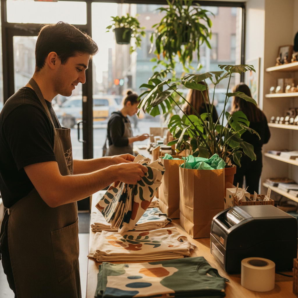
Choosing a local screen-printing partner in Mississauga
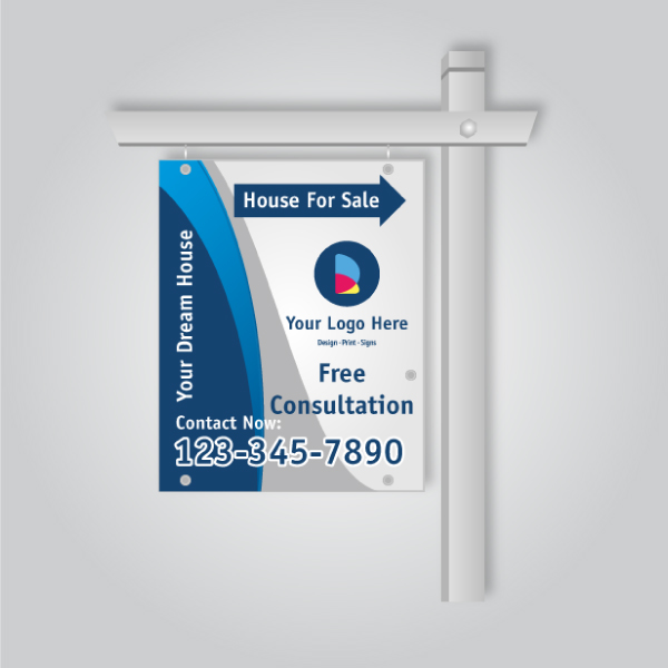
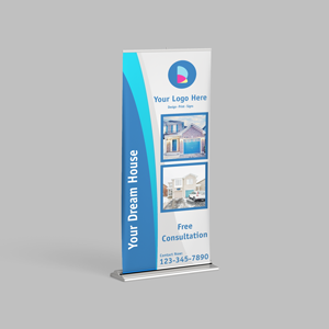
For teams in 5004 Timberlea Blvd Unit#18 and across the Regional Municipality of Peel, choose a partner who can color-match, turn jobs quickly, and coordinate pickup. A shop that also produces signage and print collateral simplifies brand control across apparel, banners, and handouts.
Top Realtor Sign & Print brings screen printing together with business cards, flyers, roll-up banners, and real estate signs—all from one Mississauga location. One artwork handoff and one project manager streamline color approvals. When timing is tight, our same-day pickup options for select items keep launches on track.
Local considerations for 5004 Timberlea Blvd Unit#18
- Plan pickups around traffic near Canadore College at Stanford Mississauga Campus when classes start or end.
- Seasonal surges hit before spring and fall community events; schedule apparel and signage together to secure press time.
- Bundle uniforms with banners and street-visible signs so colors match on day one.
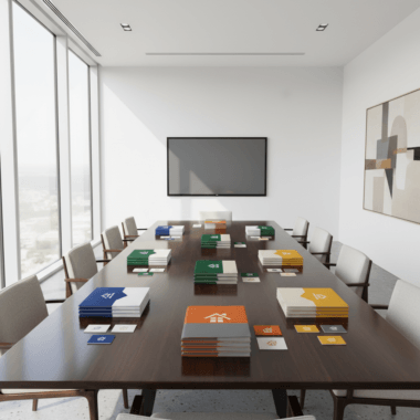
Need help assembling a complete kit? Our team can align your apparel with luxury business cards, printed handouts, and sign packages—one brief, one timeline.
Mini case examples (real-world scenarios)
Start with a cohesive kit: shirts for staff, totes for giveaways, and a banner for visibility. Align art once, then reuse across apparel and signs to speed approvals and keep colors consistent from sidewalk to checkout counter.
Consider these real-world scenarios our Mississauga team supports weekly. Each mixes apparel with signage or printed materials so your brand shows up the same way at every touchpoint. Batch sizes of 50–200 units per sku are common for launches; add reorders in 25–50 unit increments as you learn demand.
- Open house kit: Branded tees for hosts, canvas totes for flyers, and a backdrop banner. Pair with coordinated sign packages to match colors curbside to doorstep.
- Local café launch: Staff aprons, two-color merch tees, and loyalty totes for first-week buyers. Display with a simple roll-up banner near the entrance for 6–10 feet visibility.
- Nonprofit 5K: Volunteer shirts (one-color front), finisher tees (two-color), and tote bags for sponsors’ samples. Expect quick turnarounds 7–10 days ahead of race day; confirm garment stock early.
- Pop-up retail: Uniforms, reusable totes, and a hanging sign for checkout. Keep placements consistent so replacements match without new proofs.
After each activation, store approved art, notes, and garment SKUs in a single folder. When you reorder, reference the exact Pantone IDs and placements, and we’ll replicate the print—down to squeegee angle and off-contact—so the next batch looks like the first.
Screen printing vs alternatives
Choose screen printing for medium-to-large runs with solid colors and the need for durability. Consider digital direct-to-garment or heat transfer when you need photo detail, individualized names, or very small quantities without multi-screen setup.
| Technique | Best for | Durability | Feel | Setup time | Color range | Notes |
|---|---|---|---|---|---|---|
| Screen printing | 25–1,000+ units, spot colors, dark garments | High with proper cure | From bold to soft (ink dependent) | Higher (per color) | Excellent for solids; halftones possible | Best for Pantone-matched brand colors |
| Direct-to-garment (DTG) | Small runs, photographic detail | Moderate (varies by ink/fabric) | Soft, ink absorbed into fibers | Low setup | Full-color images | Great for one-offs and gradients |
| Heat transfer (DTF/Vinyl) | Names/numbers, micro-runs | Moderate to high (film dependent) | Film-like; varies by transfer | Low to moderate | Full-color possible | Ideal for personalization |
Looking into on-demand fulfillment? According to Shopify’s print‑on‑demand guide, PoD services enable single‑unit orders and automated shipping. For event uniforms and bulk promos, traditional screen printing still wins on opacity, Pantone control, and per‑unit efficiency once you pass small batch sizes.
Need to test a design before a larger run? Shopify’s T‑shirt overview outlines low‑commitment ways to validate art. After you confirm demand, shift to screen printing to lock color and durability for day‑to‑day wear.
Investment and ROI factors (no pricing)
Your unit economics depend on design complexity, color count, print locations, and garment choice. Standardizing artwork and batching sizes reduces setup time and helps maintain color accuracy, so your brand looks consistent across every item in the run.
From a planning standpoint, two to three spot colors often hit the recognition threshold while keeping production nimble. Placing prints at repeatable sizes (e.g., 3.25-inch left chest, 10.5-inch full front) across apparel sizes avoids fresh proofs later. Each added location—like a sleeve mark—adds handling time; weigh the branding value.
- Color count: Fewer spot colors shorten setup and reduce variables; halftones can simulate gradients when needed.
- Print areas: Front plus sleeve or back adds press steps; confirm which placements actually drive recognition.
- Fabric: Cotton vs performance blends affect ink choice and cure parameters; confirm manufacturer specs.
- Batching: Grouped sizes and planned reorders streamline scheduling and preserve color continuity.
If your brand roadmap includes signage and handouts too, coordinate items together. Our team regularly aligns apparel with luxury cards and core print materials so customers meet the same brand—on a shirt, a flyer, and a storefront banner.
Tools and resources for small teams
You don’t need a full in-house department to get pro results. Use simple templates, a clear asset library, and a local shop that can handle apparel, signage, and print collateral under one roof. That single-source model keeps colors tight and timelines predictable.
We recommend three folders: Brand (logos, colors, typography), Apparel (press-ready art, placement templates), and Signage/Print (banners, flyers, business cards). Name everything predictably and include readme notes with Pantone IDs and minimum sizes. A 20–30 minute brand kickoff call prevents days of email back-and-forth.
- Asset library with vector logos and a one-page brand spec.
- Placement templates for common sizes and locations.
- Shared checklist for art handoff, approvals, and pickup windows.
- One partner to coordinate time-sensitive items and scheduled reorders.
Exploring complementary merch across formats? Shopify’s posters guide shows how brands add low-barrier items to their mix; once designs convert, we translate the look to durable screen-printed apparel for staff and fans.
Frequently Asked Questions
These concise answers address the most common questions small-business owners ask before their first screen printing run—file prep, ink options, wash durability, and when to choose alternative methods.
What file type should I submit?
Vector files (AI, EPS, SVG, or press-ready PDF) with outlined fonts and Pantone callouts work best. If you only have a high-resolution PNG, keep it at least 300 DPI at final print size.
How long do screen prints last?
With correct curing and care, prints withstand dozens of washes without major cracking or fading. Durability depends on ink selection, garment material, and following care instructions.
When is screen printing better than heat transfer?
Choose screen printing for medium-to-large runs, spot colors, and opacity on dark garments. Heat transfer suits short runs, photographic images, or many variable names and numbers.
Can you match my brand colors?
Yes—provide Pantone references and a print sample if available. Consistent lighting during approval helps ensure what you see on screen translates accurately to fabric.
Conclusion
Screen printing turns simple garments and totes into durable, mobile brand assets. Standardize your art, define Pantone colors, and partner locally to coordinate apparel with signage, cards, and banners. The result is consistent visibility from storefront to street team.
- Key Takeaways
- Lock your brand basics: logo, colors, clear space, and lockups.
- Prep vector files and get a proof before production starts.
- Batch sizes and plan reorders to keep color continuity.
- Unify apparel with signage and print for a cohesive customer journey.
Ready to align apparel with signs and print? Visit our Mississauga shop or start online—then book same‑day pickup items where available so your team can wear the brand this week.