

 Our Price Brochure
Custom business card design tips are practical guidelines for creating a card that drives calls and appointments. For real estate pros in Mississauga near 5004 Timberlea Blvd Unit#18, the right size, typography, finishes, and QR strategy turn a card into a lead magnet. Top Realtor Sign & Print supports this with same-day printing and an easy online design tool.
By Ashwani at Top Realtor Sign & Print
Last updated: 2026-05-27
Quick Start: Hook & Table of Contents
The fastest way to upgrade your business card is to lock in the right size, legible type, strong contrast, and a scannable QR that lands on a mobile-friendly page. Add one premium finish for memorability, then proof at 100% scale before sending a 300 dpi, CMYK file with 0.125 inch bleed to print.
Here’s the thing: cards that look great but fail to prompt action don’t convert. You’ll learn what to change now and how to print with zero surprises.
- What you’ll learn
- North American card specs (3.5 × 2 in, 0.125 in bleed)
- Readable typography and contrast targets (aim ~4.5:1)
- QR code setup with safe landing pages
- Premium finishes that match real estate brands
- Proofing and print-ready export workflow
- Why this matters
- Cards still convert at events, door knocks, and open houses
- Premium touches improve recall and follow-up
- Local, same-day options reduce downtime between meetings
- Table of contents
Summary
A high-performing real estate business card pairs readable design with one standout finish and a frictionless next step. Keep size standard (3.5 × 2 inches), type clear, colors high-contrast, and the QR pointing to a fast mobile page. Export CMYK, 300 dpi, 0.125 inch bleed, then print locally for speed.
In our experience, the right mix is simple information hierarchy, strong contrast, and a single tactile accent like raised spot UV or foil. This keeps costs in check and impact high.
- Use 10–11 pt minimum body size and 0.125 in clear margins
- Target contrast around 4.5:1 for dark-on-light text
- Pick one finish: soft touch, foil, spot UV, or painted edges
- Test-scan your QR; add a 4-module quiet zone
- Print locally in CMYK to match on-screen proofs more closely
What Is Custom Business Card Design?
Custom business card design is the intentional layout, typography, color, and finish choices that create a distinctive, on-brand card. The goal is fast recognition and a clear next step—usually a call, text, or QR scan—supported by durable stock and precise, print-ready files.
Custom design is not about cramming in features; it’s about choosing only what helps someone contact you. For realtors, that’s your name, role, phone, brokerage compliance line, and a direct call-to-action.
- Core anatomy
- Front: Name, title, brokerage logo, direct phone, CTA
- Back: QR code to listing search, reviews, or calendar
- Format: 3.5 × 2 inches (North America), landscape or portrait
- Print specs that matter
- Resolution: 300 dpi minimum for crisp type and logos
- Color: CMYK with an ink coverage target under ~300%
- Bleed/Safe: 0.125 in bleed and 0.125 in inner margin
- Finish options
- Soft touch lamination for a velvety feel
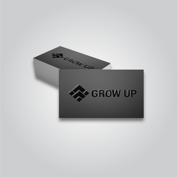
- Raised spot UV to highlight names or logos
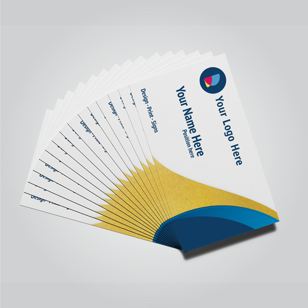
- Gold/Silver foil for a luxury accent
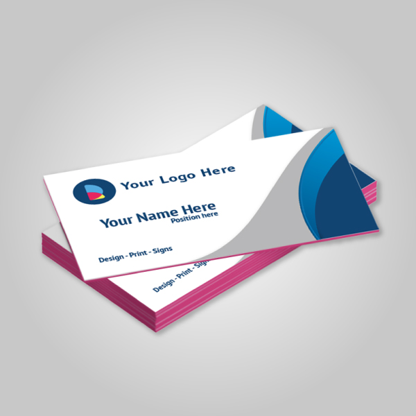
- Painted edges for a bold border pop
Here’s why that’s powerful: a tactile accent raises recall, and a scannable QR reduces friction. Together, they shorten the path from handshake to calendar invite.
Why It Matters for Realtors in Peel
In the Regional Municipality of Peel, a sharper card wins attention at open houses and networking events. Near 5004 Timberlea Blvd Unit#18, agents see more follow-ups when cards pair readable design with one premium finish and a QR to a mobile page. Local pickup keeps momentum high.
Open houses, builder events, and neighborhood canvassing still generate in-person moments. A well-designed card turns those seconds into scheduled tours.
- Moments where cards convert
- At a crowded open house where a tactile finish stands out
- Door knocks and community events where speed matters
- Brokerage meetings where compliance and polish are visible
- Performance drivers
- Readable type: minimum 10–11 pt body with solid line spacing
- Contrast: dark text on light fields to aid quick scans
- QR paths: reviews, listings, or calendar—never a generic homepage
- Local advantage
- Same-day pickup avoids shipping delays before a weekend blitz
- On-site checks for color and finish, aligned with your signage
- Design help to meet brokerage brand standards the first time
When your card matches your printed card stock and finish to your open house signage palette, your brand memory compounds across touchpoints.
How Custom Card Design Works (Step-by-Step)
Set your canvas to 3.75 × 2.25 inches (with 0.125 inch bleed), design within a 3.25 × 1.75 inch safe zone, and export CMYK at 300 dpi. Keep copy minimal, add one premium finish, place a tested QR, then proof at 100% before sending print-ready PDFs.
Step-by-step workflow
- Set the file: 3.5 × 2 in final size, add 0.125 in bleed on all sides (canvas 3.75 × 2.25 in).
- Define safe margins: Keep text/logos 0.125 in from trim to avoid edge clipping.
- Color mode: Work in CMYK; spot colors only if your printer supports them.
- Typography: Choose 10–11 pt body, 14–16 pt name, and 18–22 pt for headline accents.
- Layout: Use a 2–4 column grid; left-align for fast scanning.
- Hierarchy: Name first, phone second, CTA third; remove anything not helping contact.
- QR code: Link to reviews, listings, or a booking page; test on iOS and Android.
- Finish map: Mark layers for foil/spot UV as vectors on a separate color plate.
- Proof and print: Export PDF/X with bleed and crop marks; soft-proof at 100% size.
Process table
| Step | Owner | Key Setting/Tool | Output |
|---|---|---|---|
| Canvas + bleed | Designer/Agent | 3.75 × 2.25 in, 300 dpi, CMYK | Correct print dimensions |
| Typography | Designer | 10–11 pt body, 16–22 pt headers | Readable hierarchy |
| QR + CTA | Agent | Short URL, tested on 2 phones | Frictionless next step |
| Finish mapping | Designer/Printer | Vector plates for spot UV/foil | Accurate specialty layers |
| Final export | Printer | PDF/X with crops + bleed | Print-ready file |
We’ve found that separating finish layers into 100% black vectors labeled “SPOT UV” or “FOIL” prevents registration drift and speeds approval.
Types/Methods/Approaches
Choose one tactile accent—soft touch, raised spot UV, foil, or painted edges—to elevate an otherwise clean layout. Each method adds a distinct feel: soft touch is velvety, spot UV is glossy and raised, foil is reflective, and painted edges add a bold color frame.
Match finish to message. Luxury listings may warrant foil; a modern condo specialist might prefer matte soft touch with a spot UV logo. Painted edges can reinforce brokerage colors without cluttering the face.
| Finish | Look & Feel | Best For | Design Tip |
|---|---|---|---|
| Soft touch | Matte, velvety surface | Premium, understated brands | Use dark ink; avoid tiny white text on matte |
| Raised spot UV | Glossy, tactile highlights | Logos, names, key shapes | Contrast glossy shapes against matte fields |
| Gold/Silver foil | Reflective metallic sheen | Luxury or heritage positioning | Reserve for accents to avoid glare on text |
| Painted edges | Bold color on card edges | Brand color reinforcement | Pair with thicker stock for visibility |

Want a quick shortcut? Start with a soft touch base and add spot UV to your name or logo—minimal ink, maximal feel.
Best Practices for Realtor Cards
Keep what matters, cut what doesn’t. Use a clean hierarchy, strong contrast, and one finish. Map your QR to a high-intent page like reviews or booking, and proof at 100% scale. Export CMYK, 300 dpi, with proper bleed and safe margins to avoid production surprises.
Design playbook
- Information hierarchy: Name, title, direct phone, CTA. Everything else is optional.
- Legibility first: 10–11 pt minimum body text and 14–16 pt for your name.
- Color contrast: Favor dark-on-light; aim for ~4.5:1 contrast.
- Whitespace: Leave at least 0.125 in margins; don’t crowd logos.
- Asset quality: Vector logos (SVG/PDF/AI) avoid fuzzy edges in print.
- QR hygiene: Add a 4-module quiet zone; avoid low-res bitmap QR codes.
- Finish restraint: Pick a single accent; multiple finishes can compete.
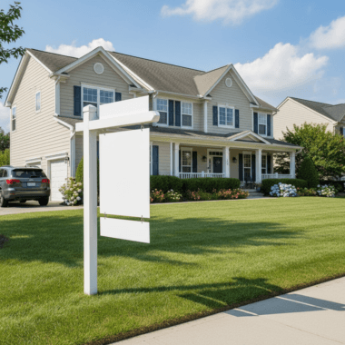
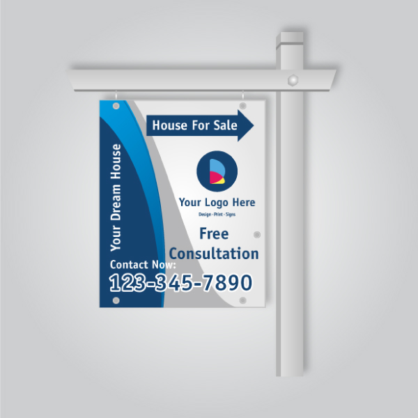
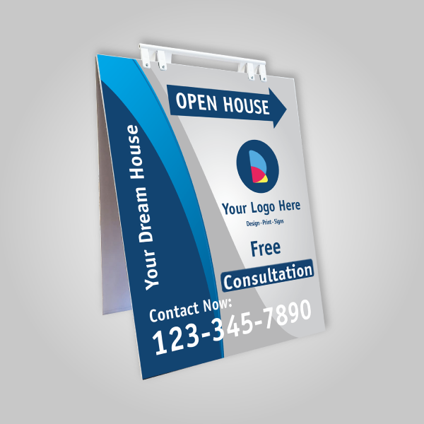
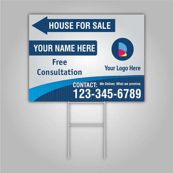
Align cards with your yard signs and open house materials so prospects spot you from the curb to the kitchen.
Explore premium options like same-day realtor business cards or Ontario realtor card inspiration for fast, on-brand upgrades.
Local considerations for 5004 Timberlea Blvd Unit#18
- Transit timing: If you canvass near Tomken Station East Platform A, add a short QR URL and bold phone number for quick commuters.
- Seasonality: Mississauga winters can dull contrast; choose high-contrast palettes that read even in low light.
- Neighborhood nuance: Weekend open houses by Red Brush Park? Stock extra cards and keep finishes consistent with your directional signs.
Tools/Resources
Use a browser-based design editor, vector logos, and QR tools that export SVG with quiet zones. Save final art as PDF/X with bleed and crops. Local printers help map layers for spot UV and foil, speeding approvals and same-day pickup when deadlines loom.
- Design: Our online design tool and card templates give you precise bleeds and safe margins.
- Brand assets: Keep brokerage-compliant colors and logos in vector for crisp results.
- QR generation: Choose dynamic links you can update later; always test on two phones.
- Proofing: Print to scale on office paper; check alignment and spacing by eye.
- Production: For finishes, provide separate vector plates labeled clearly (e.g., “SPOT UV”).
Thinking about digital complements? Explore examples of modern mobile contact flows in this e-business card app roundup and its companion collection for ideas on pairing physical cards with quick taps.
Need help finishing your design? We offer in-house artwork setup, brokerage-compliant layouts, and finish mapping. Stop by our Mississauga shop for a quick proof or use our online editor for fast approvals.
Get started with same-day realtor cards or browse premium card finishes.
Case Studies/Examples
Small design shifts—contrast, hierarchy, and a single finish—consistently increase callbacks. Pairing a QR with reviews or a booking link reduces friction, while local pickup aligns color and finish with your signage before weekend showings.

- Open house pro: A Peel-based agent swapped a glossy front for soft touch and added raised spot UV to her name. The tactile contrast made people pause and ask about listings, leading to more scans of her reviews page.
- Condo specialist: A modern, portrait layout with minimal copy and a QR to curated condo tours. Painted edges in brokerage red tied the card to yard riders and roll-up banners.
- Team rebrand: A small team aligned cards with new branding guidelines, keeping type sizes consistent and mapping foil to a monogram only—clean, upscale, and compliant.
- Event blitz: Before a weekend launch, an agent used flyers that echoed the card palette and grabbed local, same-day cards to avoid shipping delays.
Want to layer digital? Review this concise mobile real estate feature checklist to decide which page your QR should open first—reviews, listings, or booking.
Frequently Asked Questions (FAQ)
The most effective realtor business cards use standard size, strong contrast, clear hierarchy, and a single premium finish. A tested QR to a mobile page boosts response. Keep files at 300 dpi in CMYK, include 0.125 inch bleed, and proof at 100% scale before printing.
What is the best size for a realtor business card?
Use the North American standard: 3.5 × 2 inches. Build your file at 3.75 × 2.25 inches to include a 0.125 inch bleed. Keep all text and logos at least 0.125 inch inside the trim to avoid clipping.
Should my business card include a QR code?
Yes—link it to a high-intent destination like reviews, a listings page, or a booking calendar. Ensure the code has a quiet zone around it, and test it on both iOS and Android before sending to print.
Which premium finish should I choose?
Pick one accent that matches your brand. Soft touch feels upscale and understated, raised spot UV highlights names or logos, foil adds a luxury sheen, and painted edges amplify brand colors. One finish is usually enough.
How do I prepare a print-ready file?
Set the canvas with 0.125 inch bleed, work in CMYK at 300 dpi, and keep text inside a 0.125 inch safe margin. For finishes, create separate vector plates. Export PDF/X with bleed and crop marks, then proof at 100% scale.
Key Takeaways
Standard size, clear hierarchy, high contrast, one finish, and a tested QR code deliver reliable results. Keep assets vector-based, export CMYK with bleed, and print locally for speed. Align cards with signage to reinforce your brand across every touchpoint.
- 3.5 × 2 in, 300 dpi CMYK, 0.125 in bleed and safe margins
- 10–11 pt body type; dark text on light backgrounds for speed
- One premium finish to add memorability without clutter
- QR to reviews, listings, or booking; test before print
- Local pickup at our Mississauga shop keeps projects moving
Conclusion & Next Steps
Great realtor cards are simple, tactile, and action-focused. Lock in standard specs, keep type readable, add one elevated finish, and point your QR to a page that converts. Proof at 100% scale, export CMYK with bleed, and print locally so you’re ready before the weekend rush.
You don’t need a complicated concept to win attention. You need a clean design, a confident feel in hand, and a clear path to contact. That’s what turns a five-second exchange into a booked showing.
Ready to move? Start in our business card builder, peek at premium finish options, or try same-day realtor cards if your next open house is around the corner.
Visit us in Mississauga for local pickup and on-the-spot guidance, and let’s align your cards with your open house signs, riders, and roll-up banners—so every touchpoint tells the same story.