



 Our Price Brochure
Stickers for realtor branding are custom adhesive labels designed to carry your name, brokerage compliance line, and a fast call to action. Applied to signs, folders, door hangers, and giveaways, they multiply impressions quickly. From our 5004 Timberlea Blvd Unit#18 shop in Mississauga, we standardize sticker sets for fast pickup and consistent brand recall.
By Ashwani — Top Realtor Sign & Print · toprealtorshop.ca · Last updated: 2026-05-24
- Quick Summary
- What Are Realtor Branding Stickers?
- Why Stickers Matter
- How Sticker Branding Works
- Types of Stickers
- Design Best Practices
- Tools and Resources
- Local Sticker Strategy
- Case Studies
- FAQ
- Conclusion
Quick Summary
Realtor branding stickers turn everyday surfaces into repeat brand impressions. Keep copy under seven words, use high contrast, and choose outdoor-rated vinyl for yard signs. A three-sticker kit—logo, QR label, and compliance mini—covers listings, folders, and riders with consistent messaging and fast, repeatable placement.
Here’s the high-level playbook we use with Ontario agents who want reliable, on-brand execution without reprinting every asset between listings. It leans on durable materials, clear typography, and a repeatable placement plan. The result: faster setup, neater presentation, and more touchpoints captured during open houses and private tours.
- Two core sizes handle 80% of use cases: 2–3 inch logos and 3–4 inch QR rectangles.
- Set artwork to 300 dpi in CMYK with a 0.125 inch bleed and equal safe margins.
- Test QR codes from 18–24 inches under daylight and warm indoor lighting.
What Are Realtor Branding Stickers?
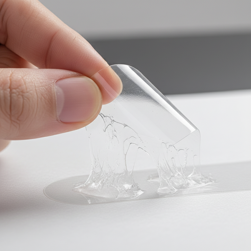
Realtor branding stickers are custom adhesive labels carrying your logo, name, brokerage line, and a call to action. They overlay existing assets—signs, riders, folders, mailers, and swag—to create extra touchpoints without redesigning core materials. Durable stocks and clean design keep them legible under handling and weather.
In practice, stickers function as flexible brand boosters. Instead of reprinting a rider to add “Book a Tour,” apply a high-contrast QR sticker that links to your calendar. Rather than redesigning folders for every campaign, seal them with a die-cut logo that reinforces your face-and-name pairing. This approach reduces lead time while maintaining a polished look.
In our experience outfitting Mississauga and GTA agents, the most practical starter kit includes three pieces: a 2–3 inch die-cut logo for swag and laptops, a 3–4 inch rectangular QR label for yard signs and folder fronts, and a compact compliance strip that keeps brokerage text consistent on handouts. That trio covers 90% of everyday placements without clutter.
- Common shapes: circles for swag, rectangles for QR labels, custom die-cuts for standout logos.
- Preferred specs: vector logos, outlined fonts, and a quiet zone around QR codes.
- Durability: outdoor vinyl with laminate for signs; BOPP for water-resistant handouts.
If you’re building your first set, bring your brand kit (logo files, color values, fonts, and a one-line CTA). We can load those into templates so future reorders are a two-click process, whether you’re topping up before a weekend open or prepping for a brokerage event.
Why Stickers Matter in Real Estate Marketing
Stickers multiply brand impressions across surfaces buyers already handle—folders, door hangers, and signs. They create micro-moments for recall and quick actions via QR codes. When the message is short and contrast is strong, these small placements reliably bridge online discovery and in-person showings.
Real estate marketing hinges on repetition and clarity. A yard sign may get drive-by glances, but a folder seal or door-hanger label travels home with visitors. Each added touchpoint nudges recall, especially when your headshot and name appear alongside a scannable prompt. The small canvas forces discipline—5–7 words often outperforms longer copy.
We also see how stickers support cohesive branding across mixed assets. Agents often juggle riders, open house signs, flyers, and presentation folders produced at different times. A tight, on-brand sticker system evens out color differences, typography drift, and outdated CTAs. Over a selling weekend, that uniformity signals professionalism and reduces decision friction.
If you want to explore production methods and materials beyond this guide, the Shopify sticker guide covers formats and finishes at a high level. It’s a helpful primer when you’re evaluating durability, gloss vs. matte, or the impact of clear vs. white media on legibility.
How Sticker Branding Works: From Strategy to Print
A reliable sticker program follows a plan: set outcomes, map surfaces, choose formats, design for legibility, select durable materials, then place and restock on a cadence. A three-pack—logo, QR callout, and compliance mini—covers most REALTOR workflows without reprinting core signage.
Start by writing a one-sentence outcome such as “Increase weekend open house scans to our showing form.” Next, inventory surfaces: yard signs, riders, A-frames, folders, door hangers, postcards, laptops, and even lockboxes. Assign a sticker type to each surface, then lock design rules so any team member can deploy without guesswork.
- Set outcomes: more scans, more booking requests, or faster “contact me” actions.
- Map surfaces: signs, riders, A-frames, folders, door hangers, postcards, laptops.
- Pick formats: die-cut logos for giveaways, rectangular QR labels for quick scans.
- Design rules: bold sans-serif type, high contrast, 300 dpi CMYK, 0.125 inch bleed.
- Materials: laminated vinyl outdoors; BOPP for water resistance on handouts.
- Placement plan: same corner, same angle, same distance from edges—every time.
- Restock cadence: monthly top-ups; keep extras in your showing kit and vehicle.
| Step | Owner | Timeframe | Notes |
|---|---|---|---|
| Brand kit finalize | Agent/Designer | 1–2 days | Confirm logo, CMYK values, fonts, brokerage compliance line. |
| Template setup | Printer | Same week | Die-cut paths, bleed/safe margins, QR testing at 18–24 inches. |
| Proof + print | Printer | 1–3 days | Approve proof; outdoor sets laminated for weather and abrasion. |
| Deploy + track | Agent/Team | Weekly | Standardize position on riders/folders; log scans and leads. |
For outdoor placements, laminated vinyl is the default. If you’re curious about road-tested options and adhesives, the Shopify bumper sticker overview highlights durability factors relevant to rough environments—useful when you’re choosing a laminate thickness or evaluating weather exposure near busy streets.
Types of Stickers for Realtor Branding
Pick sticker types by application. Use laminated vinyl for outdoor signs, BOPP for water-resistant handouts, and die-cut logos for giveaways. Kiss-cut sheets speed team use, while window clings and floor decals organize open house flow. A simple three-pack covers most needs: logo, QR, and compliance.
Material affects both appearance and longevity. Outdoor vinyl with a protective laminate resists moisture and abrasion on yard signs and A-frames. BOPP (polypropylene) balances durability and print clarity on folders and take-home materials. Paper label stocks suit indoor mailers and inserts when budgets favor high volume over weather resistance.
Finish also matters. Matte coatings minimize glare and improve QR scannability under bright light. Gloss adds pop to photos and deep brand colors but can reflect on glass or glossy plastics. Clear media produces a “printed on glass” look for office doors and acrylic displays, but you’ll want bold, dark elements so the design doesn’t disappear.
Format decisions come down to speed and impact. Rectangular QR labels stack neatly on sheets for quick application at scale. Die-cut logos match your mark’s silhouette for giveaways and laptop placements. Kiss-cut sheets put several shapes on one carrier so teams can restock riders and folders in minutes during a busy weekend.
For event scenarios, consider temporary options like window clings and floor decals. Clings place key CTAs at eye level on office glass or pop-up booths; floor decals can guide visitors to sign-in tables or feature rooms inside an open house. These placements help pace foot traffic and ensure no one misses the key scan points.
When you’re ready to order, browse our sticker options for REALTORS to match material, shape, and finish to each use case. If you want the whole kit dialed in, our realtor packages consolidate must-haves so you can refresh listings fast.
Design Best Practices for Realtor Stickers
Clarity wins. Keep copy to 5–7 words, use bold sans-serif fonts, and maximize color contrast. Maintain a 0.125 inch safe area, export 300 dpi CMYK artwork, and allocate a quiet zone around QR codes. Test scannability from 18–24 inches on matte finishes to reduce glare.
Typography and layout are the first make-or-break choices. At small sizes, a 10–12 pt minimum font height holds up on a 2–3 inch logo sticker; for a 3–4 inch QR label, aim for 18–24 pt on the main line. Keep a strict hierarchy—one headline, one QR, and minimal backup text. More words rarely perform better on a 4 inch rectangle.
Color is your second lever. Use your primary color for the headline and a neutral background when possible. Avoid midtone-on-midtone pairings. If your brand palette leans light, add a dark stroke to thin letterforms, and ensure your QR code prints with solid dark foreground modules and an intact quiet zone for reliable scanning.
File preparation keeps production smooth. Supply vector logos (AI, PDF, or SVG), outline fonts, and provide CMYK values for color accuracy across print runs. Add a 0.125 inch bleed so artwork trims cleanly, and keep essential text the same distance inside all four edges to avoid visual drift when stickers land on varied surfaces.
Finally, test in the wild. Place a proof on a sign edge and read it from a few feet away under daylight. Try scanning the QR in a kitchen lit with warm bulbs. If legibility fails in those conditions, simplify. A small canvas rewards restraint far more than clever copy.
For additional execution ideas that complement stickers—like pairing them with flyers or presentation folders—see our practical real estate branding guide and this marketing materials checklist tailored for busy agents.
Tools and Resources for Fast Execution
Templates plus an online design editor let you move from idea to print in hours. Save brand kits, keep pre-sized sticker layouts next to your sign and folder files, and coordinate same-day pickups for time-sensitive listings. This keeps campaigns cohesive without emergency redesigns.
Agents who standardize their assets move faster. We save your logo, fonts, colors, and brokerage line inside our templates so your next “QR to listing” label or die-cut logo is a quick reorder. When new listings drop on Thursday, you can pick up Friday and be open-house ready Saturday with everything matching across signs, folders, and handouts.
Beyond stickers, we keep common companion items in sync: open house signs, print-shop selection tips, and time-saving realtor packages. Short, scannable prompts paired with responsive pages prevent drop-off when prospects hop from a sign to a phone in seconds.
Need hands-on help? Swing by our Mississauga shop at 5004 Timberlea Blvd Unit#18 for in-house design support and same-day pickup on select items. We’ll align sticker templates with your riders, folders, and open house materials so every touchpoint looks intentional, not improvised.
Local Sticker Strategy for Mississauga Agents
For agents near 5004 Timberlea Blvd Unit#18 in the Regional Municipality of Peel, use laminated vinyl for all outdoor placements and keep 3–4 inch QR labels on hand for folders and sign-in tables. Same-day pickups help you prep for weekend opens while maintaining consistent brokerage lines across listings.
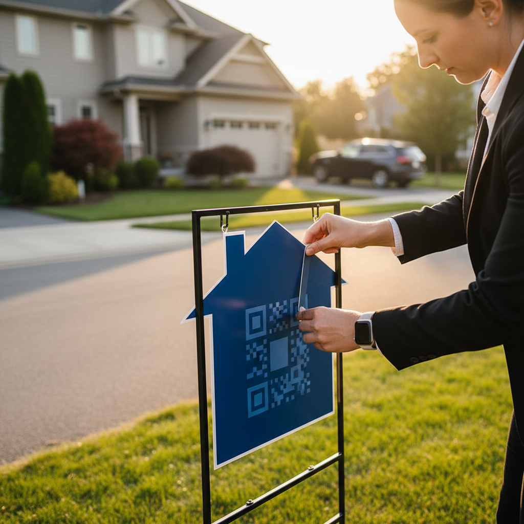
Local climate and surfaces drive material choices. Freeze–thaw cycles and mixed substrates (powder-coated sign frames, corrugated plastic, painted wood) reward stronger adhesives and lamination. Place QR labels chest-high on A-frames and at table-level in kitchens, where visitors naturally pause. We see better scanning when the QR sits near the sign-in sheet or feature displays.
Local considerations for 5004 Timberlea Blvd Unit#18
- Transit foot traffic near Tomken Station East Platform A responds to eye-level window clings during open house hours—keep CTAs under seven words.
- Spring market weekends fill fast; plan Thursday pickups so Saturday opens have fresh, laminated QR labels and replacement logo die-cuts.
- Events at Stanford International College can lift walk-by visibility—prep A-frame decals with simple arrows pointing to the showing route.
To round out your kit, sync stickers with door hangers, brochures, and postcards. Our teams regularly coordinate these with riders and open house signage so your brand looks steady from curb to kitchen.
Case Studies and Real Examples
A compact three-sticker kit—logo, QR, and compliance—accelerates setup, tightens presentation, and improves capture during opens. Teams standardize positions on riders and folders, stock kiss-cut sheets in cars, and refresh placements after weather. The result is steadier recall and fewer missed scan moments.
Mississauga team rollout: a brokerage standardized a 3.5 inch QR label positioned in the lower-right of every yard sign. Over three weekends, setup times dropped because agents no longer debated placement. The label pointed to a mobile-friendly showing form, and follow-up moved faster since scans routed straight to each agent’s calendar.
Listing refresh in Peel: an agent used a die-cut logo to brand a generic rider instead of ordering a custom one midweek. The visual pop was immediate, and the saved time meant the Thursday broker open went live with a consistent look across the block. A matching folder seal kept the brand intact during offer reviews.
Open house kit consistency: teams who pre-pack kiss-cut sheets in vehicles replace weather-worn stickers before photos, opens, or buyer second looks. Because everyone follows the same placement rules and safe margins, riders and folders read cleanly. That predictability reduces visual clutter and telegraphs professionalism to neighbors and attendees.
To mirror these results, align stickers with the rest of your kit. Our agent checklist and bundled packages keep signs, folders, and QR experiences in sync so each new listing launches on-brand—no scramble.
Frequently Asked Questions
Most REALTOR sticker sets include a 2–3 inch logo, a 3–4 inch QR label, and a small compliance line. Use laminated vinyl outdoors and BOPP indoors. Keep copy short, maintain strong contrast, and test QR codes from 18–24 inches under both daylight and warm indoor lighting.
What size sticker works best on a yard sign?
For yard signs, 3–4 inch rectangular or circular stickers read cleanly from a few feet away. Use laminated outdoor vinyl, keep copy under seven words, and place near the top-right or bottom-right corner to avoid covering key listing details.
Are vinyl stickers weather-resistant for winter?
Yes—choose outdoor-rated vinyl with a protective laminate for moisture and abrasion. Apply to clean, dry surfaces within the recommended temperature range to maximize adhesion. For textured frames, press firmly along edges to prevent early lift.
How do I add a QR code that scans reliably?
Export the code at high resolution with a clear quiet zone, maintain strong foreground/background contrast, and test from 18–24 inches. Matte finishes reduce glare. Link to a short, mobile-friendly URL that opens fast on cellular networks.
What’s the difference between die-cut and kiss-cut?
Die-cut stickers follow the exact outline of your design and peel as a single piece—great for giveaways. Kiss-cut stickers are lightly cut through the top layer and remain on a backing sheet, which speeds bulk application for teams.
Conclusion and Next Steps
A durable, legible three-pack—logo, QR, and compliance—covers most REALTOR sticker needs. Standardize placement, maintain high contrast, and laminate for outdoor use. Keep templates on file and restock monthly so every new listing launches on-brand with minimal prep time.
Here’s how to keep momentum without overthinking it. Finalize your brand kit once. Save sticker templates next to your sign and folder files. Place stickers in the same corner every time. Keep kiss-cut sheets in your vehicle. These small habits compress setup and create a strong, consistent buyer experience.
- Key takeaways: Short copy wins; contrast matters; 300 dpi CMYK; 0.125 inch bleed; matte for scannability.
- Action steps: Load brand assets into templates, lock a placement plan, and schedule monthly top-ups.
- Next move: Explore our sticker templates and coordinate with your open house signs so your next listing is ready on time.