GotPrint business cards are online-ordered, mass-produced cards known for low per-unit pricing and standardized options. They suit simple, high-quantity needs. For Realtors near 5004 Timberlea Blvd Unit#18 in Mississauga, local shops like Top Realtor Sign & Print add premium finishes, same-day pickup, and hands-on design help that big online printers can’t match.
By Ashwani • Last updated: 2026-07-05
Above-Fold Section: Hook + What You’ll Find
This complete guide compares GotPrint business cards with local, premium cards from Top Realtor Sign & Print. You’ll see when online ordering wins, when local printing outperforms, and how to choose stock, finishes, and turnaround—plus a comparison table, step-by-step process, and Realtor-specific tips.
Busy day? Scan this quick overview and jump to the section you need.
- What GotPrint business cards are and who they fit best
- Why Realtors often prefer local premium cards for listings
- How ordering works, timelines, and color accuracy tips
- Finishes: soft touch, raised spot UV, foil, painted edges
- Comparison: GotPrint vs Top Realtor Sign & Print
- Best practices, tools, real examples, and a practical FAQ
Summary
If you need basic cards at scale, GotPrint business cards deliver standardized value. If you need premium impact, same-day pickup, and guidance that protects your brand, Top Realtor Sign & Print in Mississauga is the better fit. Choose based on finish quality, turnaround, color control, and support.
- Standardized online cards work for volume and simplicity.
- Local premium cards win on tactile finish, brand control, and speed.
- Realtors benefit from brokerage-compliant design done in-house.
- Color-managed workflows reduce reprints and timeline risk.
- Same-day options exist locally when listings pop up fast.
What Are GotPrint Business Cards?
GotPrint business cards are template-based cards produced in high-volume “gang-run” print batches. They are optimized for low per-unit pricing and common sizes, finishes, and quantities, making them practical for basic, repeatable needs where customization and hands-on support are limited.
Context helps you decide if this route fits your goals.
- Production method: High-volume batching reduces cost but narrows customization windows.
- Typical specs: Standard sizes, common coatings, and preset paper stocks.
- Strength: Economical for straightforward designs and large quantities.
- Trade-off: Less control over exact color, coating thickness, or tactile feel.
- Support model: Self-serve templates; limited hands-on design guidance.
For a Realtor who just needs simple contact cards for farm mailers, this model can work. For listing presentations or luxury properties, agents often want high-impact finishes that elevate perceived value.
Why This Matters for Realtors (Brand, Speed, Results)
Your card is a 3-second brand test. Premium cards with soft touch, foil, or raised spot UV feel different and signal quality—useful in competitive listing appointments. Local pickup and brokerage-aligned design help you move faster and avoid brand or color errors when timelines are tight.
- First impressions are fast: People form a judgment almost immediately; tactile feel guides that judgment.
- Brand compliance: RE/MAX red or Royal LePage gray slightly off? It stands out—and not in a good way.
- Local speed: Same-day or next-day pickup minimizes listing delays and event stress.
- Consistency: Matching your flyers and brochures reinforces recall and trust.
- Real-world effect: Higher-quality leave-behinds raise perceived expertise in listing consultations.
We see this daily: agents who upgrade finishes report more confident intros and smoother brand conversations at the kitchen table.
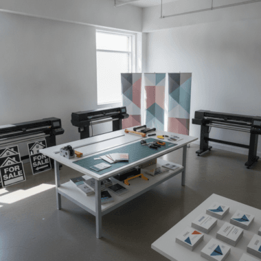
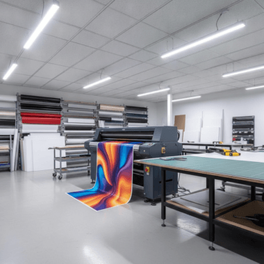
How Ordering Works (Online vs Local)
Ordering from a mass online vendor is self-serve and shipment-based. Ordering locally with Top Realtor Sign & Print blends an online catalog with human review, color checks, and same-day pickup options—ideal when accuracy and speed matter more than bare-minimum price.
Typical 7-step process
- Choose specs: Size, paper, finish, quantity.
- Prepare artwork: Use print-ready files or our online editor.
- Preflight: Bleed, margins, and resolution checked.
- Proof approval: Digital proof; physical proof if needed.
- Production: Offset or digital press, then finishing.
- Quality check: Inspect color, trim, and coating.
- Pickup: Same-day/next-day options in Mississauga.
Many Realtor projects move from “need cards” to “need cards plus listing insert signage.” One order review often prevents multiple trips and keeps color consistent across pieces.
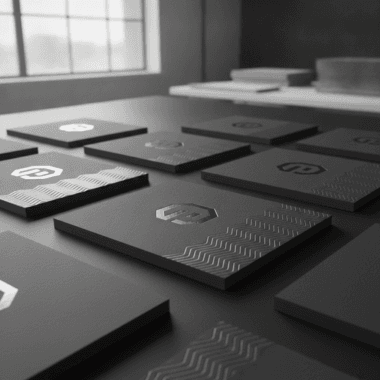
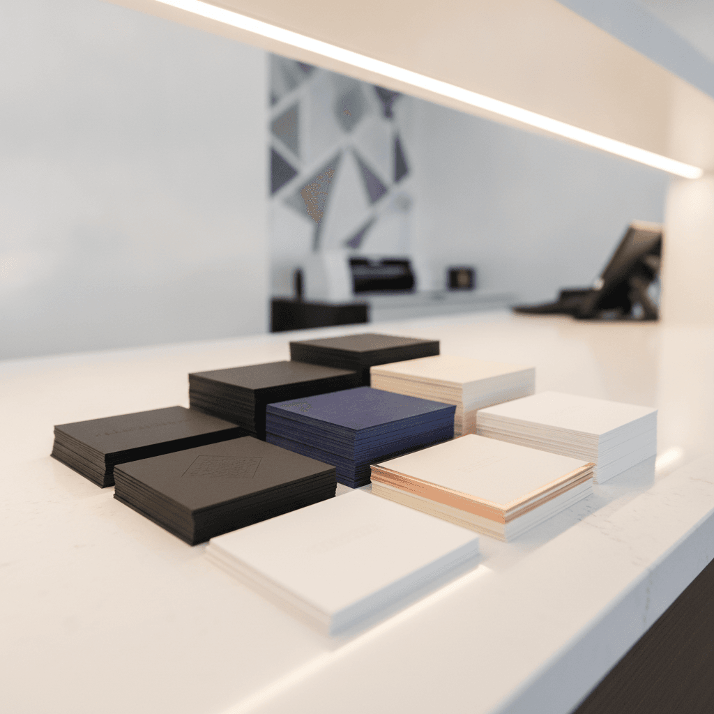
Finishes and Stocks Realtors Actually Use
Premium finishes—soft touch, raised spot UV, and foil—create tactile contrast that budget coatings can’t. Pair them with sturdy stocks to avoid bent corners in coat pockets and open house kits. These combinations look and feel better, especially for higher-end listings.
- Soft touch laminate: Velvety feel that screams premium; smudge-resistant.
- Raised spot UV: Gloss highlights over matte; great for logos or agent names.
- Gold/Silver foil: Metallic accents for luxury homes and brand cues.
- Painted edges: A color pop that’s visible in a stacked deck.
- Sturdy cores: Thicker cards resist wear during showings and tours.
Want to see how foil pairs with brokerage palettes? Our branding guide shows tasteful use so finishes elevate—not overwhelm—your identity.
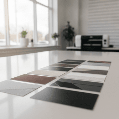
GotPrint vs Local: Side-by-Side Comparison
Choose GotPrint for basic volume and predictable templates. Choose Top Realtor Sign & Print for premium finishes, color-managed accuracy, local pickup, and Realtor-specific support. This table summarizes the trade-offs so you can pick with confidence.
| Factor | GotPrint Business Cards | Top Realtor Sign & Print (Mississauga) |
|---|---|---|
| Ordering Style | Self-serve templates | Guided setup + online editor |
| Turnaround | Ships after production | Same/next-day pickup options |
| Finishes | Standard coatings | Soft touch, raised spot UV, foil, painted edges |
| Color Accuracy | Batch variance risk | Local proofs and spot checks |
| Brand Compliance | DIY responsibility | In-house alignment to brokerage guides |
| Support | Email/FAQ | Human help, design check, pickups |
| Add-Ons | Limited | Signs and riders, brochures, flyers |
| Local Convenience | Delivery only | Pickup in the 5004 Timberlea Blvd Unit#18 area |
If you rarely need help and prefer standard templates, online wins. If you want luxury finishes, fast fixes, and brand control, local wins.

Pricing and Value Factors (No Numbers, Just What Drives Them)
Card pricing is driven by stock thickness, finish complexity, run size, and turnaround speed. Value grows when color accuracy reduces reprints, local pickup prevents delays, and durable finishes extend card life in the field. Think total impact over sticker price.
- Run size: Larger batches lower per-unit cost but increase risk if design changes soon.
- Finish complexity: Raised spot UV and foil add steps that require expertise.
- Stock choice: Thicker cores resist wear, keeping cards presentable longer.
- Timeline: Rush work prioritizes speed; plan specs accordingly.
- Brand protection: Accurate brokerage colors prevent awkward reprints and lost time.
In our experience, optimizing finish and stock for how you actually hand out cards at showings matters more than shaving a tiny amount off unit price.
Best Practices for Realtor Business Cards
Keep design clean, brand-aligned, and scannable. Use one strong call to action, readable contrast, and a finish that matches your market. Build a system that keeps cards, signs, and brochures consistent across listings.
- Limit noise: One CTA (book a consult, scan QR) beats five weak messages.
- Readable contrast: High contrast improves scanning in dim foyers and night events.
- Finish fit: Soft touch for luxury; painted edges for a bold, modern look.
- Consistent assets: Mirror your Realtor package styling across cards and signs.
- Keep a kit: Refill cards alongside directional signs and flyers for open houses.
Practical tip: pack 50 cards and a small microfiber cloth in your open house kit so cards look pristine on arrival.
Tools and Resources You Can Use
Use our online editor for quick layouts, get a preflight check for errors, and lean on in-house design for brokerage alignment. Combine cards with flyers and brochures for a cohesive leave-behind kit at listing appointments and open houses.
- Online editor: Build print-ready layouts without pro software.
- Preflight checklist: Bleed, safe area, and 300 DPI prevent soft edges.
- Design help: In-house tweaks align to brand guides fast.
- Bundle smarter: Pair cards with brochures and flyers for consistent color.
- Event add-ons: Pack a few insert signs for visibility on show day.
When your assets share the same color-managed workflow, your brand looks unified on every doorstep.
Case Studies and Examples (Mississauga Realtors)
Realtors near 5004 Timberlea Blvd Unit#18 often pair soft touch cards with raised spot UV on names for listings above the area average. Teams running multiple open houses favor thicker stocks and painted edges to withstand weekend use and frequent pocket carry.
- Luxury listing consults: Agents brought soft touch + foil cards to match high-end brochures—smoother intros, stronger perceived expertise.
- Weekend open house blitz: Teams used thicker cores; corners stayed sharp, cards looked fresh across three properties.
- Brokerage color check: A quick in-house proof prevented a brand-color mismatch before a 60-card handoff at showings.
- Add-on synergy: Cards matched directional signs, improving wayfinding and recall.
The throughline: finish and stock choices should reflect how, where, and how often you hand out cards—not just a spec sheet.
Ordering Checklist (Confident First-Time Setup)
Use this checklist to avoid the most common pitfalls: correct bleed and safe margins, legible contrast, vector logos, and a finish that matches your market. Approve a proof you’d be proud to hand out tomorrow.
- Confirm final size and orientation.
- Set 0.125″ bleed; keep key elements 0.125″ inside trim.
- Export CMYK PDF at 300 DPI; outline fonts or include them.
- Use vector logos to keep edges crisp on spot UV and foil.
- Test contrast on matte and soft touch backgrounds.
- Pick a finish that aligns with your typical listing price point.
- Request a color check if matching other pieces.
Small setup wins prevent reprints and timeline slips—especially ahead of a busy weekend.
Process Table: From Idea to In-Hand
This five-stage process keeps your project moving: Discover, Design, Proof, Print, and Pickup. At each stage, one clear decision advances the job toward the timeline that matters for your next listing or event.
| Stage | Your Action | Our Assist | Output |
|---|---|---|---|
| Discover | Share goals and specs | Recommend stock/finish | Clear, aligned plan |
| Design | Upload or use editor | Preflight & tweaks | Print-ready file |
| Proof | Approve design | Digital/physical proof | Green light to print |
| Confirm timeline | Run & inspect | Boxes packed | |
| Pickup | Grab in Mississauga | Same/next-day options | Cards in hand |
When your listing calendar changes, we adapt with you—because speed without quality creates more problems than it solves.
Local Tips Near the 5004 Timberlea Blvd Unit#18 Area
Plan pickups around traffic windows and events near Mississauga transit and parks. Bring a sample from your last run to match color fast, and keep an emergency kit in your trunk for weekend open houses.
Local considerations for 5004 Timberlea Blvd Unit#18
- Time your pickup to avoid peak times near Tomken Station East Platform A so you’re not rushing to a showing.
- Weekend open houses? Keep cards in a cool, flat spot if you stage photos near Red Brush Park on warmer days.
- For brokerage color checks, bring a prior card or flyer; side-by-side review speeds approvals.
GotPrint Business Cards: Fast Answers
Use GotPrint for basic, budget-friendly runs with predictable specs. Use Top Realtor Sign & Print when brand control, premium finishes, color checks, and same-day Mississauga pickup are priorities—especially for listing presentations and open houses.
- When online wins: Simple layouts, big quantities, flexible timelines.
- When local wins: Tight turnarounds, luxury finishes, brokerage compliance.
- Hybrid tip: Keep budget cards for farming, premium cards for appointments.
Frequently Asked Questions
These quick, direct answers cover the questions Realtors ask most about online versus local business card printing, finishes, and timelines. Each response is designed for speakable clarity.
Are GotPrint business cards good enough for luxury listings?
They’re fine for basic use, but luxury listings benefit from premium finishes like soft touch, raised spot UV, and foil. Local production also helps verify brand colors in person, which reduces the chance of reprints before a high-stakes appointment.
How fast can I get cards in Mississauga?
Top Realtor Sign & Print offers same-day or next-day pickup on select specs. That’s useful when an unexpected listing hits your calendar or you need fresh cards for an open house this weekend.
What finishes hold up best during weekend open houses?
Soft touch lamination with raised spot UV ages well and resists smudges. Pairing those with thicker stock keeps edges clean even when cards live in a jacket pocket or open house kit.
Can you match my brokerage colors exactly?
We align your files to brand guides and can provide a quick color check. That side-by-side review helps ensure your card, flyer, and sign set look consistent at a glance.
Key Takeaways and Next Steps
If you need standardized, economical cards, GotPrint business cards work. If you need premium feel, exacting colors, and fast pickup near 5004 Timberlea Blvd Unit#18, work with a local specialist. Protect your brand, then optimize for speed.
- Pick production based on finish quality, color control, and timeline.
- Use premium finishes for listing presentations and luxury properties.
- Bundle cards with signs, flyers, and brochures for cohesive branding.
- Keep a ready-to-go kit for open houses and pop-up events.
For deeper design tips, see our internal guides on business card printing, brochures, and flyers.
For more on common stock types and finishes, browse this overview from The UPS Store’s card stock guide. If you’re new to layout sizes and safe margins, their business card template tips explain fundamentals. For broader print options, see their flyers and brochures section.