


Painted edge business cards for realtors are thick, premium cards with vivid color applied to the card’s sides, creating a bold border that stands out in hand. From our Mississauga shop at 5004 Timberlea Blvd Unit#18, we design and produce these cards with luxury finishes and local same-day pickup options.
Last updated: 2026-05-16
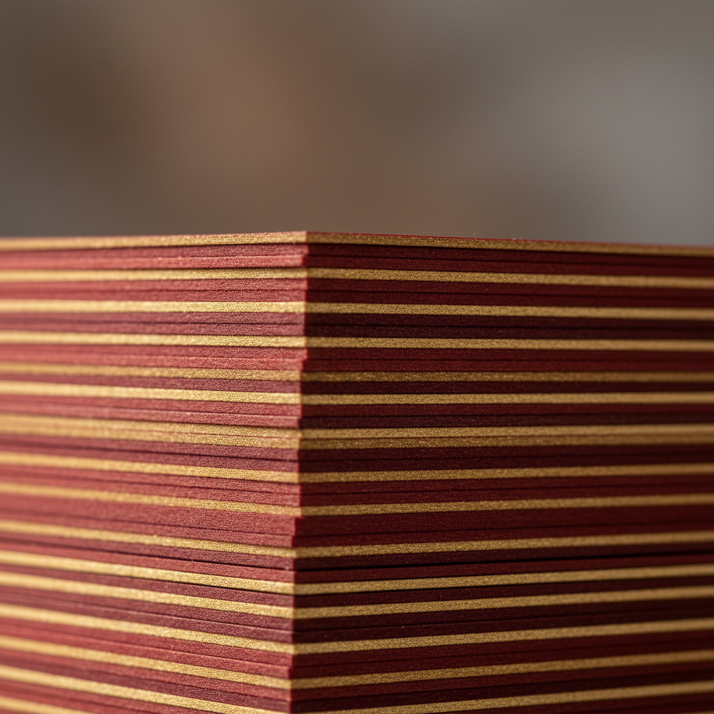
Above the Fold: Why Painted Edges Win Attention
Painted edge cards win attention because the colored sides form a bold halo that’s visible from any angle. For real estate agents, that edge acts like a mini yard sign in your hand—amplifying brand colors, highlighting premium paper thickness, and signaling quality before prospects even read your name.
Here’s the thing: first impressions often happen in two seconds or less. A colored edge makes your card instantly recognizable in a stack and memorable at open houses.
- Quick impact: Color on the edge is visible from every angle—great at busy showings.
- Premium feel: Thick stock (typically 32pt) telegraphs quality without saying a word.
- Brand pop: Edge paint can match your brokerage palette for cohesion.
- Perfect pairings: Combine with soft touch, foil, or raised spot UV for tactile contrast.
- Local convenience: Same-day pickup options from our Mississauga location for urgent listings.
Quick Summary
- What you’ll learn: What painted edges are, how production works, design best practices, and how to order.
- Who it’s for: Ontario realtors who want luxury business cards that stand out at open houses and listing meetings.
- Outcome: A crisp plan to design, proof, and pick up cards locally with confidence.
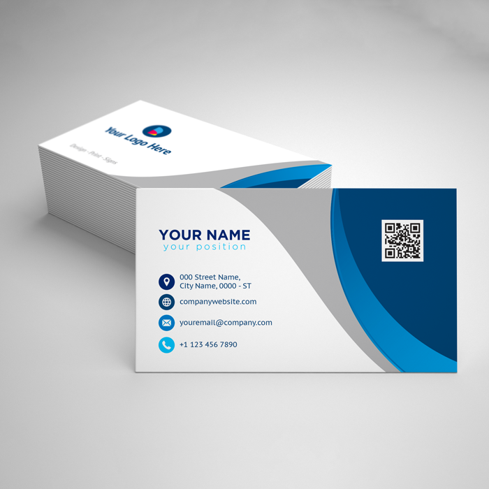
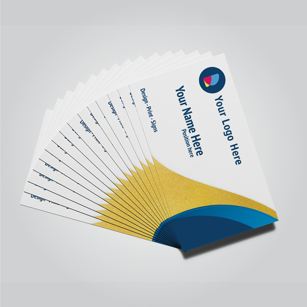
What Are Painted Edge Business Cards?
Painted edge business cards are thick, multilayer cards with ink or pigment applied to the perimeter edges after trimming. The result is a crisp band of color that frames the card from any angle, enhancing perceived thickness and reinforcing brand identity in seconds.
In our experience working with GTA agents, these cards function like micro-billboards in your pocket. The moment prospects see that color pop, they expect a high-caliber, detail-focused professional.
- Core components:
- Heavyweight stock (commonly 32pt or layered board)
- Precision trim to square edges
- Edge painting with durable pigment
- Optional surface finishes (soft touch, matte, gloss)
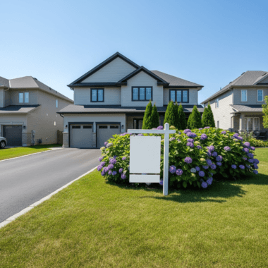
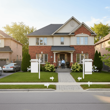
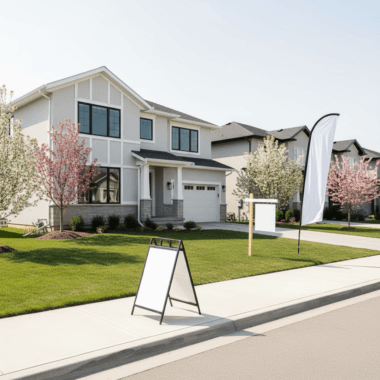
- Ideal use cases: Open houses, listing presentations, networking events, luxury property showings.
- Brand alignment: Match brokerage colors for instant recognition.
Want to see options tailored to real estate? Explore our painted edge business cards product page for specs and upload guidelines.
Why Painted Edges Matter for Realtors
Painted edges increase recall, signal quality, and drive conversations. In competitive markets, distinctive cards help agents earn second looks, more referrals, and higher open house engagement—small details compound into measurable lead flow over time.
Realtors juggle showings, negotiations, and marketing—cards often carry the brand when you can’t. We’ve found that luxury details spark more “Where did you print these?” moments, which turn into warm intros.
- Higher pickup rates: Guests at open houses are more likely to grab a card that looks premium.
- Better memory hooks: Color-matched edges provide a simple yet strong recall cue.
- Signals trust: Heavier stock and refined finishes correlate with perceived professionalism.
- Fits luxury narratives: Works especially well when listing higher-end or renovated homes.
Pair edge color with tactile finishes to maximize impact. Compare with our raised spot UV business cards or upgrade surfaces via soft touch lamination to build a distinct “feel-first” identity.
How Painted Edges Are Made (Production Workflow)
Production starts with printing on thick stock, then precision trimming, stacking, clamping, and applying pigment to all exposed edges. After curing, cards receive optional finishes and a final quality check to ensure color uniformity and clean corners.
Here’s a transparent view of our in-shop process for realtors across Ontario.
- Print on premium stock: We use heavyweight boards suited to edge color saturation.
- Trim to final size: Clean, square edges are essential for even paint lines.
- Stack and clamp: Stacks are secured to keep cards perfectly aligned during application.
- Apply edge pigment: Even coats yield bold, consistent color; we test for absorption.
- Cure fully: Ensures durability so color won’t transfer under normal use.
- Finish surfaces (optional): Soft touch, matte, or gloss to dial in the feel.
- Final inspection: We check edges, corners, and surface fidelity before packing.
Designing for this workflow is easy with our browser-based editor. If you’d rather not DIY, our in-house designers align fonts, spacing, and colors to your brokerage style guide.
Color Theory: Choosing the Right Edge Color
Choose edge colors that reinforce your brand palette, contrast with your card face, and remain legible under indoor lighting. Bold primaries pop on soft touch; metallic inks pair well with dark face designs. Consistency across signs, riders, and cards builds recognition.
Color is strategy, not decoration. You’re guiding attention and memory during short, high-stakes moments.
- Brokerage alignment: Match RE/MAX red, Royal LePage red/black, or Century 21 gold accents.
- Contrast planning: On dark card faces, silver or white edges can look razor-sharp.
- Finish synergy: Soft touch mutes glare, allowing neon or metallic edges to stand out.
- Lighting reality: Open houses use warm bulbs; test samples under warm light for accuracy.
To understand how surface sheen affects perceived color, compare how gloss and matte finishes influence reflections in this practical overview of gloss vs. matte finishes—the principles translate directly to cards handled under different lighting.
Painted Edges vs Foil vs Raised Spot UV
Painted edges amplify thickness and side-view visibility; foil draws metallic highlights on the face; raised spot UV creates glossy, tactile accents. The best real estate cards often combine two techniques—edge color for pop plus foil or spot UV for touch and light play.
Here’s a fast comparison to help you choose your stack.
| Feature | Painted Edges | Foil (Gold/Silver) | Raised Spot UV | Soft Touch Lamination |
|---|---|---|---|---|
| Main impact | Side-view color halo and thickness cue | Metallic shine on logos/text | Glossy, raised areas for texture | Velvety, non-glare surface feel |
| Best for | Standing out in stacks | Luxury branding cues | Tactile engagement | Premium handfeel |
| Design tip | High-contrast edge vs face | Keep vector art clean | Use spot layers sparingly | Pair with bold colors |
| Pairs well with | Soft touch, foil, spot UV | Soft touch, painted edges | Painted edges, soft touch | Foil, painted edges |
If you want deep-dive comparisons, see our practical guide to luxury card finishes and the specific product pages for painted edges, raised spot UV, and soft touch lamination.
Design Best Practices for Realtors
Keep the front clean, prioritize hierarchy, and reserve special effects for essentials—name, title, brokerage logo, and direct phone. Align edge color to a single brand accent. Less clutter equals faster comprehension and more action during brief interactions.
- Information hierarchy: Name and phone first, then role and brokerage.
- Whitespace wins: Minimalism makes luxury finishes breathe.
- Brokerage compliance: Keep logos clear and unaltered; follow your brand guide.
- Typography: Use 1–2 type families; ensure strong contrast on small text.
- Back-of-card utility: Add a QR to listings, reviews, or a lead magnet.
Need layout ideas proven in Ontario markets? Skim our top 10 business card design tips for agents—each tip pairs with real print specs we run in-shop.
File Setup and Proofing Checklist
Export print-ready PDFs with CMYK color, embedded fonts, vector logos, 0.125-inch bleeds, and safe margins. Outline spot effects on separate layers. Always review a digital proof for edge alignment, contrast, and scannability before production.
- Color mode: CMYK (not RGB) for predictable print color.
- Resolution: 300 dpi minimum on images.
- Bleed/safe area: 0.125 in bleed; 0.125–0.1875 in safe margins.
- Fonts: Embed or outline to prevent substitution.
- Vectors: Supply logos as vector for crisp foil/UV edges.
- QR codes: Test with two phone models under indoor lighting.
Curious how surface sheen influences perceived legibility? See this accessible primer on finish choices and durability; while it’s written for painted surfaces, the same visibility principles apply to print under daily handling.
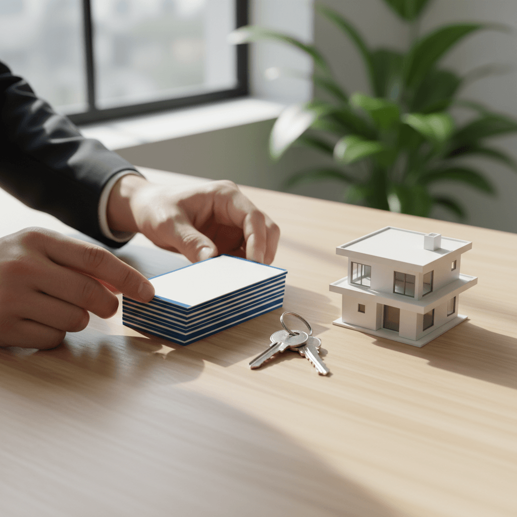
Local Ordering and Pickup in Mississauga
Order online and pick up painted edge business cards at 5004 Timberlea Blvd Unit#18 for reliable same-day and next-day options in the Regional Municipality of Peel. Neighborhood access and parking make last‑minute open house runs fast and predictable.
We built our workflow around Realtor timelines. When a listing goes live or an open house gets scheduled, speed matters.
- Easy ordering: Use our luxury card ordering guide to move from idea to proof fast.
- On-brand help: Our in-house design team aligns cards to your brokerage style.
- Bundles: Add riders, open house signs, and Realtor packages in one checkout.
Local considerations for 5004 Timberlea Blvd Unit#18
- Transit tip: If you’re riding transit, plan pickups around Tomken Station East Platform A timing to avoid peak waits.
- Seasonal timing: Build in extra time during winter weather—edge paint cures best at stable indoor temps before you head to a showing.
- Parking and handoff: Quick curbside handoff near Red Brush Park side streets can make last-minute pickups smooth during weekend open houses.
Real-World Realtor Use Cases and Mini Case Notes
Edge-painted cards shine in fast interactions—doorway greetings, open house exits, and post-tour debriefs. Agents report more callbacks and “Who printed these?” comments, which naturally open conversations about listings and services.
We see three recurring patterns in the field:
- Open house stacks: A small acrylic holder by the sign-in sheet with bright edges increases pickup rates.
- Listing presentations: Leaving one card on the kitchen island, face up, edge toward the door, subtly signals attention to detail.
- Networking events: Bright edges become social lubricants—people ask about them, giving you an easy opener.
When working with agents near our shop, we’ve noticed edge-painted stacks pair nicely with brokerage-branded cards and a matching raised spot UV logo for tactile emphasis.

Tools and Resources (Templates, Editor, Support)
Use our online design tool for quick layouts, download print templates with correct bleeds, and lean on in-house designers for brokerage alignment. The fastest path: start with a proven template, swap your details, then request a preflight check.
- Online design tool: Build cards in-browser—no pro software required.
- Template library: Realtor-ready sizes with safe margins baked in.
- Design help: Our team dials in fonts, spacing, and logo placement.
- Proofing: One-click approval keeps your timeline moving.
Prefer a quick walkthrough? Our short primer on how to order luxury business cards explains file prep, approvals, and pickup timing.
Quality Control and Durability
Quality comes from tight tolerances: square trims, even pigment, and finish compatibility. We test for smudge resistance and color transfer to ensure edges stay crisp under daily handling, wallets, and cardholders.
- Edge consistency: We spot-check stacks for uniform saturation and clean corners.
- Surface pairing: We confirm paint and lamination play well together before full run.
- Handling tests: Shuffle, bend, and sleeve tests simulate real use.
If you’re curious about how protective coatings influence longevity, this overview of pro vs. DIY finishing highlights why process control matters—similar logic applies to premium print.
How to Order Step-by-Step
Choose your finish, upload or design in-browser, request a preflight check, approve your proof, and schedule pickup at 5004 Timberlea Blvd Unit#18. For tight timelines, call us after proof approval so we can prioritize your open house deadline.
- Pick your finish stack: Painted edges + soft touch, foil, or spot UV.
- Upload/design: Start from a template or your existing artwork.
- Proof: Review contrast, hierarchy, and scannability.
- Approve + schedule: Lock in pickup; we’ll prep packaging.
- Layer your brand: Add Realtor packages for cohesive launch-day materials.
Want a quick brand check? Send us your logo and we’ll recommend the best edge color + finish combination to match your brokerage standards.
Book a 10‑minute consult and pick up at our Mississauga shop.
Compliance, Branding, and Professional Etiquette
Respect brokerage brand guidelines and keep required disclosures visible. Use premium finishes to elevate—not to distract. Professional etiquette still rules: clear contact info, proper titles, and error-free details matter more than any effect.
- Logo integrity: Don’t stretch or recolor brokerage marks.
- Readable titles: Keep designations clear and unambiguous.
- Contact accuracy: Double-check phone and email; test QR targets.
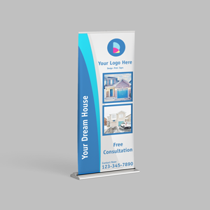
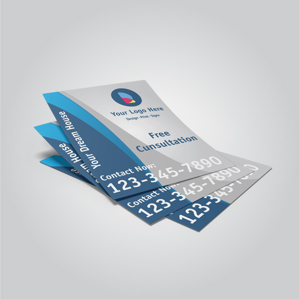
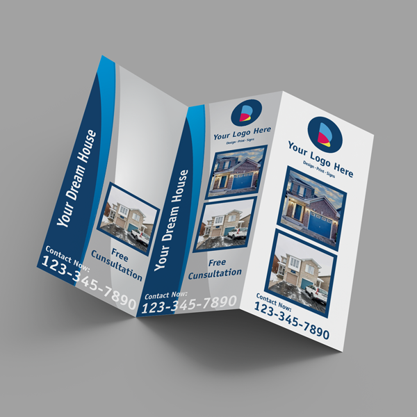
- Consistent collateral: Match cards to your signs, riders, and brochures.
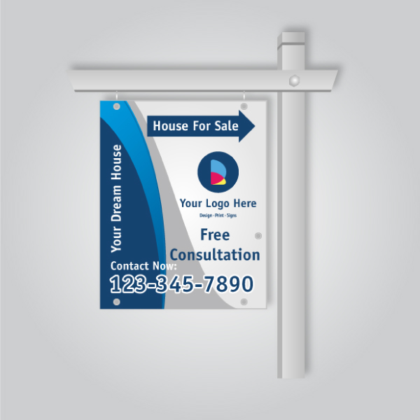
For a fully unified look, add matching finishes across your card finish plan and core signage like For Sale or Open House boards.
Case Studies and Examples
Realtors who align edge color with brokerage accents and add one tactile finish see stronger engagement. The cards feel cohesive with yard signs and listing materials, creating a consistent, professional arc from curb to business card.
Example 1: Bold red edges + soft touch
- Context: Busy weekend open houses; multiple agents competing for attention.
- Design: Deep red edges, soft touch face, clean sans-serif type.
- Outcome: Noticeably higher card pickup and more “love your card” remarks at sign-in.
Example 2: Century-inspired gold edge + spot UV
- Context: Listing presentations for renovated properties.
- Design: Warm gold edge plus raised spot UV on the logo.
- Outcome: Sellers associated the tactile finish with attention to detail.
Example 3: Monochrome face + neon edge
- Context: Networking mixers where lighting is dim.
- Design: Black-and-white face with neon edge for visibility.
- Outcome: Easy to find in pockets and holders; strong recall the next day.
Frequently Asked Questions
Agents most often ask about durability, finish pairings, and turnaround. Painted edges are durable under normal use, pair well with soft touch and foil, and can be produced on tight timelines with coordinated proofs and local pickup.
Will the edge color rub off in a wallet?
Properly cured edge pigment is durable and shouldn’t transfer under normal handling. We test stacks for smudge resistance and color stability during quality checks to make sure your cards stay crisp in pockets and cardholders.
Which finish pairs best with painted edges?
Soft touch lamination is the go-to for contrast and a premium feel. For extra pop, add raised spot UV to the logo or select foil accents. The combo of edge color + one tactile effect is both striking and readable.
How fast can I get them if my open house is soon?
Once your proof is approved, we can prioritize production for same-day or next-day local pickup when feasible. Call us after approval so we can align production with your open house schedule.
Can I match the edge to my brokerage color?
Yes. Provide your brand color values and we’ll match closely within print tolerances. Many agents choose a single accent from their brand palette for a clean, cohesive look across signs and print.
Key Takeaways
Painted edge cards for realtors create instant visibility and a premium feel. Pair them with one tactile finish, align colors to your brokerage, and use a clean layout. Order online, approve quickly, and pick up locally to align with fast-moving listings.
- Use edge color as a recall cue in busy, short interactions.
- Limit special effects to one or two focal elements.
- Keep hierarchy tight: name and phone first.
- Approve proofs early to secure your pickup window.
Next Steps
Choose your finish stack, upload artwork or start a template, and request preflight. Approve the proof and schedule your pickup at our Mississauga shop. Add matching signage so every touchpoint—from curb to card—feels on-brand.
- Start with painted edge business cards.
- Compare with raised spot UV and soft touch lamination.
- Bundle for speed using our Realtor packages.
Prefer a quick conversation? Stop by 5004 Timberlea Blvd Unit#18 for a hands-on look at finish swatches and edge colors. We’ll help you pick a stack that suits your listings and brand.