Common mistakes when ordering flyers include incorrect bleed and safe margins, low-resolution images, paper/finish mismatches, and vague calls to action. At 5004 Timberlea Blvd Unit#18 in Mississauga, Top Realtor Sign & Print helps real estate teams avoid these pitfalls with file preflight, smart stock choices, and same-day pickup—so every flyer works hard.
By Ashwani — Top Realtor Sign & Print • Visit our shop
Last updated: 2026-06-05
Quick Summary
Flyer orders succeed when specs, materials, and timing align. Use CMYK, 300 ppi images, and a 0.125 inch bleed with safe margins. Match stock and finish to handling, approve a proof, and lock your pickup window. This overview highlights the must-dos and provides a step-by-step plan you can follow today.
Use this checklist-style guide to spot risks fast and plan a stress-free order. You’ll learn how to prep files, choose sizes and paper, avoid production delays, and coordinate same-day pickup in Mississauga.
- What to check in your file (resolution, color mode, fonts)
- How to choose size, stock, and coating that fit your use
- Proofing workflow and realistic timeline planning
- Distribution tips for door-to-door, events, and mail
- Local pickup logistics near the Regional Municipality of Peel
What is flyer ordering?
Ordering flyers means preparing print-ready artwork, selecting size, paper, and finish, approving a proof, and scheduling production plus pickup or delivery. Most issues come from file setup (bleed, color, resolution), material mismatch, or missed approvals. Nail these, and your flyers arrive sharp, on time, and on-brand.
In practice, a flyer order covers design setup, file export, preflight, production, and distribution. Each choice—dimensions, paper weight, coating, and ink limits—affects color accuracy, legibility, and durability in the field.
Scope of a typical order
- Design and layout: template or custom artwork aligned with your brand
- File prep: 0.125 inch bleed, CMYK, 300 ppi images, outlined or packaged fonts
- Paper selection: text (80–100 lb) vs. cover (10–16 pt) based on handling
- Finish: matte for writing/low glare; gloss/UV for high color pop
- Proof approval: digital or hard proof with sign-off
- Production + pickup: confirmed window, especially for same-day needs
Where problems begin
- Undersized bleed or missing safety margins cause thin white edges after trimming
- RGB/lower-res images print dull or soft; CMYK/300 ppi keeps detail
- Un-outlined fonts can reflow; outline/package to preserve spacing
- Flimsy stock bends in mail or door-to-door distribution
- Rushed approvals skip proofs and risk reprints or delays
Here’s the thing: every step is a chance to prevent defects. A 60-second preflight often catches 80% of issues—before they cost you time.
Why flyer ordering accuracy matters
Precision protects brand credibility and response rates. Specs like 0.125 inch bleed and 300 ppi prevent trim and image issues. The right paper and finish control durability and feel—shaping first impressions and how long prospects keep your flyer.
Marketing is tactile. Heavier cover stocks resist scuffs in transit, while matte cuts glare for easy reading under bright lights. Gloss or UV boosts saturation in imagery-heavy pieces. A clear call to action (CTA) reduces friction and drives scans or calls within seconds.
- Brand consistency builds recall—match brokerage colors, fonts, and tone
- Tactile quality influences trust the moment someone picks up your flyer
- Correct specs avoid production holds, reprints, and schedule slip
- Readable CTAs (short URLs/QRs) increase conversions and tracking
Practical numbers you can use now: body text ≥ 9 pt, disclaimers ≥ 7 pt, safe margin 0.125–0.25 inch, and total ink coverage within your press range (often 240–300%).
How the flyer ordering process works
A smooth flyer order follows five steps: plan goals and size; prepare print-ready files; select stock and finish; approve the proof; and book production plus pickup. Use checkpoints at each step to eliminate surprises and protect your deadline.
- Plan the campaign
- Audience, message, size, and distribution method
- Decide single-sided vs. double-sided; imagery vs. copy-led
- Set a measurable CTA: short URL, QR, or tracked phone number
- Prepare files
- Set 0.125 inch bleed, CMYK color, and 300 ppi images at final size
- Outline or package fonts; embed links; flatten transparencies if needed
- Export a high-quality PDF/X with fonts embedded or outlined
- Select materials
- Text (80–100 lb) for flexible handouts; cover (10–16 pt) for durability
- Matte for writing and low glare; gloss/UV for maximum vibrancy
- Consider climate and handling: rain, snow, or humid venues
- Proof
- Check trims, spelling, QR function, tiny type legibility
- Confirm color on brand-critical areas and gradients
- Sign off with a named approver to keep the timeline moving
- Schedule
- Confirm production window and same-day pickup if urgent
- Buffer 1–2 hours for proof edits before press
- Coordinate distribution—door-to-door routes or event handoffs
| Step | Checkpoint | What to verify |
|---|---|---|
| Plan | Size + distribution | Fits doors, events, or mail specs |
| Prepare | File setup | 0.125 inch bleed, CMYK, 300 ppi, safe margins |
| Select | Materials | Stock weight/finish match handling |
| Proof | Approval | Spelling, trims, QR/URL, brand colors |
| Schedule | Timing | Pickup window aligns with event |
In our experience, teams that formalize these five checkpoints cut reprints dramatically and hit their distribution dates consistently—even on rapid same-day cycles.
Types, sizes, and print methods
Choose sizes based on use: 4×6 and 5×7 for handouts, 8.5×11 for details, and tri-folds for storytelling. Digital printing is ideal for short runs and speed; offset excels at large volumes and color consistency. Match paper and coating to prevent bends, glare, or ink rub.
Popular sizes and folds
- 4×6 and 5×7: compact handouts, community boards, stackable at open houses
- 8.5×11: spec sheets, schedules, or full-bleed visuals
- Tri-fold/half-fold: brochure-style sequences for features and maps
Need help deciding? See our take in flyer vs. brochure for listings and compare how cadence, copy length, and photography density affect the right format.
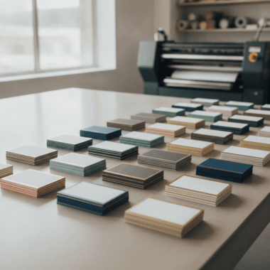
Stock and finishes
- Text weights (80–100 lb): flexible, indoor handouts, good for notes
- Cover weights (10–16 pt): premium feel, better longevity in bags or mail
- Matte: easy to write on, low glare under bright lights
- Gloss/UV: vivid color and improved scuff resistance on imagery-led designs
Print methods
- Digital: fast, great for variable data (personalized QR/URLs), ideal for same-day
- Offset: stable color across big runs; best for precise spot-color needs
For real estate teams, digital’s agility often wins—especially when flyers, business cards, and open house signs need to land together.
Common mistakes when ordering flyers (and how to avoid them)
The biggest pitfalls are missing bleed/safe margins, low-resolution images, unreadable fine text, paper/finish mismatch, fuzzy CTAs, and missed timelines. Avoid them with a preflight checklist, a proof you actually print, and stocks/finishes chosen for real-world handling.
- No bleed or thin margins: add 0.125 inch bleed and keep live elements 0.125–0.25 inch inside trim.
- RGB or low-res images: export CMYK at 300 ppi; avoid upscaling beyond 120–150%.
- Fonts not outlined/packaged: prevent substitutions that break line wraps.
- Text too small: body ≥ 9 pt; disclaimers ≥ 7 pt; test with a printed proof.
- Busy layouts: increase white space and hierarchy; one dominant CTA.
- Wrong paper: choose heavier cover for mail or outdoor handouts.
- Finish mismatch: matte for writable sign-ups; gloss/UV for color-rich imagery.
- Dark-on-dark contrast: target a strong contrast ratio for small type.
- File format issues: export high-quality PDF/X with embedded/outlined fonts.
- Unverified QR/URL: test scans/links before approval; minimum QR size ~0.8–1 inch for arm’s-length scans.
- Over-inking: keep total ink within press limits (commonly 240–300%).
- Timeline gaps: lock proof time and pickup window; add a buffer for edits.
Many readers ask for examples: our team once fixed a late-afternoon file missing bleed, added 0.125 inch on all sides, and still delivered a same-day pickup before an evening open house. Planning plus preflight does the heavy lifting.
Best practices for flawless flyer orders
Design backward from your goal: clear hierarchy, strong imagery, and one friction-free CTA. Use CMYK, 300 ppi, 0.125 inch bleed, and safe margins. Pick stock and finish for how the flyer will be handled, then protect your schedule with an approved proof and a confirmed pickup time.
- Lock the message: define one primary action (scan, call, visit) and say it early
- Use brand kits: consistent colors and fonts speed approvals
- Set type hierarchy: headline, subhead, body; avoid more than 2–3 fonts
- Place CTA high: above the fold if possible; repeat once on back
- Proof on paper: screens lie about size and contrast—print one at 100%
- Preflight habit: check bleed, color, resolution, and fonts before upload
- Distribution-ready: align quantities and bundling with routes or events
Want to go deeper on copy? These practical writing tips for clarity and action mirror what works on flyers too—see effective copy tips for ideas you can adapt.
Tools, templates, and resources
Use size-specific templates, an online editor, and a preflight checklist to move fast without mistakes. Add a QR generator with tracking and a small sample pack to decide paper and finish in minutes. These tools compress timelines while improving consistency.
- Templates: 4×6, 5×7, 8.5×11, tri-fold—prebuilt with bleeds and safe areas
- Online editor: build without pro software; lock brand colors and fonts
- Preflight list: bleed, CMYK, 300 ppi, fonts embedded/outlined
- QR generator: short URL + UTM so scans can be measured
- Paper samples: feel matte vs. gloss and text vs. cover stocks
If you’re choosing between formats, compare our breakdown in top flyer sizes. And if your campaign expands, weigh a multi-panel format via flyer vs brochure trade-offs.
Local logistics: Same-day pickup in Mississauga
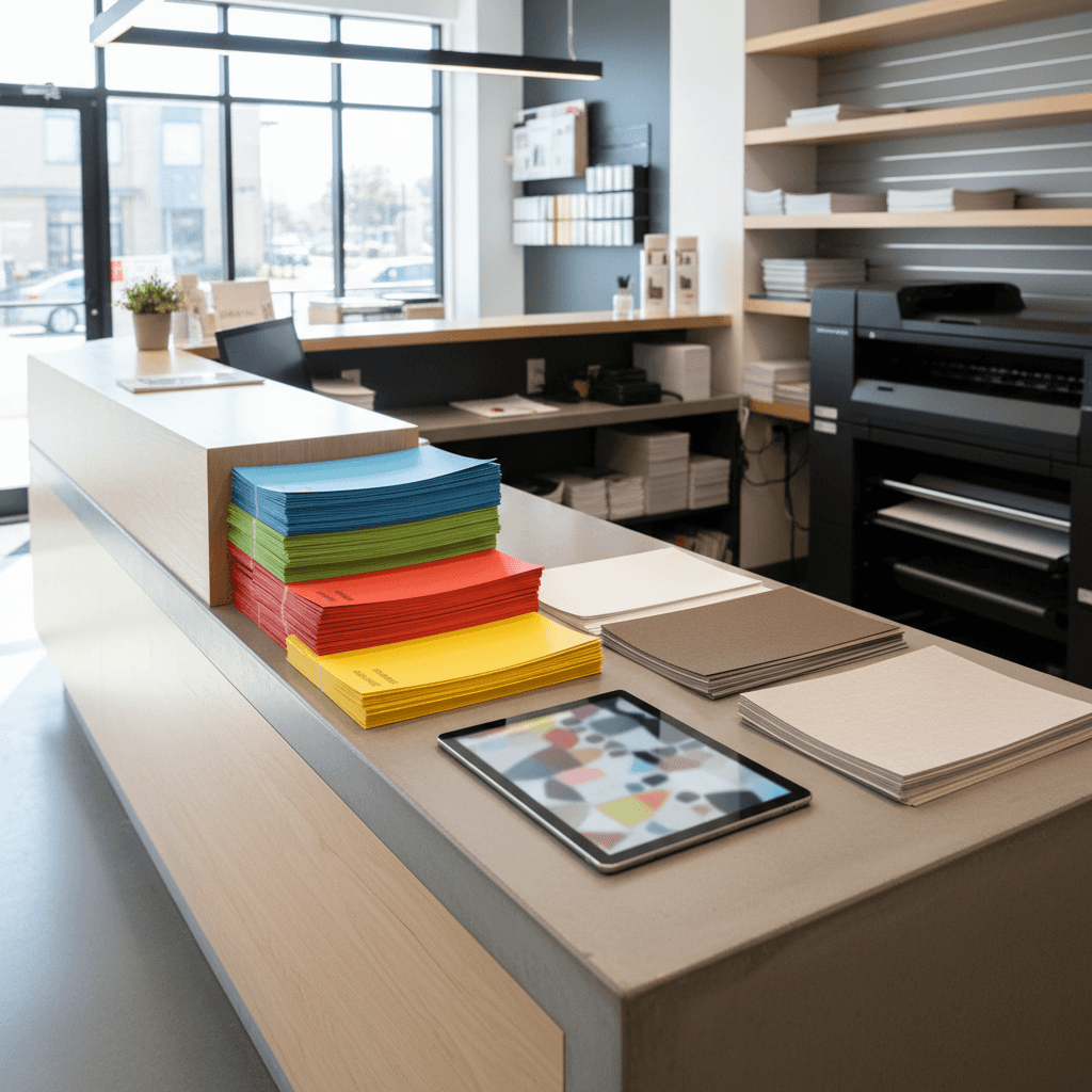
Teams near 5004 Timberlea Blvd Unit#18 in the Regional Municipality of Peel can often secure same-day pickup for urgent flyer runs. Submit print-ready art early, approve the proof quickly, and align pickup with traffic windows. Local expertise speeds fixes and protects your timeline before showings or events.
Our Mississauga shop coordinates preflight, proofs, and pickup so flyers, flyers, and supporting pieces land together. When listings move fast, a 30–60 minute approval window keeps production on track.
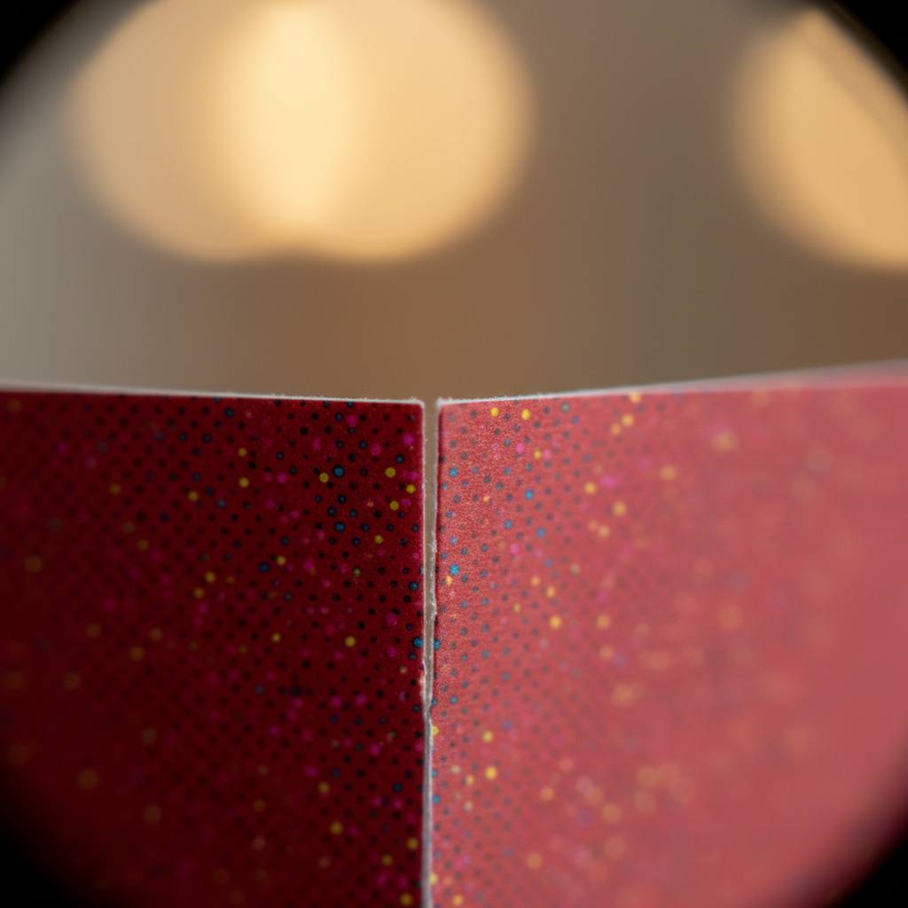
Local considerations for 5004 Timberlea Blvd Unit#18
- Plan pickup around peak times near Canadore College at Stanford Mississauga Campus to avoid traffic before evening showings.
- In winter, allow extra drying and transit time so gloss or UV finishes don’t scuff moving from cold to heated interiors.
- If you rely on public transit, coordinate pickup windows around Tomken Station East Platform A schedules to keep setup tight.
Real examples from Ontario real estate marketing
Small, technical tweaks—proper bleed, heavier stock, and one clear CTA—consistently improve outcomes. These snapshots show how Mississauga and GTA teams avoided reprints, tightened timelines, and delivered sharper brand experiences by fixing a few specs before press.
- Open house blitz: An agent needed same-day 5×7 handouts. We corrected missing bleed, switched to cover stock, and chose matte for notes. Flyers were ready before doors opened.
- New development preview: A builder’s RGB art printed dull. We converted to CMYK, up-leveled image resolution, and applied gloss UV for renderings that popped.
- Door-to-door campaign: Bent corners on thin stock hurt retention. We advised 14 pt cover with matte; damage complaints dropped on the next route.
- Mail-ready spec: A team targeting a neighborhood shifted to an 8.5×11 that matched common mail handling specs and avoided delays.
- Brand alignment: A brokerage unified fonts and colors using a brand kit; approvals sped up and reorders stayed visually consistent.
- Cross-promo riders: When planning yard signs, we mapped the flyer’s CTA to a yard sign rider (what a rider sign is used for) to reinforce one strong message.
For more cross-media planning, our realtor marketing checklist shows how flyers, signs, and business cards can reinforce each other across a single weekend of activities.
Copy, visual hierarchy, and conversion cues
Short, scannable copy and clear visual hierarchy steer attention to your CTA. Use 6–10 words for headlines, 1–2 short sentences per block, and high-contrast type on complex images. Repeating the CTA once improves recall. Make your next step unavoidable and easy.
- Headlines: 6–10 words that promise value (“Tour this weekend” beats “Open house”)
- Body copy: one thought per line; bullets beat walls of text
- CTA design: bold color, ample white space, and proximity to proof points
- Contrast: avoid text over busy images; use overlays and strong color splits
For additional inspiration on message clarity and action wording, explore these behavioral cues from remarketing; the same friction-reduction ideas help flyer CTAs get noticed.
Proofing, reorders, and consistency over time
Approving a printed proof at 100% scale prevents tiny-type surprises and color misses. Save your press-ready PDF and settings so reorders match. Keep a centralized brand kit for colors and fonts to reduce drift across teams and offices.
- Printed proof: verify legibility of 7–9 pt type and QR scan distance
- File hygiene: name files consistently; lock final PDFs in a shared folder
- Brand kit: hex/CMYK, fonts, logo variants, and usage notes
- Reorder notes: record stock, finish, and any on-press adjustments
For a quick primer on catching layout issues before they go to press, skim our business card proofing guide—the same principles apply to flyers.
Get a 5-minute preflight + pickup plan
Send your file for a free preflight check and we’ll confirm bleed, color, resolution, and pickup timing. This five-minute review removes surprises and secures a realistic same-day window when you need speed.
Ready to move? Start your order on our flyers page, or bring a USB to the shop. We’ll pinpoint any issues, suggest stock/finish options, and outline a pickup plan that fits your route.
Frequently Asked Questions
These concise answers cover the flyer setup and logistics questions we hear in Mississauga and across Ontario—resolution, bleed, finishes, and reorders. Use them as a preflight checklist before you submit artwork or schedule same-day pickup.
What resolution should my flyer images be?
Use 300 ppi at final size for photos and graphics. Lower resolution can look soft in print. If you only have lower-res assets, reduce their display size in the layout or swap for higher-quality images.
How much bleed do I need?
Add 0.125 inch (3 mm) bleed on all sides and keep critical elements 0.125–0.25 inch inside the trim. This allows for minor cutting variances and prevents unwanted white edges.
Should I choose matte or gloss?
Pick matte if you want a low-glare, easy-to-write-on surface for sign-ups or notes. Choose gloss or UV for bold color and higher scuff resistance, especially for handouts at busy events or outdoor distribution.
Do I need to outline fonts?
Outlining or packaging fonts avoids unexpected substitutions. If a font goes missing, layout can reflow. Converting to outlines in the final PDF preserves your design and spacing on any press.
Can you help if my design isn’t print-ready?
Yes. We can preflight your file, fix bleed and color mode, and adjust small text for legibility. If you don’t have design software, use our online editor or ask for in-house design support.
Conclusion and next steps
Avoiding common mistakes when ordering flyers comes down to five things: correct file setup, readable hierarchy, the right stock and finish, proof approval, and tight timing. Lock these in and your flyers will look great, feel right, and show up when you need them.
- Run a preflight before you upload art
- Match paper/finish to real handling conditions
- Approve a printed proof early to protect deadlines
- Coordinate pickup and distribution in one route plan
Have a listing this weekend? Swing by our Mississauga shop or start online to book a same-day window. If you also need event signage or riders, we’ll align everything so your brand reads consistently from the yard sign to the handout.
Key takeaways
- 0.125 inch bleed, 300 ppi images, CMYK color—non-negotiables for clean output
- Choose stock/finish for durability, glare control, and how the flyer will be used
- One clear CTA with strong contrast and generous white space outperforms clutter
- Printed proofs and locked pickup times prevent last-minute surprises
For message clarity, see practical copywriting tips. For attention flow and visual weighting ideas, skim this take on visual hierarchy. And for reducing friction to action, note these conversion cues you can adapt to flyer CTAs.