A Practical Guide to Wide Format Printing
Wide format printing opens the door to vivid, large-scale visuals that catch attention at a distance and communicate clearly in spaces where standard page sizes fall short. Whether you are planning event graphics, retail displays, real estate signage, or trade show backdrops, understanding the fundamentals helps you choose the right materials, prepare files correctly, and deliver a professional finish.
This guide explains what wide format printing is, common applications, substrate and ink choices, file-prep best practices, design tips for legibility, and basic installation and care. Use the checklists to move efficiently from concept to finished piece.
What is wide format printing?
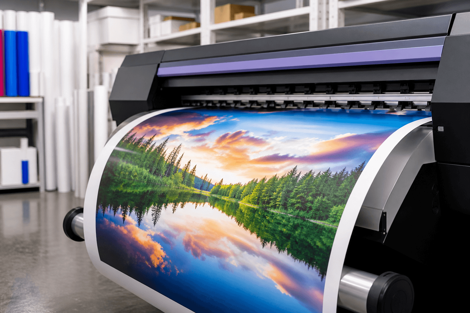
Wide format printing (also called large format printing) refers to digital printing produced on devices capable of handling media significantly wider than standard office printers. Typical outputs include posters, banners, signs, window graphics, wall murals, event backdrops, floor graphics, and point-of-purchase displays. Instead of printing multiple small pages and tiling them, a single continuous sheet or panel carries the full design, preserving sharpness and visual impact.
Broadly, wide format work involves three building blocks:
- Media/substrate: The material receiving the ink or toner (for example, vinyl, fabric, paper, foam board, PVC board, or aluminum composite).
- Ink/printing technology: The chemistry and process that form the image (such as eco-solvent, latex, UV-curable, or dye-sublimation).
- Finishing: Post-print processes that prepare the piece for use (lamination, mounting, hemming, grommets, contour cutting, or hardware assembly).
The right combination depends on how and where the piece will be used, how long it needs to last, the desired look and feel, and how it will be installed.
Common applications and use cases
Wide format output appears anywhere high-visibility communication is needed. Typical scenarios include:
- Outdoor signage: For-sale signs, directional signs, building identification, site safety notices, and seasonal promotions.
- Event and trade show graphics: Roll-up banners, backdrop walls, hanging banners, wayfinding, and tabletop displays.
- Retail and hospitality: Window decals, point-of-purchase displays, menu boards, aisle violators, and floor graphics.
- Corporate interiors: Branded wall murals, glass privacy films, mission/values displays, and reception signage.
- Real estate marketing: Open house signs, riders, large-format feature sheets, and community-directional signage.
- Education and institutions: Wayfinding maps, informational posters, donor walls, and exhibit panels.
When selecting an application, match the message duration and environment to the appropriate material and printing method. For example, a short-term promotional banner may call for a lightweight vinyl, while a permanent lobby sign might suit a rigid panel with standoff hardware.
Materials and substrates
Choosing the right substrate is essential for durability, appearance, and installation ease. Below are common categories and typical scenarios where they excel.
- Banner vinyl: A flexible, reinforced material suitable for indoor and outdoor banners. Often finished with hems and grommets for hanging.
- Adhesive vinyl (calendared or cast): Pressure-sensitive media for windows, walls, vehicles, and panels. Paired with laminates for extra protection or specific finishes (matte, gloss, textured).
- Paper and poster stocks: Cost-effective for indoor use, presentations, and retail posters. Available in satin, gloss, or matte finishes.
- Rigid boards: Foam board (lightweight, short-term displays), corrugated plastic (yard signs and directionals), PVC and styrene (durable indoor/outdoor panels), and composite aluminum (sleek, long-term signage).
- Fabrics and textiles: Stretch fabrics for silicone-edge graphics, soft signage, table throws, and backdrops. Favored for a premium, glare-free look and easy shipping.
- Specialty media: Perforated window film (one-way view), optically clear film (glass branding), floor graphic films (with anti-slip laminates), and wallcoverings (custom murals).
When evaluating substrates, consider surface compatibility (smooth glass vs. textured drywall), exposure (UV, moisture, temperature swings), handling and transport, desired finish (sheen, texture), and sustainability preferences.
Print technologies compared
Different wide format technologies balance color quality, durability, and application specificity. Here is a practical overview of common approaches:
- Eco-solvent/solvent: Known for strong color on vinyls and durable outdoor performance after curing. Common for banners, decals, and general signage.
- Latex: Water-based inks designed for a wide range of media with rapid turnaround characteristics. Frequently used for decals, wall graphics, and soft signage.
- UV-curable: Inks cure under UV light, enabling direct printing on rigid boards as well as flexible media. Valued for speed, versatility, and scratch resistance.
- Dye-sublimation: Dyes infuse into coated materials or textiles (transfer or direct), producing rich, washable fabric graphics and vivid photo panels.
Select a technology based on substrate compatibility, intended environment, finishing requirements, and the visual outcome you need (for example, ultra-matte interior walls vs. glossy exterior signage).
File prep checklist and specs
Large graphics magnify both strengths and mistakes. Proper file preparation maintains clarity and prevents production delays. Use this checklist:
- Size at scale: Build your layout at final size when possible. If working smaller for manageability, keep proportions exact and note the scale.
- Resolution: For raster images, target sufficient effective resolution at final size to avoid visible pixelation at typical viewing distances. Photography and gradients benefit from higher-quality source files.
- Vector where possible: Logos, icons, and line art render crisply at any size when kept as vector elements.
- Color mode and profiles: Wide format devices print in CMYK or expanded-gamut variants. Convert spot colors thoughtfully, and embed or reference color profiles according to your workflow to maintain consistency.
- Bleed and safe area: Include appropriate bleed for edge-to-edge prints and keep crucial content within safe margins to accommodate trimming and finishing.
- Fonts and links: Outline or embed fonts, and package linked images to prevent missing assets.
- Cut paths and layers: For decals or contour-cut shapes, provide a dedicated vector cut path on its own layer with clear naming conventions.
- Proofing: Review a scaled hard proof or accurate on-screen soft proof. Verify spelling, alignment, contrast, and brand color targets before finalizing.
- Export: Print-ready PDFs with bleed and crop marks are widely accepted. Confirm required file formats if handoff specifications are provided.
Tip: If your design includes fine patterns or thin lines, view the artwork at 100% and at reduced opacity on a neutral background to spot artifacts, moiré, or insufficient contrast early.
Design tips for impact
Big surfaces reward simplicity and hierarchy. Aim for immediate readability from the intended distance and angle.
- Prioritize hierarchy: Decide the single most important message (headline, offer, or call to action). Make it dominant in size and contrast, followed by secondary details.
- Scale for distance: As viewing distance increases, so should headline size and spacing. Err on the side of larger type and generous white space.
- High contrast: Pair light text on dark fields or dark text on light backgrounds. Avoid color-on-color combinations that reduce legibility.
- Limit fonts and colors: Two type families and a restrained palette help maintain consistency and brand recognition.
- Use vector logos and clean imagery: Start with the highest-quality assets available to preserve sharpness when scaled.
- Consider environment: Account for lighting glare, shadows, and nearby distractions. Matte finishes mitigate reflections on bright surfaces.
- Plan for hardware: Leave clear areas for hems, pole pockets, grommets, standoffs, or clamps so critical content isn’t obstructed.
Installation and care basics
Thoughtful installation planning protects the graphic and the surface it adheres to. While methods vary by material and hardware, these fundamentals apply widely:
- Site assessment: Measure accurately, note obstacles, and confirm surface type (painted drywall, glass, brick, metal). Identify load-bearing limitations for heavier panels.
- Surface prep: Clean and dry the area thoroughly. For painted walls, ensure the paint has cured; for glass, remove residues with appropriate cleaners.
- Environmental conditions: Apply adhesive graphics within recommended temperature ranges. Avoid excessive humidity during install.
- Layout guides: Use level lines, spacers, or painter’s tape to position graphics before committing. For multi-panel murals, dry-fit sections to check alignment.
- Application technique: For decals, use a squeegee with felt edge, applying steady pressure from center outward to reduce bubbles. For banners, secure evenly to minimize sag.
- Hardware safety: When drilling or mounting, use appropriate anchors and fasteners for the substrate. Follow manufacturer guidance for stands, frames, or standoffs.
- Care: Clean with non-abrasive cloths and mild solutions suited to the print and laminate. Roll fabric or vinyl graphics loosely; avoid creasing.
If you are unsure about a surface or method, test with a small sample in an inconspicuous area to evaluate adhesion and removal behavior.
Budgeting and planning considerations
Wide format projects vary widely in scope. To plan effectively, clarify the following before requesting quotes or beginning production:
- Objective and lifespan: Is the graphic short-term (weeks), mid-term (months), or long-term (years)? Lifespan guides substrate, laminate, and ink choices.
- Environment: Indoor vs. outdoor, exposure to sun and weather, cleaning requirements, or proximity to high-traffic zones.
- Size and quantity: Exact dimensions and the number of sets or locations help determine print method and material efficiency.
- Finishing and hardware: Hems, grommets, pole pockets, lamination, contour cuts, frames, stands, or standoffs—note what’s required and who provides installation.
- Brand requirements: Pantone targets, typography rules, and logo clear-space standards ensure consistency across pieces.
- File readiness: Confirm whether design is final and print-ready or if creative support is needed.
- Timeline: Include internal review cycles and any fixed event dates to avoid rush changes late in the process.
Capturing these details early helps align expectations, reduce revisions, and streamline production.
Quality control and proofing
Quality checks protect your investment and ensure the final piece matches intent:
- Content verification: Double-check spelling, dates, addresses, URLs, and legal copy.
- Color expectations: Where critical, review a physical proof or sample swatch printed on the intended material and finish.
- Scale validation: Print a small section at full scale to inspect image sharpness and line weight.
- Finishing marks: Confirm bleeds, crop marks, and cut paths, especially for contour-cut decals and die-cut shapes.
- Hardware fit: If using frames or stands, cross-check final dimensions against hardware specifications.
Sustainability considerations
Many wide format projects can be planned with environmental impact in mind. Consider:
- Material selection: Choose substrates and inks that align with your organization’s sustainability preferences when options are available.
- Modularity and reuse: Design graphics that accept changeable inserts or modular components to extend useful life.
- Right-sizing: Produce only the sizes and quantities needed to minimize waste and storage needs.
- End-of-life planning: Determine how graphics will be stored, repurposed, or responsibly disposed of after use.
Wide format printing FAQs
How do I choose between vinyl, fabric, and rigid panels?
Start with where and how the piece will be used. Vinyl suits flexible banners and decals, fabric provides a premium, glare-free look for backdrops and soft signage, and rigid panels deliver a sturdy, polished finish for wall-mounted or freestanding signs. Consider durability, transport needs, finish preferences, and installation method to guide the choice.
What resolution should my images be for large prints?
Aim for images that retain clarity at the final viewing distance. As a rule of thumb, higher-quality source files provide better results. If you must scale images up, review a 100% crop on screen or request a test print of a critical section to confirm sharpness before committing to full production.
Do I need lamination?
Lamination can protect against abrasion, add UV resistance, and provide a specific finish (matte or gloss). It’s frequently used for decals, signs in high-touch areas, and floor graphics. For short-term indoor posters or fabric prints, it may be unnecessary. Match the laminate to the application environment and desired look.
What’s the difference between a roll-up banner and a hanging banner?
A roll-up (retractable) banner installs into a portable base and is ideal for quick setup at events or in lobbies. A hanging banner uses grommets, pole pockets, or rails to suspend from walls or ceilings. Choose based on portability needs, display location, and the visual height you want to achieve.
How can I ensure colors match my brand?
Provide vector logos, specify brand color values, and share prior print samples if available. Request a color proof or swatch printed on the actual material when critical brand colors are involved, as substrate and finish can influence perception.
Next steps
If you’re ready to plan or print wide format graphics, visit Top Realtor Sign & Print to explore options and take the next step.