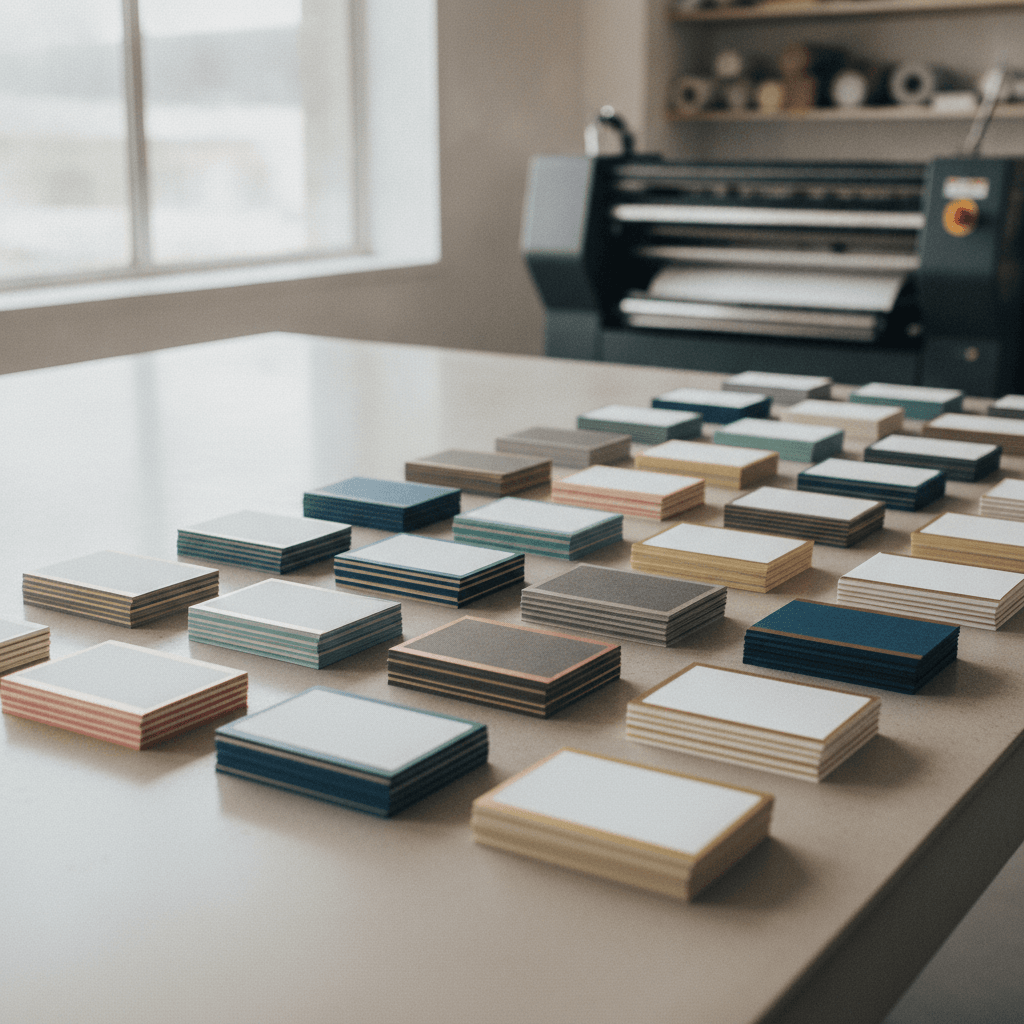
Painted edge business card alternatives are finishing techniques that deliver bold edge or surface impact without paint on the edges. Options like raised spot UV, soft touch lamination, and foil stamping create contrast, thickness, or shine that stands out at a glance. At 5004 Timberlea Blvd Unit#18, we help Realtors pick fast, brand-ready finishes.
By Ashwani, Top Realtor Sign & Print — Last updated: 2026-06-21
Introduction
Painted edge business card alternatives give you standout cards without edge paint. For agents near 5004 Timberlea Blvd Unit#18 in the Regional Municipality of Peel, the smartest swaps are raised spot UV, soft touch lamination, and foil stamping—fast to produce, consistent to reorder, and brand-true.
Here’s the simple truth: most people decide whether to keep a card within a few seconds. Alternatives to painted edges work because they deliver instant visual and tactile cues—shine, texture, or weight—that register fast. When you’re moving from a listing appointment to an open house, that extra “hold onto this” moment matters.
In this list-style guide, we’ll compare practical options you can order locally and pick up quickly. We’ll use real scenarios from Ontario real estate marketing, tie choices to your brand assets, and show how to combine finishes for an unforgettable handoff.
- What “painted edge business card alternatives” actually include
- Thirteen high-impact finishes, ranked by versatility and recall
- A quick table for scanning specs, turnaround, and ideal uses
- Step-by-step selection and a buying guide tailored to Realtors
Throughout, we’ll reference business card fundamentals (3.5 × 2 inches, safe margins, and bleed) and point to our in-house options that align with brokerage standards. If you need help, our online design tool and design team make setup straightforward.
Summary
If you love the bold outline of painted edges but need faster turnaround or broader compatibility, consider raised spot UV, soft touch, or foil stamping. These finishes deliver tactile pop, contrast, and premium feel on standard 3.5 × 2 in cards and common 16–22 pt stocks—great for quick reorders.
Here’s what this guide covers for agents and small businesses:
- Top painted edge business card alternatives that actually stand out
- A side-by-side table with durability, speed, and best uses
- Real Mississauga examples, plus pickup logistics
- Actionable steps and a printable-style checklist you can follow today
Local considerations for 5004 Timberlea Blvd Unit#18
- Plan same-day pickups around peak traffic in the Regional Municipality of Peel; allow a small buffer for parking and handoff.
- Winter tip: store cards flat and sealed; rapid humidity shifts can warp lighter uncoated stocks during transit.
- Staging near Canadore College at Stanford Mississauga Campus? Bring 25–50 extra cards—midday foot traffic increases pass-along potential.
Quick Comparison Table
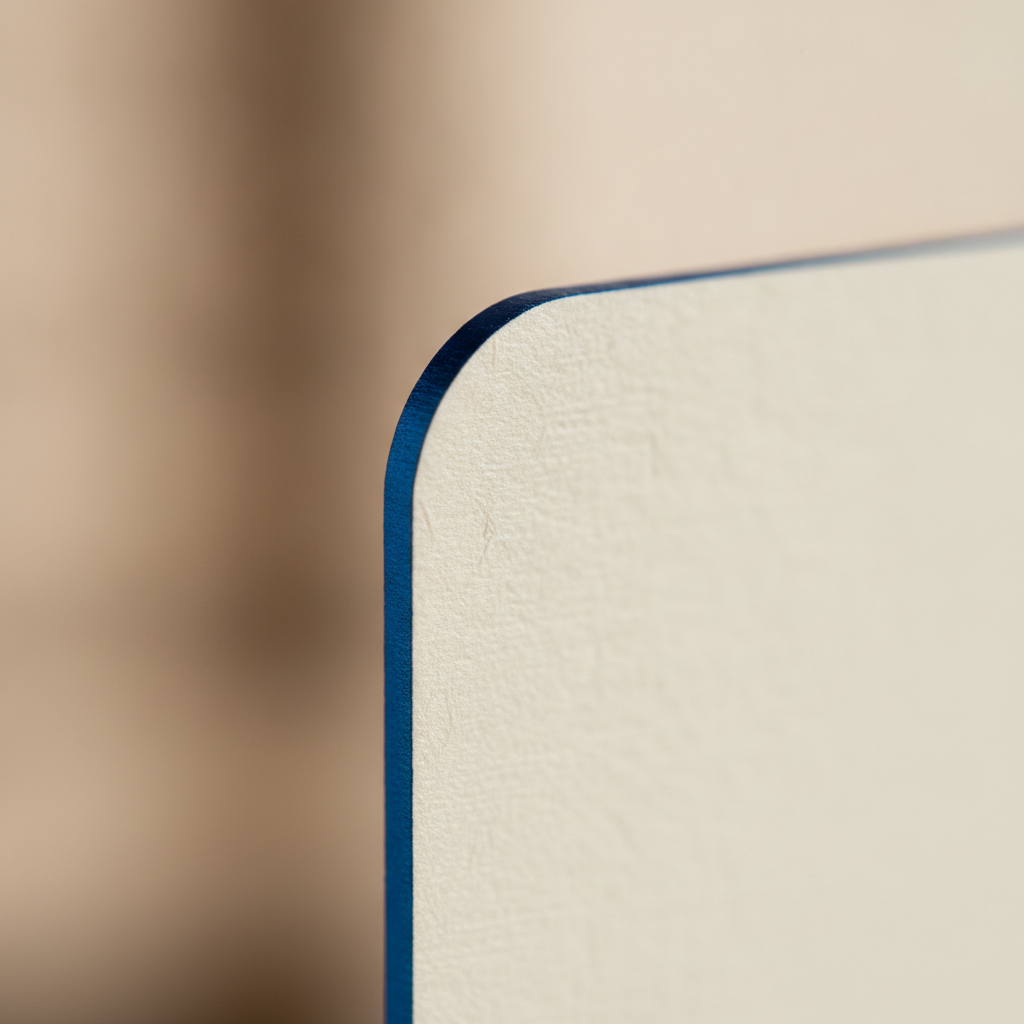
Use this table to compare the most reliable painted edge business card alternatives by look, feel, turnaround, and best fit. Match your brand goals to a finish, confirm stock compatibility, then book a pickup window that meets your listing timeline.
Many of these finishes pair well together. For instance, soft touch lamination under raised spot UV creates a matte–gloss contrast that reads cleanly in photos and under indoor lighting. If you’re weighing surface effects more broadly, you can also review third-party overviews of surface printing methods to visualize how gloss and texture behave on different substrates.
| Alternative | Visual effect | Tactile/Height | Typical stock | Turnaround | Best for |
|---|---|---|---|---|---|
| Raised Spot UV | Selective gloss pattern | Noticeable relief | 16–18 pt + lam | Quick | Logos, textures, maps |
| Soft Touch Lamination | Velvety matte | Silky, non-glare | 18–22 pt (with lam) | Fast | Luxury brand feel |
| Foil Stamping (Gold/Silver) | Metallic shine | Debossed/flat | 16–32 pt | Moderate | Premium accents |
| Duplex/Thick Stock | Solid edge mass | Rigid | 28–40 pt | Moderate | Hefty presence |
| Colored Core (Triplex) | Color stripe inside | Rigid | 32–48 pt | Moderate | Subtle color signal |
| Emboss/Deboss | Raised/recess detail | Pronounced relief | 20–32 pt | Longer | Tactile logos |
| Die-Cut Shape | Custom silhouette | Edge-focused | 16–24 pt | Longer | Unique outlines |
| Textured Stock (Linen/Felt) | Woven texture | Natural tooth | 14–18 pt | Moderate | Classic stationery |
| White Ink on Kraft | High-contrast white | Flat | 18–24 pt kraft | Moderate | Eco, rustic look |
| Edge Foil (Gilding) | Reflective edge | Smooth metallic | 28–40 pt | Longer | Event sparkle |
| UV Flood + Matte | Matte with glossy logo | Gloss contrast | 16–18 pt | Fast | Modern minimal |
| Spot Color PMS | Exact brand tones | Flat | 16–18 pt | Fast | Brand consistency |
| High-Build Polymer Gloss | High-profile gloss | Thicker relief | 18–22 pt | Moderate | Bold textures |
Want a quick way to review options? Browse our business cards category to see finishes we run regularly in Mississauga. It’s the fastest route to a reliable reorder path.
Our Top Pick
Raised spot UV on soft touch stock is the most versatile alternative to painted edges. The matte base deepens color while the glossy lift highlights logos, icons, or patterns cleanly. It photographs well, resists fingerprints, and feels premium without complicating reorders.
Why it works: the silky base controls glare so the gloss becomes the star. On a 3.5 × 2 inch card, a logo mark or brokerage crest gains instant separation without overpowering important details like a phone number or QR code. This balance is ideal for busy listing days.
Execution tips from our shop floor: keep thin strokes sturdy; avoid hairline gloss below roughly 0.3 pt equivalents; and reserve 0.125–0.25 inch safe margins around QR codes. For deeper guidance, see our Realtor-focused walkthrough on raised spot UV cards, then layer in lamination best practices via our lamination options.
Alternatives Ranked: #2–#13
If raised spot UV isn’t your style, explore eleven more finishes below. Each one notes the core effect, ideal use cases, and setup guardrails. Use these to match your brand personality, neighborhood, and event conditions.
#2 — Gold or Silver Foil Stamping
Foil stamping delivers mirror-like shine that catches light immediately, turning a simple layout into a premium handoff. It complements classic palettes (black, white, navy) and elevates brokerage crests or monograms.
- Best stock: 16–32 pt, uncoated or laminated for structure.
- Design: keep foil art simple; solid shapes and sturdy strokes reproduce best.
- Real scenario: luxury listings or awards nights where lighting is dynamic.
- Pro tip: add a subtle blind deboss underneath the foil for extra depth.
Want examples aligned to real estate branding? We break down palettes and do’s/don’ts in our gold foil business cards guide.
#3 — Soft Touch Lamination (Velvet)
Soft touch creates a velvety, non-glare surface that feels refined and photograph-ready. Colors appear smooth and saturated, and fingerprints are less visible than on gloss laminates.
- Ideal brand vibe: modern, minimal, and confident.
- Pairing: add spot gloss over the logo to create a clean two-tone effect.
- Durability: holds up well in wallets and card cases during busy showings.
- Pro tip: use bolder typography (9–11 pt) to take advantage of the matte field.
If you’re curious how matte and gloss finishes compare in the real world, this overview of gloss versus matte appearance offers a useful visual primer (different industry, same surface principles).
#4 — Duplex or Triplex Thick Stock
Thicker constructions communicate stability the moment someone lifts the card. They also reduce edge dings and corner wear compared with lighter weights.
- Specs: think in layers—two or three sheets bonded for heft and edge quality.
- Design: simple layouts excel; typography and negative space do the heavy lifting.
- Use case: broker–owner cards, development teams, or milestone mailers.
- Pro tip: request grain direction parallel to the long edge for crisp corners.
#5 — Colored Core (Triplex Stripe)
A colored core creates a subtle stripe through the middle of the card—cleaner and more uniform than painted edges, especially on thicker builds.
- Brand tie-in: echo brokerage colors (e.g., a red core) without overwhelming the face.
- Visibility: the stripe is visible in stacks and card holders.
- Use case: teams seeking a signature color accent with minimal risk.
- Pro tip: keep photography and heavy gradients away from trim lines.
#6 — Emboss or Deboss
Embossing (raised) and debossing (recessed) add sculpted detail that’s felt before it’s fully seen. It’s ideal for initials, seals, or subtle map lines of your farm area.
- Design: avoid ultra-thin strokes; larger shapes and sturdy type work best.
- Stock: uncoated and thicker stocks hold relief more crisply.
- Use case: traditional brands and heritage-focused marketing.
- Pro tip: a blind (ink-free) deboss creates a refined, minimalist look.
#7 — Die-Cut Shapes
Custom silhouettes create immediate differentiation and are memorable in event settings. Rounded corners, house outlines, or key shapes can reinforce your niche.
- Practicality: confirm the card still fits standard wallets and cases.
- Design: use bold shapes and sufficient margins to avoid weak points.
- Use case: property management, new-home specialists, or prop-tech brands.
- Pro tip: combine with soft touch so the cutline isn’t competing with surface glare.
#8 — Textured Stocks (Linen, Felt, Eggshell)
Textured papers deliver a tactile handshake—classic, refined, and great for script fonts. They photograph beautifully in natural light and feel substantial without lamination.
- Design: increase contrast; textured fibers can soften fine details.
- Use case: heritage neighborhoods, appraisal services, or estate work.
- Practicality: test QR codes on uncoated stocks to ensure clean scans.
- Pro tip: add a subtle watermark pattern for depth without ink coverage.
#9 — White Ink on Kraft or Dark Stock
Opaque white ink printed on kraft or deep-colored stocks creates a crisp, modern look with an eco-forward vibe. It’s striking, minimal, and pairs well with simple iconography.
- Design: high-contrast layouts with generous margins look best.
- Use case: staging companies, renovation partners, or sustainability-forward teams.
- Production: consider an underlayer for vibrant color over dark stocks.
- Pro tip: keep fine white lines sturdy to prevent visual break-up.
#10 — Edge Foil (Gilded Edges)
Edge foil produces a bright, reflective edge—more uniform and intense than painted edges. Under event lighting, it sparks attention even when the card faces down.
- Prerequisite: thicker stocks with smoothed edges before foiling.
- Design: keep faces understated so the edge becomes the accent.
- Use case: launch events, awards galas, or holiday client gifts.
- Pro tip: pair with soft touch faces to control overall shine.
#11 — Full UV Flood with Matte Contrast
Combine a glossy flood with matte spot areas (or vice versa) to make large shapes, logos, or text blocks appear dimensional without new colors.
- Design: geometry and negative space do the storytelling.
- Use case: modern brands with simple marks and bold shapes.
- Production: tight registration is key; align layers carefully.
- Pro tip: run a small batch proof when the design relies on tight overlays.
#12 — Spot Color (PMS-Matched)
Spot colors ensure exact brand hues when precision matters—for example, franchise red or brokerage black. It’s a controlled, professional way to maintain consistency across agents.
- Design: minimize tints below 10% on solid areas.
- Use case: teams sharing templates across multiple agents.
- Production: coated stocks amplify saturation and edge clarity.
- Pro tip: keep your brand guide handy during proofing.
#13 — High-Build Polymer Gloss
High-build polymer gloss (often applied digitally) creates taller, shinier relief than standard raised UV. Use it for bold textures, big logos, or dramatic patterns that you can feel.
- Design: limit coverage so the effect doesn’t overpower content.
- Use case: pre-construction previews, developer showcases, or VIP mailers.
- Production: confirm lamination compatibility for best adhesion.
- Pro tip: pair with matte bases for clean contrast in photos and video.
Need a fast recommendation? Share your logo and a photo of your current card. We’ll suggest two painted edge business card alternatives and prep a production-ready proof. Prefer DIY? Spin up a layout in our online design tool.
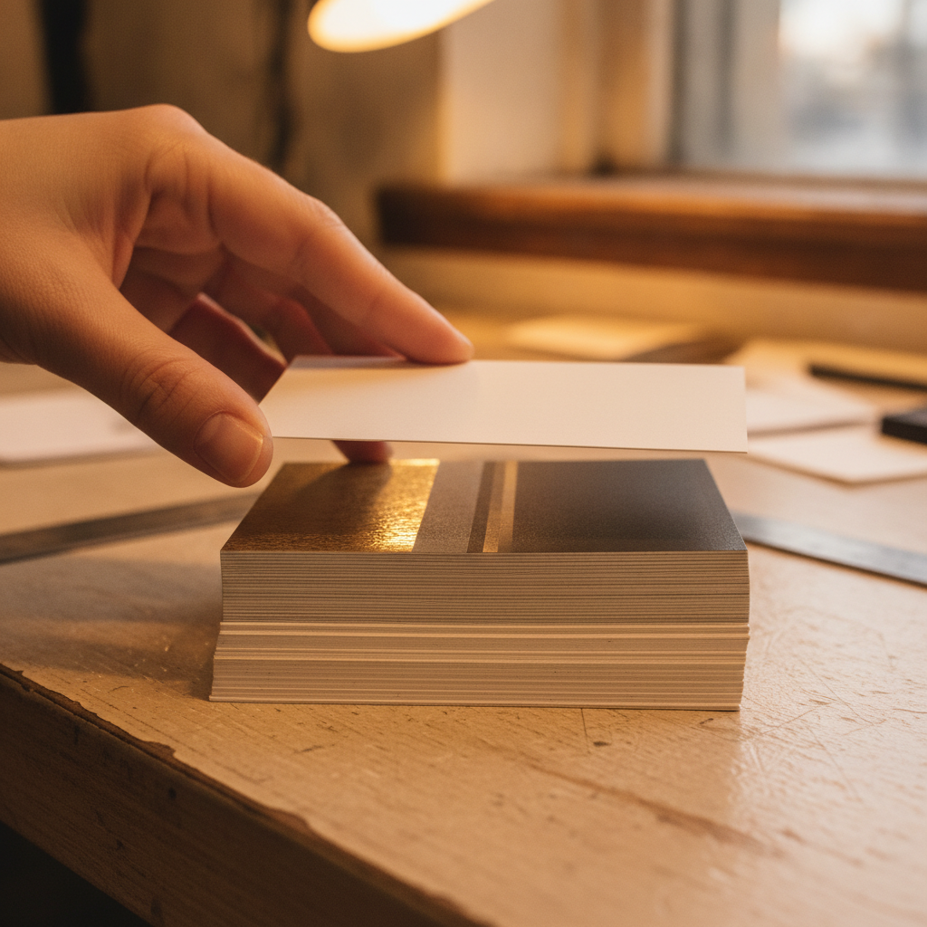
How to Choose Painted Edge Business Card Alternatives
Decide what you want remembered—shine, texture, or weight—then test your logo at business card scale. Confirm stock and lamination needs, review QR code legibility, and schedule a pickup window that fits your event calendar in Mississauga.
Start by identifying your “hero effect.” If your logo is an outline with fine strokes, raised spot UV keeps edges clean. If your brand leans classic, foil’s metallic pop or a blind deboss can add pedigree without changing colors. For modern minimalists, soft touch turns simple type into a premium experience.
- Define the effect: shine (foil/UV), touch (soft touch/emboss), or mass (thick stock).
- Audit your logo: thin lines favor UV; large, simple shapes suit foil or embossing.
- Pick stock weight: 16–18 pt for speed; 28–40 pt for presence and edge quality.
- Test a QR: size 0.8–1.2 inches; place at least 0.25 inches from any trim.
- Plan logistics: align your order with showings and community events to maximize handoffs.
If you’d like a broader view of print process stages from prep to finish, skim a third-party process overview to understand how coatings and surface effects are sequenced.
Buying Guide for Realtors and Local Businesses
For Mississauga pickups, prioritize fast, reliable finishes like soft touch, spot UV, and standard laminations, then layer premium effects such as foil. Lock brand standards, coordinate quantities across teams, and bundle print items for cohesive impact at listings and events.
Brand standards come first. Decide logo width, headline scale, and safe margins you’ll repeat across cards, cards reorders, and supporting pieces. The goal is recognition—every touchpoint should feel like it came from the same kit.
Next, choose one hero effect for the card face and one supporting accent at most. For example, soft touch + raised spot UV balances texture and clarity without making the card busy. Save themed flourishes for seasonal mailers, event table cards, and signage.
- Readability: aim for strong contrast under indoor and outdoor light; proof small type.
- Durability: laminates protect artwork through real-world pocket use and handoffs.
- Logistics: standard cards and flyers can be ready quickly; specialty finishes take more planning.
- Bundles: coordinate with roll-up banners, riders, and inserts to own the space at showings.
Curious how various surface textures interact? A general overview of surface printing illustrates how coatings and inks can change perceived depth and sheen—useful when you’re pairing multiple effects.
FAQ: Painted Edge Business Card Alternatives
The most popular painted edge business card alternatives are raised spot UV, soft touch, and foil. They’re widely compatible with standard stocks, photograph well, and are easy to reorder. Choose by the effect you want remembered: shine, texture, or weight.
What size should I use?
Standard North American business cards are 3.5 × 2 inches with 0.125 inch bleed. That size fits wallets and card holders well, and it’s supported by most specialty finishes without custom tooling.
Will QR codes still scan on textured or matte cards?
Yes—keep the QR between 0.8 and 1.2 inches, maintain high contrast, and leave about 0.25 inches of safe margin. On uncoated stocks, avoid low-opacity tints behind the code.
Which finish holds up best in pockets and card cases?
Soft touch lamination with selective spot UV performs well in day-to-day use. The matte base hides fingerprints, while the raised gloss protects key graphics like logos from light scuffs.
How do these alternatives compare to rider or insert signage?
Cards travel in pockets; riders and inserts deliver curbside visibility. Use the same brand standards across both so your handoff matches your yard sign. Consistency builds recognition fast.
Methodology
We ranked finishes by field performance, brand consistency, and production reliability. Inputs included real estate use cases, reorders, and feedback from agents running listings, showings, and community events across Peel and the GTA.
- Decision factors: tactile impact, color integrity, durability, speed, and reorder consistency.
- Real examples: standard cards, luxury variants, and combinations like soft touch + spot UV.
- Local context: pickup practicality at 5004 Timberlea Blvd Unit#18 and nearby venues.
If you’re new to specialty finishing steps, reviewing a general production process helps you visualize when coatings, foils, and laminations are applied relative to print.
Conclusion and Next Steps
Choose a finish that earns a second look fast—shine (foil), texture (spot UV on soft touch), or weight (thick stock). Lock your specs now so every reorder matches, and schedule pickup 24–72 hours before key events in Mississauga.
Here’s a quick wrap-up you can act on today.
- Decide your hero effect and supporting accent.
- Confirm stock, lamination, margins, and QR code size.
- Align cards with open house signs, riders, and inserts for a cohesive kit.
- Use our online design tool to lock brand standards, then book a pickup window.
Key takeaways
- Painted edge business card alternatives deliver equal or better impact with fewer limitations.
- Soft touch + raised spot UV is the most flexible, photo-friendly combination.
- Keep designs simple, margins generous, and QR codes well-sized for real-world use.
- Consistency across cards, riders, and inserts builds recognition quickly.