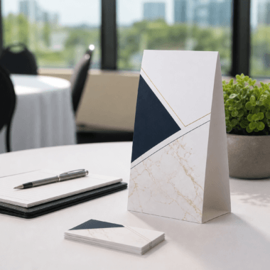


A Practical Guide to Post Cards
Post cards are one of the most versatile, budget‑friendly print formats for brand awareness, local outreach, product launches, and event promotion. They’re easy to carry, quick to scan, and ideally suited to clear, single‑minded messages. This guide walks you through how to plan, design, print, distribute, and measure post cards with confidence—whether you’re creating a one‑off announcement or building a repeatable direct outreach program.
Start with a purpose
Before you open a design file or think about finishes, decide exactly what your post card must achieve. A specific purpose will keep every creative and production choice on track.
- Define one primary objective: awareness, response (calls, form fills, store visits), event attendance, or nurturing existing relationships.
- Choose one audience per card: new prospects, past customers, neighbors, attendees, or partners.
- Decide the single action you want: scan a QR code, visit a URL, redeem an offer, RSVP, or call.
- Set a simple success metric before you begin: number of scans, web sessions from a vanity URL, redemptions, or inquiries.
Plan your message hierarchy
Great post cards communicate at arm’s length. Use a clear hierarchy so skimmers get the point immediately and motivated readers find supporting detail without clutter.
- Headline: A short promise or benefit people can grasp in two seconds. Keep it specific and outcome‑oriented.
- Subhead or proof: One line that clarifies who it’s for or offers a key reason to believe.
- Body copy: Two to four brief bullets or a compact paragraph that expands the benefit, addresses a pain point, or explains how it works.
- Primary call to action (CTA): Make the next step obvious and easy. Repeat it on both sides.
- Secondary details: Only what’s essential—date/time, location, contact, or short terms for an offer.
Design principles that work
Strong design helps the message do its job. You don’t need complex layouts—just disciplined choices that prioritize clarity and recall.
- Use contrast deliberately: Pair bold headlines with ample white space. High contrast between text and background improves readability.
- Limit typefaces: One family with two weights (e.g., bold for headlines, regular for body) keeps things unified.
- Align to a simple grid: A consistent margin and baseline grid make the card feel organized and professional.
- Choose one focal image or graphic: Let it reinforce the headline rather than compete with it.
- Design for quick scanning: Use short lines, bullets, and icons to guide the eye.
- Mind brand consistency: Apply your brand colors, logo clear space, and tone of voice consistently across all post cards.
Content that gets read
People skim print the way they skim web pages. Keep copy tight, specific, and useful.
- Write for one person: Address a single reader directly. “You” beats “customers” every time.
- Lead with benefits: Show the outcome first, then the features that enable it.
- Use numbers selectively: Specifics help, but only include figures that are meaningful and accurate.
- Make the CTA unmistakable: Use imperative language, a button‑style treatment, and a single destination.
Format and material choices
Your format influences cost, durability, and how people handle the piece. While there are many size options, the most important choice is ensuring the card feels sturdy in hand and presents your visuals crisply.
- Cardstock weight: Heavier stocks feel premium and resist bends. Many teams choose sturdy options such as 14pt cardstock for everyday durability.
- Finish and coating: Uncoated stocks invite handwritten notes; coated stocks enhance color and resist smudges. Pick the finish that matches your use case.
- Corners and edges: Square corners look sharp; rounded corners resist fraying and slide easily into pockets and holders.
- Front and back planning: Treat both sides as valuable real estate—headline and hero on the front, details and CTA on the back.
If you’re repurposing artwork across multiple pieces (flyers, brochures, table tents), align your post card typography and color palette with the broader kit so everything looks like one family.
Production prep checklist
Prevent last‑minute surprises by preparing production‑ready files with this concise checklist:
- Confirm trim size and safe margins with your print partner before finalizing layout.
- Export print‑ready PDFs with embedded fonts and linked images.
- Keep vector artwork for logos and line art whenever possible.
- Use high‑quality images and consistent color profiles to avoid dull or shifted colors.
- Proofread with fresh eyes and verify all contact details and URLs/QR codes.
- Order a test run or digital proof for color and content sign‑off.
Distribution that fits your goal
How you get post cards into hands matters as much as what they say. Match your distribution method to your objective and audience.
- In‑person handouts: Ideal for events, conferences, and storefronts. Equip staff with a one‑line pitch that mirrors the headline.
- Point‑of‑sale displays: Place holders near checkouts, waiting areas, and reception desks for passive pickup.
- Door‑to‑door drop: Suitable for neighborhood announcements and hyperlocal promotions. Respect property boundaries and posted notices.
- Insert with other materials: Tuck post cards into product shipments, welcome kits, or information packets to amplify reach.
- Partner placements: Ask complementary businesses or organizations to display your card in exchange for doing the same.
Make your CTA easy to act on
Smooth the path from interest to action by reducing friction at every step.
- Short URLs and QR codes: Use memorable, human‑readable URLs and a QR code that lands on a mobile‑friendly page with the same headline.
- Single action focus: Avoid split attention. If the goal is RSVPs, don’t also request newsletter signups.
- Time cues: If your message is time‑sensitive, say so plainly to encourage prompt action.
- Contact clarity: Provide one primary contact method (web, phone, or in‑person) rather than many.
Measurement and iteration
Think of post cards as a learning loop. Use simple tracking to learn what resonates—and refine.
- Trackable elements: Dedicated URLs, QR codes, unique promo codes, or specific email aliases.
- Compare creative variations: Test alternative headlines, images, or CTAs in small batches.
- Watch leading indicators: Scans, visits, and inquiries often come before conversions—measure both.
- Document learnings: Capture what worked, what didn’t, and what to try next time to accelerate future projects.
Common mistakes to avoid
- Too much text: Dense paragraphs get skipped. Prioritize brevity and scannability.
- Weak or hidden CTA: If the next step isn’t obvious, response rates suffer.
- Poor contrast: Light text on light backgrounds becomes illegible in real‑world lighting.
- Inconsistent branding: Off‑brand colors and fonts dilute recognition across campaigns.
- Unvalidated details: Typos in dates, addresses, or URLs can derail an otherwise strong piece.
Templates and structure ideas
Use these flexible outlines to speed up creation while keeping quality high:
- Event announcement: Headline (event + benefit) • Date/Time • Location • One key reason to attend • CTA to RSVP or learn more • Map snippet or short parking note if space allows.
- Grand opening or launch: Big, celebratory headline • Hero image • Top three offerings or features • Opening date • CTA to visit or follow a URL.
- Service spotlight: Problem‑solution headline • One image or icon set • Three proof points • CTA to book a consult or view details.
- Loyalty or referral nudge: Headline focused on appreciation or reward • How it works in two steps • Unique code • CTA to redeem.
Sustainability and longevity
If environmental impact is a factor for your organization, consider ways to prolong the life of each piece and reduce waste overall.
- Evergreen content: Design versions without short‑lived dates or prices so extras remain useful.
- Durable materials: Heavier stocks and protective coatings help cards survive handling and display.
- Right‑sized runs: Print quantities aligned to real distribution plans to minimize leftovers.
- Versatile design: Create modular sections that can be versioned with small edits as needed.
FAQ
What’s the main difference between post cards and flyers?
Post cards are typically printed on sturdier cardstock and designed for concise, single‑message communication that holds up in the hand and on display. Flyers often use lighter paper and can hold more detailed information. Choose post cards when you want durability, a premium feel, and fast scanning.
Which cardstock should I pick?
Pick a weight that matches how the piece will be used. For general‑purpose campaigns, many teams choose sturdy options such as 14pt cardstock because it resists bending and presents color well. If you plan to write notes on the card, an uncoated option can make handwriting smoother.
Do I need to design the back of the card?
Yes—treat both sides as valuable space. Use the front for a bold headline and visual, and reserve the back for details, proof points, and a clear CTA. Repeating the CTA on both sides increases the odds it’s seen.
How many words should go on a post card?
There’s no fixed limit, but brevity wins. Aim for a headline, a supporting line, a handful of bullets or a short paragraph, and a clear CTA. If you need to explain more, point readers to a web page for the full story.
Can I reuse the same design across multiple campaigns?
Absolutely. Build an evergreen base design that’s on brand, then update a few modular elements—headline, hero image, date, and CTA—for each new campaign. This keeps production fast and consistent.
Next step
Ready to turn this guide into a finished piece? Explore options and get started at Top Realtor Sign & Print: https://toprealtorshop.ca/.