Last updated: October 2026
Brochures give real estate professionals and local businesses more room than a flyer, but that extra space creates more opportunities for production errors. A small setup problem can become a visible white edge, fuzzy property photo, clipped phone number, dull brand color, or crease that cracks through an important image.
At Top Realtor Sign & Print, 5004 Timberlea Blvd Unit#18 in Mississauga, we help customers catch those problems before production. The practical goal is simple: prepare a reliable file, confirm how the sheet will fold, approve the important details, and choose finishing that suits how the brochure will be handled.
The five brochure mistakes that cause the most trouble
Most wasted brochure prints can be traced to one of five decisions made too late or left unchecked. Fix these before sending a file:
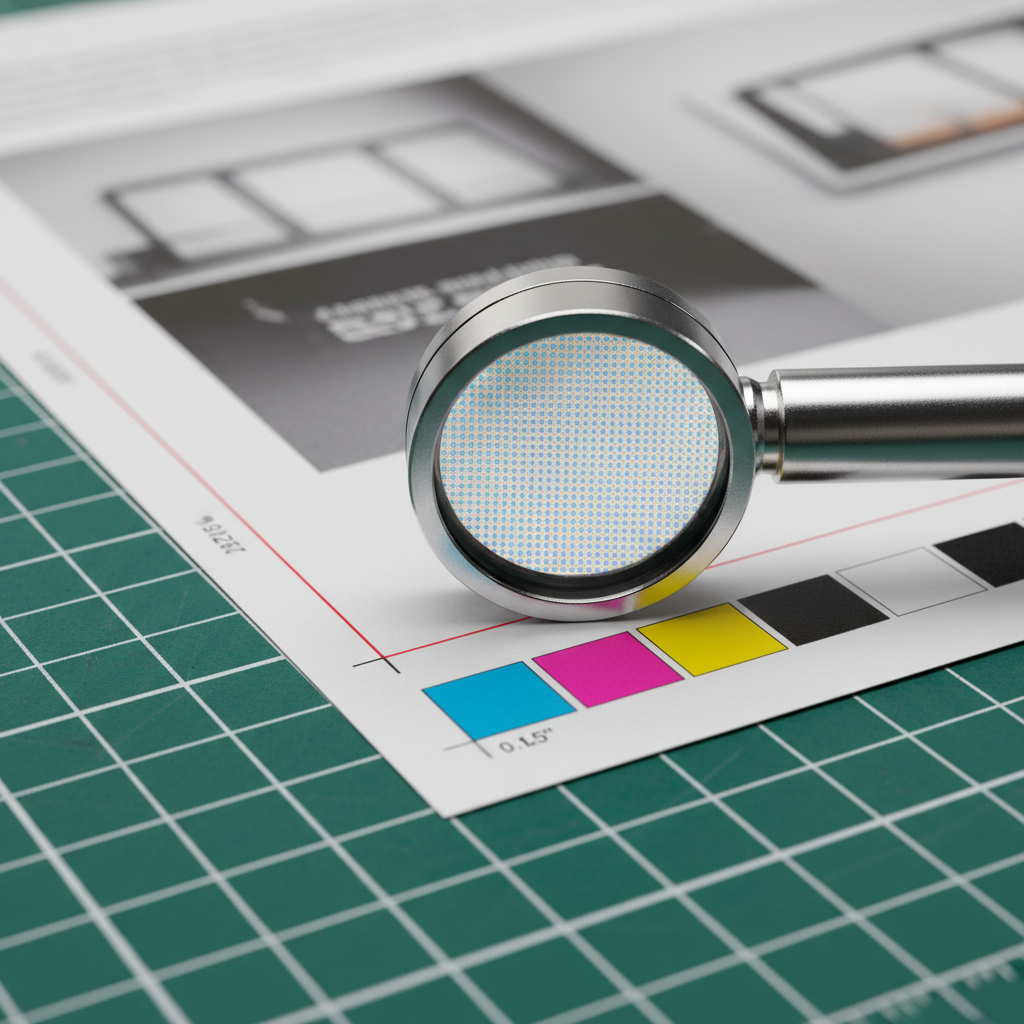
- Missing bleed: Full-bleed artwork needs 0.125 inch beyond every trim edge.
- Low-resolution imagery: Photos should generally be 300 ppi at their final placed size.
- RGB artwork: Print files should be prepared and reviewed in CMYK.
- Unsafe content: Text, logos, QR codes, and borders placed too close to trims or folds can be clipped or look uneven.
- Incorrect fold order: A screen layout can look right while the physical brochure reads in the wrong sequence.
Do not wait until the press stage to solve these issues. A preflight check and a folded paper dummy can reveal most of them while changes are still inexpensive.
What counts as a brochure printing mistake?
A brochure printing mistake is a preventable file, layout, material, or finishing problem that reduces readability, accuracy, durability, or presentation quality. Some errors originate in design software, while others appear when the flat sheet is trimmed, scored, folded, coated, or handled.
File errors that appear after printing
- Artwork ends at the trim line instead of extending into the bleed.
- Important copy sits too close to a trim edge or crease.
- Images taken from websites or listing pages are too small for their printed size.
- Fonts are missing, substituted, or not embedded in the exported PDF.
- Logos are supplied as small raster files instead of vector artwork.
- QR codes, URLs, phone numbers, or disclosure copy are not tested at actual size.
These problems are particularly costly when a brochure contains a property photograph, floor plan, map, or contact detail that cannot be replaced easily. A professional preflight should check the whole file rather than only the cover.
How to prepare a brochure file correctly
Start with the finished size and fold style, then build the document around the way it will be trimmed and folded. Do not design a generic rectangle first and try to force the panels into place at the end.
Use the right color and image settings
Prepare print artwork in CMYK and review important colors in a proof. RGB can display a wider range of bright colors on screen than many print processes can reproduce, so a saturated red, green, or blue may look different when converted. Color-managed conversion and proofing are safer than relying on a monitor alone.
Use images at approximately 300 ppi at their final placed size. A photo that is 300 ppi when small may become effectively 150 ppi when enlarged to twice its dimensions. Avoid enlarging a small web or MLS image and expecting it to gain detail; it can only spread existing pixels over a larger area.
Build in bleed and safe margins
Extend backgrounds, photographs, and other edge-to-edge elements 0.125 inch beyond every trim edge. This extra area is removed during trimming and prevents a thin unprinted sliver from appearing if the cut shifts slightly.
Keep text, logos, borders, faces, QR codes, and key property details at least 0.125 to 0.25 inch inside trims and folds. A border positioned close to an edge can look uneven even when it technically remains on the page, because normal finishing tolerances become more visible.
Stabilize fonts, logos, and export settings
- Embed fonts or outline them after the copy is approved.
- Use vector artwork for logos, icons, and line illustrations whenever possible.
- Confirm that placed images are linked or embedded correctly before export.
- Export a press-ready PDF using the printer’s requested PDF/X settings.
- Open the exported PDF and inspect every page, rather than assuming the export preserved the layout.
How fold mistakes happen – and how to prevent them
Folding is geometry, not just a visual effect. The thickness of the paper, coating, grain direction, and number of folded layers affect how panels stack. A roll fold, for example, may require an inner panel to be slightly narrower so it can tuck inside without buckling.
Choose a fold that matches the content
- Half-fold: Two broad panels work well for large photographs, floor plans, menus, or a short presentation.
- Tri-fold: Six panels provide a familiar sequence for property highlights, services, contact information, and a mailing panel.
- Z-fold: The accordion movement suits maps, process explanations, and content that should be revealed in steps.
- Gate fold: Two outer panels open toward a central reveal, making it useful for a focused luxury or event presentation.
- Roll fold: Nested panels need careful width planning so the inside section does not buckle.
Make the physical reading order clear
For a tri-fold, do not trust the flat screen view alone. Print the sheet on ordinary paper, label the panels, fold it by hand, and read it as the recipient will. Check that the front cover, back panel, inside sequence, contact details, and any disclosure copy land where expected.
Keep headlines and critical information away from creases. If a photograph or large color area must cross a fold, plan scoring and select a paper or coating that reduces the chance of cracking. Avoid thin rules that run directly alongside a crease because even a small shift can make them appear broken or uneven.
For related presentation pieces, coordinate the brochure with presentation folders for listing packages so the finished materials use compatible branding, spacing, and paper choices.
Design mistakes that make brochures harder to use
Correct technical setup cannot rescue an overcrowded or confusing layout. A brochure should guide the reader through a small number of decisions rather than fill every panel with available information.
Give each panel a job
Assign a purpose before writing: cover and promise, key benefits, property or service details, proof points, contact information, and next action. This prevents the common habit of adding paragraphs until there is no breathing room. Short headings, consistent alignment, and deliberate white space usually make a brochure feel more substantial than dense blocks of type.
For handouts at showings or events, body copy around 10–12 pt is often easier to scan than very small type. Limit the design to two or three typefaces, use a clear hierarchy, and check contrast under the lighting where the brochure will be read.
Check the details people act on
- Scan every QR code from the printed proof, not only from the design file.
- Call or verify phone numbers and inspect URLs for typing errors.
- Confirm listing facts, dates, prices, addresses, and agent details before approval.
- Check that maps, floor plans, captions, and legends remain readable after folding.
- Review brand colors and logos against the current approved artwork.
If the brochure is part of a wider campaign, matching flyers for handouts can extend the message without forcing every detail into one folded piece.
Why proofing and finishing decisions matter
A proof is more than a last look for spelling. It is an opportunity to test the physical reading order, margins, image quality, color expectations, and finishing assumptions before the full quantity is produced.
Use a consolidated proofing checklist
- Fold the proof in the intended direction and read every panel in order.
- Check trims, bleeds, safe margins, borders, and elements crossing creases.
- Inspect photos, floor plans, small type, and line art at normal viewing distance.
- Scan QR codes and verify all contact information and links.
- Compare important colors under neutral lighting and record the approved version.
- Send one consolidated correction list rather than making scattered changes across multiple files.
Plan scoring, coating, and handling together
Scoring creates a controlled channel for a fold and can help reduce cracking, particularly where heavy ink coverage crosses a crease. Gloss coatings can add visual impact but may increase glare; matte finishes can be easier to read under bright lights; soft-touch finishes change the tactile impression. The correct choice depends on the design, stock, handling, and intended setting.

When the brochure will be mailed, carried outdoors, or handled repeatedly at showings, discuss durability before approving the file. A finish selected only for appearance may not be the best choice for fingerprints, glare, or repeated folding.
A practical workflow for Mississauga brochure printing
A repeatable workflow helps busy agents and businesses avoid rushing the decisions that affect quality. Start by confirming the quantity, finished size, fold, stock, coating, and required date. Then provide the complete artwork, brand assets, and any details that must be verified.
Use a preflight pass to identify technical issues, a folded proof to confirm sequence and spacing, and a final approval that clearly identifies the file to produce. If you need supporting handouts, coordinate marketing materials for a consistent campaign rather than ordering disconnected pieces with different colors or deadlines.
Local pickup can be useful when a listing launch, open house, or event creates a firm handoff time. Build in time to review the proof and allow for corrections instead of treating same-day service as a substitute for approval. Customers collecting near 5004 Timberlea Blvd Unit#18 in Mississauga should also allow practical travel time during busy periods.
For a brochure-led campaign, add matching postcards for follow-up outreach or other pieces only after the core message and brand files are finalized. This reduces the chance that one last change creates inconsistent versions across the campaign.
Final preflight checklist before you approve
| Check | What to confirm | Why it matters |
|---|---|---|
| Document size | Finished size and fold match the order | Prevents wrong dimensions and panel order |
| Bleed | 0.125 inch on every full-bleed edge | Prevents white slivers after trimming |
| Safe area | Key content is 0.125–0.25 inch from trims and folds | Protects readable copy and balanced borders |
| Images | Approximately 300 ppi at final size | Preserves photo and floor-plan detail |
| Color | CMYK artwork and reviewed brand colors | Reduces unexpected screen-to-print shifts |
| Fonts | Fonts embedded or outlined | Prevents substitutions and text reflow |
| Proof | Physical fold, copy, QR code, and contact details checked | Catches errors that a flat screen view hides |
Keep the approved PDF and proof notes together with the job details. That record makes repeat orders easier and helps identify which elements should remain fixed when a future listing or promotion changes.
Frequently asked questions about brochure printing mistakes
What resolution should brochure photos be?
Use approximately 300 ppi at the final printed size. Enlarging a small web image lowers its effective resolution and can make property photos or fine floor-plan details look soft. Supply vector files for logos and line art whenever possible.
How much bleed and safe margin does a brochure need?
Use a 0.125-inch bleed on all sides where artwork reaches the trim. Keep text, logos, QR codes, and other important elements about 0.125 to 0.25 inch inside trims and folds so normal finishing tolerances do not affect them.
Should brochure artwork be RGB or CMYK?
Prepare and export brochure artwork in CMYK, then review important colors in a proof. RGB files can shift or print less vividly after conversion. A proof is especially useful for brokerage colors, skin tones, and large property photographs.
How do I prevent a tri-fold brochure from folding incorrectly?
Use a template made for the exact finished size and fold, confirm the panel order, and print a paper dummy before production. Keep key content away from creases and allow the printer to account for the narrower panel needed by some roll or tri-fold constructions.
Get your brochure file ready for production
Good brochure printing starts before the press: use the correct file settings, test the physical fold, proof the details, and plan finishing around the way the piece will be used. If you need a suitable format or a preflight review, review brochure printing options and contact Top Realtor Sign & Print for help preparing the job.
Contact Top Realtor Sign & Print to coordinate your next brochure project in Mississauga.