best signage design checklist: readability, visibility, and impact
Great signs do more than decorate a space—they direct, inform, and persuade in seconds. If you’re aiming for the best signage design, treat every choice (from layout to materials) as a performance decision measured by one question: can your audience grasp the message quickly, accurately, and from where they actually stand? This article turns that goal into a practical framework you can apply to storefronts, events, real estate listings, lobbies, and trade shows.
What defines best signage design?
The most effective signs strike a balance of clarity, immediacy, and memorability. In practice, that means:
- Single, primary message that’s unmistakable
- Strong visual hierarchy that guides the eye without effort
- High contrast and legible type that hold up at distance and speed
- Right-sized elements based on viewing distance and conditions
- Materials and finishes matched to the environment and lifespan
- Concise copy that’s human, skimmable, and action-oriented
- Real-world testing before committing to print and install
Start with audience and context
Before opening a design app, define who needs the sign and how they encounter it. Context shapes every design decision.
- Role: Wayfinding, promotion, identification, compliance, or information?
- Viewer state: Walking, driving, seated, queueing, browsing, or scanning a crowded space?
- Viewing window: Will people have 2 seconds or 20 seconds?
- Distance and angle: How far away are they, and at what height and angle?
- Environment: Bright sun, glass glare, dim interiors, moving crowds, or competing visuals?
Clarifying these constraints early prevents common failures like tiny type, low contrast, or glossy finishes that mirror the sky.
Visual hierarchy and layout
Hierarchy tells the eye where to start, what matters next, and where to end. A simple three-tier structure works for most signs:
- Primary: The action or identification (e.g., “Open House,” “Entrance,” “Sale”). Biggest, boldest, and highest contrast.
- Secondary: Essential qualifiers (time, direction, unit number, limited dates).
- Tertiary: Optional or supporting info (disclaimers, URLs, hashtags).
Design tips:
- Use size, weight, and spacing—not color alone—to signal priority.
- Group related information with proximity and consistent alignment.
- Leave breathing room. White space makes the primary line read faster.
- Align to a grid and keep edges clean; avoid visual clutter and decoration that competes with the message.
Color, contrast, and branding
Color carries brand recognition and mood, but contrast carries legibility. Prioritize dark-on-light or light-on-dark pairings with strong value differences.
- High-contrast pairs: Black/white, navy/white, deep green/white, white/charcoal.
- Use brand color purposefully: Keep backgrounds simple; reserve brand accents for borders, icons, or the call to action.
- Avoid low-contrast traps: Red on black, yellow on white, or mid-tones on mid-tones washed out by daylight.
- Test for glare: On glossy surfaces, colors can mute; matte or satin finishes retain contrast better outdoors.
When in doubt, print a small proof and view it from the intended distance under realistic lighting.
Typography that reads at a glance
Readable type beats beautiful type when they’re in conflict—ideally you get both.
- Choose workhorse faces: Sans-serifs with open apertures and clear character shapes maintain clarity at scale. For traditional or upscale settings, select serif families with sturdy strokes and generous spacing.
- Limit to two families: One for headlines, one for supporting info. Excessive variety slows reading.
- Weight wisely: Use bold for the primary line, regular for secondary, and avoid ultra-thin styles on backlit or outdoor signs.
- Letterspacing matters: Slightly loosen tracking on large, all-caps headings; keep numerals highly legible for times, dates, and unit numbers.
- Case choice: Title case or sentence case is typically faster to read than all caps. Reserve all caps for short identifiers.
Size, distance, and viewing conditions
Scale text and elements for how far away people are and how quickly they pass. A practical approach:
- Work backwards from distance: Mock your headline at various sizes and step back to the expected viewing distance. If you can’t read it instantly, upsize.
- Plan for movement: Driving or walking viewers need fewer words, bigger type, and stronger contrast.
- Consider height and angle: Mounting higher than eye level often requires larger type and tighter hierarchy.
- Think lighting: Backlighting increases apparent contrast; harsh sun can do the opposite. Adjust palettes accordingly.
Materials, finishes, and mounting
Match your substrate and finish to the sign’s lifespan and environment to preserve legibility and durability.
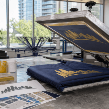
- Substrates: Rigid boards for durability and crisp edges; flexible vinyl for banners and temporary promotions; coroplast for lightweight, short-term use.
- Finishes: Matte or satin reduce glare; gloss can punch colors indoors but risks reflections outdoors.
- Protection: Lamination can add UV and abrasion resistance for high-touch or sun-exposed applications.
- Mounting: Ensure hardware doesn’t obscure key content; plan safe, stable installation locations visible from approach paths.
Copywriting for signage that moves people
Short copy forces clarity. Aim for one job per sign: direct, inform, or persuade.
- Lead with the verb or benefit: “Visit Today,” “Now Leasing,” “Open House,” “Order Online.”
- Eliminate filler: If it doesn’t change a decision, cut it.
- Use scannable structure: Break lines where a natural pause occurs; avoid hyphenations and cramped wraps.
- Make the CTA obvious: One call to action is stronger than three. URL or QR should be short and clean.
Testing, measurement, and iteration
Prototypes and quick tests save time and reprints. Build these steps into your process:
- Scale print: Print a mini at full scale for key elements (e.g., headline at final size) and view from the intended distance.
- Lighting check: Place the prototype in similar lighting to spot glare and low-contrast areas.
- Second-person test: Ask someone unfamiliar with the project to read it once and tell you the message. If they hesitate, simplify.
- Field rehearsal: For directional or event signage, mock placement to confirm arrows, angles, and heights work from real approach paths.
- Post-install review: After deployment, gather quick observations: Are people missing the entrance? Are questions repeated at the counter? Update the next print run.
Common mistakes to avoid
- Too much content: Crowding destroys hierarchy. If you need more information, add a secondary sign or QR.
- Low-contrast palettes: Pastel on pastel looks refined on screen but vanishes outdoors.
- Decorative type for body copy: Keep display fonts for short headlines only.
- Small CTAs: If the action matters, it deserves scale and space.
- Ignoring environment: Reflective finishes, sun-faded colors, and wind load all affect performance.
- Unplanned placement: Beautiful signs hidden by doors, shrubs, or aisles fail in the real world.
Checklist to use before you print
Run this quick checklist to stress-test your design:
- Primary message can be read and understood in 3 seconds at the intended distance.
- Headline, secondary, and tertiary information are visually distinct.
- Color pairs exceed a strong light/dark contrast; critical text remains legible in grayscale.
- Typefaces are limited, weights are deliberate, spacing is comfortable.
- CTA stands out and is singular; any link or QR is short and scannable.
- Substrate, finish, and mounting were chosen for location and lifespan.
- Proof viewed in similar lighting; checked for glare and reflections.
- Mock installed or taped up to validate height, angle, and approach visibility.
- Someone uninvolved could summarize the sign’s purpose after a single glance.
Applying the principles to real estate and events
Different scenarios, same fundamentals:
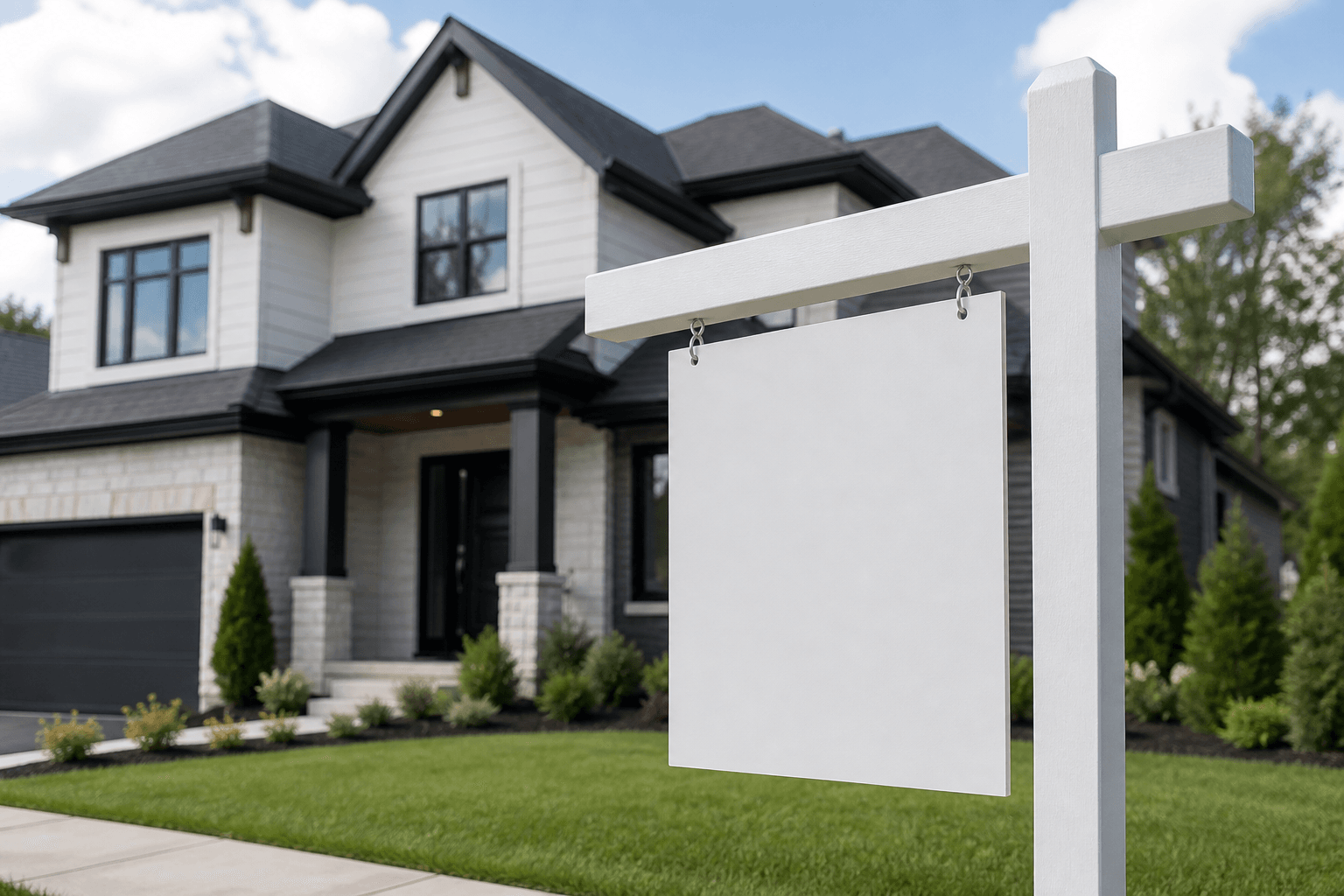
- Real estate “For Sale” or “Open House” signs: Make the event or status the hero line. Pair with a bold directional arrow when location is the barrier. Keep contact shortest path (phone, short URL) and avoid crowding with extras.
- Directional signs: Lead with the action plus arrow (“Register →”). Keep symbols large and consistent across multiple placements for a breadcrumb effect.
- Trade show roll-up banners: Headline at eye level, benefit-driven subhead, and one clear CTA. Assume most reading happens at 6–10 feet, often on the move.
- Retail window posters: Contrast and scale first. If sun hits the glass, prefer matte materials and bold type over intricate patterns.
FAQs
How many fonts should I use on a sign?
Most signs perform best with one to two type families—one for the headline and one for supporting details. Add weight and size changes for hierarchy instead of introducing more fonts.
What’s the simplest way to ensure legibility outdoors?
Choose a high-contrast palette, a clear sans-serif headline in a bold weight, and a matte or satin finish to reduce glare. Print a quick full-scale proof of the headline and view it from the intended distance in daylight.
Should my logo be the biggest element?
Only if brand recognition is the sign’s job. For most directional or promotional signs, the message or action should be largest, with the logo supporting legibility and trust.
How do I decide what to cut from crowded layouts?
Ask what the viewer must know in three seconds to act. Keep that, demote or remove the rest, and move long details to a secondary sign or scannable link.
Is all-caps ever a good idea?
All-caps can work for short identifiers or single-word commands, set large with generous spacing. Avoid it for longer lines where mixed case reads faster.
Next step: if you’re planning new signage and want to translate this checklist into print-ready files and materials, visit Top Realtor Sign & Print at https://toprealtorshop.ca/.