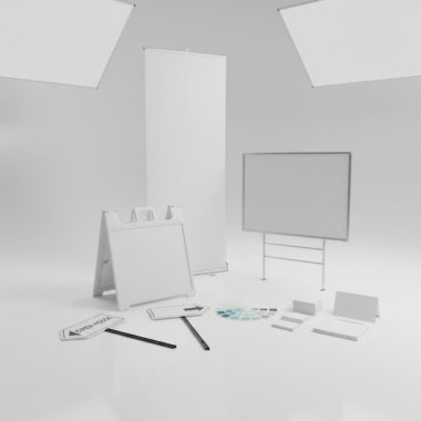


How to order luxury business cards is straightforward: choose a premium finish (foil, raised spot UV, soft touch, painted edges), prepare a print-ready file, confirm a proof, and select pickup at 5004 Timberlea Blvd Unit#18 in Mississauga. Use the online design tool to personalize, then place your order for fast turnaround.
By Ashwani • Top Realtor Sign & Print
Last updated: 2026-05-02
Summary
This guide shows real estate pros exactly how to order luxury business cards—from picking finishes to file setup and pickup. You’ll learn specs, design tips, and a step-by-step workflow aligned to Top Realtor Sign & Print’s Mississauga operation so you can place a confident, fast order.
Luxury business cards elevate your brand with tactile finishes and richer color. In this article, we show you the practical steps busy REALTORS can follow to get premium cards fast—without design software or guesswork.
- Understand premium finishes and when to use each
- Follow precise file specs (size, bleed, color, foil masks)
- Use the online design tool when you don’t have artwork
- Confirm a proof and schedule local pickup in Mississauga
- Pair your cards with postcards and brochures for listings
Before You Start (Prerequisites)
Gather your brand assets, choose a finish, and confirm print specs before you order. For Mississauga REALTORS, plan pickup at 5004 Timberlea Blvd Unit#18 in the Regional Municipality of Peel and allow time for lamination, foil, or edge paint to cure for best results.
Preparation prevents delays. Here’s what to line up so the order flows smoothly and your luxury cards look flawless the first time.
Brand and file essentials
- Logo files: Vector .AI/.EPS or high-res transparent PNG (300 PPI or higher).
- Fonts: Provide OTF/TTF or outline text in your design to avoid substitutions.
- Colors: Use CMYK values; spot colors only where needed for foil masks or special effects.
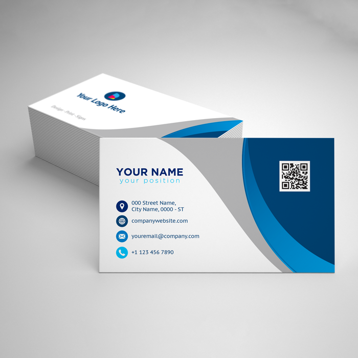
- Size: Standard North American card size is 3.5 x 2 inches with 0.125 inch bleed on all sides.
- Safe area: Keep critical text at least 0.125 inch from trim to prevent clipping.
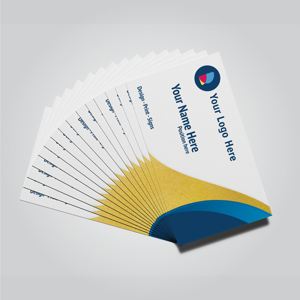
Pick the premium finish that fits your brand
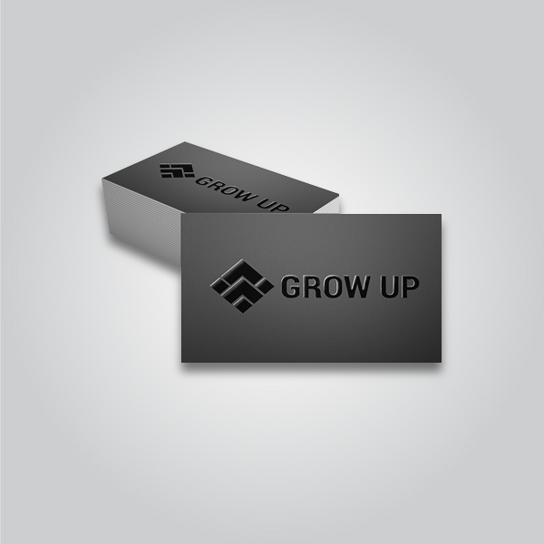
- Gold/Silver Foil: Metallic shine for names, logos, or borders. Creates an upscale, realtor-lux feel.
- Raised Spot UV: Glossy relief on matte cards; ideal for highlighting logomarks and patterns.
- Soft Touch Lamination: Velvet-like, reduces glare; pairs well with foil or raised accents.
- Painted Edges: Bold color edge on thick stock; a subtle but memorable detail at handoff.
Not sure what to choose? Review live options in our business cards collection and match finishes to your brokerage’s visual style.
Local logistics for Mississauga pickup
- Pickup timing: Specialty finishes may add production time; plan around open houses.
- Proof approval: Approve digital proofs quickly to keep your timeline on track.
- Curing considerations: Foil, UV, and paints benefit from proper set time for durability.
How to Order Luxury Business Cards: Step-by-Step
Select your finish, set correct print specs, design or upload artwork, review a proof, then book Mississauga pickup. Use foil, raised spot UV, soft touch, or painted edges to align with your brand and listing style, and confirm bleed, resolution, and foil masks before submitting.
Follow this practical flow. You can complete the entire process online in minutes, then let our team handle the specialty production.
Step 1: Choose a finish and stock
- For metallic shine, start with foil-accent business cards (gold or silver).
- For tactile gloss, review raised spot UV cards that pop on matte surfaces.
- For a luxe, velvety feel, consider soft touch laminated cards.
- For a bold profile, pick painted edge cards on thick stock.
Tip: Choose one hero effect. Combining too many specialty finishes can reduce contrast and readability.
Step 2: Set size, bleed, and color
- Size: 3.5 x 2 inches (horizontal) or 2 x 3.5 inches (vertical).
- Bleed: Add 0.125 inch bleed beyond trim; extend backgrounds and images to bleed.
- Color mode: CMYK for print consistency; avoid RGB-only artwork.
- Resolution: Minimum 300 PPI at final size for crisp type and logos.
These specs help prevent white edges, fuzzy logos, and color shifts after lamination or UV.
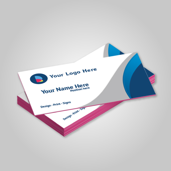
Step 3: Design online or upload artwork
- Use our browser-based editor to place logos, contact info, and brand colors without pro software.
- Prefer uploading? Export a print-ready PDF with bleeds and embedded fonts or outlined text.
- Keep rear-side content clean: a tag line, QR code, or appointment link works well.
For an easy start, browse the business card catalog to pick a base product that matches your finish.
Step 4: Prepare specialty layers (foil and raised UV)
- Foil mask: Provide a 100% black vector layer for foil areas; avoid thin lines under 0.5 pt.
- Raised UV areas: Supply a separate solid-black spot layer; leave 1–2 pt margin from small type.
- Registration: Keep masks aligned with underlying art; don’t exceed edges or tight corners.
Clean spot layers ensure the metallic or glossy effect lands exactly where you expect.
Step 5: Proof, produce, and pick up
- Proof review: Check trim, spelling, phone, email, URL, license numbers, and mask placement.
- Production: Specialty laminations, foils, and paints are applied after printing for maximum effect.
- Pickup: Choose local pickup at our Mississauga address to meet tight listing timelines.
Most REALTORS prefer local pickup to sync with open house weekends and listing launches.
Step 6: Pair with matching marketing pieces
- Drop a leave-behind 14pt postcard at showings with the same foil palette.
- Prepare listing packets with consistent brochures and signage visual cues.
- Use color and finish coordination across cards, riders, and open house materials for cohesion.
Finish selection quick-compare
| Finish | Tactile/Visual Effect | Best For | Pairs Well With |
|---|---|---|---|
| Gold/Silver Foil | Reflective metallic accents | Luxury listings, premium brand cues | Soft touch lamination, minimal layouts |
| Raised Spot UV | Glossy, raised relief on matte | Logo emphasis, pattern textures | Matte backgrounds, bold typography |
| Soft Touch | Velvety, low-glare surface | High-end feel with subtlety | Foil accents, monochrome palettes |
| Painted Edges | Color pop on thick stock | Memorable handoffs, brand color | Heavy cardstock, simple face design |
Need a quick check? Share your logo and we’ll confirm which finish will read crisply and align with your brokerage brand before you place the order.
Troubleshooting
If your proof shows fuzzy logos, foil misalignment, or color shifts, fix resolution, adjust spot layers, and convert colors to CMYK. Re-export a print-ready PDF with bleeds. When in doubt, use the online editor or request a quick preflight review.
Minor file issues can delay premium production. Here are fast fixes that keep your timeline intact.
- Low-resolution logos: Replace with vector art; ensure 300 PPI minimum for rasters.
- Foil mask overrun: Nudge the mask inward by 1–2 pt and avoid hairline details.
- Raised UV on tiny type: Remove from small text to maintain readability.
- Color inconsistency: Convert RGB to CMYK; limit rich blacks to safe builds on matte/soft touch.
- Edge paint chipping: Choose thicker stock and avoid dense ink coverage at the edge.
When your schedule is tight, leverage our business card team for a preflight—one review often prevents rework.
Advanced Tips (Optional)
Elevate luxury cards by limiting effects to one hero accent, using high-contrast palettes, and aligning finishes with listing tiers. Coordinate cards with signage and postcards, and standardize specs so reorders are one click away.
These tactics keep your brand sharp across seasons and listings while reducing order friction for busy weeks.
Design moves that photograph well
- Contrast is king: Metallic foil reads best on darker, low-gloss backgrounds.
- Texture zones: Use raised UV for logos or geometric textures—not full floods.
- Minimal face: One focal point per side; let finishing be the hero.
Production choices that last
- Durable lamination: Soft touch adds scuff resistance and a premium hand-feel.
- Thicker stock: Heavier boards help painted edges look saturated and resist wear.
- Edge color harmony: Match or complement your brokerage brand’s primary color.
Bundle and align with your Realtor toolkit
- Use the same foil tone across cards and listing materials.
- Coordinate event-day handouts with matching postcards and brochures.
- For a wider refresh, explore our Realtor packages to standardize looks.
Local considerations for 5004 Timberlea Blvd Unit#18
- Plan pickups around campus traffic near Stanford International College to save time during weekday rushes.
- Spring market runs busy; forecast your reorders two weeks ahead of open houses to keep inventory steady.
- For quick handoffs, stage extra packets in your vehicle after a client walk at Parkway Belt Dog Park or a nearby showing.
Frequently Asked Questions
Here are quick, direct answers to common luxury business card questions for real estate pros—file setup, finishes, timelines, and design support—so you can place your order with confidence.
What file format works best for foil and raised spot UV?
Submit a print-ready PDF in CMYK with 0.125 inch bleeds. Provide separate 100% black vector layers for foil and raised UV areas. Outline fonts or include OTF/TTF files to prevent substitutions.
Can I order luxury business cards without professional design software?
Yes. Use our browser-based online editor to place your logo, contact details, and brand colors. It exports a print-ready file with bleeds, so you can proceed straight to proof and production.
Which finish should I pick for high-end listings?
For premium listings, gold or silver foil on a soft touch base creates a refined, high-contrast look. If you prefer subtle texture, raised spot UV over a matte field emphasizes logos and patterns without glare.
How thick should luxury cards be?
Heavier stocks feel more substantial and improve durability. Thick boards are ideal for painted edges and reduce bending. Choose a weight that supports your chosen finish and still fits standard card holders.
Can I coordinate my cards with postcards and brochures?
Absolutely. Use the same color palette, foil tone, and typography across cards, postcards, and brochures to reinforce brand recognition at every touchpoint.
Additional Resources
Explore finish-specific product pages, a curated card catalog, and inspiration from established publishers to spark your luxury card concept and streamline ordering.
- Browse all business card options to pick a base product.
- See foil-accent cards for high-impact metallics.
- Learn how direct mail complements handoffs in this Shopify postcard guide.
Conclusion
Order luxury business cards by selecting a signature finish, preparing print-ready files, confirming a proof, and booking Mississauga pickup. Keep the design minimal, let one effect lead, and coordinate with postcards for a cohesive, premium brand story.
- Pick one hero finish: foil, raised UV, soft touch, or painted edges
- Use CMYK, 300 PPI, and 0.125 inch bleeds for clean production
- Approve proofs quickly to safeguard your timeline
- Align cards with your listing collateral for consistency
Next step: Choose your finish and place an order for local pickup at our Mississauga location. Your luxury cards will be ready for confident handoffs at the next showing.
Key Takeaways
- Luxury cards win attention with tactile effects and clean layouts.
- Correct specs (size, bleed, CMYK) prevent reprints and delays.
- One hero effect plus soft touch is a reliable premium combo.
- Local pickup at 5004 Timberlea Blvd Unit#18 supports tight timelines.