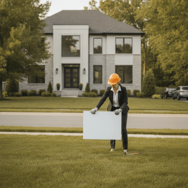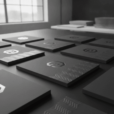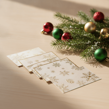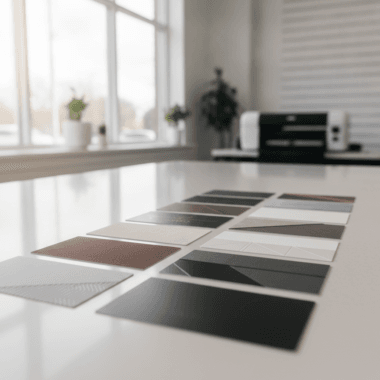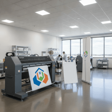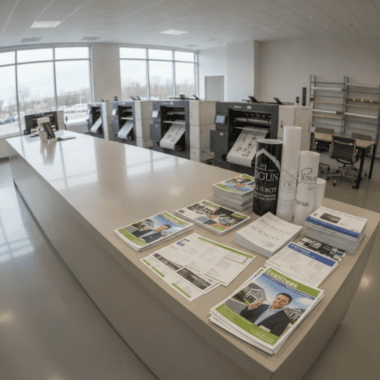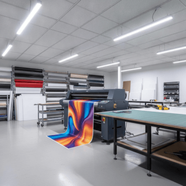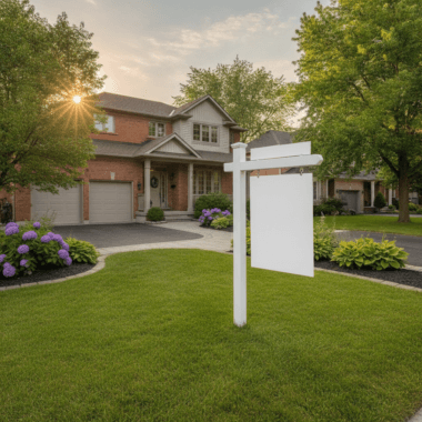
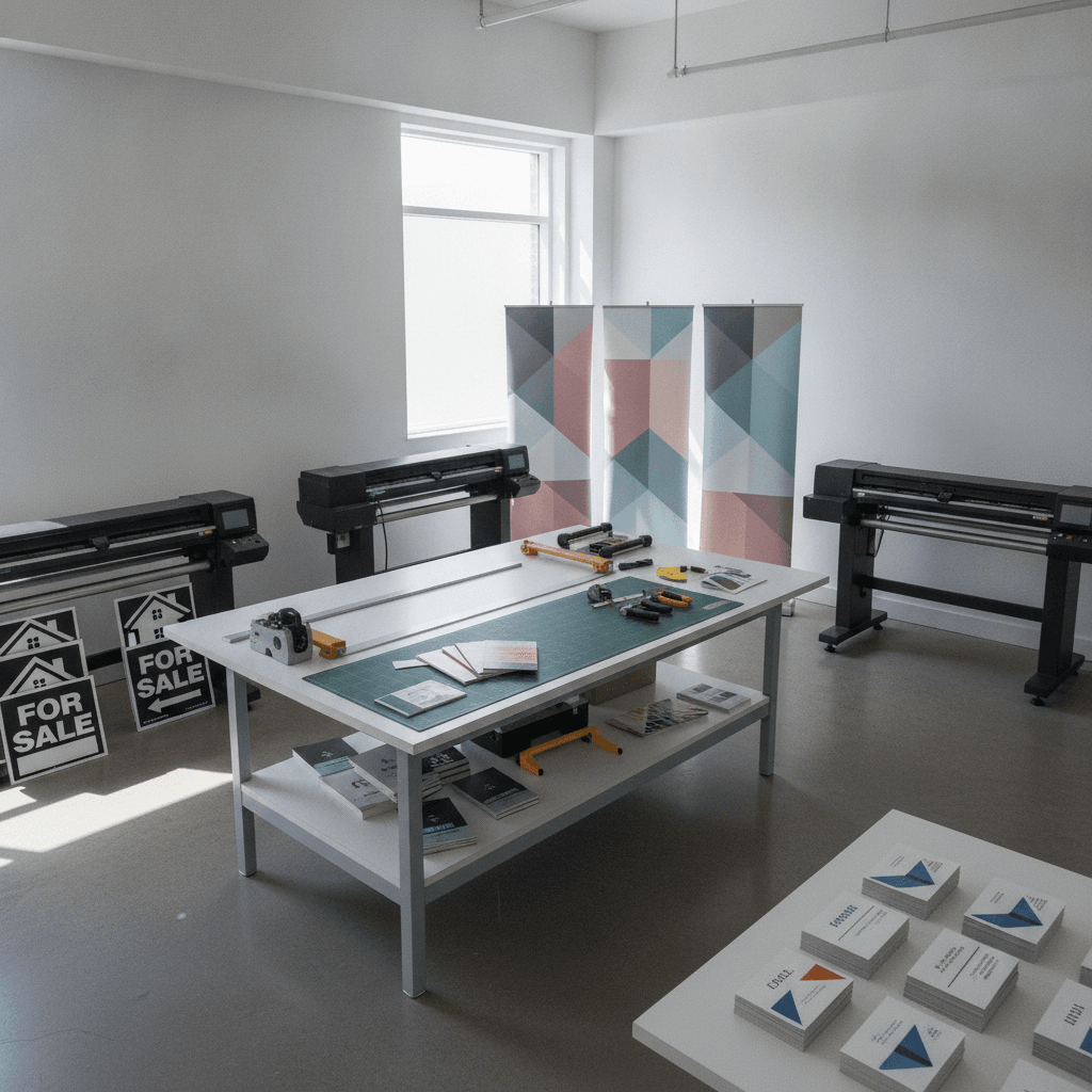
Print designs are professionally created layouts for physical marketing materials—like yard signs, brochures, banners, postcards, and business cards—that translate brand visuals into press-ready files. They use CMYK color, correct bleeds, and high-resolution images to reproduce crisply in print. For teams near 5004 Timberlea Blvd Unit#18, strong print design accelerates listings, open houses, and local outreach.
By Top Realtor Sign & Print (Ashwani) • Last updated: 2026-07-07
Above the fold: overview and contents
This expert guide explains what print design is, why it drives real estate results, how files move from concept to press, and which formats deliver. You’ll get practical specs, file checklists, and Mississauga-proven examples so your next signs, cards, and flyers look sharp, on-brand, and ready on time.
Here’s what you’ll learn at a glance:
- Clear definition of print designs and the core principles behind reliable output
- Why good design wins showings, referrals, and repeat business
- How the design-to-press workflow really works (with specs)
- Which formats matter most for Realtors and local businesses
- Best practices that prevent reprints and rush-weekend stress
- Tools, templates, and local pickup tips to move fast
- Mini case studies and a quick-reference table of specs
What is print design?
Print design is the craft of converting brand ideas into press-ready layouts for paper, board, or vinyl. Great files use CMYK color, 300 dpi images, and proper bleeds/safe margins so the finished piece looks crisp, color-accurate, and consistent across every sign, flyer, or card.
At Top Realtor Sign & Print, print designs connect your listing story to tangible pieces—For Sale signs, Open House A-frames, directional arrows, roll-up banners, postcards, brochures, and premium business cards. The aim is simple: faster recognition at the curb, easier conversations in hand, and a smoother path to offers.
Core principles we use daily
- Hierarchy that scans fast: One primary headline, a single call to action, and minimal secondary text.
- Distance legibility: Signs designed for 30–50 feet; handouts for 12–18 inches. Different contexts, different type scales.
- Color discipline: Brand contrast that works in CMYK; spot colors reserved for strict brand needs.
- Pixel-to-inch math: 300 dpi at final size for photos; vector logos for unlimited sharpness.
We’ve seen agents save hours each month once their core pieces share the same fonts, spacing, and color ratios. Consistency removes debate and speeds approvals—especially when timelines compress to 24–48 hours before an open house.
Why print designs matter in real estate
Clear, consistent print design increases attention at 30 feet and credibility at arm’s length. In real estate, that combination turns drive-bys into showings and handshakes into listings—making signs, postcards, brochures, and business cards high-ROI building blocks.
Design choices pay off in seconds. A yard sign has about 3–5 seconds to communicate a message to passing traffic. That’s why we favor bold type, high contrast, and short copy. Meanwhile, a postcard or flyer can earn 8–12 seconds in the hand; we use a single headline, three to five bullets, and a clean QR target so action is obvious.
- Visibility at speed: For Sale signs need strong color contrast and 2.5–3 inch cap heights for primary lines.
- Recognition across pieces: The same headline style, logo spacing, and accent color across signs and handouts compounds recall.
- Tactile trust: Soft touch lamination, raised spot UV, and foil accents signal care—prospects keep these cards longer.
- Directional clarity: Simple arrows and 1–2 words on wayfinding; use the flyer for details once they arrive.
Want a deeper strategy pass? Our branding guide for agents shows how a small number of design rules can standardize dozens of assets without slowing you down.
How print designs move from screen to press
Great print follows a simple path: intent, content, layout, proofing, prepress, and output. Final PDFs use CMYK, 300 dpi images, 0.125 in bleeds, outlined fonts, and safe margins of 0.25 in. A last proof prevents reprints and weekend delays.
1) Define the goal
- Context first: Curbside? Mailbox? Lobby? Each demands different type scales and copy density.
- Outcome metric: Calls, scans, RSVPs, or foot traffic—pick one primary action per piece.
- Timeline: Same-day pickup is possible for select items; we’ll align format to deadline.
2) Gather assets
- Brokerage-compliant logos (vector preferred) and brand color values
- MLS photos exported at 300 dpi at final size (no upscaling)
- Short copy: one headline, 3–5 bullets, contact, and a QR destination
When you’re rushed, our Realtor packages bundle the most-used formats so you can deploy a complete, consistent kit in hours.
3) Layout & hierarchy
- One font family (two weights) or two families total: Keeps rhythm and clarity.
- Headlines ≥ 24 pt on handouts: Names/titles 14–18 pt; details 9–11 pt.
- White space: 10–20% negative space improves scanning and polish.
4) Prep for press
- CMYK color space (no RGB-only elements)
- Bleeds at 0.125 in; keep key elements 0.25 in from trim
- Outline fonts; package linked images; include a flattened low-res proof
5) Proof & approvals
- Confirm phone, email, URLs, license numbers, and brokerage disclosures
- Test QR codes—aim for 0.8–1.2 inches square for reliable scans
- Check photo crops at 100% size to avoid soft edges
6) Output & pickup
- Choose stock/finish by objective: gloss for photo pop, soft touch for premium feel
- Hardware plan: A-frames, H-stakes, grommets, or banner stands
- Schedule local pickup to hit open-house windows without shipping risk
Our practical walkthrough on avoiding print mistakes expands these specs with real file screenshots and checklists.
Types of print designs for Realtors and local businesses
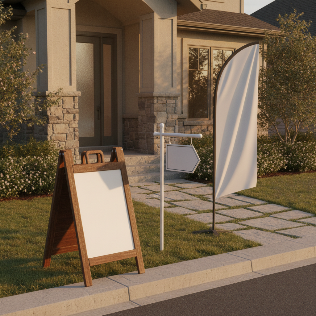
Core formats include yard signs and A-frames for roadside attention, flyers and brochures for details, postcards for targeted outreach, roll-up banners for events, and premium business cards for personal follow-up. Each serves a specific moment in the buyer journey.
High-visibility signage (curbside)
- For Sale signs: Large phone or web/QR, bold type, and clean contrast. Common panels 24×18 in; riders 24×6 in.
- Open House A-frames: Short arrows, 1–2 words. Durable frames for repeated weekend use.
- Directional arrows: Place at decision points; keep copy to essentials for 3–5 second reads.
- Custom riders & inserts: “New Listing,” “Sold,” or brand patterns that extend your visual reach.
Want sign-specific pitfalls to avoid? See our Realtor signs guide for layout do’s and don’ts.
Hand-to-hand marketing (in the room)
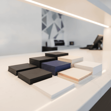
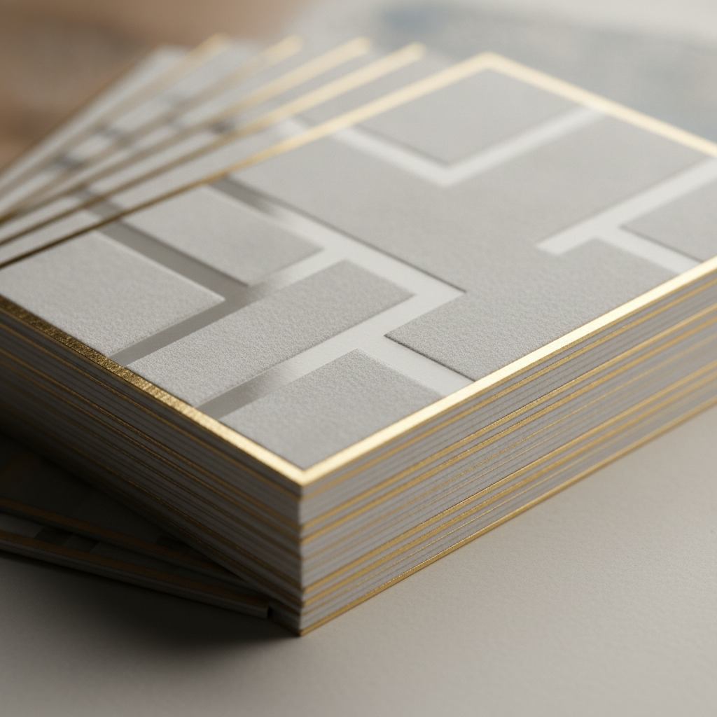
- Business cards: Soft touch, raised spot UV, and foil accents lift perceived value immediately.
- Flyers and postcards: One headline, 3–5 bullets, and a clear CTA or QR. Common sizes: 8.5×11 in flyer; 4×6 or 5×7 in postcard.
- Brochures: Tri-folds organize features, floor plans, and neighborhood notes without crowding.
If you prefer done-for-you structure, start with our brochure templates and adjust copy and photos for each listing. It’s faster than building layouts from scratch.
Event and venue presence
- Roll-up banners: Portable brand billboards (often 33×80 in). Perfect for broker tours or community events.
- Table tent cards & stickers: Useful for condo lobbies and local cafés (with permission).
Our deep-dive on business cards explains finish combinations and what to expect when you elevate thickness, texture, and edge treatments.
Best practices that prevent reprints and missed deadlines
Use big type, short copy, strong brand contrast, and strict prepress specs. Deliver press-ready PDFs with bleeds, outlined fonts, and 300 dpi images, plus a low-res proof. Label files with product and date so everyone knows which version to print.
Typography that works
- Signs: Aim for 2.5–3 in cap height on the primary line and ≥ 1 in on secondary lines.
- Cards and handouts: 14–18 pt for names/titles; 9–11 pt for details; avoid condensed fonts for contact info.
- Line length: 45–75 characters per line on handouts for easy scanning.
Color & contrast
- Design in CMYK from the start; preview total ink coverage to avoid muddy darks.
- Use contrast ratios that read quickly outdoors; avoid lime on white or pale tones on pastels.
- When in doubt, test small swatches on your target stock under daylight.
Images & QR reliability
- Export photos at 300 dpi at final size—e.g., a 6 in-wide postcard image should be ~1800 px wide.
- QR codes perform best at 0.8–1.2 in square; always run a phone scan after export.
For a broader checklist across formats, our post on custom printed materials documents the exact preflight we use before every run.
Tools, templates, and resources you can use today
Use our browser-based design tool, editable templates, and in-house graphic design to move quickly. Pre-sized canvases include bleeds and brand swatches, so your export lands press-ready without back-and-forth or emergency fixes.
- Online design tool: Build postcards, flyers, and business cards without professional software.
- Editable templates: Realtor-ready layouts for signs, riders, brochures, and banners.
- In-house design: Hand off assets and approvals; we’ll align everything to brokerage rules.
- Pickup planning: Same-day options exist for key items when timelines are tight.
- Catalog overview: Skim all formats in one place via our printing materials catalog.
Prefer Adobe? Export CMYK PDFs with 0.125 in bleeds and outlined fonts, then include a flattened proof so our team can confirm intent before print.
Local considerations for 5004 Timberlea Blvd Unit#18
- Plan pickups to avoid peak traffic near Tomken Station East Platform A on busy weekdays.
- Spring and fall open houses surge—reserve A-frames and directional stakes in advance.
- Testing yard sign placement near Red Brush Park? Bring zip ties and a spare rider.
Mini case studies you can model
Teams that standardize a kit—signs, riders, flyers, postcards, banners, and premium cards—launch listings faster and maintain brand consistency. Templating core pieces reduces setup time, lowers error rates, and makes handoffs simple as volume grows.
Open house traffic boost
A Mississauga agent templated A-frames, arrows, and a roll-up banner that matched their yard sign style. With consistent arrows at each turn (and one banner at the door), weekend foot traffic stabilized and became easier to replicate across neighborhoods.
Luxury card, faster callbacks
Switching to soft touch with raised spot UV on the name and logo, one team found prospects kept cards longer and replied faster after events. A tactile upgrade created a quality signal in the first two seconds of contact.
Postcard to showing
Using a bold headline, three bullets, and a clear QR to the live listing page, postcards triggered steady scans within 48 hours of delivery. Short copy and a clean back side helped the message stand out in mailbox stacks.
Directional discipline pays
Another group standardized directional arrows with a single brand color and extra-large arrowheads. With signs placed only at true decision points, drivers needed fewer turns to arrive—reducing calls for last-minute guidance on busy Saturdays.
Helpful specs and quick tables
Use these reference specs to speed approvals: 300 dpi images, CMYK color, 0.125 in bleeds, and 0.25 in safety margins. Choose coatings and stocks by goal—soft touch for premium cards, gloss for imagery pop, and matte when you need writable surfaces.
Common file formats for print
| Format | Best use | Notes |
|---|---|---|
| PDF (Press-Ready) | Final print files | Embed/outline fonts; include bleeds and crop marks |
| AI/INDD | Editable source files | Package links; ensure CMYK profiles are included |
| TIFF/JPEG | Flattened images | 300 dpi at final size; CMYK preferred over RGB |
| PNG | Logos with transparency | Use sparingly; convert to CMYK for print accuracy |
Finishes by objective
| Finish | Perception | Where it shines |
|---|---|---|
| Soft touch | Premium, modern | Business cards, presentation covers |
| Raised spot UV | Tactile emphasis | Names, logos, subtle brand patterns |
| Foil (gold/silver) | Luxury, high contrast | Cards, invitation accents |
| Gloss UV | Photo pop, shine | Flyers, postcards with rich imagery |
| Matte/Satin | Understated, writable | Brochures, notepads, folders |
Mid-article tip
Need a turnkey setup for your next launch? Our Realtor packages bundle proven formats so your team can execute the same day without hunting for specs or templates.
Evidence and expert cues worth noting
Industry resources consistently emphasize legibility, material choice, and brand consistency for reliable print results. Design basics—contrast, type size, and format purpose—are the levers that keep your message clear from curbside speed to in-hand reading time.
For large-format clarity and sizing, The UPS Store’s large-format tips echo the importance of simple layouts and readable scale for posters and banners. When evaluating substrates, their overview on signage materials underscores matching material to environment—vital for outdoor A-frames and yard signs. And on brand cohesion across stationery, The UPS Store’s branding guidance aligns with our recommendation to reuse the same fonts, color ratios, and spacing rules across cards, flyers, and folders.
Frequently asked questions
Design for print by working in CMYK, using 300 dpi images, and adding 0.125 in bleeds. Keep signs simple for distance legibility and use premium finishes on cards for a strong first impression. Always request a proof before you print.
What size should my open house sign text be?
For curbside legibility, target 2.5–3 inch cap height for the main line and at least 1 inch for secondary lines. Keep words short, maximize contrast, and let the flyer carry the details.
Do I need CMYK for print?
Yes. Converting your layout to CMYK ensures colors reproduce predictably on press. Provide a press-ready PDF with 0.125 in bleeds and outlined fonts to avoid last-minute fixes.
What’s the standard bleed for postcards and flyers?
A common standard is 0.125 inches on all sides. Also keep key elements at least 0.25 inches from trim for safety, especially when designs use borders or edge elements.
Which finish should I choose for business cards?
Pick based on brand feel: soft touch for premium subtlety, raised spot UV for tactile emphasis, and foil for high-contrast highlights. All three communicate quality in different ways.
How many fonts should I use in one piece?
Use one family with two weights or two families total. Limiting fonts protects hierarchy and speeds reading, especially on signs that must be understood in 3–5 seconds.
Conclusion and next steps
Great print design is clear, consistent, and press-ready. Standardize your kit—signs, riders, flyers, postcards, banners, and premium cards—so every listing launches fast and on brand. When time is tight, use templates and local same-day pickup.
- Keep distance pieces simple; save details for in-hand formats.
- Export CMYK PDFs with 0.125 in bleeds and 300 dpi imagery.
- Template core pieces for repeatable, fast launches.
- Use premium card finishes for instant credibility.
- Schedule pickups around local traffic to stay on time.
Key takeaways
- Print designs turn brand ideas into reliable, press-ready assets.
- Clarity at 30 feet and credibility in hand drive real estate results.
- Specs matter: CMYK, 300 dpi, 0.125 in bleeds, 0.25 in safety.
- Templates and standardized kits save hours every listing.
- Local pickup beats shipping risk when deadlines shrink.
Ready to sharpen your kit? We’ll align signs, cards, and flyers to brokerage rules and prep files for quick pickup at our Mississauga shop—so your next launch is simple, fast, and repeatable.