
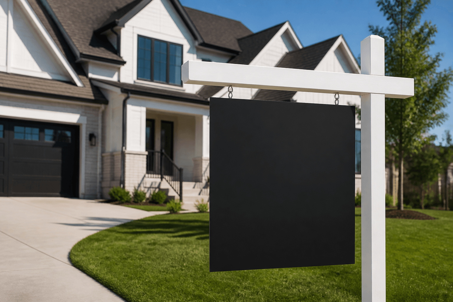
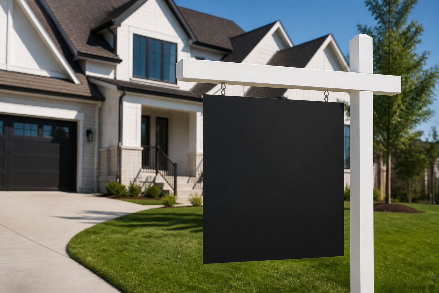
Real estate signs that get noticed: design, placement, and materials checklist
Real estate signs still do heavy lifting in a digital-first world. They grab attention from passersby, guide visitors to your open house, and reinforce your brand at curbside distance—often within seconds. This practical, field-tested playbook walks you through choosing the right sign types, designing for instant readability, selecting durable materials, placing signs for maximum visibility, and maintaining them so they keep delivering leads week after week.
Sign types and when to use them
Different situations call for different real estate signs. Mixing formats helps you capture attention from the street, on foot, and at key decision points like driveways and intersections.
- For Sale signs: The centerpiece at the property. Prioritize clear agent/broker info, a primary call to action, and legible contact details. Add a simple headline if space allows (e.g., “3+1 Bed Family Home”).
- Open House signs: Designed to be deployed temporarily and repeatedly. Use bold direction arrows and the time window. Keep copy to essentials so drivers can process at a glance.
- Directional signs: Placed at turns and intersections to guide traffic from main roads to your listing. Arrows should be oversized with high-contrast color combinations.
- Riders: Compact add-ons above or below the primary sign—great for timely messages like “Just Listed,” “Sold,” “Price Reduced,” “By Appointment,” or a URL/QR code. Keep to 2–3 words.
- Insert signs and frames: Interchangeable panels let you refresh a listing’s message without replacing the entire structure. Helpful for seasonal or status updates.
- Roll-up banners: Portable vertical banners for indoor showings, broker tours, or condo lobbies. Useful for brand presence and feature highlights when floor space is limited.
Want to see popular options in one place? Explore a curated catalog of real estate signs by category for inspiration.
Design essentials that boost readability
The most common reason signs underperform is not location—it’s legibility. A driver has about two seconds to decode your message. These principles help ensure your sign reads in a blink.
- Hierarchy first: Decide what must be read in order: primary action (For Sale/Open House), property address or key feature, then contact (phone/site/QR). Give each a distinct size and weight.
- Large type, short words: Aim for clear, punchy copy. Avoid dense blocks of text. Use simple language drivers can grasp at 30–60 feet.
- High-contrast color pairing: Dark text on a light background (or vice versa) maintains clarity in sun, shade, and rain. Reserve accent colors for arrows or calls to action.
- Whitespace is not empty space: Margin around elements makes them read faster. Cramming in more information usually costs you results.
- Consistent branding: Keep your logo, colors, and typography consistent with your other materials. Consistency breeds recognition and trust.
- Scannable contact options: Pair a readable phone number with a short URL or QR code that leads to the listing page. Test QR codes at actual viewing distances.
- Arrows that communicate: When wayfinding matters, make arrows big and unambiguous—pointing the exact direction of travel at that location.
For a deeper dive into curbside readability, sizing, and layout tips tailored to residential properties, see this practical residential real estate signs guide.
Materials, finishes, and hardware
Your environment and deployment schedule should inform material choices. The goal is to maintain a crisp, professional appearance through weather changes and multiple uses.
- Substrates:
- Coroplast (corrugated plastic): Lightweight, budget-friendly, and easy to transport—popular for open house and directional signs.
- Aluminum or aluminum composite panels: Durable, warp-resistant options that present a premium look for long-term installs.
- PVC or rigid foam boards: Smooth face for sharp prints; consider for indoor or short-term outdoor use where weight matters.
- Finishes:
- Matte lamination: Reduces glare for easier reading in bright conditions.
- Gloss lamination: Adds vibrancy and wipe-clean convenience; best where reflections won’t hinder readability.
- UV-resistant inks/coatings: Help maintain color over time in sun-exposed placements.
- Hardware and frames:
- H-stakes: Portable choice for corrugated directional signs; simple push-in installation.
- Hinged A-frames: Effective for sidewalks and driveways; easy to set up and store.
- Metal posts and panel systems: Strong, stable, and suitable for larger, more permanent For Sale panels.
- Grommets and zip ties: Useful for temporary attachment where frames aren’t available.
Before ordering, visualize where your signs will live: windy corners, sun-exposed boulevards, shaded cul-de-sacs, lobby floors, or building vestibules. Let the location dictate durability and finish.
Placement, wayfinding, and visibility
Strategic placement can double or triple the effectiveness of your real estate signs. Think in terms of the journey: discovery, approach, arrival.
- Discovery zones: Major intersections or high-visibility routes where drivers first become aware of your listing or open house. Use bold open house or directional signs with large arrows and minimal copy.
- Approach path: Secondary streets and turns leading closer to the property. Place directionals just before and right after turns to confirm the path.
- Arrival point: The curb in front of the property. Your For Sale sign should be perpendicular to traffic for maximum read time, not parallel to the road.
Additional placement pointers:
- Height matters: Keep vital details at typical driver eye level when possible. For sidewalks, ensure pedestrian line-of-sight above parked cars.
- Angle for dwell time: Slightly angle signs toward oncoming traffic to extend the readable window.
- Avoid obstructions: Trees, hedges, and parked vehicles can block sightlines. Revisit placements after different times of day to check shadows and traffic patterns.
- Night and low light: If evening traffic is important, consider reflective vinyl accents or supplemental lighting where appropriate.
Note: Always confirm any placement rules or permissions that may apply in your area before installing signage.
Copy and CTAs that convert
Great design is only half the job—your words must earn action. Keep it short, specific, and actionable.
- Reduce friction: Short URLs and visible phone numbers get used. Pair with a QR code for the listing page.
- Highlight one hook: If you feature a selling point, pick one that’s instantly understood: “Legal Basement Suite,” “Ravine Lot,” “Walk to Transit.”
- Be consistent: Align the sign’s promise with what visitors see online and on-site to build trust.
File prep, proofing, and ordering checklist
Production hiccups can delay installs. A tidy preflight routine keeps your timeline on track.
- Correct size and orientation: Match file dimensions to your chosen frame or post system.
- Safe margins and bleed: Keep critical text and logos comfortably inside safe areas; include proper bleed for trimming.
- Vector logos and arrows: They scale cleanly and look crisp at larger sizes.
- Readable fonts only: Avoid ultra-thin weights. Test legibility at reduced scale (e.g., 10% printout viewed at arm’s length).
- Color checks: If brand accuracy is crucial, supply Pantone references or a CMYK swatch for comparison.
- QR code test: Verify it scans from the distance you expect people to stand or sit in a car.
- Final proof review: Confirm phone numbers, URLs, and dates—then get a sign-off from stakeholders before printing.
Deployment, maintenance, and reuse
Signs are assets. Treat them well and they’ll work harder and longer for you.
- Transport smart: Use protective sleeves or cardboard between signs to prevent scuffs in transit.
- On-site check: After installing, walk or drive past at normal speed to confirm visibility and arrow directions. Adjust immediately if anything is unclear.
- Weather watch: After heavy wind or rain, revisit placements to straighten, clean, or re-secure hardware.
- Clean regularly: Dust, mud splatter, or road salt can reduce legibility. A quick wipe restores professional appearance.
- Refresh riders: Update time-sensitive messages (“Open House Today”) promptly so signs never mislead viewers.
- Store flat and cool: Keep panels out of direct heat and sunlight when not in use to prevent warping.
Measurement and iteration
Track what works so every listing performs better than the last.
- Unique short URLs: Create short, memorable links per property to monitor direct traffic from signage.
- Distinct QR codes: Use unique codes by channel (yard sign vs. intersection directional) to see which placements drive scans.
- Call tracking numbers: Assign a number to specific sign types to measure inbound calls.
- Time-of-day insights: Note when scans and calls spike to optimize open house times and sign refresh schedules.
- Incremental tests: A/B test one variable at a time—arrow color, headline phrasing, or phone number size—to isolate impact.
Context also matters. If you’re exploring broader market dynamics that may impact where you deploy or how you message, here’s a look at top real estate hotspots in Canada for perspective.
Frequently asked questions
What size should real estate signs be for curbside visibility?
There’s no one-size-fits-all, but larger panels with bold headlines, oversized arrows, and high-contrast colors are easier to read at drive-by speeds. Match size to the viewing distance and the surrounding visual noise. When in doubt, increase headline and arrow sizes rather than adding more words.
How many directional signs do I need for an open house?
Plan a path from the nearest major road to your listing and place signs at every decision point—before and after each turn. Many agents pre-map two routes to account for one-way streets or blocked visibility. Walk or drive the route to confirm arrows are obvious at normal speeds.
Should I use QR codes on real estate signs?
Yes—when they complement, not replace, a clear phone number and short URL. QR codes are great for quick listing access, photo galleries, or pre-registration forms. Test scanability at realistic distances and lighting conditions, and ensure the destination page loads quickly on mobile.
What’s the best material for reusable open house signs?
Lightweight, durable substrates like corrugated plastic paired with sturdy H-stakes or A-frames are popular for repeated weekend use. If you expect frequent heavy wind, consider heavier frames or weighted bases.
How do I keep signs compliant with local rules?
Requirements can vary by area and property type. Before placing signs, check any applicable rules or permissions related to location, size, and duration. When in doubt, get written confirmation to avoid last-minute removals.
Next steps
When you’re ready to plan, print, and deploy real estate signs with confidence, visit Top Realtor Sign & Print to explore options and move from concept to installation smoothly.